
Ever wonder what makes some brands instantly recognizable? It’s not just the product or the catchy slogan; often, it’s the font. The typography in a logo is more than just letters; it’s a visual representation of a brand’s personality and values.
Think of it as the silent ambassador of your brand, communicating trustworthiness, innovation, or playfulness at a single glance. Choosing the right font is a strategic decision that can significantly impact how your brand is perceived.
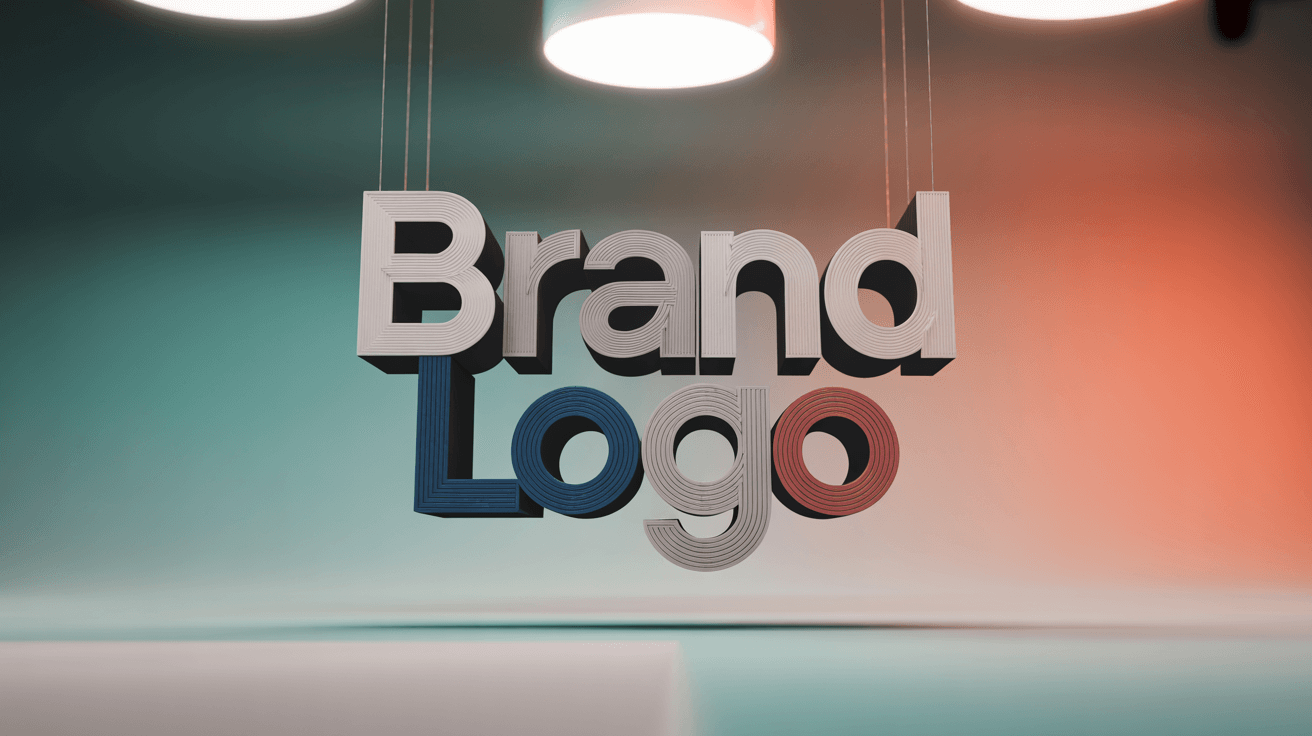
Let’s explore how the best logotype fonts create lasting impressions and emotional connections.
Table of ContentsUnderstanding the importance of logo fonts in branding
Types of logo fonts – Choosing the right style for your brand
Top 10 famous logo fonts used by iconic brands
How to choose the perfect font for your logo
Trending and unique logo fonts for modern brands
Combining fonts in logo design – Tips and best practices
Timeless vs contemporary – Balancing tradition and modernity in logo fonts
Understanding the importance of logo fonts in brandingWhen you consider the world’s most recognizable brands, what immediately springs to mind? It’s likely not just their products or services, but their distinct visual identity. The best logotype fonts are essential in creating that instant recognition we associate with successful brands. Typography in logo design goes beyond mere readability; it communicates your brand’s personality, values, and promises to your audience.
Your choice of logo typeface can significantly impact your brand’s first impression. Think about how Coca-Cola’s flowing script conveys tradition and warmth, while Google’s clean sans-serif suggests innovation and accessibility. These choices aren’t random; they’re strategic decisions reinforcing each brand’s core message. The connection between fonts and logos extends beyond aesthetics; it’s about forging an emotional bond with your audience.
When you select the best font for branding, you’re essentially deciding how you want people to feel when they encounter your brand. For example, a law firm might choose a traditional serif to project stability and expertise, whereas a children’s toy company might opt for a rounded, friendly typeface to appear approachable and fun.
Typography also influences practical aspects like scalability and versatility. Your logo needs to perform well across various mediums – from business cards to billboards, and websites to mobile apps. The font you choose must maintain its impact and readability regardless of size or context. That’s why understanding the fundamentals of logo typography is vital for anyone aiming to build a strong, memorable brand identity.
Now that we understand the importance of logo fonts, let’s dive into the different types available and how they can shape your brand’s image.
Types of logo fonts – Choosing the right style for your brandUnderstanding the different categories of typography can help you pinpoint which style best reflects your brand’s personality. Each font family carries its own associations and emotional cues, making your choice a powerful branding tool. Let’s explore the main categories and what they communicate to your audience.
Sans-serif fonts are among the most awesome fonts for logos in today’s digital world. These clean, streamlined typefaces lack the decorative strokes found in serif fonts, creating a modern and minimalist look. Brands like Apple, Microsoft, and Netflix use sans-serif typography to project innovation, simplicity, and forward-thinking values. These fonts work exceptionally well on digital platforms and maintain their clarity at any size.

Serif fonts, with their traditional flourishes and decorative elements, convey heritage, sophistication, and reliability. Many established brands in finance, publishing, and luxury goods choose serif typography to communicate trustworthiness and timeless elegance. The small decorative strokes help guide the eye along lines of text, making serifs particularly effective for brands that want to appear established and authoritative.
Script and handwritten fonts offer a personal touch that can make your brand feel more human and approachable. These coolest logo fonts work particularly well for creative industries, boutique businesses, and brands that want to emphasize craftsmanship or personal service. However, they require careful consideration regarding readability and scalability, as intricate details can become lost at smaller sizes.
Display and decorative fonts provide the most distinctive character but require the most careful application. These attention-grabbing typefaces can create memorable brand identities when used appropriately, but they can also overwhelm or confuse if not handled with restraint. Many successful brands use display fonts as accent elements while relying on more readable typefaces for their primary text.
The emergence of modern logo fonts has introduced new possibilities for brand expression. These contemporary typefaces often blend elements from traditional categories, creating unique personalities that feel both familiar and fresh. Geometric fonts, for example, combine the clarity of sans-serifs with distinctive shapes that can make a brand stand out while maintaining professional logo fonts standards.
When evaluating different font styles, consider how each category aligns with your brand’s core values and target audience expectations. The most effective logo fonts create an immediate connection between your visual identity and your brand’s personality, making the choice feel natural and authentic to your audience.
Now that you have a grasp on the different font styles, let’s look at some real-world examples of famous logo fonts used by iconic brands.
Top 10 famous logo fonts used by iconic brandsExamining the typography choices of world-renowned brands offers valuable insights into what makes certain fonts so effective for logo design. These famous logo fonts have proven their worth through decades of successful branding, becoming synonymous with the companies that use them.
Helvetica stands as perhaps the most influential typeface in modern branding history. This Swiss-designed sans-serif has been adopted by countless brands, including American Airlines, BMW, and Panasonic. Its clean, neutral appearance allows brands to project professionalism and reliability without overwhelming their message. The font’s versatility makes it one of the most popular fonts for logos across various industries.
Futura represents the geometric sans-serif category with its distinctive, forward-looking character. Brands like Volkswagen, FedEx, and Supreme have leveraged Futura’s bold, geometric shapes to communicate innovation and efficiency. The font’s strong character makes it particularly effective for brands that want to appear cutting-edge and authoritative.
Times New Roman, while primarily known as a text font, has found its place in logo design for brands seeking to convey tradition and scholarly authority. Many publishing houses, educational institutions, and established businesses choose this serif font to communicate reliability and intellectual credibility.
Trajan, inspired by ancient Roman inscriptions, brings gravitas and timeless elegance to brand identities. This all-caps serif font has been used effectively by luxury brands and institutions that want to emphasize their heritage and prestige. Its classical proportions create an immediate association with quality and permanence.
Gotham has become synonymous with American optimism and strength since its creation in the early 2000s. This geometric sans-serif gained widespread recognition through political campaigns and has since been adopted by brands seeking to project confidence and approachability. Its balanced character makes it suitable for both corporate and consumer-facing brands.
The custom typography created specifically for major brands represents another category of famous brand fonts. Coca-Cola’s Spencerian script, Disney’s whimsical lettering, and Google’s custom sans-serif demonstrate how brands can create unique typographic identities that become instantly recognizable. These iconic logo fonts show the power of investing in custom typography to create truly distinctive brand identities.
Proxima Nova has gained popularity among tech companies and startups for its modern, friendly appearance. This humanist sans-serif strikes a balance between professionalism and approachability, making it ideal for brands that want to appear innovative yet accessible. Its extensive family of weights and styles provides flexibility for various applications.
Avenir, meaning “future” in French, embodies the optimistic spirit of geometric sans-serif design. Brands choosing Avenir often want to project forward-thinking values while maintaining readability and professionalism. Its clean lines and balanced proportions make it effective across digital and print applications.
Understanding why these fonts have achieved such widespread success can inform your own typography decisions. Each of these typefaces succeeds because it effectively communicates specific brand values while maintaining practical considerations like readability and versatility.
Now that we’ve explored some famous examples, let’s discuss how you can choose the perfect font for *your* logo.
How to choose the perfect font for your logoSelecting the right typography for your brand identity requires a strategic approach that balances emotional impact with practical considerations. Understanding how to choose a font for a logo involves evaluating multiple factors that will influence how your audience perceives and interacts with your brand.
Begin by defining your brand’s personality and core values. Are you positioning your business as innovative and cutting-edge, or traditional and trustworthy? Do you want to appear approachable and friendly, or authoritative and professional? Your font choice should consistently reinforce these characteristics. The best fonts for business logos are those that authentically represent what your brand stands for.
Consider your target audience’s expectations and preferences. A children’s brand might benefit from playful, rounded fonts, while a financial services company would likely choose more conservative, established typefaces. Understanding your audience’s visual language helps ensure your typography resonates with the people you’re trying to reach.
Evaluate the practical requirements of your logo application. Will your logo primarily appear on digital platforms, print materials, or both? How small will it need to scale while remaining readable? Some great logo fonts that look stunning at large sizes may lose their impact or become illegible when reduced for business cards or mobile applications.
Think about longevity and timelessness in your font selection. While trendy typefaces might feel current and exciting, they may also quickly date your brand. The most successful logo fonts name choices often balance contemporary appeal with lasting power, ensuring your brand identity remains relevant for years to come.
Test your font choices across different contexts and applications. How does your selected typeface look when paired with your brand colors? Does it maintain its character when used in different weights or styles? Can it work effectively alongside other design elements in your brand system? Comprehensive testing helps identify potential issues before finalizing your choice.
Consider the legal and practical aspects of font licensing. Some fonts require licensing fees for commercial use, while others are freely available. Understanding these requirements upfront can prevent complications later and may influence your final decision. Many brands opt for fonts with flexible licensing terms to ensure they can use their chosen typography across all applications without restrictions.
With these considerations in mind, let’s explore some of the trending and unique logo fonts that are making waves in the modern branding landscape.
Trending and unique logo fonts for modern brandsThe contemporary design landscape offers exciting opportunities for brands willing to explore beyond traditional typography choices. Current trending logo fonts reflect broader cultural shifts toward authenticity, sustainability, and digital-first experiences. These modern typefaces help brands connect with audiences who value innovation and originality.
Variable fonts represent one of the most significant developments in recent typography. These unique logo fonts can dynamically adjust their weight, width, and other characteristics, offering unprecedented flexibility for responsive design and brand applications. Brands adopting variable fonts can create more dynamic and adaptable visual identities that work seamlessly across different platforms and contexts.
Hand-lettered and custom typography continues to gain popularity as brands seek to differentiate themselves in crowded markets. These stylish logo fonts offer complete uniqueness and can be tailored specifically to reflect a brand’s personality. While requiring more investment than off-the-shelf fonts, custom typography can provide unmatched brand distinction and legal protection.
Sustainable and eco-conscious design has influenced typography trends, with many brands choosing fonts that reflect environmental values. These font designs for logos often feature organic shapes, natural proportions, and earthy characteristics that communicate a brand’s commitment to sustainability and social responsibility.
The rise of digital-native brands has also influenced typography trends toward fonts optimized for screen reading and mobile experiences. These modern typefaces prioritize clarity and impact at small sizes while maintaining distinctive character that helps brands stand out in digital environments.
Now that we’ve covered individual font choices, let’s explore the art of combining fonts to create a visually compelling logo.
Combining fonts in logo design – Tips and best practicesSuccessfully combining multiple typefaces in logo design requires understanding the principles of typographic harmony and contrast. When working with different logo type fonts, your goal is to create a cohesive visual hierarchy that guides the viewer’s attention while reinforcing your brand message.
Establish a clear primary font that will carry the main weight of your brand identity. This dominant company logo fonts choice should be the most distinctive and memorable element of your typography system. Any secondary fonts should support and complement this primary choice without competing for attention or creating visual confusion.
Consider the relationship between different font characteristics when making combinations. Pairing fonts with similar x-heights and proportions often creates more harmonious results than combining typefaces with dramatically different structural elements. However, strategic contrast can also be effective when used purposefully to create emphasis or hierarchy.
Limit your font combinations to maintain clarity and professionalism. Most successful logos use no more than two different typefaces, with many iconic brands relying on a single font family with different weights or styles. This restraint helps create a more cohesive and memorable brand identity.
Test your brandname font combinations across various applications and sizes. What works well at large display sizes may become problematic when scaled down for smaller applications. Ensure your font combinations maintain their effectiveness and readability across all intended uses.
Pay attention to the spacing and alignment between different fonts in your logo. Proper kerning and leading become even more critical when combining different typefaces, as inconsistent spacing can make your logo appear unprofessional or difficult to read. The relationship between your logo letter font elements should feel intentional and balanced.
Consider the cultural and contextual associations of your font combinations. Different typeface pairings can evoke different emotional responses and cultural references. Ensure your combinations align with your brand values and resonate appropriately with your target audience.
Finally, let’s consider the balance between timeless and contemporary fonts, and how to strike the right chord for your brand.
Timeless vs contemporary – Balancing tradition and modernity in logo fontsThe decision between timeless logo fonts and modern logo fonts reflects a fundamental branding choice about how you want your audience to perceive your brand’s relationship with tradition and innovation. Understanding this balance is crucial for creating famous brand typography that resonates with your target market while standing the test of time.
Timeless typography choices offer the advantage of proven effectiveness and broad appeal. These designer brand fonts have demonstrated their ability to communicate trust, reliability, and established expertise across decades of use. Brands choosing timeless fonts often benefit from immediate credibility and recognition, as audiences have positive associations with these well-established typefaces.
Contemporary font choices can help brands appear innovative, forward-thinking, and relevant to current cultural moments. These modern typefaces often incorporate design elements that reflect current aesthetic trends and technological capabilities. However, the challenge lies in selecting contemporary fonts that won’t quickly appear dated as design trends evolve.
Many successful brands find their sweet spot by choosing fonts that blend classical proportions with contemporary refinements. These hybrid approaches allow brands to communicate both stability and innovation, appealing to audiences who value tradition while embracing progress. This balanced approach often proves most effective for brands serving diverse demographics or operating in evolving industries.
Consider your brand’s long-term vision when weighing timeless versus contemporary options. Will your chosen typography still feel appropriate and effective five or ten years from now? The most successful logo fonts maintain their relevance across changing design trends while continuing to communicate your brand’s core values effectively.
The key to successful font selection lies in understanding that timeless doesn’t mean outdated, and contemporary doesn’t mean trendy. The best typography choices transcend simple categorization, creating distinctive brand identities that feel both current and enduring. By focusing on fonts that authentically represent your brand’s personality and values, you can create typography that serves your brand effectively regardless of changing design fashions.
Making Your Font Choice CountChoosing the right font for your logo is a critical step in building a strong brand identity. By understanding the different types of fonts, considering your brand’s personality, and balancing timeless appeal with modern trends, you can select a typeface that resonates with your audience and stands the test of time. Don’t rush the process; experiment with different options and seek feedback to ensure your final choice truly captures the essence of your brand. As a next step, explore different font pairings and visualize your logo across various platforms to ensure consistency and impact.
And if you ever come across a logo and wonder what font it uses, a reliable font identification tool can be an invaluable resource. Your logo font is more than just a design element; it’s a powerful tool for communicating your brand’s story.
Frequently Asked Questions (FAQ) about Logo FontsLogo fonts are typefaces specifically chosen or designed for use in a brand’s logo to convey its personality and values.
The right font enhances brand recognition, sets the tone, and helps communicate your brand’s message at a glance.
Sans-serif, serif, script, and display fonts are among the most popular choices for logos.
Not always; you must check the font’s licensing terms to ensure commercial use is allowed.
It should be readable, scalable, and align with your brand’s identity, values, and target audience.
Most iconic logos use one or two fonts at most to maintain clarity and cohesion.
Consider your brand’s long-term vision; timeless fonts offer longevity, while trendy fonts can make your brand feel current.
A custom logo font is a unique typeface designed exclusively for a brand, ensuring full distinctiveness.
Yes, variable fonts offer flexibility and adaptability, making them a strong choice for responsive branding.
Online tools like WhatFontIs can help identify fonts from images of logos.

I'm a programmer at heart. But in my 20s, I realized there was more to the world of fonts than just Courier.
Driven by endless curiosity, I built a system to explore them.
That project grew into one of the world’s leading font identifier platforms: www.WhatFontIs.com.
By 2024, WhatFontIs is helping nearly one million designers—famous or not—discover the names of the fonts they need.

