
When having a branding project on your hands, your main asset is the logotype’s font. Choosing the font you’ll use is actually a critical point, and you need something that is legible and original and works in plenty of situations while maintaining a distinct personality.
When you’re choosing fonts, make sure you keep in mind the client’s company and its personality, as well as the timelessness of the design and the practical uses.
Now, when it comes to fonts, there are plenty of cool free fonts. Some might say that the best fonts aren’t free, but rest assured, there are plenty of royalty free fonts that qualify for the ‘best font’ title.
Some of the best fonts for logos are also some of the best free modern fonts, which proves that not all good fonts are premium. Look around for free typefaces, you’ll end up with some of the coolest fonts you can get.
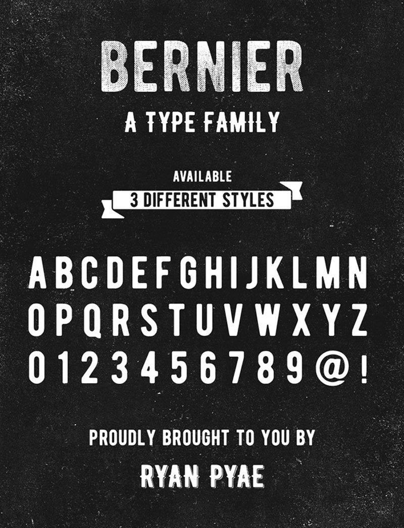
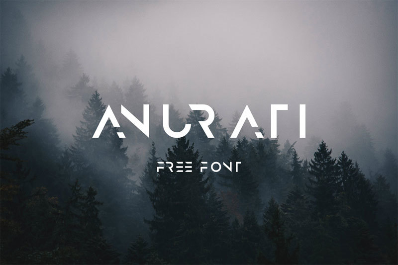
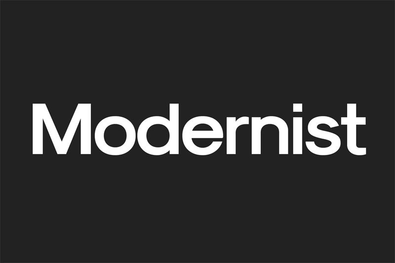
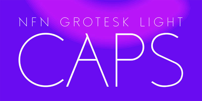
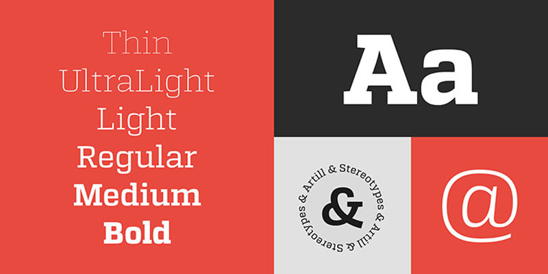
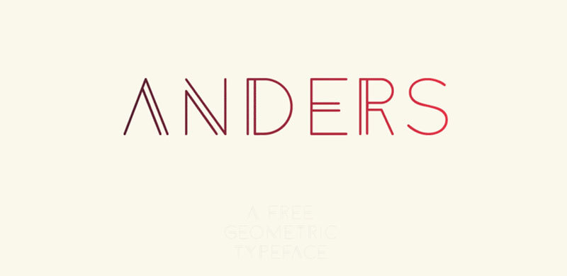
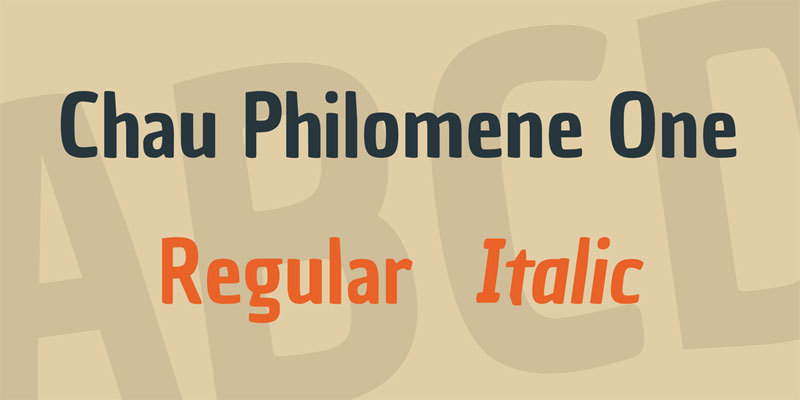
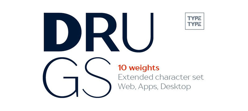
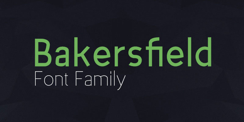
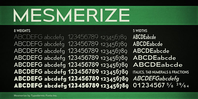
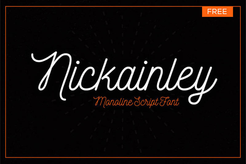
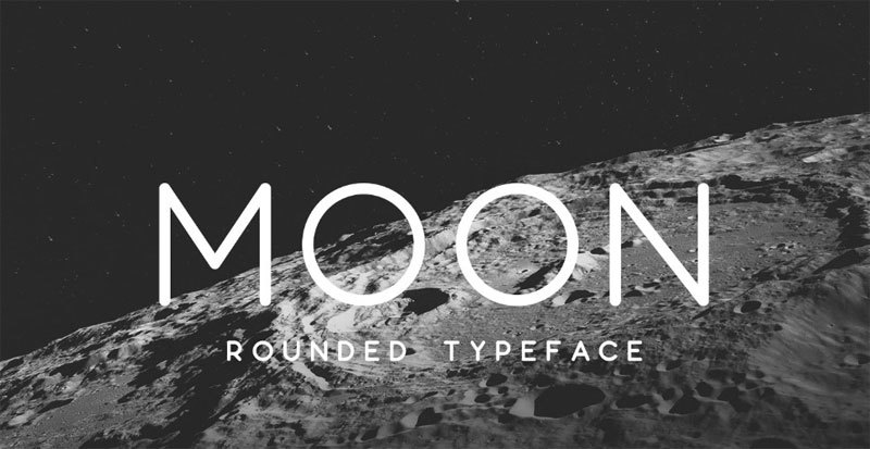
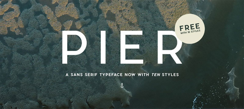
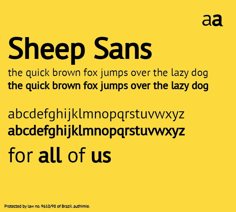
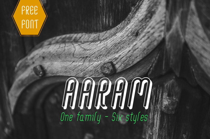
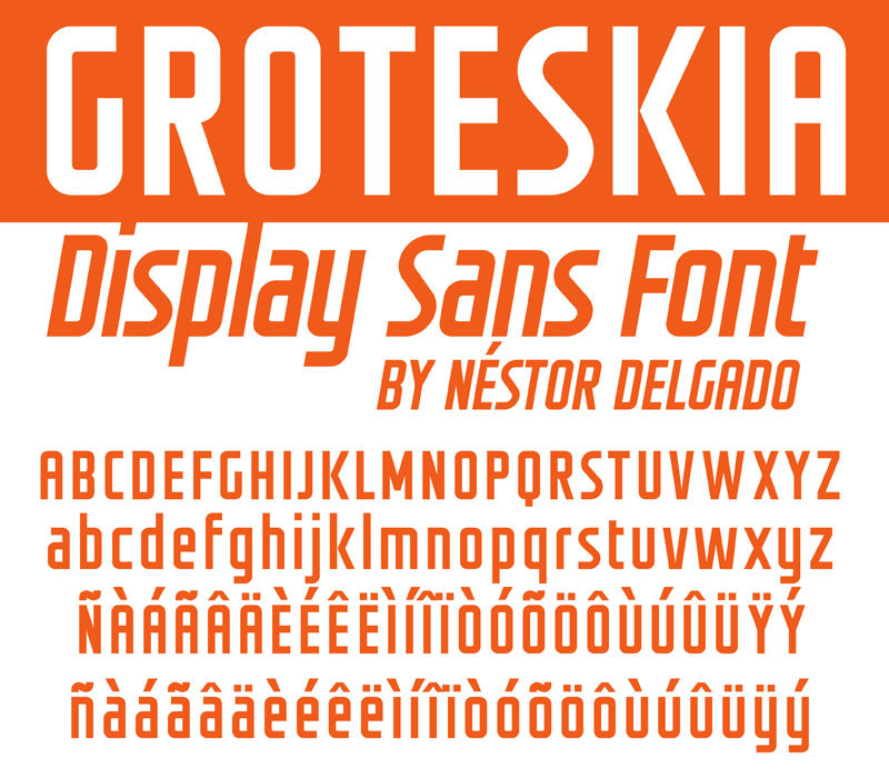
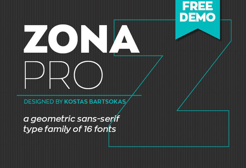
The free best fonts we recommend Moderne Sans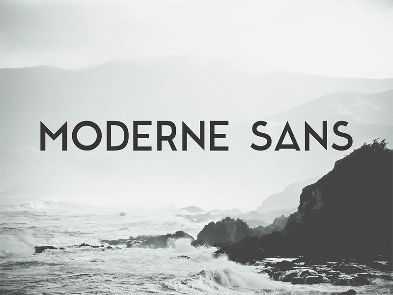
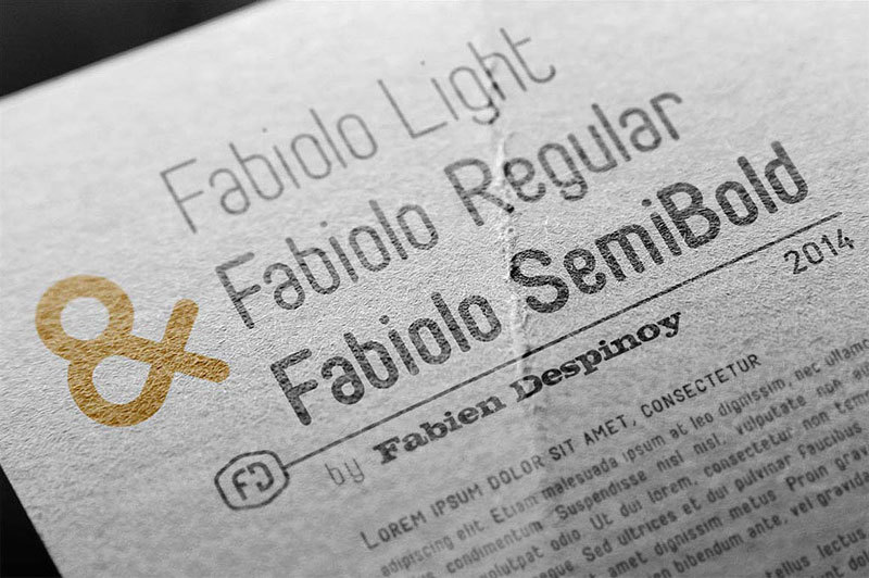
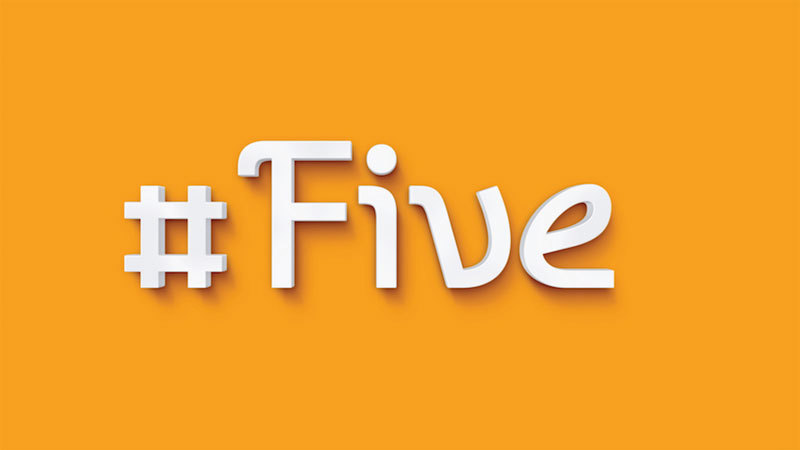
 Fabiolo


Many design scenarios dictate two fonts, where one is used in the headline and another one in the body. You could go with two weights of a font, different colors, or two completely different families.
What you’re aiming for is a visual hierarchy that will let your viewers identify what is important, and how everything relates to everything else. For inbound marketers, this is especially important. A website visitor will often scan the headlines and focus on what piques their interest, and not read every word.
Make sure your fonts are comfortable to readHow easy the font is to read depends on quite a few things, and the factors are usually divided into two categories, legibility, and readability.
Legibility usually refers to the typeface’s design, and how well you can distinguish one individual character from another. And, it also refers to how well the word shapes are defined. Readability, on the other hand, refers to how the words and blocks are arranged on the page.
Don’t neglect legibilityIf a font looks great in a headline, it doesn’t mean it will work just as well for the body. Sure, there are exceptions, but here are a few rules that you can follow to make things easier.
- Display faces work best in larger formats, for example,
- Body or text faces should be used for longer passages, where you have plenty of copy.
The characters’ shapes are another factor that will contribute to the legibility, and you’ve most likely heard the terms ‘serif’ and ‘sans-serif’.
- Serifs tend to have ‘feet’, known as ‘serifs’, which are tailing from the letters and symbols’ edges.
- Sans serifs don’t have these small lines.
A serif font is commonly easier to read in the body copy, and they’ve been used as such for decades. This sometimes gives them a classic feel. However, due to the resolutions and screen sizes commonly used today, many web designers prefer sans serif fonts for web use. They have a more modern feel and work well with modern design trends.
Readability should be taken into consideration tooReadability is all about how the words and groups of words are arranged on a page, and how easy the reader can make sense of the layout and content.
There are actually plenty of technical components that will contribute to a typeface’s readability, and they include but are not limited to, letter spacing, font size, and paragraph spacing.
Contrast is your friendNo matter how obvious this sounds, contrast is actually a major component. You can easily achieve it with space and color, such as dark text on a pale background.
This works best for books and blogs because when reading long blocks of text, you have a much better experience. Save the colored type for display text and headlines.
Consider the font sizeThis usually depends on what screen, or surface, the message is to be displayed. For example, when you have a multiple-line paragraph, the body font’s size is best if you limit it to 45 to 70 characters per line.
If you have more than that, readers will have to go back and forth too much, and they will, at some point, lose their place. If you have lines that are too short, you will get some awkward breaks, or plenty of whitespace through the paragraphs if you choose to go justified.
Paragraph spacing and line heightJust like the font size, the spacing between the lines of text has a pretty big impact as well. This space is known as ‘leading’, and it should at least the type’s point size.
Plenty of digital designers will opt for 150% of the text size. The reader shouldn’t even notice the paragraph spacing, nor the line height. Typography, when well crafted, is focused on function. This function is to communicate the message, and the appearance shouldn’t be the center of attention.
The brand message should be conveyed wellTypography is a lot like furniture, or fashion. Sure, there are functional exceptions, but people want to look different, or at least fit with a specific look, and there are millions of styles and trends.
The typography elements discussed above will help you with your font choice, but you might be left wondering again.
The final choice is usually down to good taste in design, and you will need the experience when developing a visual identity. This is what will help you hone in on the ideal typeface for the brand.
SummaryFree fonts are great for a reason, and that is licensing. Any typeface you choose will be unique to the brand, and opting for a free font will make sure that you can make it available for even the most modest budget.

I'm a programmer at heart. But in my 20s, I realized there was more to the world of fonts than just Courier.
Driven by endless curiosity, I built a system to explore them.
That project grew into one of the world’s leading font identifier platforms: www.WhatFontIs.com.
By 2024, WhatFontIs is helping nearly one million designers—famous or not—discover the names of the fonts they need.

