Any graphic designer will tell you that it’s a pretty difficult task to find a font pairing that won’t fight each other for attention and will harmonize without looking dull and boring.
The rule most designers go by is “concord or contrast, but don’t conflict”. Even though you might think font pairing is random, there is actually a science behind combining the headings, subheadings, and body and making them suit the content and the tone of the brand.
But, with so many to choose from, how do you find fonts that go well together? Below are some tips for font pairings, which will make mixing fonts a breeze for you. Let’s take a look at our font pairing guide.
Mix serifs and sans serifs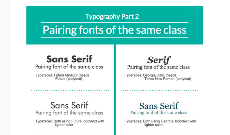
Contrast is good if you don’t push it too hard. Making a font match where one font is a serif, and the other one isn’t, will give you balance. You can achieve more or less the same effect with font pairs where one is a handwritten font, and the other one is a script.
Don’t use more than three fonts
When font matching, don’t bother finding too many fonts. Try to stick with two. And, three fonts doesn’t mean three typefaces, using the same font in three weights works as well, and gives you plenty of variety.
Take a look at the glyphs first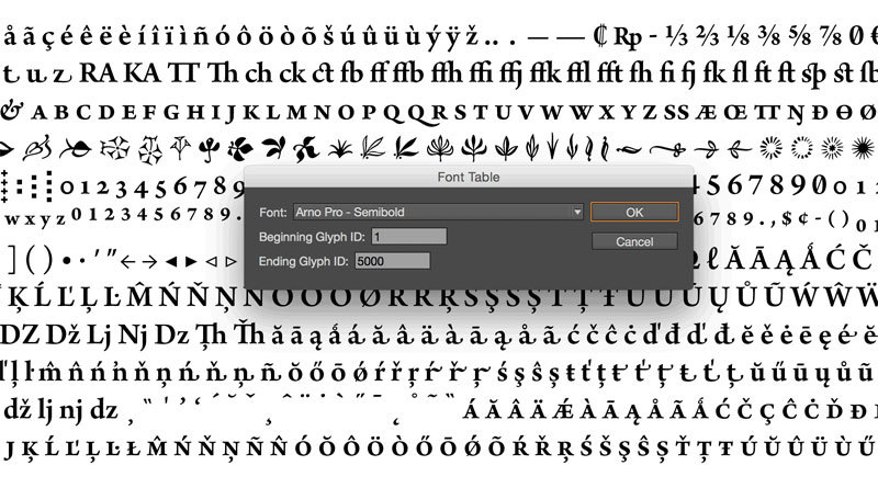
Before you commit to using a font, check if it has all characters you need. This might not be an issue, but if you’re working with multilingual or international clients, this is important.
Be careful with the tone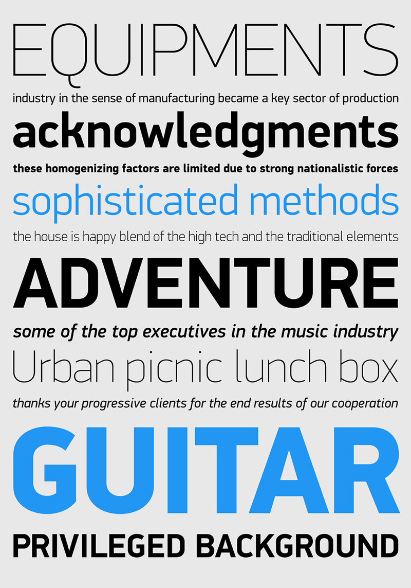
The font comes with an attitude. They might be girly, or bold, or fancy, or scary. Compare the mood to your project’s, and make sure they match.
Work with columnsOur eyes struggle much less with short lines. When you don’t have massive amounts of text, you could reduce the columns’ width, and improve readability.
Making the font readable is keyYou could go with the most beautiful font pairings possible. However, if people can’t read what you say, that won’t matter at all. You shouldn’t make them zoom in.
Try using superfamilies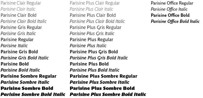
When you use different fonts that are within the same typeface family, so-called ‘superfamily’, you already have a range of fonts, styles, and weights that are actually made to work with each other.
A good one will give you both a serif and sans serif, such as Meta and Meta Sans, or Lucida and Lucida Sans.
Contrast is your friend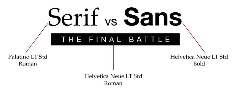
As mentioned above, contrasting fonts such as a serif and sans-serif work great. Contrast is all about finding typefaces that are different, yet complementary. If too similar, the typefaces might conflict. Opt, however, for slightly different sans serifs or serifs, and you’ll get amazing pairings.
Establishing hierarchy is important. You could do this with nothing more than size and weight, but when you have a varying typeface, it is crucial to have a careful pairing. If the display face has a unique personality, you will need a neutral one as well, to do the hard work.
Pair the font subcategories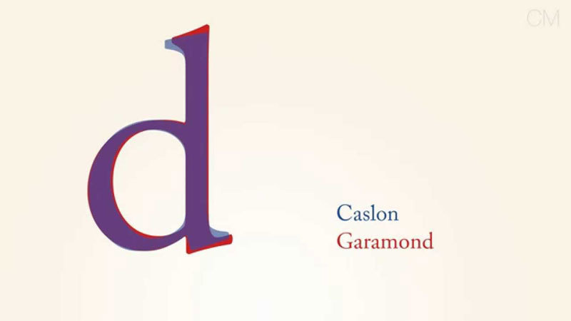
It doesn’t end with ‘serif’ and ‘sans-serif’. They’re each split into categories, where for example, old style serifs such as Caslon or Garamond, work great with humanist sans serifs from the likes of Lucida Grande and Gill Sans.
Traditional serifs, on the other hand, come with a contrast between thin and thick strokes. Fonts such as Perpetua, Times or Bookman will look stunning with geometric sans serifs, such as Century Gothic or Avant Garde.
And last but not least, modern serifs achieve a pronounced, stylized effect by having a dramatic contrast between thin and thick, and a larger x-height. This category includes fonts such as Walbaum, Didot, and Bodoni, and they’re also best paired with geometric sans serifs.
A few examples of font pairingsShall you ever consider using this guide as a reference material, below are a few unique font pairings that you can choose from. And, they’re sorted according to what they work best with.
Julius Sans One & Archivo NarrowJulius Sans One is a great display font due to the broad baseline and fine stroke. Archivo Narrow’s masculine, geometric style, is a great contrast to it, and you get a great combination which guarantees easy readability.
Formal documents such as resumes are usually lackluster when you need fonts and font pairings, but that doesn’t have to be the case. Clean and easy to read typefaces can balance things out and create a hierarchy.
Archivo Black & Archivo narrow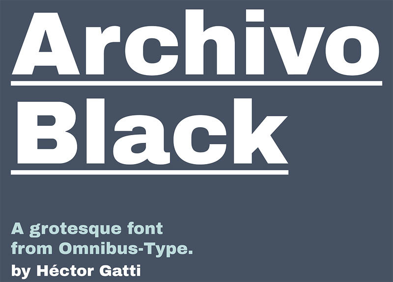
Combine a light, condensed style with a bold and rounded typeface. Archivo Black is bold and wide and goes excellent with Archivo Narrow and Arialle. You can break up the text color and make it complement the background colors, and the composition. This is a visual technique that will bring symbolism to the designs.
Libre BaskervilleOpting for a single typeface across the whole brand isn’t something to be afraid of. Libre Baskerville is a font that comes with style variants, and using them is a great way to achieve nuance, and not overcomplicate the design. This is a classic serif typeface that works great both for headings and body.
Bebas Neue and MontserratThe crowd favorite, Bebas Neue is amazing. It has a clean and condensed form that makes it great for headings. To contrast, it, use Bebasand Montserrat and get a contemporary, yet tidy pairing. This font combination has a geometric form, and you can use shapes to accompany the type.
Lora and a sans serif font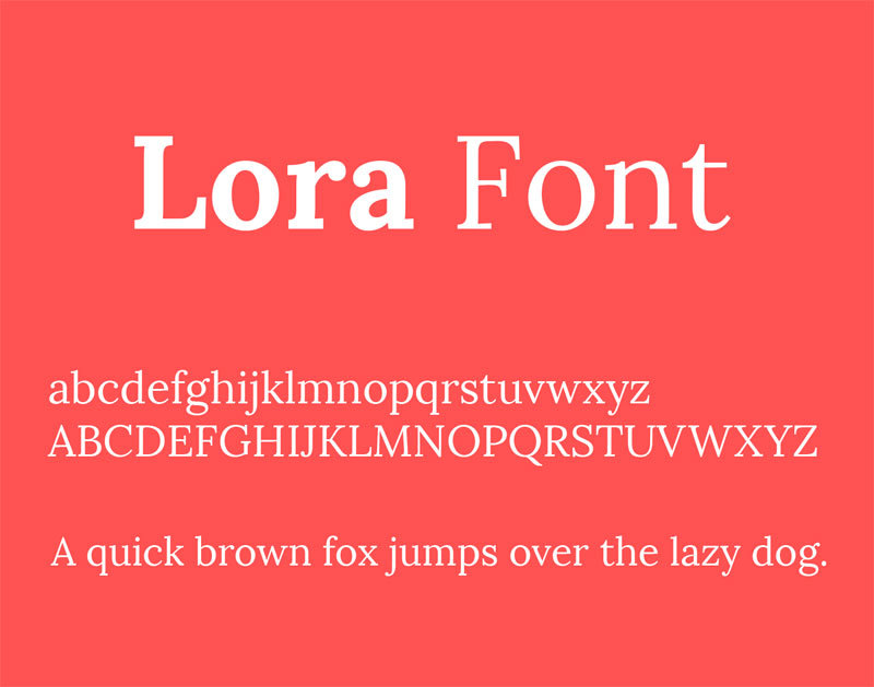
When you want to achieve a dramatic effect, you can go with light and bold versions of the same font. For example, Lora has brushed curves, which results in a sophisticated and elegant typeface. For a charming, feminine effect, combine regular and italic.
Open Sans Exta Bold & Cooper HewittYou need something that is similar to pairings you would commonly get in publishing or newspapers. To grab the attention, something a headline should do, use Open Sans Extra Bold.
And, for a tough, straight to the point, use uppercase Cooper Hewitt. For the body, you could opt for PT Sans, as it’s very easy to read, and combined with the other two, gives a solid style that is well anchored.
Playfair Display & a sans serif font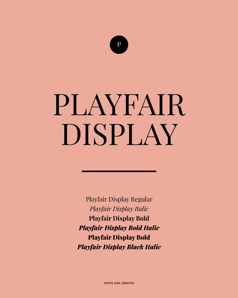
For a wedding design or other invitations, Playfair Display is amazing. Playfair Display Black has a heavy style, and when combined with Playfair Display Italic, you get a stunning hierarchy. Use light tones in the background to soften the text.
Raleway and Roboto Condensed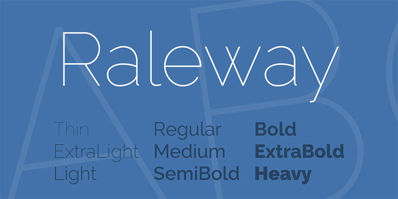
Raleway’s roundness does wonders with the condensed Roboto Condensed. The heavy heading typeface will offset well against the finely weighted subheading. Mixing weights of one typeface is a great way of achieving hierarchy.
Wrapping things upRegardless of whether you go for elegant typefaces or contemporary ones, you should know that the typefaces you go for will create a face for your brand.
Having a successful combination will make things easy to read and will also help you communicate your message to your audience.
Technical lead at WhatFontIs since 2010 with a (healthy?) obsession for fonts.