When you’re discussing graphic design, one of the most gratifying and important elements is typography design.
You might be the most experienced designer in the world, but a little reminder of the principles of typography can’t hurt.
You could try to learn some specifics, such as where a particular font comes from, and things like that can add a whole new meaning to your design.
Knowing your craft is something that can easily impress your clients. And, once you know the typography rules, breaking them is much easier.
And, just like with any skill, before you can develop and expand your skills completely, you need to learn some specific guidelines and rules, and it’s the same with typography terms.
Get a hold of the basics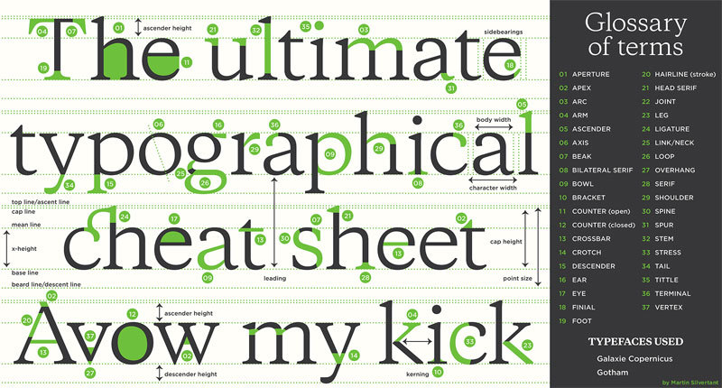
The first step towards, well, everything actually, is to know the basics. If you’re new to the principles, you might think it’s just a practice.
However, being a combination of science and art, typography can actually get pretty complex. You need to know the typography definition when someone asks you to “define typography”, or “what is typography”, you need to know the answer.
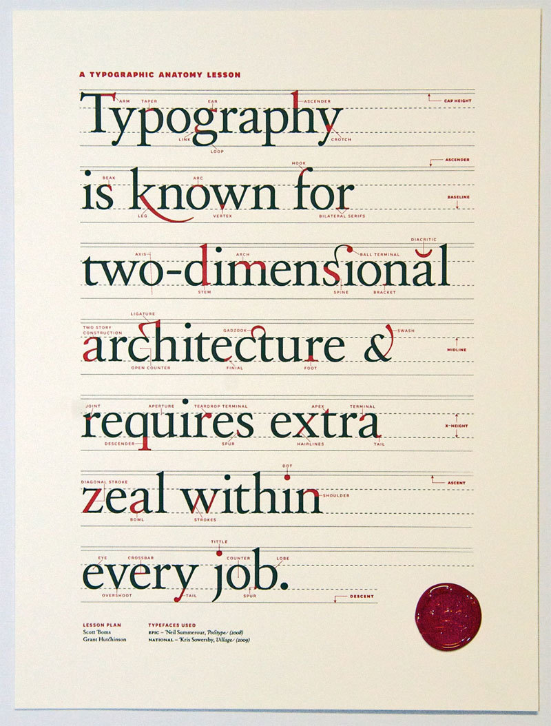
There are specifics, such as typography terminology, central specifications, and accurate measurements, that you should always consider.
And, breaking a rule is something you can only do if you know it by heart, and you are doing it on purpose to create something truly significant. Spend some time studying the art, and you’ll get a better grip on the basics.
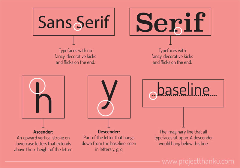
Size of the typefaces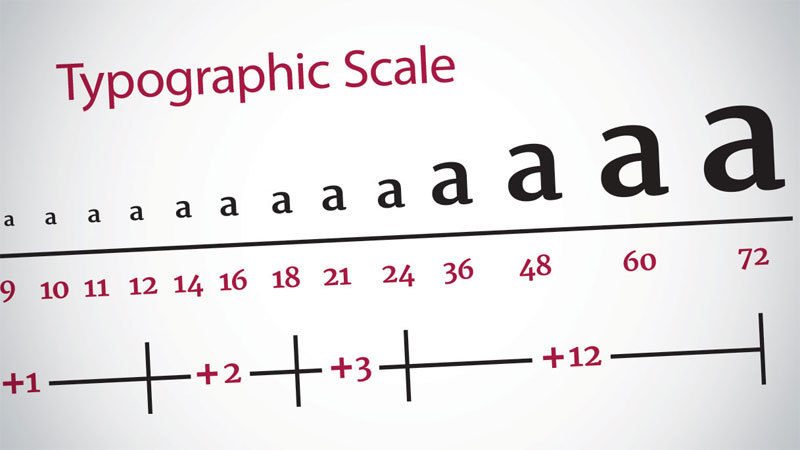
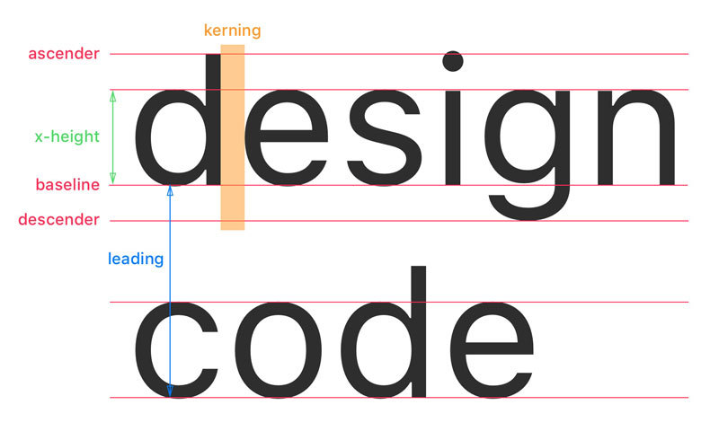
Not all of them are equal, and setting words in different typefaces takes up a pretty different amount of space on the page. A character’s height is known as the x-height, and when pairing typefaces, using those that have a similar x-height is a smart choice.
The ‘set width’, or the width of a character, which contains the body, plus a space that acts as a buffer, is also important. The point system, which originates back in the 18th century, is the most common way of measuring type.
One point is 1/72”, and 12 points make a pica – the unit usually used to measure the width of a column. And, you can also express the type sizes in pixels, millimeters, or inches.
Consider font communication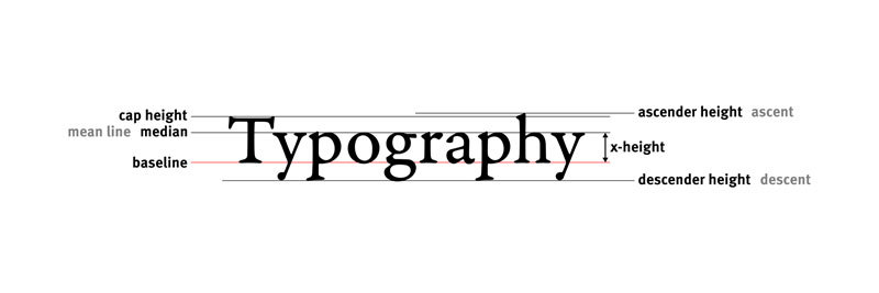
When someone is choosing a typeface, that doesn’t happen at random. There is actually psychology that is linked to certain typefaces, and when you’re designing, you really need to make sure that your type will connect with your audience.
This is usually much more than just making sure that the copy is written impeccably, but you should also make sure that the font you use is the right fit for the market. For example, for something serious, like a real estate agent, you wouldn’t use rainbow-colored fonts, would you?
Make sure you understand kerning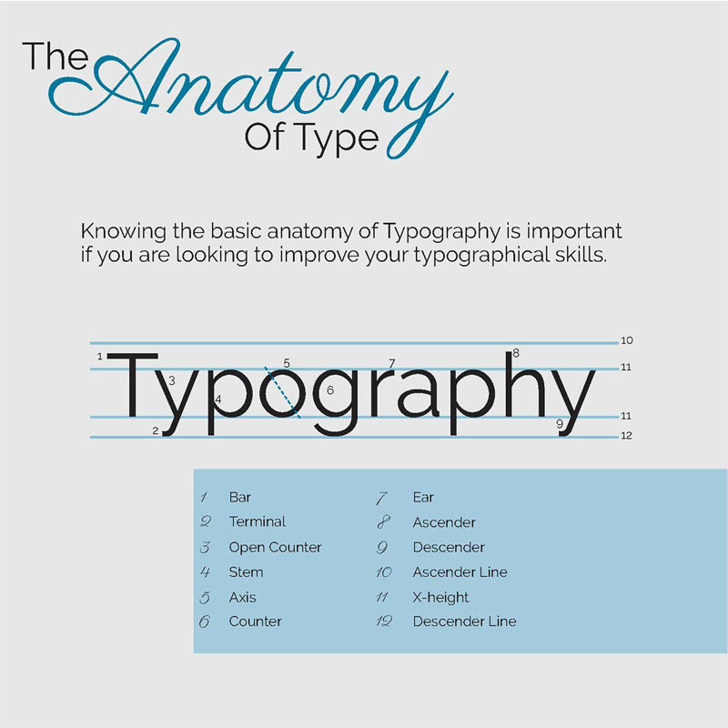
First of all, what is kerning? Kerning is actually an art, the art of fine-tuning the space between the characters, in order to have a unified pairing. It is a pivotal skill that you must learn as soon as possible, as a sloppy kerning job is actually a really bad thing in the design world.
It might not seem important, but a good job does make a lot of difference, as the space between each character will be even, and result in a well-arranged text.
Design programs such as Adobe Illustrator can do a few things to fix kerning errors, but not a lot. And, these errors can be subtle when in a sentence or paragraph, but when you have one in a logo or headline, it can ruin the entire design in a minute.
Measuring the text blocks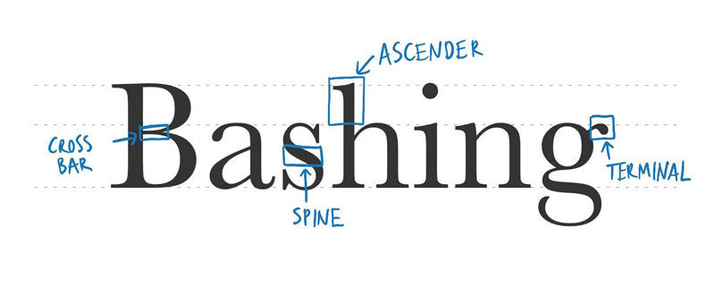
The term “measure” is actually used to describe the width of a text block. If you’re really after the optimum reading experience, make sure you don’t neglect it.
Put a limit on the fonts – not more than three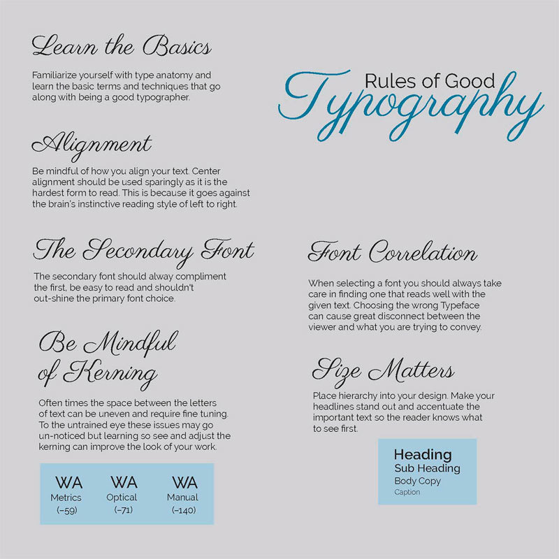
Many designers, especially new ones, go with plenty of fonts and styles. If you’re really in need of more than one, you should make sure that you don’t go with more than two or three. And, this is provided you use one for the header, another for the subheadings, and the third for the body.
Opt for fonts that are from different families, but make sure they work well with each other. When you use two fonts that are very similar, people might think that you’re sloppy and have accidentally used the wrong font.
Correct alignment is extremely importantThis is a concept that is actually imperative. A lot of people that aren’t designers either go for Center Aligned or Justified, both of which make things hard on the eyes. There are four key options, and they’re Left Aligned, Right Aligned, Center-Aligned, and Justified.
The most common one is Left Aligned because it’s very easy on the eyes. However, Right Aligned, when executed properly, also looks great. Justified is actually a designer’s nightmare.
If you decide to go for Left or Right Aligned, make sure you watch out for ragged lines. They’re also pretty obvious with Center Aligned text, as it makes the text look like it has a lot of bumps. Try to fix this by adjusting the lines’ length.
Visual hierarchy is something you should useHierarchy in typography is how you choose to make some lines more significant than others. This gives the user an order in which they’ll receive the information and guide their eyes through the design.
Without a typographic hierarchy, the reader might fail to identify pieces of information that are important within the design.
Use grids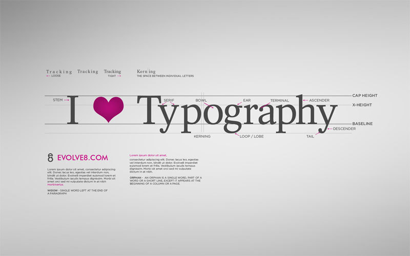
A design grid is a critical tool in any arsenal. It ensures that anything you have on the page is actually placed in relation to something else, and you end up with both logical and visual harmony.
This is what makes things look cohesive and interconnected. However, you don’t have to use them every time. But, whenever you have typography involved, knowing how and why one is used, is a great benefit.
Make sure your text is actually readable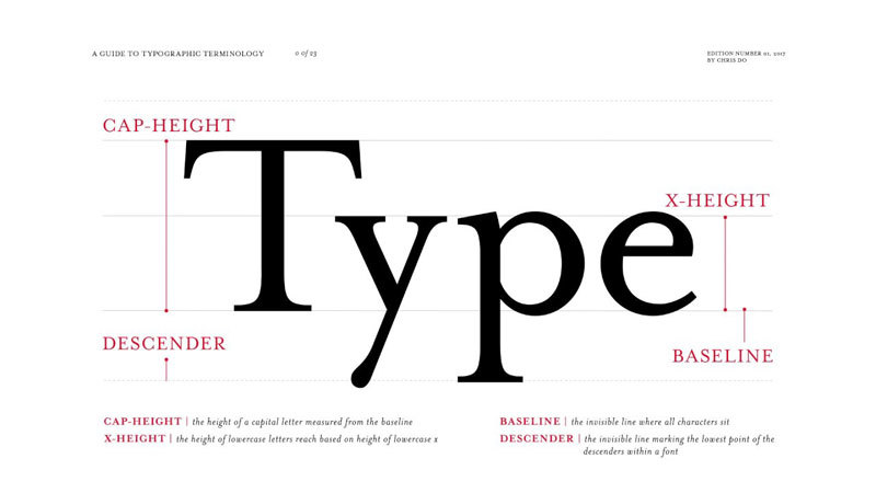
This is the primary need for typography – ending up with a readable font. Sure, there are a lot of beautiful fonts, but how many of them are actually easy to read?
If something looks good but breaks the whole reading flow, might be why your sales are decreasing, and this is especially true when you’re writing in paragraphs. The font that you used to draw attention in the heading might not be the ideal choice for a paragraph.
Mind your grammarThe grammar might make, or break, your typography’s flow. There are too many rules, and messing up the grammar is a fatal mistake.
Make sure that ampersands, spaces, and hyphens are all taken care of, and the fonts complement the design. There are a few hidden rules that should be addressed, and the content structure should highlight the message you’re trying to convey to your targeted audience.
Don’t distort fonts, and don’t stretch them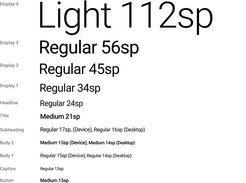
A designer might stretch a font to fill a blank space, but this isn’t something that you should be doing. Not even by a little bit.
The font’s designer put in a lot of effort and thought about the shape, size, and the texture of the font. Make sure you make it a standard rule never to modify a font just to make sure it fits.
Understand, and use white spaceThis is crucial, as white space isn’t something that you should always fill. You can often use it to your advantage, and give the whole content some space to breathe.
White space will convey the intended message, and when you combine it with the right font, it makes the design seem effortless and outstanding. It lets you put a focus on what is really essential.
Wrapping things upDo you still think typography is just a play on words? Think again. It is a form of art, and the rules above are something that every designer should know. Start implementing them, and see how your design improves.

I'm a programmer at heart. But in my 20s, I realized there was more to the world of fonts than just Courier.
Driven by endless curiosity, I built a system to explore them.
That project grew into one of the world’s leading font identifier platforms: www.WhatFontIs.com.
By 2024, WhatFontIs is helping nearly one million designers—famous or not—discover the names of the fonts they need.