Variable fonts are revolutionizing digital typography by consolidating multiple font styles into a single, adaptable file. Unlike traditional static fonts that require separate files for each weight or style, variable fonts offer unprecedented control and flexibility while improving web performance through reduced file sizes and HTTP requests.
Table of Contents- What is a Variable Font – Understanding Dynamic Typefaces
- Variable Typeface Technology – How Font Variations Work
- Typography Axis Fundamentals – Weight, Width, and Slant Variations
- Variable Font CSS Implementation – Font-Variation-Settings Guide
- Variable Font Examples – Real-World Applications and Use Cases
- Variable Font Animation – Creating Dynamic Typography Effects
- Variable Font Support – Browser Compatibility and Performance
- Variable Font vs Static Font – Advantages and Limitations
- Getting Started with Variable Fonts – Implementation Best Practices
- Frequently Asked Questions
Variable fonts are revolutionizing digital typography, offering designers unprecedented control and flexibility. To fully appreciate their impact, it’s helpful to understand the broader context of typefaces, including the fundamental differences between sans-serif vs. serif fonts, as many variable fonts are built upon these foundational styles. Unlike traditional static fonts, which require separate files for each weight, style, or variation, variable fonts consolidate all these variations into a single, adaptable file. This innovation not only streamlines design workflows but also enhances web performance by reducing file sizes and HTTP requests. This guide explores the core concepts, implementation techniques, and practical applications of variable fonts, providing you with the knowledge to leverage this technology effectively.
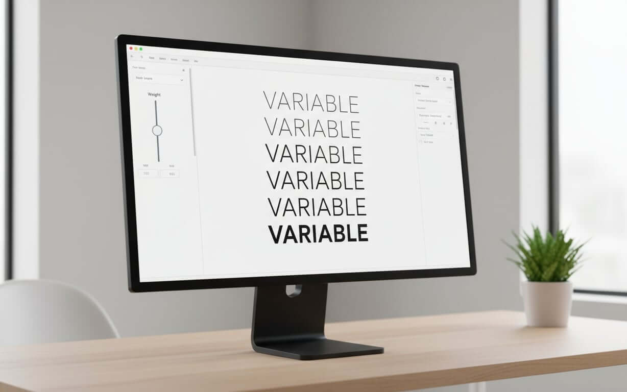
What is a Variable Font – Understanding Dynamic Typefaces What is a variable font?A variable font marks a significant shift in typography, consolidating numerous font styles into a single, adaptable file. Unlike static fonts, which need individual files for each weight, width, or style, a variable typeface houses all potential variations in one package.
Key characteristics of dynamic typefaces:- Continuous variation: Smooth transitions between predefined design limits using continuous axes
- Single file solution: All weights and styles exist within one file instead of requiring separate downloads
- Responsive typography: Ability to adapt to different screen sizes and user preferences automatically
- Precise control: Access to a spectrum of weights beyond traditional “Regular” and “Bold” options
The core of these dynamic typefaces is their ability to smoothly transition between predefined design limits using continuous axes. Designers gain access to a spectrum of weights, not just “Regular” and “Bold,” allowing for detailed typographic control.
Consider the traditional method where each weight required a separate font file. With variable fonts, all these weights exist within a single file. This changes how we approach typography, shifting from set choices to fluid control.
The practical benefits go beyond convenience. Variable fonts facilitate responsive typography, adapting to different screen sizes and user preferences. A headline’s weight can adjust based on viewport size, or body text can optimize its width for readability on mobile devices.
This technology is a shift that gives designers precise control over typography, improving web performance through smaller file sizes and fewer requests.
Now that we’ve defined what variable fonts are, let’s delve into the technology that makes these dynamic typefaces possible.
Variable Typeface Technology – How Font Variations Work How do font variations work?Variable typeface technology relies on mathematical interpolation between master drawings. Type designers create “masters” representing the extremes of each axis, such as the thinnest and boldest versions.
The font engine then blends these masters to create intermediate styles. This ensures smooth transitions between font variations, maintaining the typeface’s character across possibilities.
Core technology components:- Master drawings: Extreme versions of each axis that serve as interpolation endpoints
- Mathematical interpolation: Algorithms that blend masters to create intermediate styles
- OpenType Font Variations: Standard that defines how interpolations work at the file level
- Independent axis control: Each typography axis works separately, allowing for unique combinations
Each typography axis in a var font works independently, allowing for combinations. The weight axis might range from 100 to 900, while the width axis spans from 50% to 200%. These can be adjusted together, creating unique combinations from one font file.
The implementation uses OpenType Font Variations, defining how interpolations work at the file level. This ensures consistent behavior across systems, making variable fonts reliable.
Advanced variable typefaces may include custom axes beyond weight, width, and slant, controlling serif length or qualities like “expressiveness,” giving designers creative freedom.
The technology also supports discrete variations, where stylistic features switch on or off at specific points, combining continuous variation with distinct stylistic choices.
With an understanding of the underlying technology, it’s crucial to grasp the fundamentals of typography axes. These axes are the levers that control the appearance of variable fonts.
Typography Axis Fundamentals – Weight, Width, and Slant VariationsUnderstanding variation axes is key to working with variable fonts. These typography axes control a typeface’s appearance and form the basis for typographic expressions.
Standard typography axes explained:- Weight axis (wght): Controls stroke thickness with continuous control across the spectrum for fine-tuning hierarchy and readability
- Width variations (wdth): Adjust character proportions, offering solutions for tight layouts or creating distinct personalities
- Slant axis (slnt): Provides control over character angle beyond traditional roman and italic options
- Optical Size (opsz): Optimizes letterforms for different display sizes automatically
The weight axis (wght) controls stroke thickness. Unlike traditional fonts with limited weight options, variable fonts offer continuous control across the spectrum, enabling fine-tuning for hierarchy and readability.
Width variations (wdth) adjust character proportions, offering solutions for layouts or creating personalities. A condensed setting fits more text in columns, while expanded settings create headlines.
The slant axis (slnt) provides control over character angle, beyond roman and italic. Designers can set the exact slant, creating emphasis or oblique effects that match their intent.
| Axis | Tag | Typical Range | Primary Use Case |
|---|---|---|---|
| Weight | wght | 100-900 | Hierarchy and emphasis |
| Width | wdth | 50%-200% | Space optimization |
| Slant | slnt | -15° to 15° | Stylistic variation |
| Optical Size | opsz | 6-72pt | Size-specific optimization |
These axes work together, allowing designers to create treatments that would need many font files in traditional workflows. The key is understanding how font variations interact to achieve visual impact.
Now that we’ve covered the theoretical aspects, let’s dive into the practical implementation of variable fonts using CSS.
Variable Font CSS Implementation – Font-Variation-Settings Guide
Implementing variable fonts in CSS requires understanding properties and the control offered by font-variation-settings. This CSS property is the interface for accessing typographic possibilities within a variable font.
Step-by-step CSS implementation:- Load the variable font file using @font-face declaration
- Apply the font-family to your target elements
- Use standard CSS properties (font-weight, font-stretch) for common axes
- Use font-variation-settings for custom axes or precise control
- Test across different browsers and devices for consistency
The font-variation-settings property accepts axis tags and values, formatted as quoted strings followed by numbers. For control over a typeface’s appearance, you might write:
font-variation-settings: "wght" 450, "wdth" 85, "slnt" -5;This approach to variable font CSS provides precision, allowing designers to specify values between font weights and styles. The flexibility extends to responsive design, where variable font size css adjustments can be combined with axis variations.
For axes like weight and width, CSS also provides properties that map to variable font axes. Using font-weight: 450 or font-stretch: 85% offers clarity while maintaining control.
Understanding how to use variable fonts in CSS involves considering performance. While font-variation-settings provides flexibility, it’s often more efficient to use standard CSS properties when they map to variable font axes.
| CSS Property | Variable Font Axis | Example Usage |
|---|---|---|
| font-weight | wght | font-weight: 350; |
| font-stretch | wdth | font-stretch: 75%; |
| font-style | slnt/ital | font-style: oblique 10deg; |
| font-optical-sizing | opsz | font-optical-sizing: auto; |
The strategy should balance clarity with control, using standard CSS properties where possible and using font-variation-settings for custom axes or adjustments that standard properties cannot achieve.
To illustrate the power of variable fonts, let’s explore some real-world applications and use cases where they shine.
Variable Font Examples – Real-World Applications and Use CasesThe applications of variable fonts span design disciplines, demonstrating their versatility in modern typography. These implementations show how variable typography solves design challenges while opening creative possibilities. If you encounter a variable font in a real-world application and need to identify it, a reliable font finder can help you recognize it by image.
Real-world variable font examples:- Responsive web design: Headlines adjust weight and width based on screen dimensions for optimal readability
- Brand identity systems: Companies maintain consistency while adapting to different applications from business cards to billboards
- User interface design: Button text increases weight on hover, navigation elements adjust width for different languages
- Editorial design: Magazine layouts employ multiple weight and width combinations from one font file
- Digital advertising: Billboards and web advertisements morph typography for dynamic brand experiences
Responsive web design is a use case for var font technology. Websites use variable fonts to ensure readability across device sizes. Headlines adjust their weight and width based on screen dimensions, while body text fine-tunes its characteristics for legibility on displays.
Brand identity systems benefit from variable fonts, allowing companies to maintain consistency while adapting to applications. A variable typeface can serve everything from business cards to billboards, optimized for context and viewing distance.
User interface design leverages variable fonts for feedback and state changes. Button text might increase in weight on hover, or navigation elements could adjust their width to accommodate languages. These interactions enhance user experience.
Editorial design has embraced variable fonts for creating typographic hierarchies with minimal overhead. Magazine layouts can employ weight and width combinations from one font file, enabling expression without performance penalties.
The advertising industry utilizes variable fonts for animations and displays. Digital billboards and web advertisements can morph typography, creating brand experiences impossible with static fonts.
Building on the versatility of variable fonts, let’s examine how they can be animated to create dynamic and engaging typography effects.
Variable Font Animation – Creating Dynamic Typography Effects
The animation capabilities of variable fonts enable transitions between typographic states that create user experiences. These dynamic typefaces respond to interactions and changes with grace.
Animation techniques for dynamic typography:- Set up CSS transitions for smooth interpolation between axis values
- Create hover effects that transition from regular to bold weight
- Combine multiple axes for complex animations (width + weight changes)
- Use keyframe animations for motion paths through the variable font design space
- Implement interactive typography where user input controls font variations
CSS transitions provide the foundation for variable font animation, allowing interpolation between axis values. A hover effect might transition from regular to bold weight, creating user feedback that enhances responsiveness.
More complex variable typography animations can combine axes. Text might expand in width while increasing in weight, creating emphasis effects that draw attention. These animations showcase variable font technology.
Keyframe animations unlock creative potential, enabling motion paths through the variable font design space. Loading animations might pulse through weights, while decorative elements could morph between extremes.
The implementation of variable font CSS animations requires consideration of performance and user experience. Smooth animations demand efficient rendering, making it crucial to optimize animation properties.
Interactive typography represents the cutting edge of dynamic typefaces, where user input controls font variations. Mouse position might influence slant angle, scroll position could affect weight, or audio input might drive typographic changes that create multimedia experiences.
Before fully embracing variable fonts, it’s essential to understand the current state of browser support and performance considerations.
Variable Font Support – Browser Compatibility and PerformanceThe landscape of variable font support has evolved, with browsers now offering compatibility that makes var fonts a choice for websites. Understanding this support is crucial for implementation decisions.
Current browser support statusCurrent browser support for variable fonts includes Chrome, Firefox, Safari, and Edge. This adoption means that users can experience variable font designs as intended.
Performance considerations:- File size efficiency: Variable fonts weigh less than multiple static fonts combined
- Reduced HTTP requests: One file replaces multiple font downloads
- Rendering performance: Matches static fonts with optimized browser engines
- Animation impact: Frequent axis adjustments may require performance optimization
Performance plays a role in how to use variable fonts. While a variable font file might be larger than one static font, it weighs less than multiple static fonts. This reduces requests and can improve loading times for websites.
The rendering performance of variable fonts matches that of static fonts, with browser engines optimized for processing. However, animations or axis adjustments can impact performance, requiring optimization.
Fallback strategies remain important. Progressive enhancement techniques allow websites to provide typography for older browsers while delivering experiences to users with support. Feature detection enables degradation without compromising functionality.
| Browser | Desktop Support | Mobile Support | Notable Limitations |
|---|---|---|---|
| Chrome | Version 62+ | Version 62+ | None significant |
| Firefox | Version 62+ | Version 62+ | None significant |
| Safari | Version 11+ | iOS 11+ | None significant |
| Edge | Version 17+ | Version 17+ | None significant |
File optimization techniques can enhance performance, with font subsetting tools removing unused characters to minimize file sizes. These optimizations ensure that variable fonts deliver benefits without compromising website speed.
To make an informed decision about using variable fonts, it’s crucial to weigh their advantages and limitations compared to traditional static fonts.
Variable Font vs Static Font – Advantages and LimitationsThe comparison between variable font vs static font reveals differences in approach, capability, and implementation that influence design decisions. Understanding these distinctions helps designers choose the typography solution for their needs.
Variable font advantages:- File consolidation: One file contains all styles instead of requiring multiple downloads
- Performance benefits: Fewer HTTP requests and efficient bandwidth usage
- Creative control: Access to precise typographic adjustments impossible with static fonts
- Responsive capability: Typography that adapts automatically to different contexts
- Higher licensing costs: Complex creation process commands premium pricing
- Software compatibility: Not all design tools fully support variable font features
- Legacy system issues: Older systems may require fallback solutions
- File size considerations: Individual variable font may be larger than single static font
The advantage of variable fonts lies in their consolidation of styles into one file. Where a font family might require files for Light, Regular, Medium, Semibold, Bold, and italics, a variable typeface contains font variations in one package.
This translates into performance benefits for web applications. Fewer requests mean faster loading times, while the ability to fine-tune typography eliminates the need to load font files. The result is efficient bandwidth usage and improved user experience.
The creative advantages of font variations extend beyond efficiency. Designers gain access to typographic control that was impossible with static fonts. The ability to dial in weight values, adjust width to fit layouts, or create emphasis provides creative freedom.
However, variable fonts also present limitations. The complexity of creating variable typefaces means they command licensing fees. Additionally, not all design software fully supports variable font features, limiting their use.
File size considerations vary. While a variable typeface might be larger than a static font, it’s smaller than the combined size of static fonts. The break-even point occurs when three or more weights or styles are needed.
Legacy system compatibility remains a consideration. While modern browsers and operating systems handle variable fonts, older systems may require fallback solutions to ensure accessibility.
If you’re ready to take the plunge, here are some best practices to guide you through the implementation process of variable fonts.
Getting Started with Variable Fonts – Implementation Best PracticesImplementing variable fonts requires an approach that balances ambition with practicality. These practices ensure performance, compatibility, and utilization of capabilities.
How to use variable fonts successfully- Select variable fonts that align with your project’s needs and brand requirements
- Optimize font files using subsetting tools to remove unused characters
- Write clean CSS using semantic properties when possible
- Implement progressive enhancement strategies for browser compatibility
- Test thoroughly across browsers, devices, and operating systems
- Document your implementation for team collaboration and maintenance
Begin by selecting variable fonts that align with your project’s needs and brand requirements. Consider the axes, the quality of interpolation, and the licensing terms. High-quality typefaces from foundries offer consistency and refined font variations.
Font optimization represents a step in the implementation process. Use subsetting tools to remove unused characters from your variable fonts. This process can reduce file sizes without sacrificing functionality, improving loading times.
When writing variable font CSS, prioritize clarity by using CSS properties like font-weight and font-stretch when they map to font axes. Reserve font-variation-settings for custom axes or adjustments that properties cannot achieve.
Implement enhancement strategies that provide typography for browsers without variable font support. This ensures that all users receive a typographic experience, even if they cannot access the features of your implementation.
Testing across browsers, devices, and operating systems is essential for identifying rendering issues. Pay attention to how your variable fonts perform on mobile devices, where processing power and bandwidth may be limited.
| Implementation Phase | Key Considerations | Tools/Techniques |
|---|---|---|
| Font Selection | Axes available, quality, licensing | Font specimen testing |
| Optimization | File size, character sets | Glyphhanger, pyftsubset |
| CSS Implementation | Semantic properties, fallbacks | Feature detection |
| Testing | Cross-browser compatibility | Browser dev tools |
Document your variable font implementation, including axis ranges, use cases, and CSS properties. This documentation proves for team collaboration and maintenance, ensuring application of your typographic system across projects.
Frequently asked questions (FAQ) about variable fontsA variable font is a single file containing multiple font variations of a typeface, allowing adjustments to properties like weight, width, and slant along axes. Unlike regular fonts that require separate files for each style, variable fonts provide font variations within one file through interpolation between design extremes.
Do variable fonts work in all web browsers?
Variable fonts are supported in modern browsers including Chrome 62+, Firefox 62+, Safari 11+, and Edge 17+. For older browsers, implement fallback strategies using static fonts to ensure compatibility.
A variable font is larger than one static font but smaller than multiple static fonts offering font variations. The break-even point occurs when you need three or more weights or styles. Additionally, variable fonts reduce requests, which can improve loading performance.
You can use CSS properties like font-weight and font-stretch for axes, or use the font-variation-settings property for control: font-variation-settings: "wght" 450, "wdth" 85;. The latter provides access to custom adjustments.
Yes, variable fonts can be animated using CSS transitions and keyframe animations. You can create effects like text that becomes bolder on hover, or animations that morph through axes. This creates dynamic typography effects that were impossible with static fonts.
The most common axes are weight (wght), width (wdth), slant (slnt), and optical size (opsz). Many variable fonts also include custom axes that control stylistic features like serif length or expressiveness, depending on the typeface design.
Variable fonts often have licensing fees than static fonts due to their complexity. However, they can be more cost-effective than purchasing weights and styles separately, especially for font families with font variations.
Yes, variable fonts work in print design applications that support them, such as recent versions of Adobe Creative Suite. However, support varies across design software, so it’s important to verify compatibility with your tools.
Optimize variable fonts by subsetting them to include only needed characters using tools like Glyphhanger or pyftsubset. Also, implement caching strategies, use font-display properties for loading behavior, and consider preloading fonts.
Variable fonts represent a significant advancement in typography, offering designers unparalleled control and flexibility. By consolidating multiple font styles into a single file and enabling smooth transitions between font variations, variable fonts streamline design workflows and enhance web performance. As you begin to implement variable fonts in your projects, remember to prioritize font selection, optimization, and cross-browser testing. Embrace the power of variable fonts to create dynamic and engaging typographic experiences that elevate your designs. For those looking to deepen their understanding of typography or identify fonts they encounter, a comprehensive guide on how to identify fonts can be an invaluable resource.

I'm a programmer at heart. But in my 20s, I realized there was more to the world of fonts than just Courier.
Driven by endless curiosity, I built a system to explore them.
That project grew into one of the world’s leading font identifier platforms: www.WhatFontIs.com.
By 2024, WhatFontIs is helping nearly one million designers—famous or not—discover the names of the fonts they need.