

Rare and cool facts about fonts is a super interesting subject. Two weeks ago we wrote the first episode on this subject, and today we continue the series.
You will find another 11 rare and cool facts about fonts, new and exciting stuff.
The fonts world is huge, and it includes: a huge part of humankind history, studies, tons of books (we will also write about this super-hot topic), design rules, designers still inventing new fonts, tools that will help you quickly identify the font you are looking for, and much more.
A huge world includes tons of super cool and interesting facts.
Below you will find out new interesting things about fonts, both rare and funny. The article will also help you make better decisions in life and about the fonts you choose to use. You will see below what I am talking about, very cool stuff that you will love.
Let’s start with good fonts that are easy to read by dyslexic individuals. 1. Good fonts for Dyslexia
Did you know that there is a huge difference between fonts for people with dyslexia?
A team of researchers in Spain has recently published the results of a study to determine which fonts were easiest for dyslexic individuals to read. Based on the evaluation of 48 dyslexic subjects ages 11-50, reading 12 texts with 12 different fonts, they determined that reading performance was best with sans serif, monospaced, and roman fonts used in the study. They also found that reading was significantly impaired when italic fonts were used.
2.Eco-friendly fonts?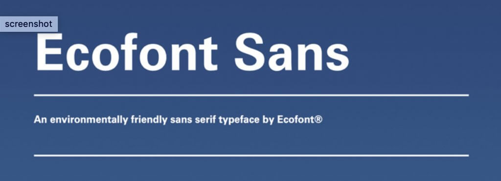
Do eco-fonts save money by saving toner and ink?
A study made by the University of Wisconsin indicated that most eco-fonts use actually more toner and ink than Century Gothic for example, a light and regular font.
There are similar stories with electric cars that are not really helping our planet to be greener.
3.Why isn’t Helvetica on Microsoft Windows, as standard?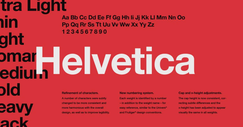
When Microsoft was choosing fonts for Windows, around 1991 or so, they made a licensing deal with Monotype, who were nearly bankrupt at the time and made a very favorable (to Microsoft) deal.
They probably discussed also with Linotype, who owns Helvetica, but couldn’t set up an agreement.
From that point started everything.
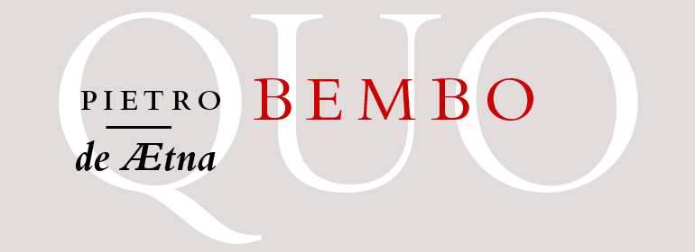
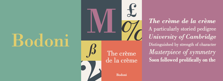
4. The three most readable fonts in the worldAmong the rare and cool facts about fonts episode, we must include three most readable fonts in the world.
The Bembo design is an old-style humanist serif typeface originally cut by Francesco Griffo in 1495 and revived by Stanley Morison in 1929. The original Morison typeface contained only four weights and no italics.
The Bodoni font is a well-known serif typeface series that has had a long history of interpretations by many design houses. The various font styles begin with Bodoni’s original Didone modern font in the late 1700s through to ATF’s American Revival in the early 1900s and into the digital age. The original design had a bold look with contrasting strokes and an upper case that was a bit more condensed then its stylish influence Baskerville®. The unbracketed serifs and even geometric styling has made this a popular font seen in almost every kind of typesetting situation, but particularly well suited for title fonts and logos.
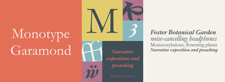
Monotype Garamond is a family of two roman weights with complementary italic designs. The family also offers small capitals, old style figures, and a suite of swash alternate characters. While intended primarily for text composition, Monotype Garamond is distinctive, lively, and remarkably versatile in large sizes.
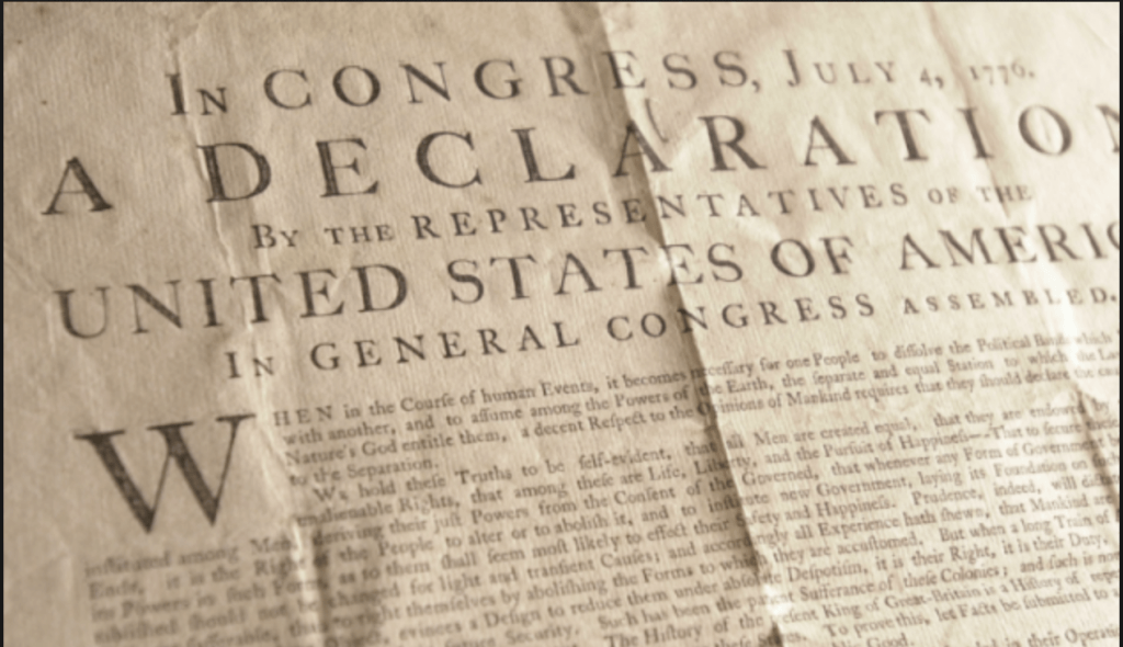
A long running serif font first designed by William Caslon in 1722 and used extensively throughout the British Empire in the early eighteen centuries. It was used widely in the early days of the American Colonies and was the font used for the U.S. Declaration of Independence, but fell out of favor soon after.
6.The guy who designed Helvetica earned a flat fee, no royalties
Helvetica or Neue Haas Grotesk is a widely used sans-serif typeface developed in 1957 by Swiss typeface designer Max Miedinger with input from Eduard Hoffmann.
IBM used Helvetica Neue as its corporate typeface until 2017, spending over $1m annually on licensing fees.
Believe it or not, Max got earned just a flat see, no royalties.
7. Road sign research reveals lower-case letters are easier to read when traveling at high speed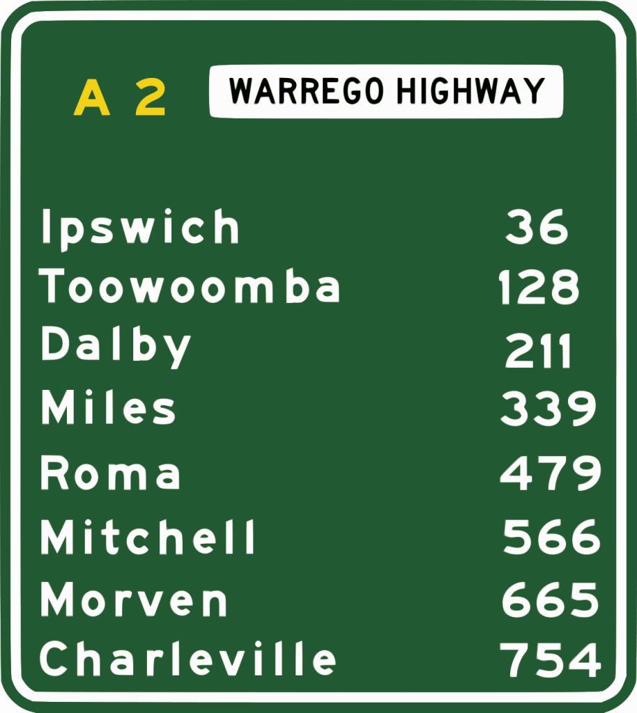
We can all confirm that we can read with much ease lower characters road signs, than the ones with CAPS.
It wasn’t for ever like this, a study demonstrated that is better to use lower-case characters, especially for road signs on highways and places where the speed is high.
8. There are “Ten Commandments of Typography” (according to Paul Felton as quoted by Simon Garfield)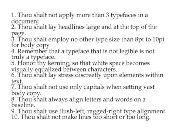
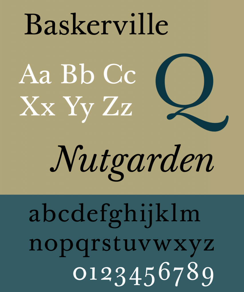
Baskerville has been proven to be more believable than Helvetica or Comic Sans in an experiment with the New York Times, yet Helvetica is rated as the most trusted of the three on a road sign. Comic Sans scores as the most believable poster for a school party.
11. Fonts names that have nothing to do with the location in which it where used
In the 1800s display typefaces designed in London were given names like Egyptienne, Tuscan and Italienne, although their design had nothing to do with these locations. This was a marketing ploy because these were fashionable travel destinations.
ConclusionsEpisode 2 included 11 rare and cool facts about fonts, just as the first episode.
It was a super enjoyable research that I have made for this article, and I save lots of other cool facts that I will share with you in the next weeks.
There will be additional episodes on this topic as it is super interesting and as you saw, we can all learn a lot from what other persons did or didn’t do.

I'm a programmer at heart. But in my 20s, I realized there was more to the world of fonts than just Courier.
Driven by endless curiosity, I built a system to explore them.
That project grew into one of the world’s leading font identifier platforms: www.WhatFontIs.com.
By 2024, WhatFontIs is helping nearly one million designers—famous or not—discover the names of the fonts they need.

