
By now, you probably know all about fonts, serifs and lack of serifs. And because of this, today we’re not going to focus on defining serif and non serif fonts. However, the main character behind our talk are serifs. Fonts with serifs have been around since Roman times, when people carved stories into stones. But what do they stand for? Let’s dig into their story and find out more about these letter styling elements.
Why are serifs around to begin with?Some believe that, back in the days, serifs gave chiselled text a more neat aspect. Because letters carved into stone were lacking sharpness, people added these terminations so they could emphasise glyphs and really point out where one letter ended and another began. Nowadays, serifs really do increase the readability and maximise the reading speed because. Why is that though? Due to their presence, the eye can travel along a straight line and follow letters easily. We can all conclude that there’s no problem a serif can’t solve!
How many types of serifs are there?When we think about serifs, there are three different kinds that pop into our minds: hairline, slab and edge. Furthermore, each one of these three can be split up into two different kinds: bracketed and unbracketed.
Hairline serifs are easy to recognise because they are the thinner than the main strokes of a particular glyph. For a better visualisation, check Didot or Bodoni.


Slab serifs are squared and can sometimes be thicker than the strokes of a particular glyph. Two ideal examples of slab serifs are Clarendon and Rockwell.


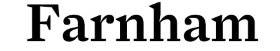
Wedge serifs are triangular and kind of innovative in this world of serifs. In case you can’t put an image on that, check out Farnham or Neue Swift.

We heard the terms, but we cannot associate a meaning to them. The time to define bracketed and unbracketed serif has come and it’s right now. So, with no further ado, let’s find out the difference between those two concepts.
Bracketed serifs are those that have a visibly smooth, curvy transition between the serif and the glyph. On the other hand, an unbracketed serif joins the glyph in a sharp way, often forming a right angle.
Searching for the right combination of fonts? Check out WhatFontIs.com for an impressively large collection of fonts. Serif or sans serif, bracketed or unbracketed, lowercase or uppercase, whatever you’re searching for, you’ll undoubtedly find something amongst over 500,000 fonts.

I'm a programmer at heart. But in my 20s, I realized there was more to the world of fonts than just Courier.
Driven by endless curiosity, I built a system to explore them.
That project grew into one of the world’s leading font identifier platforms: www.WhatFontIs.com.
By 2024, WhatFontIs is helping nearly one million designers—famous or not—discover the names of the fonts they need.
- Alexandru Cuibari
- Alexandru Cuibari
- Alexandru Cuibari
- Alexandru Cuibari
- Alexandru Cuibari
- Alexandru Cuibari
- Alexandru Cuibari
- Alexandru Cuibari
- Alexandru Cuibari
- Alexandru Cuibari
- Alexandru Cuibari
- Alexandru Cuibari
- Alexandru Cuibari
- Alexandru Cuibari
- Alexandru Cuibari
- Alexandru Cuibari
- Alexandru Cuibari
- Alexandru Cuibari
- Alexandru Cuibari
- Alexandru Cuibari
- Alexandru Cuibari
- Alexandru Cuibari
- Alexandru Cuibari
- Alexandru Cuibari
- Alexandru Cuibari
- Alexandru Cuibari
- Alexandru Cuibari
- Alexandru Cuibari
- Alexandru Cuibari
- Alexandru Cuibari
- Alexandru Cuibari
- Alexandru Cuibari
- Alexandru Cuibari
- Alexandru Cuibari
- Alexandru Cuibari
- Alexandru Cuibari
- Alexandru Cuibari
- Alexandru Cuibari
- Alexandru Cuibari
- Alexandru Cuibari
- Alexandru Cuibari
- Alexandru Cuibari
- Alexandru Cuibari
- Alexandru Cuibari
- Alexandru Cuibari
- Alexandru Cuibari
- Alexandru Cuibari
- Alexandru Cuibari
- Alexandru Cuibari
- Alexandru Cuibari
- Alexandru Cuibari
- Alexandru Cuibari
- Alexandru Cuibari
- Alexandru Cuibari
- Alexandru Cuibari
- Alexandru Cuibari
- Alexandru Cuibari
- Alexandru Cuibari
- Alexandru Cuibari
- Alexandru Cuibari
- Alexandru Cuibari
- Alexandru Cuibari
- Alexandru Cuibari
- Alexandru Cuibari
- Alexandru Cuibari
- Alexandru Cuibari
- Alexandru Cuibari
- Alexandru Cuibari
- Alexandru Cuibari
- Alexandru Cuibari
- Alexandru Cuibari
- Alexandru Cuibari
- Alexandru Cuibari
- Alexandru Cuibari
- Alexandru Cuibari
- Alexandru Cuibari
- Alexandru Cuibari
- Alexandru Cuibari
- Alexandru Cuibari
- Alexandru Cuibari
- Alexandru Cuibari
- Alexandru Cuibari
- Alexandru Cuibari
- Alexandru Cuibari
- Alexandru Cuibari
- Alexandru Cuibari
- Alexandru Cuibari
- Alexandru Cuibari
- Alexandru Cuibari
- Alexandru Cuibari
- Alexandru Cuibari
- Alexandru Cuibari
- Alexandru Cuibari
- Alexandru Cuibari
- Alexandru Cuibari
- Alexandru Cuibari
- Alexandru Cuibari
- Alexandru Cuibari
- Alexandru Cuibari
- Alexandru Cuibari
- Alexandru Cuibari
- Alexandru Cuibari
- Alexandru Cuibari
- Alexandru Cuibari
- Alexandru Cuibari
- Alexandru Cuibari
- Alexandru Cuibari
- Alexandru Cuibari
- Alexandru Cuibari
- Alexandru Cuibari
- Alexandru Cuibari
- Alexandru Cuibari
- Alexandru Cuibari
- Alexandru Cuibari
- Alexandru Cuibari
- Alexandru Cuibari
- Alexandru Cuibari
- Alexandru Cuibari
- Alexandru Cuibari
- Alexandru Cuibari
- Alexandru Cuibari
- Alexandru Cuibari
- Alexandru Cuibari
- Alexandru Cuibari
- Alexandru Cuibari
- Alexandru Cuibari
- Alexandru Cuibari
- Alexandru Cuibari
- Alexandru Cuibari
- Alexandru Cuibari
- Alexandru Cuibari
- Alexandru Cuibari
- Alexandru Cuibari
- Alexandru Cuibari
- Alexandru Cuibari
- Alexandru Cuibari
- Alexandru Cuibari
- Alexandru Cuibari
- Alexandru Cuibari
- Alexandru Cuibari
- Alexandru Cuibari
- Alexandru Cuibari
- Alexandru Cuibari
- Alexandru Cuibari
- Alexandru Cuibari
- Alexandru Cuibari
- Alexandru Cuibari
- Alexandru Cuibari
- Alexandru Cuibari
- Alexandru Cuibari
- Alexandru Cuibari
- Alexandru Cuibari
- Alexandru Cuibari
- Alexandru Cuibari
- Alexandru Cuibari
- Alexandru Cuibari
- Alexandru Cuibari
- Alexandru Cuibari
- Alexandru Cuibari
- Alexandru Cuibari
- Alexandru Cuibari
- Alexandru Cuibari
- Alexandru Cuibari
- Alexandru Cuibari
- Alexandru Cuibari
- Alexandru Cuibari
- Alexandru Cuibari
- Alexandru Cuibari
- Alexandru Cuibari
- Alexandru Cuibari
- Alexandru Cuibari
- Alexandru Cuibari
- Alexandru Cuibari
- Alexandru Cuibari
- Alexandru Cuibari
- Alexandru Cuibari
- Alexandru Cuibari
- Alexandru Cuibari
- Alexandru Cuibari
- Alexandru Cuibari
- Alexandru Cuibari
- Alexandru Cuibari
- Alexandru Cuibari
- Alexandru Cuibari
- Alexandru Cuibari
- Alexandru Cuibari
- Alexandru Cuibari
- Alexandru Cuibari
- Alexandru Cuibari
- Alexandru Cuibari
- Alexandru Cuibari
- Alexandru Cuibari
- Alexandru Cuibari
- Alexandru Cuibari
- Alexandru Cuibari
- Alexandru Cuibari
- Alexandru Cuibari
- Alexandru Cuibari
- Alexandru Cuibari
- Alexandru Cuibari
- Alexandru Cuibari
- Alexandru Cuibari
- Alexandru Cuibari
- Alexandru Cuibari
- Alexandru Cuibari
- Alexandru Cuibari
- Alexandru Cuibari
- Alexandru Cuibari
- Alexandru Cuibari
- Alexandru Cuibari
- Alexandru Cuibari
- Alexandru Cuibari
- Alexandru Cuibari
- Alexandru Cuibari
- Alexandru Cuibari
- Alexandru Cuibari
- Alexandru Cuibari
- Alexandru Cuibari
- Alexandru Cuibari
- Alexandru Cuibari
- Alexandru Cuibari
- Alexandru Cuibari
- Alexandru Cuibari
- Alexandru Cuibari
- Alexandru Cuibari
- Alexandru Cuibari
- Alexandru Cuibari
- Alexandru Cuibari
- Alexandru Cuibari
- Alexandru Cuibari
- Alexandru Cuibari
- Alexandru Cuibari
- Alexandru Cuibari
- Alexandru Cuibari
- Alexandru Cuibari
- Alexandru Cuibari
- Alexandru Cuibari
- Alexandru Cuibari
- Alexandru Cuibari
- Alexandru Cuibari
- Alexandru Cuibari
- Alexandru Cuibari
- Alexandru Cuibari
- Alexandru Cuibari
- Alexandru Cuibari
- Alexandru Cuibari
- Alexandru Cuibari
- Alexandru Cuibari
- Alexandru Cuibari
- Alexandru Cuibari
- Alexandru Cuibari
- Alexandru Cuibari
- Alexandru Cuibari
- Alexandru Cuibari
- Alexandru Cuibari
- Alexandru Cuibari
- Alexandru Cuibari
- Alexandru Cuibari
- Alexandru Cuibari
- Alexandru Cuibari
- Alexandru Cuibari
- Alexandru Cuibari
- Alexandru Cuibari
- Alexandru Cuibari
- Alexandru Cuibari
- Alexandru Cuibari
- Alexandru Cuibari
- Alexandru Cuibari
- Alexandru Cuibari
- Alexandru Cuibari
- Alexandru Cuibari
- Alexandru Cuibari
- Alexandru Cuibari
- Alexandru Cuibari
- Alexandru Cuibari
- Alexandru Cuibari
- Alexandru Cuibari
- Alexandru Cuibari
- Alexandru Cuibari
- Alexandru Cuibari
- Alexandru Cuibari
- Alexandru Cuibari

