
College football might still be one of the most entertaining sporting events to watch, but we just can’t keep our eyes off those fonts. The comprise hundreds of years of tradition and hundreds of millions in merchandise sales.
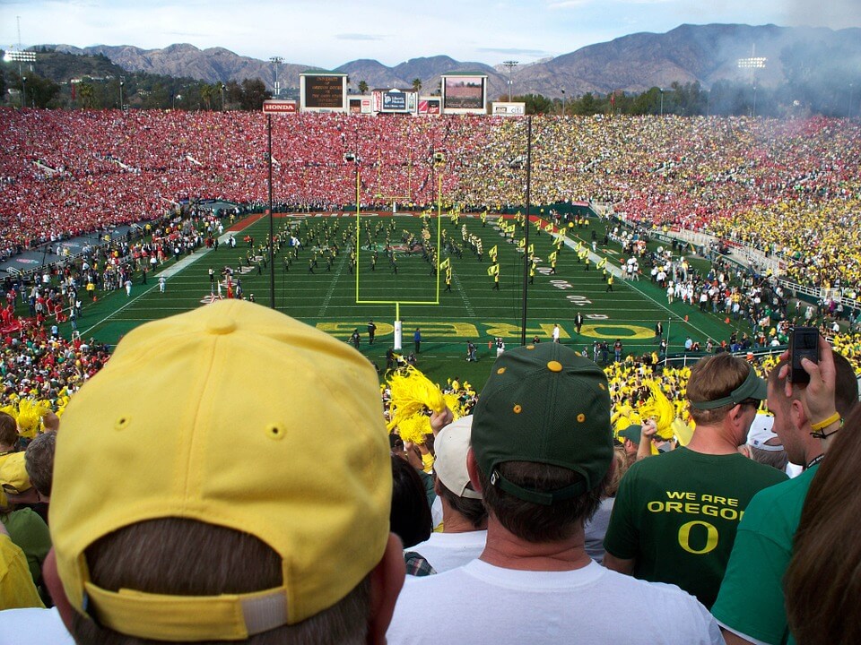
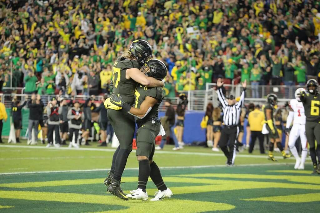
The Utah vs. Oregon game last night was an adrenaline packed one, with number 13 Oregon Ducks completely destroying the number 5 Utah Utes. The Ducks have now assured their spot in their first Pac-12 championship since 2014.
But, while the 67 yard touchdown early in the game did caught our eye, our true passion always come to life when we start wondering what is it exactly that makes football merchandise and memorabilia so desirable. Well, for surely there must be some team spirit and nostalgia, but the fonts are a huge part of it too.
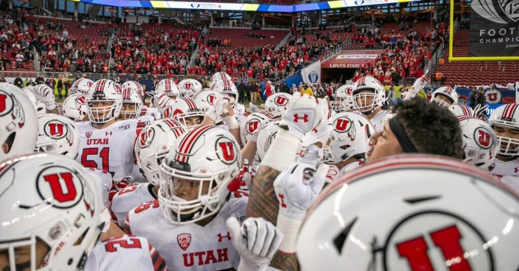
The Utah Utes traditionally wear red jerseys. The team was first established in 1892, as the football program for the University of Utah.
Actually, the Utes used to be called the Redskins up until 1972. That’s when they officially took the name Utes, inspired by the Native-American Ute tribe – the same one that the state of Utah derived its name from.
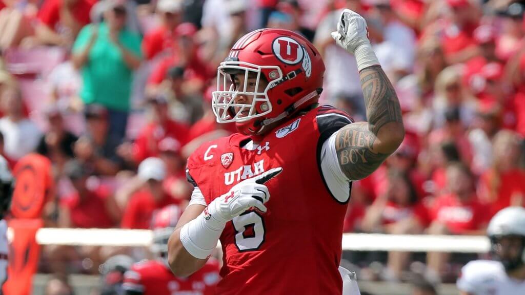
Even the Utes’ mascot, Swoop, is a red-tailed hawk. So, given that colour, their equipment designers decided to have the writing and details in white. The font they chose is not the typical extra bold typeface professional football teams so often use, but a rather tall one. This allows for its detailed endings to really pop up and be noticed. Some say the font reminds them of a hawk’s wings, while others swear they see Native-American themes in the bold details of each letter.
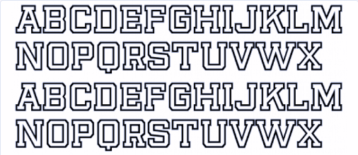
We’ve used the WhatFontIs font identifier to find out the name of the font the Utah Utes have on their official equipment and actually found more than one cool option. We’ve selected the best for you:
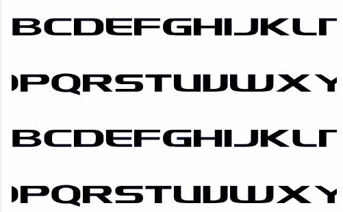
Player Outline Bold is the closest font to the bespoke Utah Utes one. There are hardly any difference between them, so this should be your go-to option if you are trying to replicate that exact look.
But if you are open to other options and just like the overall aesthetics of the Utah Utes official font, that the Stanford font could be a great alternative. It has the same detailed style, just with less wider spacing.
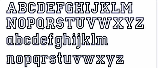
And if you are in need of a more relaxed Utah Utes inspired font, than LevSerif HandlineBold is a great way to get that effect, just with rounder edges and less details.
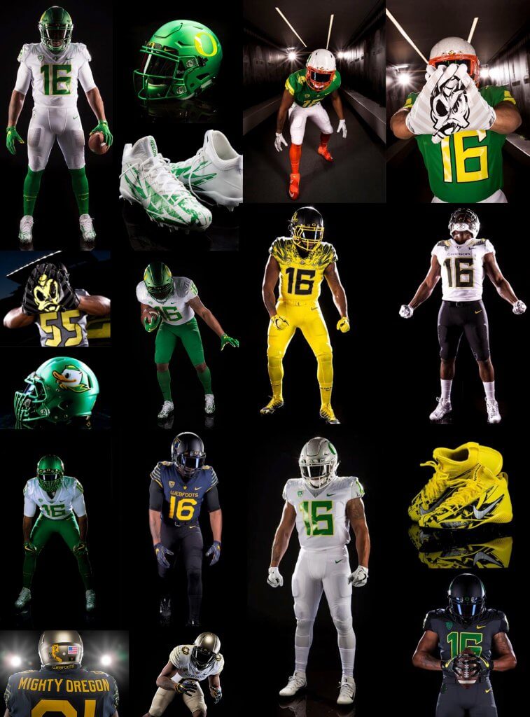
The Oregon Ducks, on the other hand, have made a name by completely revamping their equipment. So their designers had a bit less constraints when it came to choosing their colours or their fonts. A couple of years ago, the team decided to use completely different versions of their equipment each week. Yes, you read that right, each week.
The only thing that is constant about the University of Oregon team is the Donald Duck mascot and logo, that were introduced in 1985. The team was established in 1893.
This time, the Oregon Ducks played in a deep green equipment – they have even dressed Donald the same. Their equipment is designed by Nike and, while trying to maintain some loyalty to the traditional green and yellow colours of the team, the font was completely new when they first started working with the sports equipment producer. It has remained a trademark for the team in recent years and it is unlike any other font used by college football teams.
The name of the team has been mostly written in black and the font used by Nike actually complements the dark font on dark background theme.
The font is very aerodynamic, with very few corners and round shapes. The combination between thick lines for the vertical shapes with thin horizontal ones almost make the font look like it is on the move. Yes, the typeface used by the University of Oregon football team actually makes the word ‘Ducks’ looks fierce.
Again, by using the WhatFontIs font identifier, we came up with the best options if you want to use this font.
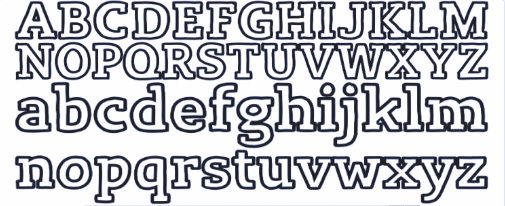
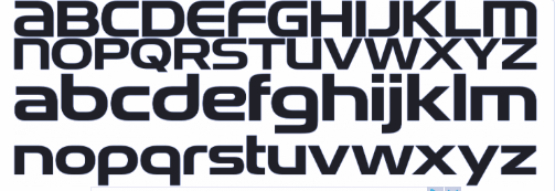
The first one is actually called NCAA Oregon Ducks, so no surprises there: it is almost identical with the official bespoke font created by Nike’s designers.
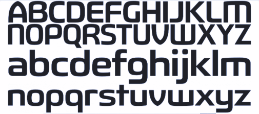
But Snasm Regular comes in at a very close second. A bit more minimalist, without the thick/thin lines combination, this font might look a bit bolder than the original.
Finally, CR Fluctuation Regular is a great alternative if you are just going for the overall vibe, without the professional athlete dynamics.
We hope this gave you a few useful tips when planning to design something using an official college football font. But, if soccer is more you game, have no fear! We took a closer look at all the fonts used by the biggest soccer teams during the World Cup. Take a look and let us know if there is any other sports logo or font you want to know more about!
Passionate about fonts or just looking for a quick solution for your lettering woes? WhatFontIs.com provides a catalogue of over 550.000 fonts that you can browse until you find the one that fits you just right.
Also, make sure you check the Blog Section – you might get that cool idea that will help you better define you visual identity.

I'm a programmer at heart. But in my 20s, I realized there was more to the world of fonts than just Courier.
Driven by endless curiosity, I built a system to explore them.
That project grew into one of the world’s leading font identifier platforms: www.WhatFontIs.com.
By 2024, WhatFontIs is helping nearly one million designers—famous or not—discover the names of the fonts they need.

