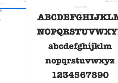
Find below the 20 most popular font myths in 2023.

It is important to know and understand all these fonts myths so you can make the right font choices for your projects.
1
Sans-serif fonts are always better than serif fonts for digital design.
Reality: Both serif and sans-serif fonts have their advantages and disadvantages depending on the context of use.
2
Helvetica is the most legible font. Reality: While Helvetica is a highly legible font, legibility can vary depending on the size, color, and background of the text.Comic Sans is the worst font.
Reality: Comic Sans is often criticized for its overuse in inappropriate contexts, but it can be a fun and playful font when used appropriately.
3
All handwriting fonts are unprofessional.
Reality: Handwriting fonts can be a great way to add a personal touch to design.
4
Using all caps makes text more legible.
Reality: Using all caps can actually make text harder to read, as it removes the natural variations in letter shapes.
5
Serif fonts are outdated and should not be used in modern design.
Reality: Serif fonts can be modern and contemporary when used in the right context and paired with complementary design elements.
6
Small caps are just smaller versions of capital letters.
Reality: Small caps are actually a different set of letters that are specifically designed to match the x-height of lowercase letters, making them more legible and visually consistent.
7
Slanted or italic fonts are always more stylish than regular fonts. Reality: Slanted or italic fonts can be more visually interesting, but they can also be harder to read and less legible.
8
Bold fonts are always more attention-grabbing than regular fonts. Reality: Bold fonts can be attention-grabbing, but they can also be overwhelming and distracting when used inappropriately.
9
All fonts can be used for any purpose.
Reality: Different fonts are designed for different purposes and should be used in appropriate contexts to convey the intended message and tone.
10
Script fonts are only appropriate for formal occasions.
Reality: Script fonts can be used in a variety of contexts, from formal to casual, depending on the specific font and design.
11
Monospaced fonts are only used for programming code.
Reality: Monospaced fonts can be used in a variety of contexts, including design, branding, and other creative projects.
12
Custom fonts are always better than standard fonts.
Reality: Custom fonts can be great for creating a unique brand identity, but standard fonts can be just as effective when used appropriately.
13
Using too many fonts in a design is always bad.
Reality: While using too many fonts can be overwhelming and distracting, using multiple fonts can add visual interest and hierarchy to a design when done correctly.
14
Condensed fonts are always harder to read.
Reality: Condensed fonts can be just as legible as regular fonts when used in appropriate contexts and with the right design elements.
15
Serif fonts are only appropriate for print design.
Reality: Serif fonts can be used in a variety of contexts, including digital design, when paired with appropriate design elements.
16
Handwriting fonts are always cursive.
Reality: Handwriting fonts can be cursive or print, and can be used to convey different tones and styles.
17
All fonts are free to use.
Reality: Many fonts are protected by copyright laws and require a license to use in commercial projects.
18
The default font in a design program is the best choice.
Reality: The default font may not be the best choice for a particular design, and designers should explore different font options to find the most appropriate choice.
19
Font choice doesn’t matter as long as the content is good.
Reality: Font can be more important than the actual content.
20
It is hard and/or expensive to have your own fully customized fonts.
Reality: With Google Roboto Flex and other such software, anybody can design its own fonts. And then there are also freelancers that can help you with affordable prices for creating a unique font.
Conclusions
Always have in mind these font myths so you don’t get trapped with misinformation.
And of course, respect common sense and you will do just fine.
equally important, finally, further, furthermore, nor, too, next, lastly, what’s more, moreover, in addition, first (second, etc.)


