Signs are a huge part of our lives. They tell us what to do and where to go. Our entire society relies on them for functioning. But how much attention do we actually pay to signage? None at all, until we actually need them. So they have to be neutral enough to blend in, but clear and bright enough for us to find and understand when we have to. So, today, we’ve asked our experts to compile the complete guide when it comes to fonts for signs.
We’ve become so used to signs that we often don’t notice them anymore. That is until you really need them. We’ve all missed a highway exit because we saw the sign too late, desperately searched for the toilets in a mall or got lost in an airport.
But, in every single one of these situations, it wasn’t just your fault. All of these problems could have easily been avoided if the signs we rely on would have been bigger and clearer.
We’re contributing our part so that no one ever goes through the agony of running in circles while trying to catch a plane.
When it comes to choosing a font in general, the possibilities are pretty much endless. WhatFontIs.com has a catalogue of 550,000 of them. So we are not going to focus today on a list of fonts, but rather on the rules that make a font eligible to be used in signage. We are adding a list of suggestions with fonts for signs below, so just keep scrolling if you want to skip the guideline.
The first rule to keep in mind when choosing a font for signs is to know your surface. On what will that fonts be printed on? It might look very different on plastic as opposed to paper. Always see multiple samples before you print out your entire signage.
Secondly, legibility is key. This is true for 99 percent of fonts and messages, but when it comes to signage, it rises to 200%. Signs are useless unless they are clean and clear enough to be read and understood in a glance.
The third rule when choosing a signage font is to adapt to the length of the message written on it. If it’s just a short word, like ‘EXIT’ or ‘WARNING’, then your options could include bold fonts for the sign. But if your lettering is longer, like ‘Caution, wet floor’ or ‘Please stand only on the right side’ than you might be restricted from using bold fonts in your signs.
The fourth rule is hidden in the above paragraph. See anything different between the examples? Exactly. The decision (or obligation) to use CAPS/small cases makes all the difference when choosing the fonts you will be using in signage. Again, always make sure you print out multiple samples before deciding.
Rule number five is that size really does matter. A font will be perfect on a three by three feet highway sign, but it will simply be ilegible on a standard 24 by 24 inches road sign.
Lastly, our experts stressed that the number of fonts you will be using on a particular sign, as well as colour and background, should always be synchronized.
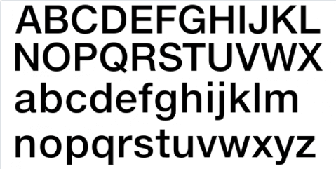
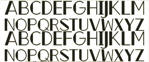
The best fonts for signsHelvetica is always a good option for signage fonts. Its qualities enable the font to follow all of the rules above even in its most basic form. Clear, clean, tall, straight lines. Exactly what you would hope for when you are trying to figure out which way to go.
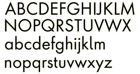
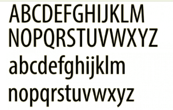
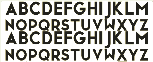
Pretty much the same could be said for Futura. It’s simple and neat, a sans serif font on the rounder side. Futura looks great as a font for signs because it is so versatile, yet so modern and fresh.
And talking about coordinating your fonts, Helvetica and Futura both look great when paired with Optima. This is also a great option for signage fonts, but our experts recommend it for the body message in a sign. For example, write ‘WARNING’ in one of the first two options and, below, use Optima to write ‘Staff Only’ or ‘Do Not Enter’.
Another more avantgarde option for signage fonts is Myriad. Wide, tall, round and clean, you basically could not miss it. Still, the thin lines would manage to make it as intrusive as possible. And, like we said, sometimes the best signs are the ones that stay invisible until we look for them.
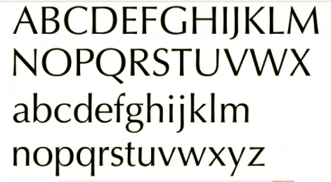
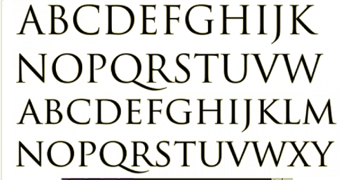
If the dimensions of you signs allow it, than Trajan is also a great option. All of the fonts for signs presented above are sans serif, but Trajan is a serif font that would still look great on a sign.
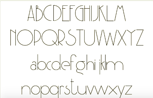
Also, for those of you with a little more space for creativity – because signage is one of the strictest design areas – we highly recommend Party at Gatsby’s as a sign font. It would look great in a modern, industrial space. Its thin, tall letters make it easy to read, but its edges and sharp angles make it pop off any sign.
San Marino is another great font sign option. It is bold and sharp at the same time and it simply looks great in all caps. We can really see this on in a chic store or coffee shop.
Let’s stay a little bit longer in this decor, fancy store, restaurants, high end spas. Now imagine the Zeky font used for all their signs. It’s just a match made in posh heaven, right?
Passionate about fonts or just looking for a quick solution for your lettering woes? WhatFontIs.com provides a catalogue of over 550.000 fonts that you can browse until you find the one that fits you just right.
Also, make sure you check the Blog Section – you might get that cool idea that will help you better define you visual identity.

I'm a programmer at heart. But in my 20s, I realized there was more to the world of fonts than just Courier.
Driven by endless curiosity, I built a system to explore them.
That project grew into one of the world’s leading font identifier platforms: www.WhatFontIs.com.
By 2024, WhatFontIs is helping nearly one million designers—famous or not—discover the names of the fonts they need.