The typefaces displayed on the backs of football superstars gathered in Moscow from all around the world had a strenuous task: how to achieve balance between the team’s history, with its traditional colours and ‘coat of arms’, and a new, fresh design, all while trying to mix in a pinch of Russian culture.
About 3,4 billion pairs of eyes tuned in during the 2018 World Cup, FIFA estimates, and it is precisely the ever-growing audience that has changed the way official football kits are now designed. Although there are no institutional statistics, sports magazines estimate that the biggest soccer clubs sell roughly 1.5 to 2 million shirts a year.
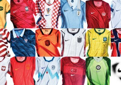
In this World Cup, an informal battle emerged between Adidas and Nike, with the first designing the official sportswear for 12 teams (Argentina, Belgium, Colombia, Egypt, Germany, Iran, Japan, Mexico, Morocco, Russia, Spain, Sweden) and the latter being responsible for the shirts on the backs of 10 national teams (Australia, Brazil, Croatia, England, France, Nigeria, Poland, Portugal, Saudi Arabia, South Korea).
Puma was chose by four national teams – Serbia, Senegal, Switzerland and Uruguay, while New Balance provided the equipment for Costa Rica and Panama. The remaining four teams present in Moscow chose as follows: Denmark wore Hummel, Peru – Umbro, Tunisia went with Uhlsport and Iceland had Errea.
And although Adidas was an official sponsor for the event, Nike is thought to have won the show with both the finalists – France and Croatia – wearing its designs.
All the sportswear companies designed special edition uniforms, featured with unique typefaces to be worn by the teams they sponsor in Moscow.
For its twelve teams, Adidas decided to use a single font, designed in-house, with hardly noticeable differences between teams. Strongly inspired by Russian imagery – more specifically from the Soviet era, the letterforms used in this typeface have inner thin line, going right through the middle of each character, be it letter or number. The characters are all sharp, cut at a 90 degree angle. This proved to be a less than inspired choice, with many supporter going to social media to express their discontent. Their main grievances revolved around the similarities between the numbers 1 and 7, as well as between the letters A and R.
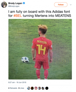
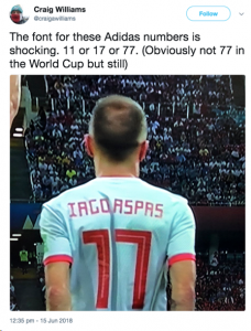
Standing out among the Adidas-designed kits are the light blue and white striped shirts worn by Argentina. The font used for the Latin American football players was taller than the base typeface, with more elongated figures. Also, the apostrophe of this font was different, using a classic bullet style rather than the acute accent mark. Some even say that it is precisely the change in the apostrophe that caused the elongation in the first place, given the fact that the numbers featured in Argentina’s font are the same height as the others designed by Adidas.
Nike decided on a general aspect for the font displayed on its 10 sponsored teams, but customized each one with a few subtle features. As far as the common traits go, all the fonts had a similar clear, sharp cut edges combined with an almost cursive, round side. All of the characters had inner linings, but not all of them went all the way around the middle of the letters or numbers (see, for example, England’s equipment). All of the characters included, in the bottom section, a small representation of each teams’ logo, reminding many of an anchor stabilizing the letterforms. Nike decided to use different graphic designers for the task, securing collaborations with Wim Crouwel, Neville Brody and Craig Ward, among others.
Let’s pause a little and take a closer look at the typography used for England’s and Nigeria’s shirts, both voted among the best at the 2018 World Cup in rankings compiled by CBS Sports, GQ and Men’s Health.
For England, Nike hired Craig Ward, a British graphic designer based in New York. The unicity of the font developed by Ward for the Three Lions, as England’s teams is called, comes foremost from its 3D dynamic. The thin inner lines help shape a curvilinear typeface. In the bottom section we can find the three lions shield, one of few common traits the British teams’ font shares with the basic typeface developed by Nike for its sponsored teams.

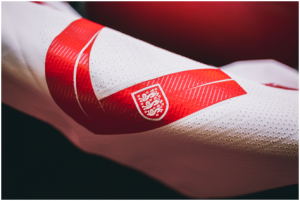

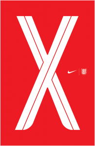
(Photo source: behance.net)
‘I was honored to be asked to create a custom typeface for England’s 2018 World Cup kit. Commissioned by Nike, the type was modeled in 3D to feature the St George’s cross and create a dynamic, twisting design which features inline, outline and fill weights along with a complementary numeral for use at larger sizes. I began by looking at the clarity and geometry of classic English typefaces (Gill, Flaxman, Johnston etc) – particularly when condensed, as that was also a requirement. I noticed how they lost some of their implied geometry in these instances and decided to create something that didn’t buckle like that. Parts of the type actually quote aspects of other fonts to feel a little more familiar – the W in Railway Sans in particular, and the flare of the alternate R is a nod to Gill. I also included a perfectly circular O should they want to use it.”, Ward writes on his web page, behance.net. (Source: https://www.behance.net/gallery/62315197/England-2018-World-Cup-Kit)
For Nigeria, largely considered the number one shirt design in this World Cup, the chosen typeface had a modern twist. Using the general lines of the base-font designed by Nike for all its teams, Nigeria’s typeface stands out due to its round edges. Using a slightly bolder aspect, the typeface maintains the sharp cut angle in just one exterior point for each letter and number, smoothing out all the rest in a curvy, almost plump character. The 45 degree angle used for endpoints creates a claw-like image, appropriate for the team dubbed ‘The Super Eagles’.
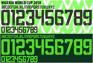
Photo source: NSMag.com
Although functionally increasing the legibility of their typography has been an overt goal for Nike during the last years, their overall objective of clarity seems to have taken a hit this year when, during a friendly game with England in early June, two Nigerian players confused each other as opponents and headbutted, much to their fans exasperation (source:https://www.thesun.co.uk/sport/football/6436093/england-nigeria-fans-complain-kit-clash/). This, however, had nothing to do with the fonts and was caused by the dominating white colour scheme used for both teams kits.
A font that stood out at this year’s World Cup was the bulky asymmetrical designed by Puma for its four teams. They decided on carving unique shapes within the numbers, with four different geometrical recesses, some resembling hexagon halves, others looking more like shards brutally chipped off the edges. They were paired with a flowing lettering, elongated and thin.This achieved an industrialized look, with a clear Russian culture influence.
New Balances’ typeface, on display on Costa Rican and Panamese players, also featured a lettering cut with a thin inner line all through the core. The numbers, however, are full, sporting a more dynamic vibe and a 3D look. This comes mostly from the mix between round, smooth edges on the exterior and the sharp recesses carved in every junction point.
For Denmark, its one team in the 2018 World Cup, Hummel decided it’s all about location and went full-on cyrillic alphabet. They stylized latin letters and arabic numerals to resemble the unique Russian characters and their main tools were the intricate, almost scribbly but definitely elegant tall letters and round numerals, evocative of Renaissance typography, but with just a hint of its delicate details.
But when trying to find the right fonts to write the names of football superstars, you have to cross one more bridge. When designing the magical names and numbers that fill stadiums, sell shirts and sneakers and brought in about 6 billion dollars for FIFA just from this World Cup, graphic designers must be in compliance with FIFA’s rules on typography. And the rules are not simple. To ensure visibility and legibility for both stadium fans and the referees, FIFA has a 100-page guideline the official kit design must follow. You can check them out here (https://resources.fifa.com/mm/document/tournament/competition/51/54/30/equipmentregulations-inhalt-e_neutral.pdf).
Hope you enjoyed the article and remember : if you ever need to identify a font from an image, try the awsome tool What FontIs .com
I'm a programmer at heart. But in my 20s, I realized there was more to the world of fonts than just Courier.
Driven by endless curiosity, I built a system to explore them.
That project grew into one of the world’s leading font identifier platforms: www.WhatFontIs.com.
By 2024, WhatFontIs is helping nearly one million designers—famous or not—discover the names of the fonts they need.


