
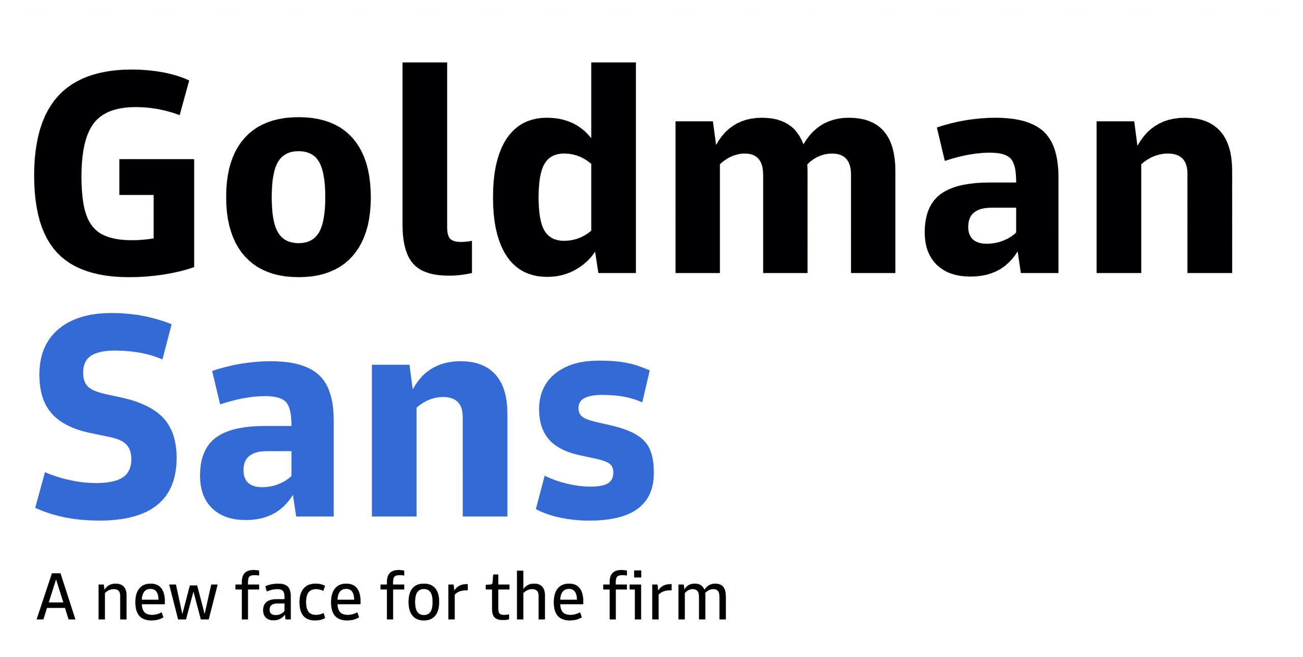
The famous Goldman Sachs launched its own font, named Golden Sans. It is a wise and powerful move made by this famous company that say to the world: Hey, at Goldman Sachs we take care of every aspect of our work!
When you are Goldman Sachs, you have the power to do anything you want, and creating your own font looks like the right decision. Why don’t most of the companies create their own fonts? I strongly believe they don’t find it useful. And how wrong they are….
Some cool things about Goldman SachsFind below things that I bet you didn’t know about Goldman Sachs; you need to see them to better understand who is this company:
- 60% of their top executives are Jews, who only account for 2% of the US population. This is reportedly the highest ratio among peers.
- It uses 1 million computing hours per day for risk management calculations.
- Largest asset managers worldwide as of June 2020, by value of managed assets
- In 2010 and 2011, Goldman received 300,000 applications for full-time positions. 4% were given offers. Of the applicants who receive offers, 9/10 accept.
- Sidney Weinberg, who started off as a janitor’s assistant, went on to become the CEO and led the firm for 39 years.

The font Goldman Sans was introduced in June 2020, and it is a typeface described by the company as “approachable without being whimsical” and “neutral, with a wink”. It is free for anyone to download, and most people find it extremely appealing.
The bank continues their effort to become more digital and open, for sure it will not become a tech-company but there are doing right moves, one after another. They relaxed its dress code, they collaborated with Apple on a credit card and opened an online consumer bank called Marcus.
Goldman Sachs will use its font into its branding and marketing materials – website, apps, YouTube videos, and everywhere else. Bespoke typefaces are a huge trend among companies. Many of them recently commissioned typefaces, companies like Toyota, CNN, Google, Duolingo, and Southwest Airlines.
Who created the font for Goldman Sachs?Dalton Maag, a 29-year-old British design firm was hired by Goldman to create the font. It is the very same company who crafted Bookerly, used on Amazon Kindle e-readers for many years now, and the BBC’s BBC Reith, the font used by the famous TV channel.
Goldman presented a clear brief to Dalton Maag.
They wanted a font that is so legible you could read strings of numbers on a phone screen or a smartwatch but would still look good on a extremely large billboards.
Goldman Sans characters are all sculpted.
The tops of p,q, n, and g all taper into “slight chamfered spurs” so they create more white space.
Another interesting fact, but extremely difficult for Dalton Maag, was to create all numbers so they line up perfectly in a financial table.
Goldman requested this, so they had to figure a way to do it.
And they did it.
Users can apply italic and bold to letters and numbers, the alignment will not be affected on spreadsheets. A Reddit user named “me3peeoh” called this feature “a gamechanger”. Download the font and see it with your own eyes, it is spectacular.
ConclusionsGoldman Sachs launched its own font on 2th June 2020 and many other companies will soon follow.
Big companies usually find this process complicated and expensive and that is why they don’t launch their own fonts.
Small companies will have the advantage of much smaller costs and faster implementation. If you are a small company, launch your own font and get all the advantages.
Get Goldmans Sans font by clicking Goldmans Sans Font.
Just imagine what you can do if you launch your own company font and this font become a super popular option for tons of people. It can help you big time, right? Imagine.

I'm a programmer at heart. But in my 20s, I realized there was more to the world of fonts than just Courier.
Driven by endless curiosity, I built a system to explore them.
That project grew into one of the world’s leading font identifier platforms: www.WhatFontIs.com.
By 2024, WhatFontIs is helping nearly one million designers—famous or not—discover the names of the fonts they need.

