
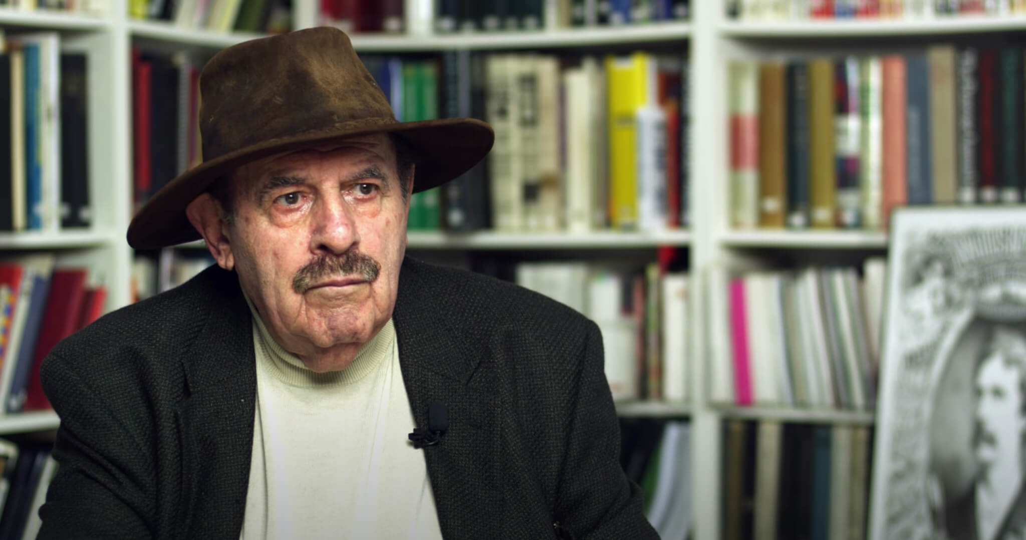
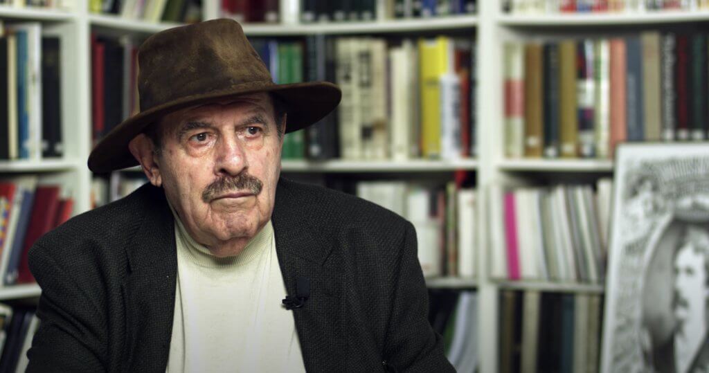
Ed Benguiat, the typography god dies at 92 in 2020, on October 15. The world lost a noted and very talented graphic designer.
“I wanted to be a musician” says Ed Benguiat in the following interview that I highly recommend you watch.
And he became a musician. He started his career as a jazz percussionist, under the name Eddie Benart, and played with numerous big bands such as Stan Kenton, Claude Thornhill and Woody Herman.
Ed Benguiat preferred the New York gigs on 52nd Street, particularly at The Three Deuces. “It kept me in town; going on the road with big bands was a drag, and tough.”
When did he switched to typography? The story is extremely interesting.“A letterform is like music. It’s got to carry a tune…have balance,” said Ed, adding “Music is essentially sounds placed together to be pleasing to the ear. Type and letterforms are the same thing, yet for the eye. So, music might be more visceral, but design does maintain the same level of intensity.”
While playing on 52nd Street, Ed Benguiat enrolled at the Worksshop School of Advertising Art. He had a strong desire to draw nudes but his drawing teacher advised him several times to quit. Ed persisted. After a while, it was obvious that Ed couldn’t draw so well.
So, he chose the direction of layout, design, typography, and calligraphy.“Why do we still use old fonts despite so many new ones being created through modern technology? Well, back in the 19th and 20th century, type had to be perfect. There was no room for error. There was such care, precision, and meticulousness. It meant months of work, versus days. And that strive for perfection created a timeless quality.”
Ed would add, “You should never be satisfied with your work, no matter if its design or music. Only when the poster has been sent to the printer or the album has been pressed, are you forced to put the pencil down.”
Ed established an impressive career as a designer and art director at a number of large and small publishing houses, studios, and advertising agencies.
He soon established his own firm.
Ed Benguiat WorkHe crafted over 600 typeface designs including Tiffany, Bookman, Panache, Souvenir, Edwardian Script, and the eponymous Benguiat and Benguiat Gothic.
Ed also known for his designs or redesigns of the logotypes for Esquire, The New York Times, Playboy, McCall’s, Reader’s Digest, Photography, Look, Sports Illustrated, The Star-Ledger, The San Diego Tribune, AT&T, A&E, Coke, Estée Lauder, Ford, and others.[1] Other notable examples of Benguiat’s work are the logotypes for the original Planet of the Apes film, Super Fly and The Guns of Navarone, and the typeface for the opening credits for Stranger Things.
Most of Benguiat’s published work was released through International Typeface Corporation. This includes ITC Barcelona, ITC Benguiat, ITC Benguiat Gothic, ITC Bookman, ITC Caslon No. 224, ITC Century Handtooled, ITC Edwardian Script, ITC Modern No. 216, ITC Panache, ITC Souvenir, ITC Tiffany. In addition, there were collaboration releases including ITC Avant Garde (condensed styles only), ITC Bauhaus (with Victor Caruso), ITC Cheltenham Handtooled (with Tony Stan), ITC Korinna (with Victor Caruso), ITC Lubalin Graph (with Herb Lubalin).
Ed Benguiat’s font was used in the main titles of the Star Trek films, Star Trek Generations and Star Trek: First Contact, and The Stranger Things, a super popular Netflix sci-fi series.
ConclusionsEd Benguiat, The Typography God Dies At 92 In 2020.
There won’t be another Ed Benguiat in this world. Rest in peace, Ed!
“Music is placing sounds, to me, in their proper order so they’re pleasing to the ear,” he said. “That’s all. What is graphic design? Placing things in their proper order so they’re pleasing to the eye.”

I'm a programmer at heart. But in my 20s, I realized there was more to the world of fonts than just Courier.
Driven by endless curiosity, I built a system to explore them.
That project grew into one of the world’s leading font identifier platforms: www.WhatFontIs.com.
By 2024, WhatFontIs is helping nearly one million designers—famous or not—discover the names of the fonts they need.

