
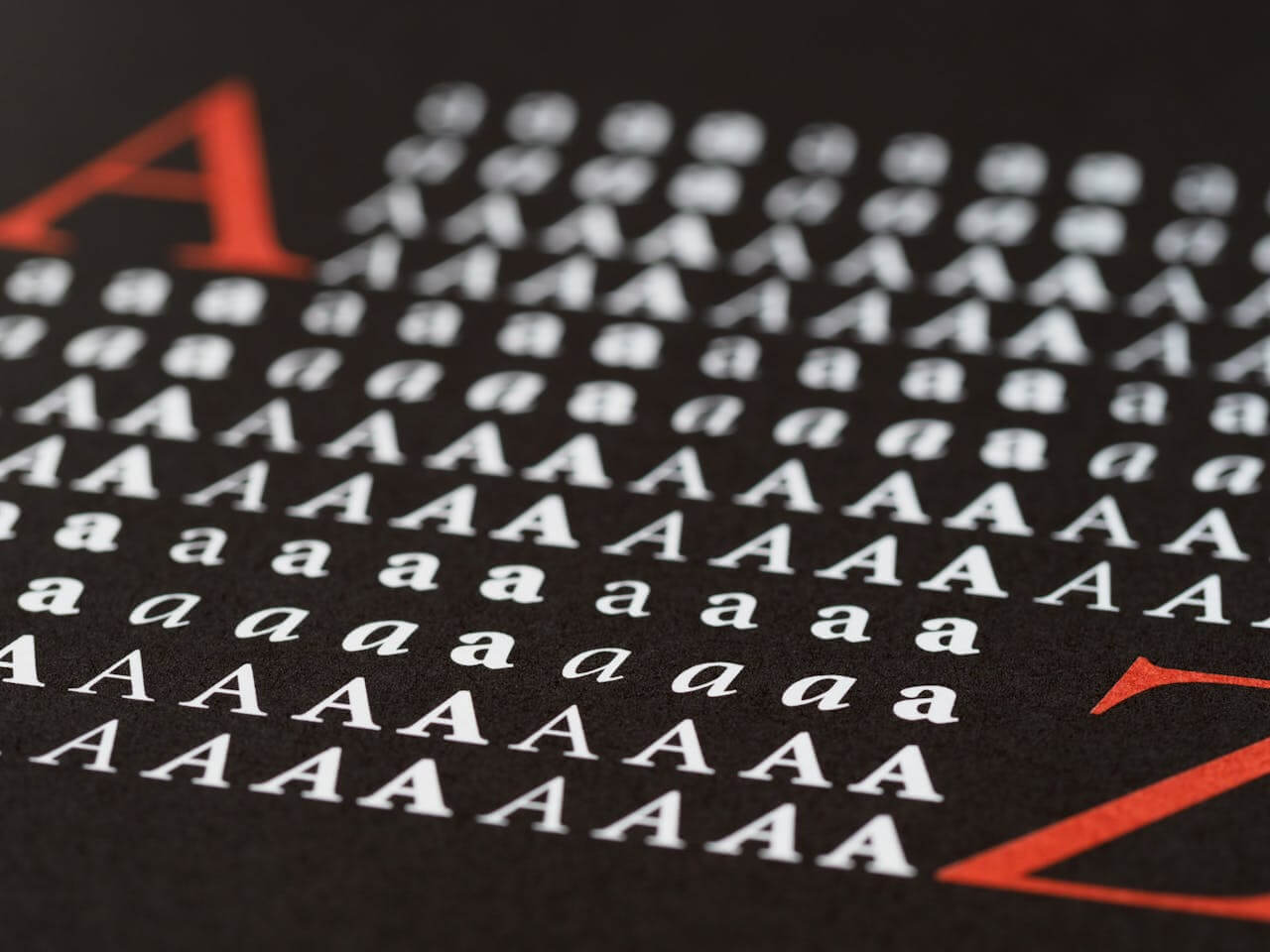
Choosing the right body font is more than just an aesthetic decision; it’s about creating a comfortable and engaging reading experience.
Think of it this way: a well-chosen body font is like a good host, making your audience feel welcome and at ease as they consume your content. But with so many options available, how do you select the perfect typeface?
This guide breaks down the key considerations, from understanding the nuances of serif versus sans-serif fonts to mastering font pairing strategies, ensuring your text is not only readable but also visually appealing.
Table of ContentsWhen designing content meant to be read, the choice of body copy fonts is critical. Unlike display fonts, which aim to capture attention with bold designs, the best fonts for body text should function unobtrusively, creating a smooth reading experience that doesn’t pull focus from the message itself. Think of body fonts as the foundation that supports your design.
The main goal of any font for long text is to fade into the background. You want readers to absorb the content without eye strain or distraction from unusual letterforms. This means selecting typefaces that remain clear across sizes and contexts, from desktop screens to mobile devices.
What sets a great body font apart? It’s about the details. Body copy fonts have sturdy, well-proportioned letterforms with generous x-heights that stay legible even at small sizes. They avoid decorative elements that might look good in headlines but become distracting in paragraphs. The spacing between letters and words creates a rhythm that guides the eye naturally.
Now that we’ve covered the importance of body fonts, let’s dive into the classic debate: serif versus sans-serif. Understanding the nuances of each style will help you make an informed decision for your specific project.
Serif vs sans-serif fonts for body textThe debate between serif vs sans-serif fonts continues to shape design decisions in print and digital media. Understanding the differences between them helps you make informed choices about readable fonts.
Serif fonts have small decorative strokes extending from the main letterforms, which many consider more traditional. These serifs are thought to guide the eye along lines of text, which is why newspapers and books have often used serif typefaces. The idea is that serifs create a baseline that helps readers keep their place in dense text.
Sans-serif fonts (“without serifs“) offer clean, simple letterforms often associated with modern, digital design. These fonts became popular with computer screens, where the shapes often appeared more clearly than serif fonts. The simplified forms reduce visual clutter, potentially improving font legibility on lower-resolution displays.
However, modern high-resolution screens have largely eliminated the technical advantages that once favored sans-serif fonts for digital reading. Now, both serif and sans-serif options can work well for body text, depending on your design goals and brand. The key is choosing well-designed typefaces rather than relying on outdated assumptions.
Your decision between serif vs sans-serif should depend on factors like brand identity, audience expectations, and the overall aesthetic. A law firm might use serif fonts for their authoritative feel, while a tech startup might prefer the clean impression of sans-serif typography.
Now that you know the difference between serif and sans-serif fonts, let’s explore the essential characteristics that make a font truly readable, regardless of its classification.
Essential characteristics of readable fontsCreating truly readable fonts means paying attention to design characteristics that affect how easily people can process text. Understanding these elements will help you evaluate potential body fonts and prioritize reader comfort.
X-height is crucial to font legibility, referring to the height of lowercase letters like ‘x’ relative to the font size. Fonts with generous x-heights feel more open and readable, especially at smaller sizes. This is important when your content needs to work across devices and screen sizes. [Invalid generated image removed]
Letter spacing and character width affect reading comfort. Well-designed body fonts have consistent spacing that prevents letters from crowding or spreading too far apart. The internal spaces within letters, called apertures, should be open enough to maintain clarity even when text is small. Characters like ‘e’, ‘a’, and ‘c’ need enough internal white space to remain distinct.
Contrast levels within letterforms affect how fonts perform in reading. While high-contrast fonts can look elegant in headlines, they often create visual fatigue in body text. The varying stroke weights can create an uneven texture that disrupts reading flow. Medium to low contrast fonts typically provide better font legibility for sustained reading.
The overall color and texture of text blocks matter. When you squint at a paragraph, it should appear as an even gray mass without dark or light patches. Fonts that create consistent visual density help readers maintain focus.
With a solid understanding of what makes a font readable, let’s move on to the art of font pairing. Combining fonts effectively can elevate your design, but it requires a strategic approach.
Font pairing strategies for body textSuccessful font pairing creates visual hierarchy while maintaining harmony. The relationship between your body font and other typographic elements can enhance readability or create visual competition that distracts from your content.
The most reliable approach to font pairing involves creating contrast between text levels. Pairing a serif font for headlines with a sans-serif body font, or vice versa, establishes visual distinction that helps readers navigate your content. This contrast should feel intentional, with both fonts sharing similar proportions or stylistic qualities that create harmony. [Invalid generated image removed]
When building font hierarchy, consider how different weights and sizes of the same typeface family can work together. Many professional font families include weights and styles designed to work together. Using a bold weight for headings and regular weight for body text from the same family ensures compatibility while maintaining hierarchy.
Limiting your font selection prevents visual chaos. Stick to two or three fonts maximum, with each serving a specific purpose. One font handles body text, another manages headlines, and perhaps a third provides styling for elements like captions. This restraint creates consistency while giving you flexibility to establish information hierarchy.
Consider the personality match between paired fonts. While contrast is important, your font choices should still feel like they belong together. A playful script font paired with a serious serif body font might create conflicts that undermine your message. Look for fonts that complement each other’s character while serving different roles in your typography system.
As you consider your font pairings, it’s crucial to think about the digital landscape. Let’s explore web safe fonts and other digital considerations to ensure your text looks great across all platforms.
Web safe fonts and digital considerationsChoosing web safe fonts ensures your content displays consistently across browsers, operating systems, and devices. While web technology offers flexibility, understanding the reliability of font options helps you make informed decisions about font legibility.
Traditional web safe fonts like Arial, Helvetica, Times New Roman, and Georgia remain popular because they’re pre-installed on virtually every device. This means your text will render predictably without requiring font downloads that could slow page loading times. For projects where performance and reliability are important, these options provide solid foundations for readable body text.
Web font services like Google Fonts and Adobe Fonts have expanded your options while maintaining performance. These services optimize font delivery and provide fallback systems that ensure graceful degradation if custom fonts fail to load. However, it’s still wise to specify web safe fonts as fallbacks in your CSS font stack.
Screen resolution and pixel density affect how fonts render across devices. What looks crisp on a high-resolution monitor might appear fuzzy on older mobile devices. Testing your chosen fonts across screen types helps identify potential font legibility issues.
Loading performance becomes important as users expect fast websites. While custom web fonts can enhance your design’s uniqueness, they also add to page load times. Consider the trade-offs between visual distinctiveness and performance, especially for content-heavy sites where reading experience should take priority.
Beyond technical considerations, remember that fonts also carry psychological weight. Let’s explore how font psychology and personality can influence your body text choices.
Font psychology and personality in body textEvery font carries associations that influence how readers perceive your content. Understanding font psychology helps you choose typefaces that reinforce your message and connect with your audience.
Serif fonts often convey tradition, authority, and reliability. They’re associated with institutions like newspapers and legal documents. If your content needs to project trustworthiness, serif body fonts can reinforce these qualities. However, serif fonts might also feel outdated to younger audiences.
Sans-serif fonts typically suggest modernity, clarity, and approachability. They’re the default choice for digital interfaces and brands that want to appear forward-thinking. The clean lines can make content feel more user-friendly, which explains their use in web design and mobile applications.
The specific font personality within these categories varies. A geometric sans-serif like Futura feels different from a humanist sans-serif like Verdana. Similarly, a classical serif like Times New Roman projects different qualities than a contemporary serif like Georgia. Pay attention to these personality differences.
Brand alignment should guide your font psychology considerations. Your body font choice should feel consistent with your brand personality and visual identity. A startup might choose fonts with quirky characteristics, while a financial services firm would likely prefer conservative options. The key is ensuring your typography supports your brand message.
Now that you’re aware of the psychological impact of fonts, let’s break down the selection process into a step-by-step guide to help you choose the perfect body font.
Step-by-step guide to choosing your body fontSelecting the perfect body font requires a systematic approach that considers aesthetic preferences and practical requirements. Following a structured process helps ensure you make decisions based on objective criteria.
Start by defining your project’s context and constraints. Are you designing for web, print, or both? Will readers primarily view your content on computers, mobile devices, or a mix? Understanding these requirements helps narrow your options to fonts that will perform well. Consider factors like file size limitations and browser compatibility.
Identify your target audience and their reading habits. Professional audiences might expect formal typography, while younger demographics often prefer approachable fonts. Consider the length of your content and the reading context. Long-form articles require different considerations than social media posts.
Evaluate potential fonts for readability. Test candidates at various sizes, paying attention to how they perform at the smaller sizes you’ll use for body text. Look for fonts with generous x-heights, open apertures, and consistent letter spacing. Avoid fonts with excessive decorative elements or extreme contrast that might cause eye fatigue.
Consider the relationship between your body font and other typographic elements. How to choose a font that works well with your headline fonts, logo typography, and user interface elements? Create sample layouts that show how your body font interacts with these elements to ensure visual harmony.
Test your shortlisted fonts in realistic content scenarios. Set actual paragraphs of your content in each candidate font and evaluate them side by side. Read through the text yourself and have others review the options. Pay attention to reading comfort, visual appeal, and how well each font supports your content’s tone and message. This testing often reveals issues that aren’t apparent when looking at individual letterforms.
Once you’ve made your selection, the work isn’t quite over. Testing and optimization are crucial to ensure your chosen font truly delivers the best possible reading experience.
Testing and optimizing your font choiceOnce you’ve selected a body font, thorough testing ensures it performs well for your readers. This optimization phase can make the difference between a font that looks good in theory and one that enhances the reading experience.
Test your chosen font across all devices and browsers your audience uses. What appears perfectly readable on your design monitor might look cramped on older mobile devices. Check how your font renders on iOS and Android devices, as well as different browsers. Pay attention to how the font performs at various zoom levels, since many users adjust text size.
Evaluate font contrast against different background colors and in various lighting conditions. Your font might look great on a white background but become difficult to read on colored backgrounds or in bright sunlight. Test sufficient contrast ratios to meet accessibility guidelines, ensuring your content remains readable for users with visual impairments.
Conduct user testing with representative members of your target audience. Have people read content set in your chosen font and gather feedback about reading comfort, perceived professionalism, and overall impression. This feedback often reveals issues that technical testing might miss, such as fonts that feel too casual or too formal.
Fine-tune typography parameters to optimize the reading experience. Adjust line height, letter spacing, and paragraph spacing to create comfortable text blocks. Monitor analytics data if possible to see whether your font choices correlate with improved engagement metrics like time on page or reduced bounce rates. These data points can validate your font selection and guide future decisions.
Making Informed Typography ChoicesSelecting the right body font involves balancing aesthetics with practical considerations. By understanding the nuances of serif versus sans-serif, prioritizing readability, and testing your choices across devices, you ensure your content is both visually appealing and easily accessible. Remember to consider font psychology to align your typography with your brand and message. These steps lead to a better reading experience, keeping your audience engaged and informed. Continue to refine your approach based on user feedback and performance data, creating a positive and lasting impression.
Frequently Asked Questions (FAQ) About Choosing the Best Body FontA body font is the primary typeface used for continuous, long-form text such as paragraphs and articles. It is chosen for maximum readability and comfort during sustained reading, distinguishing it from display or headline fonts.
Serif fonts have small decorative strokes at the ends of letters, conveying a traditional or formal feel, while sans-serif fonts have clean, unadorned letterforms and appear more modern and minimalistic.
Look for qualities like generous x-height, open apertures, consistent spacing, and medium-to-low contrast. Testing the font at small sizes and across devices can help ensure readability.
Font pairing creates visual hierarchy and improves navigation for readers. Pairing complementary fonts for headlines and body text adds interest while maintaining harmony and clarity.
Web safe fonts are typefaces like Arial, Helvetica, Times New Roman, and Georgia. They are installed on most devices and ensure your content displays consistently across browsers and operating systems.
Custom web fonts can enhance your site’s personality but may increase page load times. For content-heavy sites, prioritize reliable fonts and always include web safe fallbacks for performance and compatibility.
Fonts express personality and can influence readers’ perceptions. For example, serif fonts generally convey trust and tradition, while sans-serif fonts imply approachability and modernity. Align your choice with your brand message.
Limit your selection to two or three fonts. One for body text, another for headlines, and possibly a third for accents or captions. Keeping font choices minimal ensures consistency and avoids visual clutter.
Create sample layouts, use your actual content, and ask users from your target audience for feedback. Additionally, check the font’s performance across different devices, browsers, and lighting conditions.
Revisit your options, refine typography settings (such as line height and letter spacing), and continue testing. Pay attention to user feedback and engagement data to guide your adjustments for optimal readability.

I'm a programmer at heart. But in my 20s, I realized there was more to the world of fonts than just Courier.
Driven by endless curiosity, I built a system to explore them.
That project grew into one of the world’s leading font identifier platforms: www.WhatFontIs.com.
By 2024, WhatFontIs is helping nearly one million designers—famous or not—discover the names of the fonts they need.

