

Microsoft will have a new default font for Office in 2022, changing Calibri with something else, a fresh new font.
Is this the missing element in Office in 2022?
Maybe not, but the change was very well received by the public.
Calibri have been the default font in Office for 15 years. It is time to let it go.
Microsoft decided to change it in 2022, and even if there are over 700 fonts in Word, the company has commissioned 5 new custom fonts for Office.
I applaud this decision; it is always great to have new font options and not the very same.
They will soon start gather feedback to select the new one. There are 5 options to choose from.
You will see them later in the article.
Why the change?Probably Microsoft wants to update Office with a fresh new look and feel, and the default font is the first thing to change.
But is it important what default font Microsoft will use?
Whatever font they will choose, if it is not a super interesting font, people will not use it anyway. People can easily select another font or install the one they like.
Let’s hope that the default new font will be better than Calibri (I personally love this font and I heavily use it).
So, which are the options that Microsoft considers?
5 Fonts “Fight” for being the next default font in OfficeHere is what we know about the 5 options:
- All of them are sans-serif fonts.
- Each font is different in terms of style – traditional, modern, etc. One is inspired by German road and railway signs.
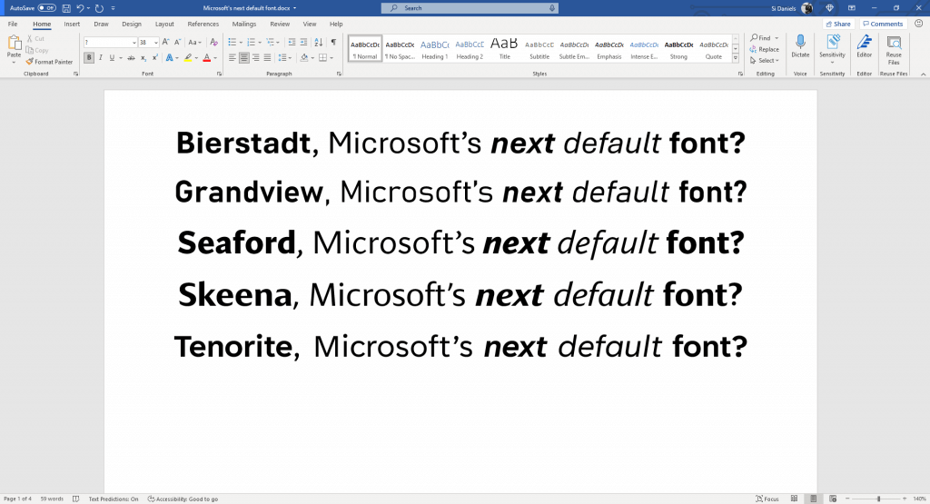
- The names of the fonts are Bierstadt, Grandview, Seaford, Skeena, and Tenorite.
- Here is how they look.
- All 5 fonts were optimized for readability, especially in long documents.
Erin McLaughlin and Wei Huang created Tenorite.
Design style – Traditional
It is very similar with Times New Roman but with a bit more modern.
SkeenaJohn Hudson and Paul Hanslow created Skeena font.
Design style – Inspired by various periods of font design
It comes in different weights and it has very distinct curves on letters like S, A, J.
BierstadtSteve Matteson created the font.
Design style – The author was heavily inspired by the Swiss typography.
The name of the font comes from a mountain in Colorado.
SeafordTobias Frere-Jones, Nina Stössinger, and Fred Shallcrass created Seaford.
Design style – Classic old-style
These designers gathered they inspiration from old armchairs.
It is a super easy to read font and it will be a super fit for long documents.
GrandviewAaron Bell created Grandview font.
Design style – Inspired from classic German road and railway signage.
It was created to be easy to read for long-form reading.
ConclusionsI said it a million times already and I will continue to say it.
The whole world is paying huge attention to fonts, now more than ever.
Apps, websites, software, machines, TVs, and even our mobile phones let us choose the fonts we like more, to adjust font sizes and spacing, colors, and everything else.
China obliges websites owners to make them more friendly for old people and I find this super normal. This is what all website owners should do, no matter if a law is requesting them do that.
In the following years, I bet that we will have the possibility to deeply customize the fonts on all our devices and equipment we use.
I bet that even our fridges will let us adjust at least the font size if not more.

I'm a programmer at heart. But in my 20s, I realized there was more to the world of fonts than just Courier.
Driven by endless curiosity, I built a system to explore them.
That project grew into one of the world’s leading font identifier platforms: www.WhatFontIs.com.
By 2024, WhatFontIs is helping nearly one million designers—famous or not—discover the names of the fonts they need.

