

Serif vs Sans-Serif fonts battle is still going in 2021 and we don’t have a clear winner.
Both fonts have a long history and both represent great options.
People struggle to decide which one should they use in different situations.
Why?
Because both fonts look great.
And no matter how many people you will ask about what type of font to use, serif or sans-serif, you cannot find a clear answer.
To understand why this “battle” exists and to decide a winner, we need to have all the information on the table.
So, let’s start with Serif fonts.
After that, we continue with Sans-serif fonts.
In the end, we will compare the 2 fonts, writing the pros and cons for each.
Serif fontsWhat are serif fonts?
Serif fonts are normal fonts that use ornamental additions to the end of a larger stroke in a letter.
It is that simple.
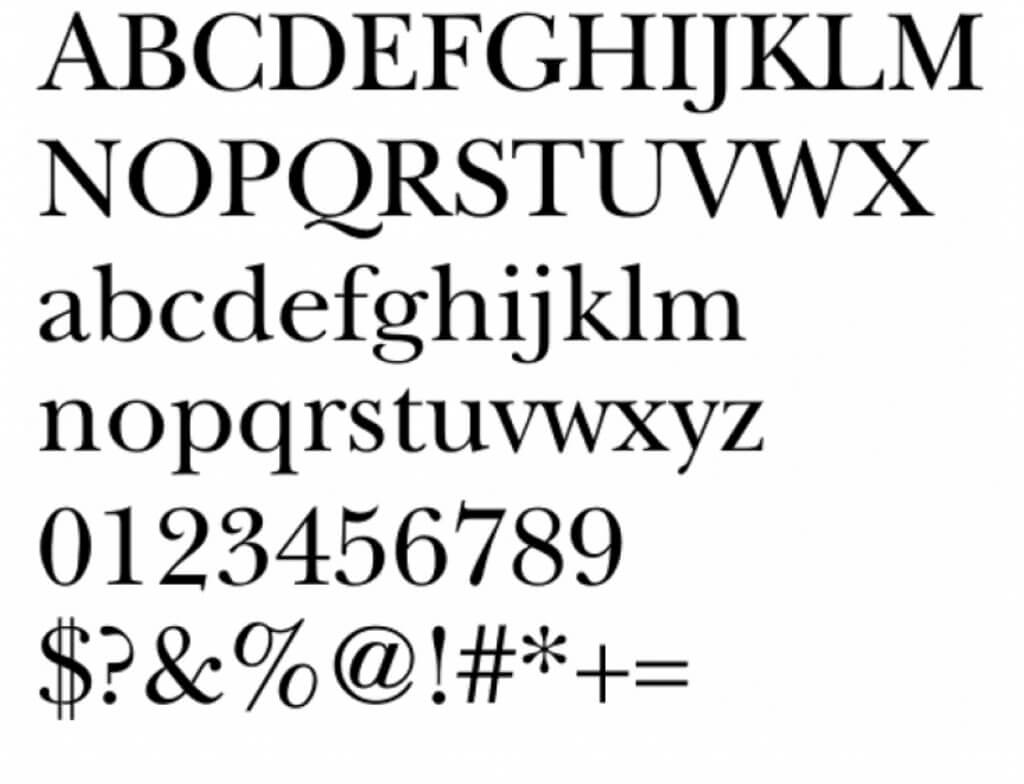
Here is an example of a serif font named Song ASC Traditional Medium font.
There are different types of serif fonts:
Didone serif fonts – People consider these fonts very elegant. Didone fonts are used in aged books having a vibrating style.
Old-style serif – Printing press invented these types of serif fonts. These fonts replaced the Gothic black letters and were much easier to read.
Transitional Serif Fonts – These fonts represent the change between old-style to modern serif fonts. These fonts had more weights, becoming “more” serif than others.
The origin of serif fonts
As written on Wikipedia – Serifs originated from the first official Greek writings on stone and in Latin alphabet with inscriptional lettering—words carved into stone in Roman antiquity.
It is believed that serif fonts appeared in 1830.
Now let’s find out more about sans-serif fonts.
Sans-serif fontsWhat are sans-serif fonts?
If serif fonts are fonts that use all kind of lines and symbols attached, sans-serif fonts are fonts that are not using these additions.
Sans means without.
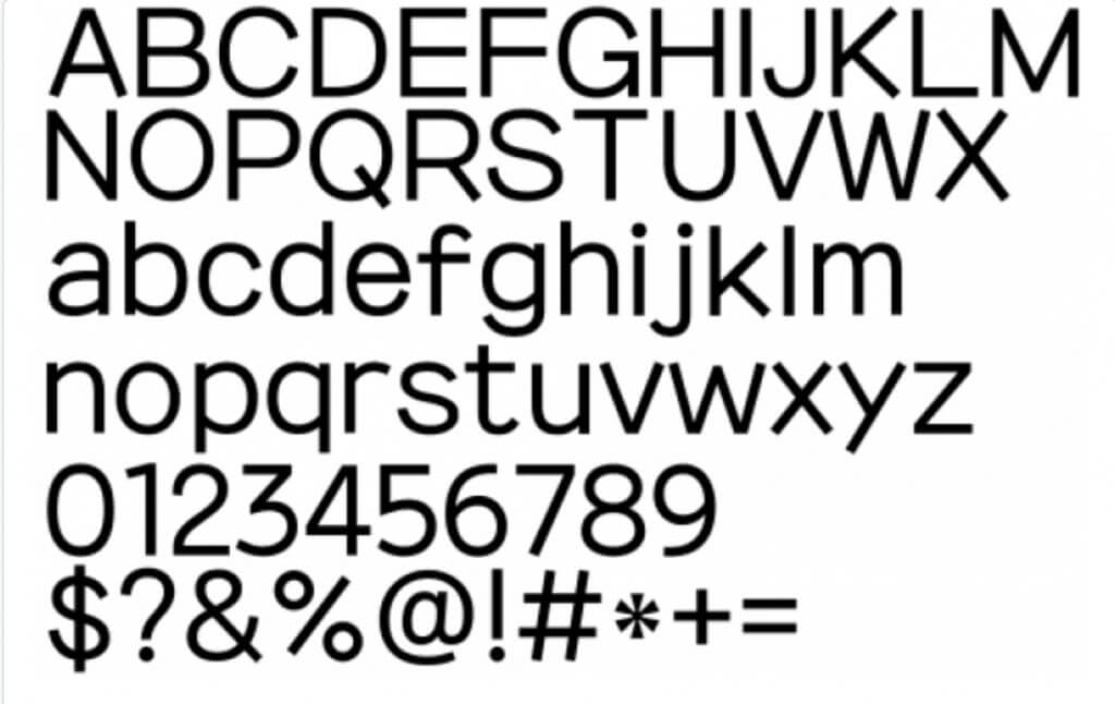
Here is an example of a sans-serif font named 210 Namoogothic Regular font.
Some of the most popular sans serif fonts on the black include Arial, Helvetica, Proxima Nova, Futura, and Calibri.
There are as many sans-serif fonts as serif fonts.
The origin of sans-serif fonts
William Caslon IV designed in 1816 the very first sans-serif font named Caslon.
The font was not popular or widely accepted, considered not a great choice.
When modernism emerged, sans-serif fonts exploded and people started to use them.
Now that we know a couple of things about each font type, let the battle begin.
Serif vs Sans-Serif Fonts BattleThis battle has several fights.
Fight 1 – The pros and the cons for each font type.
Let’s see which are the pros and cons of each font.
The pros and cons of serif fonts
Pros:
Readability
Better for print
Perfect for legal documents, books, special books, documents
Cons:
If used incorrectly, serif fonts can easily destroy designs.
Some serif fonts are way to “accessorized” being very heavy.
Designers focus more on creating sans-serif fonts, being less options for this type of fonts.
Now let’s see the sans-serif font.
The pros and cons of sans-serif fontsPros:
Easy to read on all devices
Great for both headlines and body text
Can be used anywhere
Hard to go wrong with a sans-serif font
Plenty of options, new ones being developed each day.
Awesome for minimal designs
Great for looking casual
Cons:
Ambiguous-looking i and I
The winner – TIE
Fight 2 – Price
Prices are quite similar for both types of fonts.
The winner – TIE
Fight 3 – Availability
I tried to find out how many serif fonts are there and how many sans-serif fonts.
I could not find a clear information.
The winner – TIE
Fight 4 – Font identification
Both fonts are simple to identify using font identifiers like WhatFontIs.
ConclusionsAs much as I wanted to decide the winner for the serif vs sans-serif fonts battle, I couldn’t do it.
Both fonts are great and very similar.
The only thing to remember is to know their pluses and minuses and to use them in your favor.

I'm a programmer at heart. But in my 20s, I realized there was more to the world of fonts than just Courier.
Driven by endless curiosity, I built a system to explore them.
That project grew into one of the world’s leading font identifier platforms: www.WhatFontIs.com.
By 2024, WhatFontIs is helping nearly one million designers—famous or not—discover the names of the fonts they need.

