Why famous logos use simple fonts – the reason is simple and obvious?
Popular brands like Twitter, Google, PayPal, Toyota, Pepsi, Coca-Cola, Apple, and tens others have logos that are more or less super simple: a classic font and a small representative picture.
Some were made with $0 cost, while others did cost hundreds of millions of dollars.
Let’s first understand the context.
How big brands created their logos long-time ago and how much did it cost?Years ago, people were not overcomplicating and overthinking like today. They were people of action, and it was much more important to deliver outstanding quality, always on time, to be there for their customers, and so on.
Where big brands spending hundreds of thousands or millions of dollars like I hear that some companies are doing it today?
Let’s see how much huge brands spent for their logos and who created them Coca-Cola – $0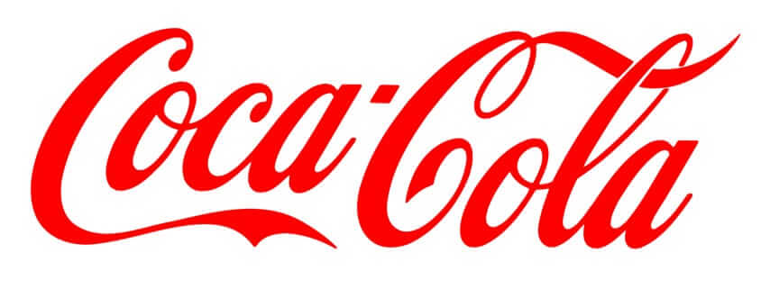
Coke’s famous logo was created by its founder’s partner and bookkeeper, Frank M. Robinson, in 1886.
Google – $0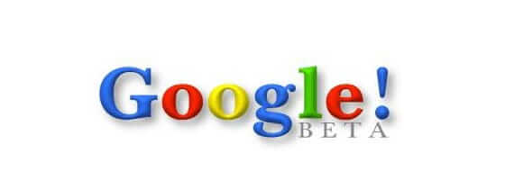
The first and original design was created in 1998 by Google co-founder Sergey Brin on the free graphics program called GIMP. Then Ruth Kedar, a mutual friend of Brin and Larry Page from Stanford, got to work on other logo prototypes.
Twitter – $15
Twitter bought rights to the now-famous Twitter bird for $15 on iStockphoto. How many startups and entrepreneurs have the guts to proceed like this? We all should learn from this and analyze better when we are being asked to pay huge amounts for a logo.
Nike – $35
Nike co-founder Phil Knight purchased the famous swoosh logo from graphic design student Carolyn Davidson in 1971. Knight was teaching an accounting class at Portland State University, and he heard Davidson talking about not being able to afford oil paints in the halls. That’s when he offered her $2/hour to do charts, graphs, and finally a logo.
So as you see, companies were not spending its money on their logos but they were investing in creating better products and services, in expanding worldwide, and so on.
How much are big brands paying now for their logos?There is a huge contrast of how companies created their logos tens of years ago and how much they spent, and how companies created or “upgraded” their logos in the last 10-15 years.
As you saw, 4 of the biggest companies in the world, each being the leader in its domain, spend a total of $50 for their 4 logos that everybody knows and can easily recognize. The logos were created by its founders or by just paying for a stock image.
Now let’s see the opposite corner
BP – $211 millions
According to Stock Logos, BP spent 211 MILLION DOLLARS for its logo design in 2008.
Why? Please let me know why.
Pepsi – $1 million
Arnell Group redesigned Pepsi’s logo to the tune of $1 million in 2008.
So, their main competitor, Coca-Cola, spend $0 for their logo, and Pepsi paid a redesign of $1 million. Is this money well-spent? Pepsi please let us know if it was worth it.
Symantec – no, it didn’t cost over a billion dollars or $1,280,000,000
There is a myth saying that Symantec paid over a billion dollars for their logo. This is not true; they paid this value for acquiring VeriSign. They paid for buying the brand, not for designing a logo.

Symantec has the habit to do rebranding every decade.
They usually pay a couple of millions of dollars for their rebranding and marketing.
Accenture – $100 millionIt was the time when Andersen Consulting and Andersen Accounting parted ways, that Andersen Consulting felt it needed a new logo.
The business also changed its name to Accenture which meant “accent of the future”.
The campaign ran, for the sake of rebranding, was priced at a whopping $100 million. The logo that was launched, as a result of the rebrand, was a simple one with Accenture written in lower case letters.
There was a forward mark on top of the word while the overall look of the logo was kept simple and minimal.
The logo was highly criticized for being simple and vague, however; the company was successful in making profits after the rebrand.
Why famous logos use simple fonts?It doesn’t matter how much you spend to create your logo if your logo cannot be read or easily understood by its viewers. Is as simple as it sounds, no magic here.
As you saw, all these huge brands despite the amounts of money they spend for their logos, understood perfectly that they need simple fonts, that are easy to read. And even more, simple fonts are simple to memorise.
There is a trend today in using only simple fonts.
Here it is one that anybody can create it, even a child.

Yes, it is super simple, super powerful, and it will remain in your head.
Which fonts was used? Be shocked, the font is IMPACT REGULAR – a free Photoshop font.
How much did the logo cost? $0. How much did it cost to identify it? $0.
ConclusionsTo identify any font from any picture, upload it to WhatFontIs and the powerful AI will quickly identify it for you, let you know how much does it cost, let you know where to get it from, and show you over 60 similar fonts, both free and paid.
Whatever logo you need, think first for simple solutions and fonts, it works excellent.
I'm a programmer at heart. But in my 20s, I realized there was more to the world of fonts than just Courier.
Driven by endless curiosity, I built a system to explore them.
That project grew into one of the world’s leading font identifier platforms: www.WhatFontIs.com.
By 2024, WhatFontIs is helping nearly one million designers—famous or not—discover the names of the fonts they need.


