
Spirits are running high in the football scene this late November, in the midst of one of the most interesting Premier League seasons in recent years. We have been lucky to witness some great games, a few very surprising moves and some spectacular goals, but we’re taking this Sunday off to talk about the visuals behind the championship. Of course we’re talking about the fonts used in the official Premier League equipment.
The 2019-2020 season in the Premier League has proven itself to be full of surprises, the cherry on top being the legendary Jose Mourinho’s return to the championship at the helm of Tottenham. Manchester City’s struggle to finally defeat Chelsea, who saw its six-game winning streak come to an end, was another unexpected event.
But, for us, there is nothing quite as interesting as the letters we see during a championship football match. What, you don’t stare at the t-shirts more than at the ball? We certainly do.
The fonts used by the Premier League teams in the 2019-2020 seasons have come a long way from previous editions, some clubs opting to completely revamp their equipment.
We have divided the 20 teams that play in the English championship in two halves. We’ve arranged them alphabetically, just so all the supporters know.
Today, we are going to take a closer look at the first ten teams and their official football gear, focusing on their fonts of choice. Some of typefaces are beautiful and perfect for sports. Some, on the other hand, are simply out of their league.
Premier League fonts: the designers But before we analyze every football jersey we see in the Premier League, let’s linger a few moments with the second, but just as important, championship. Yes, we are talking about the sports equipment giants that designed them.
Adidas is once the absolute winner, with six out of the total 20 Premier League teams wearing its logo on their chests (Arsenal, Leicester, Man United, Sheffield, Watford and Wolver). Umbro put up a good fight and was chosen by four Premier League teams to design their gear, while Nike and Puma share the third spot, each being in charge for the looks of three English football teams. Kappa, New Balance, Errea and UnderArmour were each the official designers for one Premier League team.
Our alphabetical list starts with AFC Bournemouth, whose Premier League equipment was designed by Umbro. As is the custom now, the chest area is reserved for the team’s sponsor, and typically the designers have little rooms for changes. In the case of Bournemouth, the logo was blended in with the teams colours – red and black, the only disruption being the white font of the sponsor. On the back, Umbro chose a simple, sans serif font (as opposed to the front one), focusing on height and legibility. They chose the same colour – white – for writing the player’s names on the Premier League official jerseys.
Adidas din not have an easy job at the helm of Arsenal’s Premier League equipment. The chose three very different options for the official Premier League games (Home, Away and Third), each with a completely different colour scheme. While the home equipment features the traditional white and red, the away is a pattern yellow, while the third option is a deep navy blue. The font chosen for the back of the jerseys had is a bespoke one, although very minimalist. Simple, clean and neat lettering that will blend with the three different styles.

Aston Villa had their equipment designed by Kappa and their two main options (Home and Away) have the same colour scheme – light blue and garnet. They had to follow the official Premier League guidelines for the front of the shirts – which basically mean the center is kept for the sponsor’s logo, the upper right side for the team’s coat of arms and the upper left for the sports equipment brand. The back, on the other hand, is where designers have a bit more wiggle room, and Kappa chose a wider font for the player’s name on the Premier League equipment. The spacing is also highlighted by the curved lettering.

Brighton & Hove Albion is the first team on our list with equipment designed by Nike. They decided to use only the two official club colours – white and blue, but their design stand apart from the other Premier League teams due to its thin lettering chosen for the names and extra large font size used for the each player’s number. This look is augmented by the white background colour of the shirts.
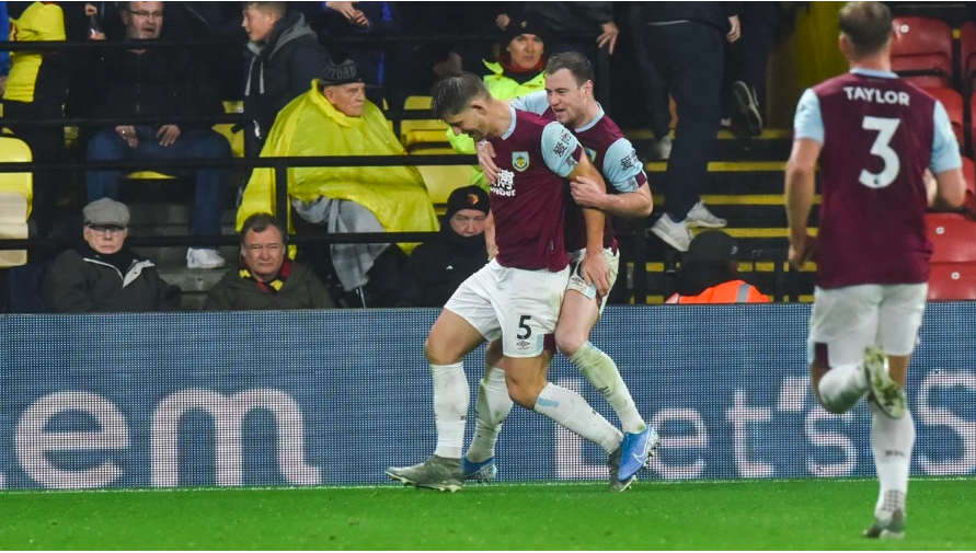
Which brings us to Burnley and one of the best examples on why teams need at least two options for their Premier League equipment. The club’s colours are light blue and garnet – yes, just like those of Aston Villa. Umbro had the task of figuring this out, and they did by creating the Away jersey with opposite proportions between the two colours. The third is a deep green combined with black. This allowed for a simple, taylored font for the lettering on the back, which perfectly complements the font used for the player’s numbers. That one is a bit more intricate, combining sharp angles with round lines.
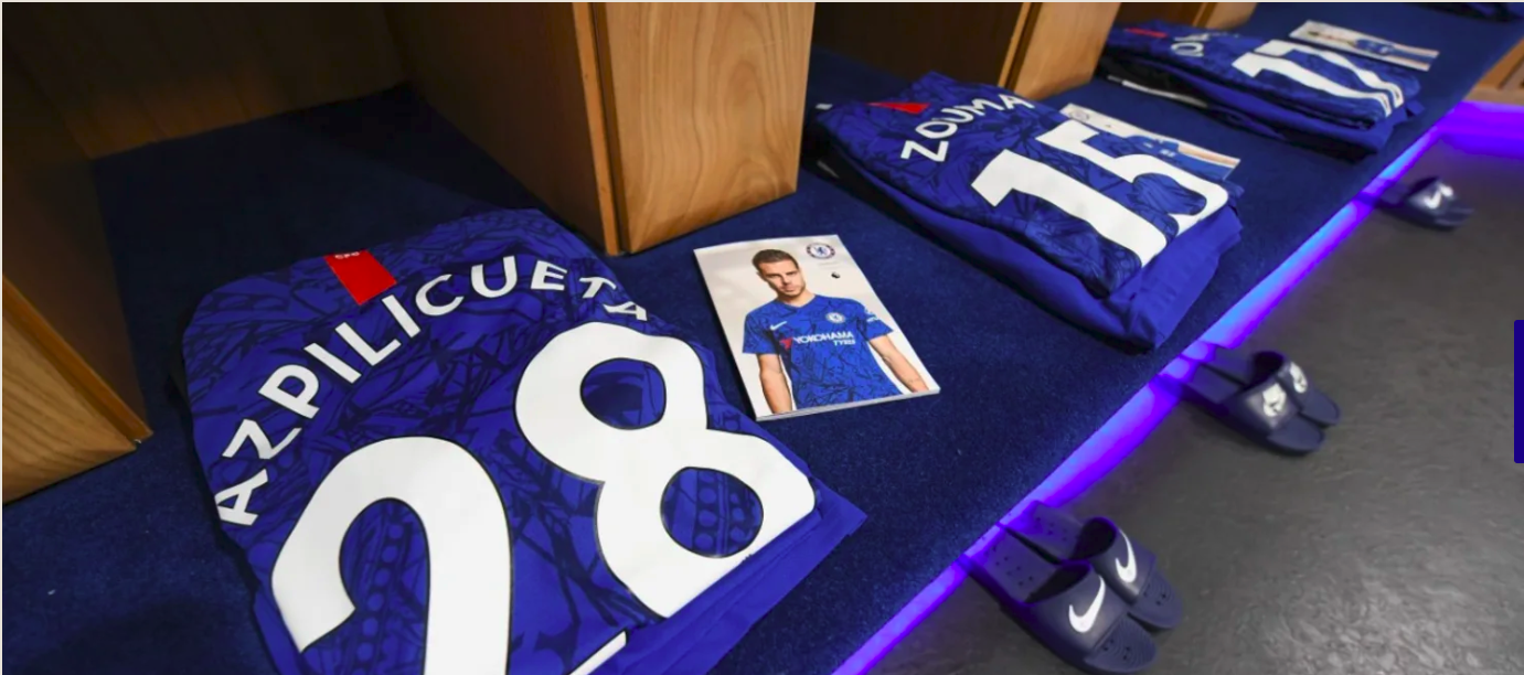
Chelsea went ahead with Nike for its official Premier League gear. The sports designer had little room to play with the overall look – after all, the team is known as ‘the Blues’, so a blue patterned colour had to be the only choice. They paired it with white lettering on both sides, deciding on a tall and wide bespoke font on the back. This is a choice many designers have made in recent years, after some very public design fails went viral and player’s name were simply impossible to read because of the bad fonts.

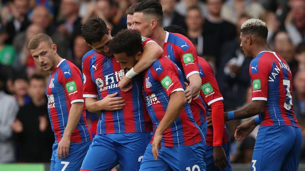
Crystal Palace is the first team on our list that had its equipment designed by Puma, who had the strenuous task of blending in no less than five colours – two of the club, three from the sponsors. So, obviously, their choices for the font on the back side were extremely limited. They opted for a clean, thin font, written in white. Also, they had to go extra wide on the spacing, making sure the font is legible.
Umbro was also in charge of designing the official Premier League equipment for Everton. In order to avoind another case of mistaken identity, Umbro decided to break the blue patterned colour scheme with white shorts and different lettering. The font chosen for the player’s names is simple, sans serif, but its formatting raised a few eyebrows. They decided agains the traditional arch in which the names are written in between the player’s shoulder, thus having less space and being forced to use a very narrow font. This also limited the height, resulting in a rather small font size.

Leicester City‘s Premier League equipment was designed by Adidas and the designer went all out on this one. A complete revamp of the old equipment was called for, so Adidas came up with three bold choices. The first combines the club’s main colours, blue and yellow, but with a modern spin, opting for gold and a deeper shade of blue. The Away and Third equipment options are dark gray and pale pink – they both look amazing. Adidas also decided against the arch on the back, instead compensating for the narrower space with a thinner font.
Finally, Liverpool‘s gear was designed by the rather new kid on the block when it comes to dressing up football superstars – New Balance. It was another case where the designer had three very different colour schemes on their hands – red and yellow, white and black, black and teal. Their option for the numbers on the player’s backs was a rather intricate, fragmented and shadowed font.

Make sure to check out the WhatFontIs Blog next week to see the second part of the Premier League fonts champions. Until then, take a look at the fonts used by the football teams during the 2018 FIFA championship or, if you are not into soccer, check out the fonts used in the NFL!
Passionate about fonts or just looking for a quick solution for your lettering woes? WhatFontIs.com provides a catalogue of over 550.000 fonts that you can browse until you find the one that fits you just right.
Also, make sure you check the Blog Section – you might get that cool idea that will help you better define you visual identity.

I'm a programmer at heart. But in my 20s, I realized there was more to the world of fonts than just Courier.
Driven by endless curiosity, I built a system to explore them.
That project grew into one of the world’s leading font identifier platforms: www.WhatFontIs.com.
By 2024, WhatFontIs is helping nearly one million designers—famous or not—discover the names of the fonts they need.

