

Google redesigns “search” with colors and better fonts in the very near future.

Joseph Johnson from Statista says: “As of the fourth quarter of 2019, 49 percent of Yahoo’s U.S. organic search traffic originated from mobile devices. Google had the highest share of organic mobile search traffic with 61 percent, slightly ahead of DuckDuckGo with 58 percent.”
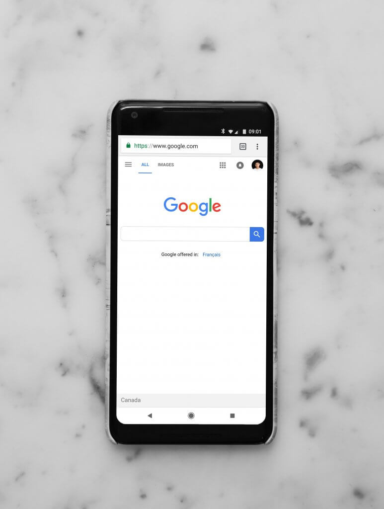
So half of the devices are mobile phones. It is easy to see why Google pays such an important attention to its search engine. Everything has to be perfect.
Google will make use of colors, and larger and bolder text fonts to help users have a better and easier reading experience. They never stop improving their famous search engine and we all win from that, including them.
The fonts that are being planned to use are the very same ones that are already in several Google products, but also in Android and Gmail.
But how will Google use colors to enhance the user experience? It is interesting that their logo is colorful and that now they will use colors to help us have a better experience when using the search engine from our mobile phones.
I am very curious to see how colors will be used. For sure their idea will inspire tons of other projects.
Aileen Cheng, a designer at Google said:
“We wanted to take a step back to simplify a bit so people could find what they’re looking for faster and more easily. I find it really refreshing. We want to let the search results shine, allowing people to focus on the information instead of the design elements around it,”
“Rethinking the visual design for something like Search is really complex,”
“That’s especially true given how much Google Search has evolved. We’re not just organizing the web’s information, but all the world’s information,”
“We started with organizing web pages, but now there’s so much diversity in the types of content and information we have to help make sense of.”
“We want to let the search results shine, allowing people to focus on the information instead of the design elements around it,”
“We’re making the result and section titles bigger, as well,”
Even more changesColors and fonts are not the only changes.
Google will use clean backgrounds to make sure users can focus on their task, and not on heavy backgrounds.
If they do that, why are we still seeing lots of websites with complicated, crowded, and heavy designs? We should all learn something from Google and other huge corporations that know very well what they are doing.
ConclusionsEven if Google is by far the most used search engine in the world, they invest massively to not only keep their position, but to still gain market points.
Whenever the competition is powerful, and this is the case also here, we, the users will win the most.
Google Redesigns “Search” With Colors And Better Fonts
I am 150% sure that when Google will redesign its “search” for mobile phones with colors and better fonts, the user experience will be much better than it is today. And let’s be honest, Google is super simple to use and extremely efficient.
Just try to remember some years ago, how hard was to find what you were looking for on Google and other search engines. Even now, try to find something on Yahoo. They are lightning fast behind Google and this is sad. Yahoo was the first in the industry, at least before BackRub (Google’s first brand name).
But anyway, let’s see the Google “Search” mobile redesign. I bet you are as curious as me.

I'm a programmer at heart. But in my 20s, I realized there was more to the world of fonts than just Courier.
Driven by endless curiosity, I built a system to explore them.
That project grew into one of the world’s leading font identifier platforms: www.WhatFontIs.com.
By 2024, WhatFontIs is helping nearly one million designers—famous or not—discover the names of the fonts they need.

