Print ads are easily overlooked in today’s time due to social media. However, the print ad is still as applicable and competent as vintage posters ever were. Whether they are small magazine ads or huge billboard ads they still work.
We are continuously seeing advertisement examples in our daily lives.We see media adverts online, in print, on billboards or on television screens. In fact, studies showed on average we see 362 ads per day (not including brand exposures) but an impression is made by only 3 percent of these advertisements. Only twelve ads a day grab our attention.
So how do you get through the advertising chaos and create a memorable advertisement for your intended audience? First, come up with a solid concept and then consider your design. Paying attention to your layout and presentation will help your ad get observed, but paying attention to concept and creativity will help your ad be retained.
Kentucky Fried Chicken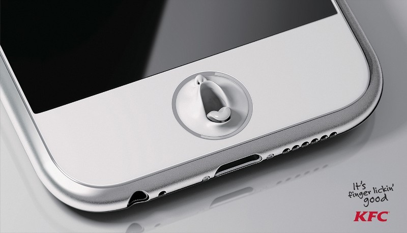
Finger-lickin’ good is one thing everyone knows about KFC. A series of annoying print advertisements was inspired by this undeniable fact. In these magazine advertisements, anywhere your fingers may touch everyday objects suddenly grow mouths, in the hope of licking off a little of the Colonel’s goodness. Lamano Studio in Chile and Zane Zhou creates these cool ads, so they might stick in our minds and it works. Thanks for tonight’s nightmares, guys.
Heinz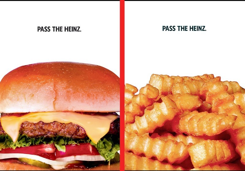
If you recognize these creative magazine ads for Heinz, there’s a good reason. They were originally seen in an episode of Mad Men. Don Draper tried to set up a series of magazine ads that featured foods that go great with ketchup but without the ketchup being visible. Heinz did not go for it when Draper argued that people would fill in the blanks and create a strong affiliation in their mind. However, today, Heinz has produced the almost exact reproduction of Draper’s idea with David Miami. Draper was a man ahead of his time.
Sticky Ad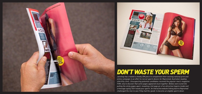
In Australia, a fertility clinic placed an ad in FHM that caused the magazine’s pages to stick together. When unstuck, the pages showed a woman posing in lingerie, along with the line, “Don’t waste your sperm.” The message is to donate your sperm at the Repromed fertility clinic instead.
Burger King or BK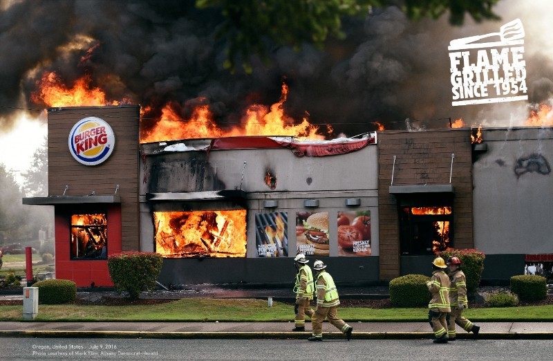
We know that fire can misbehave if you do not keep a good watch on it. Even though Burger King prides itself on flame-grilling its burgers, Burger King holds the record for the most restaurants that have burned down since 1954. This the brilliant angle used by David Miami in one of Burger King’s best advertisements. He uses actual photos of blazing BKs to highlight how BK cooks its burgers.
Dating Wall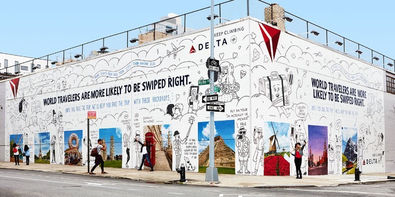
What if you do not have the means to get away to snap that perfect profile picture? According to Delta, world travelers are more likely to attract right swipes on Tinder. That’s what Delta – along with Wieden + Kennedy New York and Colossal Media– addresses with the Delta Dating Wall. These are popular ads from Williamsburg, Brooklyn, featuring alluring backdrops that you can stand in front of for a selfie. This will immediately make you a lot more exposed and interesting.
Chambord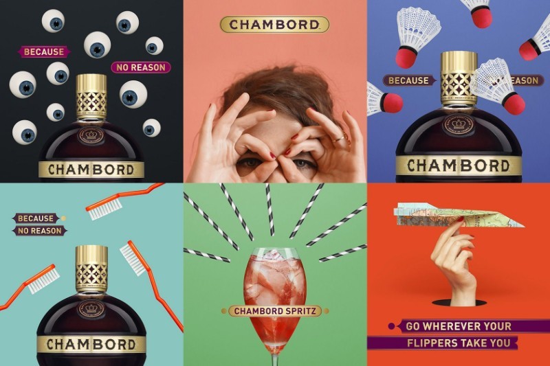
Wieden+Kennedy London was entrusted with boosting the profile of Chambord among a target audience of women aged 24-35. It used the popular advertisements to push back against the pressure on women to comply to certain rules with its “Because No Reason” tagline that reassures people to do what they like, just because they like it.
TK Maxx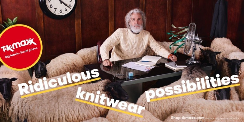
When you go shopping at TK Maxx, you never know what you will find to buy. This prospect of the designer discount store is brought ahead by these best print ads emphasizing the “ridiculous possibilities” that lie inside.
Jeep Automobiles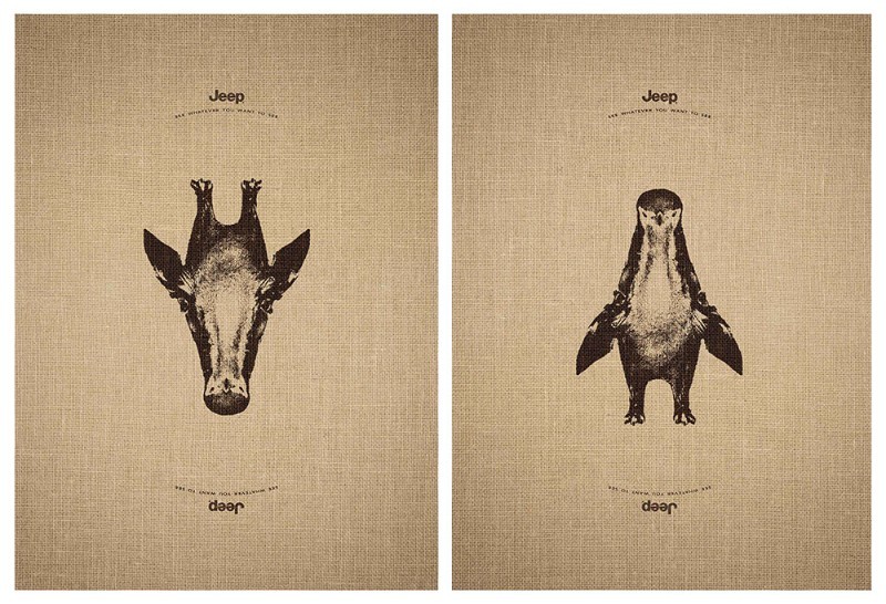
By using a series of pictures that can be seen in more than one way turns the meaning of the tagline “See whatever you want to see” on its head. In one way you might see a deer, the other way might see a penguin. These are good advertisements.
Penguin
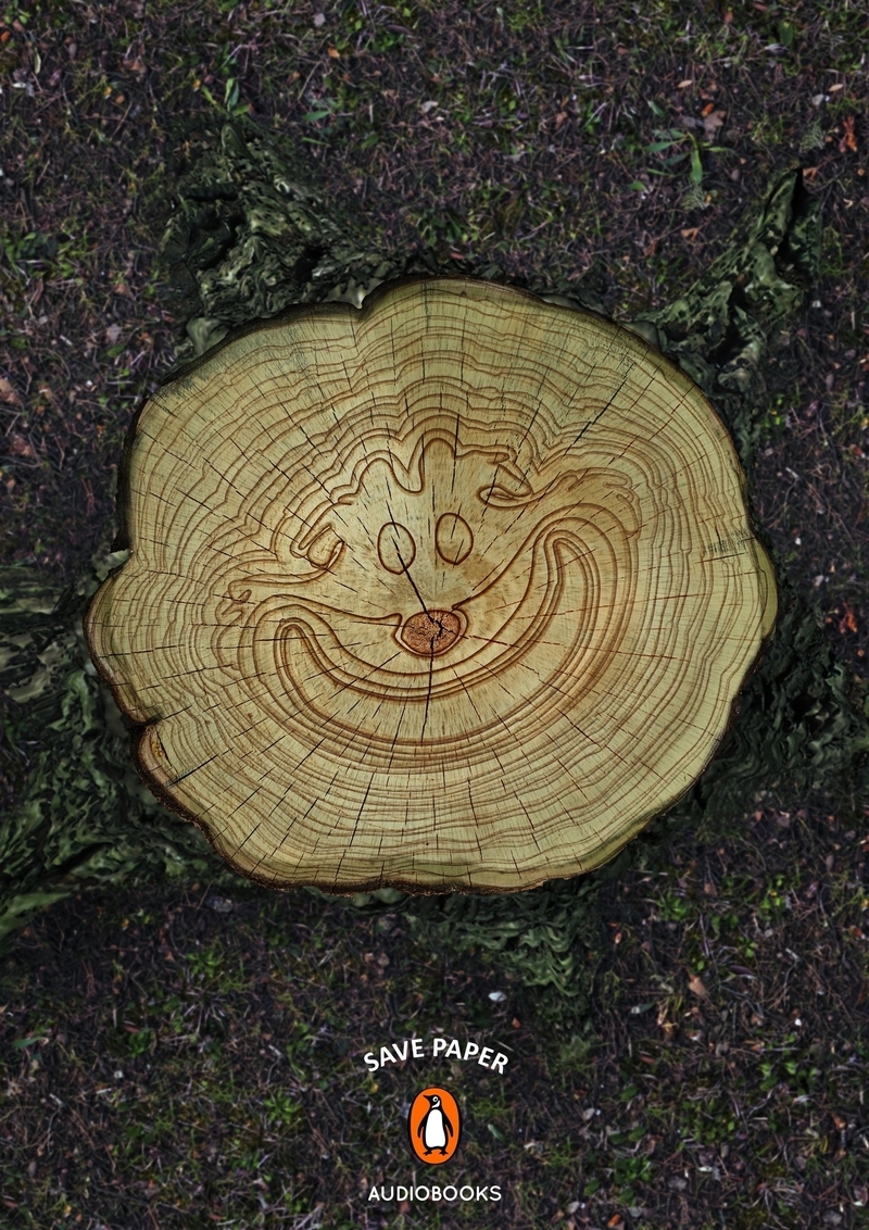
The Miami Ad School did a great job with this print. They took a company that has made their worth through selling paper books and created this print ad that is a bold step but one that works well. The complex illustration in the bark is an admirable touch.
Gripex
This is a clever print advertisement for allergy medicine that Ogilvy & Mather designed. They have once again proved themselves as print advertisement masters. They use simple yet adequate colors and illustrations that make this an ad that pops from the page.
UNEP: Skyline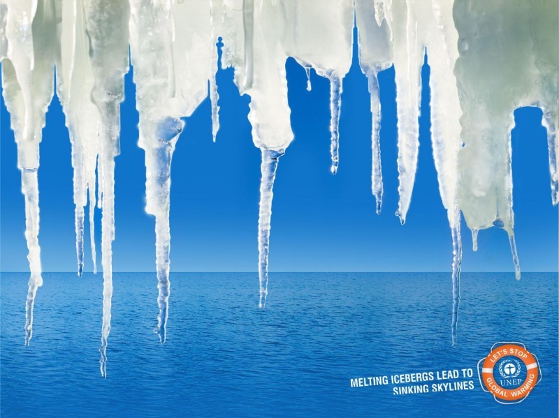
Important causes such as global warming raise awareness by using striking print advertisements. This advertisement from Vinay Saya and Siddarth Basavaraj cleverly photoshops a skyline within the ice. Bringing the ad campaign closer to home will let the viewer identify the message quicker and efficiently.
Fevikwik Instant Adhesive: Teapot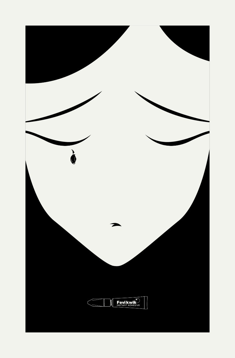
Some of the best print ads of the world are created by Ogilvy & Mather. This is just another example of their brilliant work. Created for Fevikwik Instant Adhesive, they use a monochrome color scheme to its fullest potential. It’s one of a three-part print advertisement series that uses ingenious design.
Your audience will look twice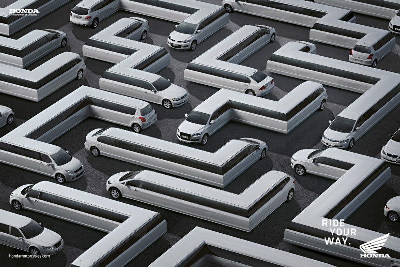
Nobody likes bumper-to-bumper traffic – except perhaps motorcyclists who can dodge and weave through trucks, cars, and buses like a maze. This idea is captured by Honda Motorcycles in a series of print ads that shows an assortment of vehicles distorted and laid out like a maze.
Animals used to send an important message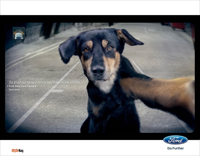
A dog taking a selfie? Not exactly. This famous advertisement by Ogilvy Istanbul is for Ford’s Rear View Camera and it shows a dog looking right into the camera – in conclusion, right out to the audience – to bring feeling and emotion to a significant message.
The Test-Drive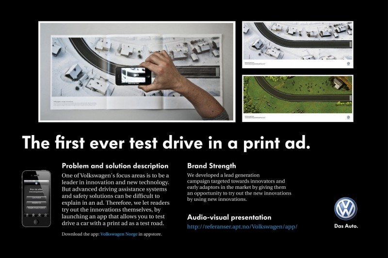
This Norwegian ad for Volkswagen shows a long stretch of road both in summer and winter scenes. It tells readers to download an app that lets you simulate driving a car on the road by hovering your iPhone over it. You can test three diverse features of the vehicle—lane assist, adaptive lights and cruise control.
Rolling Stone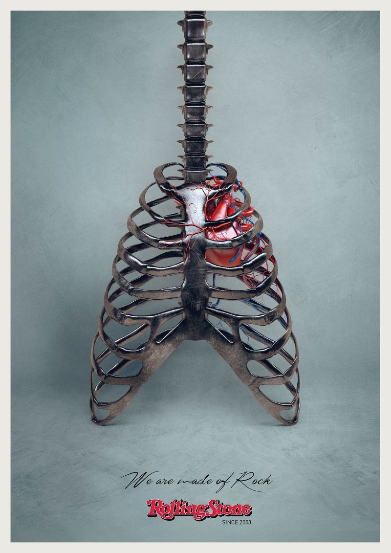
Created by DLV BBDO in Milan, Italy, this meek implementation works wonders for music magazine Rolling Stone. With an intense tagline like ‘We are made of rock,’ the brand’s attitudes, merchandise, and philosophy are naturally put across with this print advertisement. Using a signature-like font also showcases the rock star artistic view.
Ending thoughts on magazine adsDid you observe that the taglines and advertisement images are personally connected in nearly all these print ads? It reveals the status of starting any print ad or campaign with a strong impression. So, to make an impression think concept first, advertisement design second, and you’ll be on your way to making an ad that audiences observe, remember, engage with, and most importantly, acts on.
If you enjoyed this article about magazine ads, you should read these as well:
- Graphic design posters: Tips for creating amazing poster designs
- Typography terms and rules that every designer should know
- Free script font examples that you should check out

I'm a programmer at heart. But in my 20s, I realized there was more to the world of fonts than just Courier.
Driven by endless curiosity, I built a system to explore them.
That project grew into one of the world’s leading font identifier platforms: www.WhatFontIs.com.
By 2024, WhatFontIs is helping nearly one million designers—famous or not—discover the names of the fonts they need.