
The final weekend of November is setting up to be a full one for football fans, with the Premier League finishing up its 14th week, with five matches sure to fire up your team spirit Saturday and Sunday. Until then, we’re continuing our analysis of the fonts used in the official Premier League equipment.
Newcastle United and Manchester United are launching the first shots this weekend, followed shortly after by Tottendham vs. Bournemouth, Chelsea vs. West Ham United, Liverpool vs. Brighton and, on Sunday, Norwich will face Arsenal.
So you have your pick of great football teams competing against each other in the 2019-2020 season of the Premier League. And so do we, when it comes to awesome professional football equipment.
We started the week by analysing the fonts each team used for their jerseys and had quite a few surprises. Well, the truth is, most of the times, the teams just approve – or not – the designs and ideas presented to them by their equipment designers. Because this is the Premier League we are talking about, that means the biggest sport attire producers in the world. If you missed the first episode, you should check it out. It contains all the details about the equipment used by the half of the Premier League teams – we divided them alphabetically: AFC Bournemouth, Arsenal, Aston Villa, Brighton and Hove Albion, Burnley, Chelsea, Crystal Palace, Everton, Leicester City and Liverpool.
So, today, we’re focusing our attention on the fonts used by Manchester City, Manchester United, Newcastle United, Norwich City, Sheffield United, Southampton, Tottenham Hotspur, Watford, West Ham and Wolverhampton Wanderers.
As we said before, the designers plays a crucial role in deciding which font a Premier League team uses. For this season of the Englich Championship, Adidas is the absolute winner, with six out of the total 20 Premier League teams wearing its logo on their chests (Arsenal, Leicester, Man United, Sheffield, Watford and Wolver).
Umbro is the second favourite sports designer, chosen by four Premier League teams to design their gear. Nike and Puma share third place, each being in charge for the equipment of three English football teams. Kappa, New Balance, Errea and UnderArmour were each the official designers for one Premier League team.
Today’s list of Premier League teams begins with Manchester City, whose equipment was designed by Puma. The three options (Home, Away and Third) of Manchester City’s official kit for the championship have absolutely nothing to do one with the other. Puma came up with three completely different designs. Just the first one, a bit more traditional, keeps the official light blue colour of the football club. The other two options are much bolder – one combines black with yellow, while the third is a combination of neon colours – bright green and pink. Puma decided to use the same font on all three options, a round, tall font that blends in beautifully with the sponsor’s logo.

Manchester‘s United kits were designed by sports mammoth Adidas, who had their work cut out for them. They had to find a way to integrate not just the name of the sponsor on the Manchester United Premier League jerseys, but also the car maker’s logo. This reduces quite a lot the options for a design, but Adidas decided to work around it by choosing a complementary colour scheme – a deep red for the Home kit, a nude and black option for the Away version and a black and white kit as the third option. All of them go well with the golden logo on the players’s chests. The font used in the Third kit is the most interesting for us. Adidas decided to play it traditional by arching the lettering on the backs of the players, while combining it with an extra bold font for the numbering, something reminiscent of american football.

Newcastle United had their Premier League official kits designed by Puma for the 2019-2020 season, which came up with a striped black and white design for the Home kit and a deep green one for the Away design. The Home kit is complemented by a bright red font on the back, both for the names and numbering. The font, however, has another ace up its sleeve: its design includes a double white outline, that helps pop the thin and tall font used for the names, while also better highlighting the numbers, also written in a rather thin option than the traditional bold.

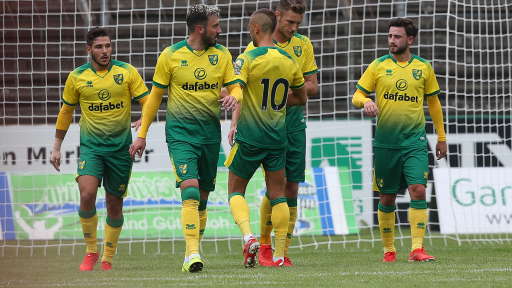
Norwich City is the only team in this season’s Premier League that decided to have its official equipment designed by Errea. The sports producer came up with a rather vintage look for Norwich City’s jerseys, the Home kit featuring a the traditional yellow and green colours of the football club, while the Away option is designed in a bright red and a neon yellow. The third option is the tamest and the most modern of the designs, in a dark grey colour. The font chosen by Errea might have something to do – a lot, actually – with the previous one used by Norwich, which was a bit too much – the black lettering was filled with a white line composed of bubbles. So, this season, the black font is simple, neat and clear, on the tall side, thin, with round lines.
Sheffield United also decided to completely revamp its official Premier League kits and chose Adidas to do it. The Home kit is, just as one might expect when it comes to Sheffield, black, white and red, with striped shirts and solid black shorts. Another particularity is that the back side of the jerseys are also designed in a solid colour. Adidas did this a couple of years ago with Newcastle’s equipment. So, this time the red backs of the players are complemented by a simple, bold font. The away version features the same font, a move that was easy to pull given the fact that the second kit has the same colour scheme – black, white and red.

Southampton‘s Home kit bears a problematic resemblance to Sheffield’s. Their official Premier League equipment was designed by Under Armour and it is striped in white and red, while the second option combines black and a golden shade of yellow. The font chosen by Under Armour is a tall, thin lettering for the names, bowed in a classical arch. That goes well with the intricate font chosen for the numbering, opting for an almost cursive font, with script-like strokes.

Tottenham Hotspur Premier League official kits were designed by Nike and are a complete overhaul of the previous jerseys. The designs chosen for the 2019-2020 season of the English championship are far more modern. The Home version is white with blue details, which reminds us of vintage football memorabilia, while the Away kit is navy blue, with a pattern fabric on the upper side which gives it some metallic highlights. The fonts chosen by Nike are from the same golden age of football inspiration Nike drew on, with simple, tall characters that combine magazine cut sharp angles with round details.

Watford brings the fourth black and yellow combination among the Premier League teams this year. At the helm of their kit’s design was Adidas, who decided on a solid block combination of the two colours. In addition, the sports equipment producer included a bright red for its emblematic three stripes that cross the players shoulders, thus making use of all the official colours of the football club. The font is in the same shade of red, with a thin white outline to really make it pop.

Umbro went all traditional for West Ham‘s official Premier League kits, choosing an all white option for the Away games and a light blue and garnet for the Home ones. This is by far the most used colour scheme in this year’s Premier League season, but don’t be quick to judge. The truth is that blue and garnet are actually the most popular traditional colours of English football clubs. The font used for the lettering is clean and simple, on the thin side, even a little short. The font used for the numbering, however, makes a beautiful use of a bold option, with a nice overlapping effect for its lines.

Wolverhampton Wanderers end our Premier League fonts series, but they do it in style: the team brings the first orange kit of the season, designed by Adidas for their Home equipment. The Away kit is black with yellow details, while the Third option is a solid deep green. The fonts used also bring us the most intricate typeface of this year’s Premier League fonts. An extra bold option, simple for the lettering part, but fragmented by sharp angles on the lettering.
We hope you liked our Premier League font series. We would love to hear your feedback, so comment below!
Make sure to check out the WhatFontIs Blog next week!. Until then, take a look at the fonts used by the football teams during the 2018 FIFA championship or, if you are not into soccer, check out the fonts used in the NFL!
Passionate about fonts or just looking for a quick solution for your lettering woes? WhatFontIs.com provides a catalogue of over 550.000 fonts that you can browse until you find the one that fits you just right.
Also, make sure you check the Blog Section – you might get that cool idea that will help you better define you visual identity.

I'm a programmer at heart. But in my 20s, I realized there was more to the world of fonts than just Courier.
Driven by endless curiosity, I built a system to explore them.
That project grew into one of the world’s leading font identifier platforms: www.WhatFontIs.com.
By 2024, WhatFontIs is helping nearly one million designers—famous or not—discover the names of the fonts they need.

