
Find below useful and easy-to-implement information about how to pick the right font for your product packaging.

This guide is quick and simple to follow, even if you prepare to launch your first product and you will work for the first time on your product packaging.
Get yourself a coffee and get comfortable, you will enjoy this article.
Fonts matter a lotThe font you will use is part of the product design, so you should carefully pick one that suits you perfectly. This is a process that takes a bit of time and trial, but it is totally worth it.
When you launch a product, everything should be perfect, especially the packaging.
People quickly scan products and they start to analyze products they know or they heard about or products that are interesting.
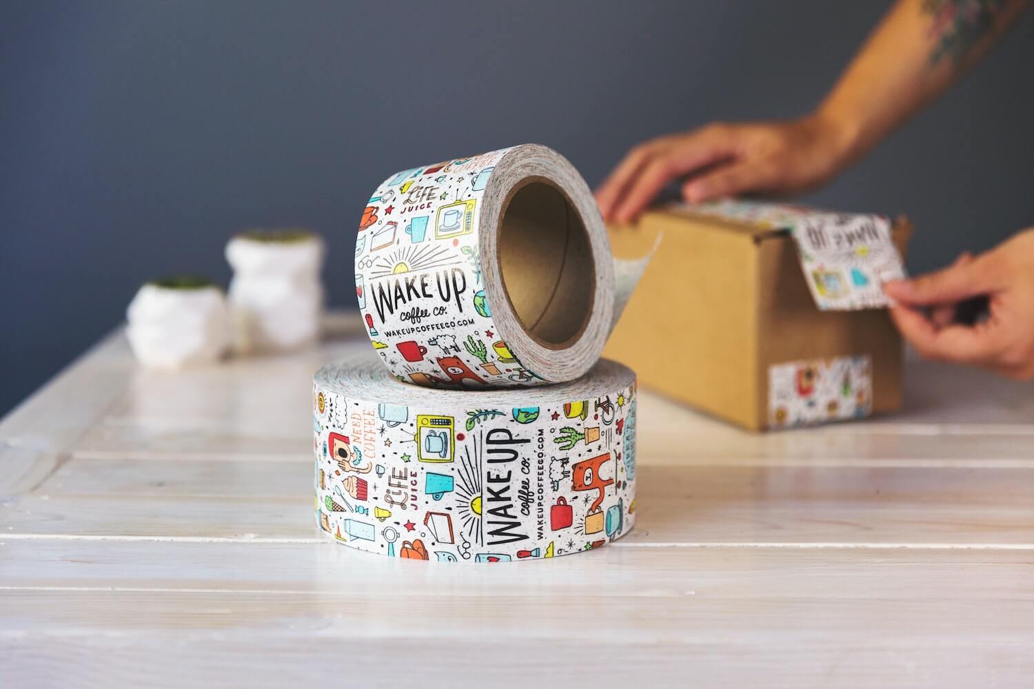
To have an interesting product, you need creative and nice packaging.
Part of the “nice” packaging is the font you will use.
This font should work excellent with your product, with the packaging, with your brand colors, style, and feeling.
So you need to know how to pick the font for your product packaging, right?
Here is what you need to know.
Picking the right font for your product packaging is simpler than it soundsHere are all the tips or rules that you need to follow.
Avoid “bad”, “toxic”, or “racist” fonts
Are there bad and toxic fonts? Yes, there are, here are some examples:
- Comic Sans
- Impact
- Papyrus
- Bradley Hand
- Courier
- Copperplate Gothic
- Brush Script
- Times New Roman
- Gill Sans
Some of these bad fonts were used incorrectly or they are well too popular.
Fonts are all good when used correctly.
People hate these fonts and if they see such fonts on your product packaging, they might unconsciously refuse to buy.
Best is to avoid these fonts, there are millions of fonts out there, and for sure you can find great options.
Serif or sans-serif fonts?You can use both serif and sans-serif fonts, just have in mind that you need a font that is easy to read.
Do lots of tests and ask for feedback from your family and friends.
Should you combine more fonts?Yes, you can combine more fonts but try to use maximum of 3 fonts.
One for headings, one for paragraphs, and one for special notes on your product packaging.
If you can stick with 2 fonts, it is even better.
Font sizeBefore picking a font for your product packaging, check how it looks with on the size your need it.
Some fonts look great in large sizes but not so good when the text is small.
Font weight is again very importantFont weight represents how bold or light your text will appear.
There are fonts with just a few font weights while there are also fonts with many weights to choose from.
Have in mind that many times you will have to buy each font-weight you need.
EmotionIf your product is related to childhood for example, you can pick a font that revives those times and emotions.
Emotion plays a huge role in every single part of our lives, use it correctly and you will feel its power.
Do tests and try many different fonts before deciding to oneNever rush the font selection process.
Take your time and see what your product packaging looks like with all the fonts you like, and in different sizes, colors, etc.
InspirationSee what fonts are used on all the products packaging you have in your house.
Inspiration is always useful.
ConclusionsPicking the right font for your product packaging is not complicated, follow these simple tips/rules and you will do just fine.

I'm a programmer at heart. But in my 20s, I realized there was more to the world of fonts than just Courier.
Driven by endless curiosity, I built a system to explore them.
That project grew into one of the world’s leading font identifier platforms: www.WhatFontIs.com.
By 2024, WhatFontIs is helping nearly one million designers—famous or not—discover the names of the fonts they need.

