
A new royal wedding is just around the corner. Princess Beatrice of the United Kingdom just announced she got engaged to real estate mogul Edoardo Mapelli Mozzi. Well, even if your significant other doesn’t propose on the sunny coasts of Positano, with a 2.5 carat diamond, you can still plan your nuptials like a royal. First step: finding the perfect fonts for the wedding invitations.
Planning the day of your dreams is a daunting task, even without taking into account all of your partner’s side of the family. Try to make it easier on yourself by setting the right tone from the very beginning: the wedding invitations. It’s the first written statement you’re sending out there about your relationship and your big day. It has to look perfect.
In the case of Princess Beatrice, things tend to be sorted out when you have all that Buckingham Palace stationary lying around. You just grab the first crown-and-lions inscripted piece of paper and it already looks noble. The fact that Princess Beatrices’ engagement photos are from one of the most beautiful spots in Italy, Positano, also helps to that effect. Not to mention her unique, designer engagement ring, with a diamond that cost about 120,000 dollars.
Well, setting aside these small details, we guarantee that your big day can be just as posh if you pick out the best font for the wedding invitations. Keep in mind, this is one of the first things you have to do in your planning, so it might be a good idea to prioritize it and leave the decisions about flowers and whether or not to have your third cousin in the bridal party for later.
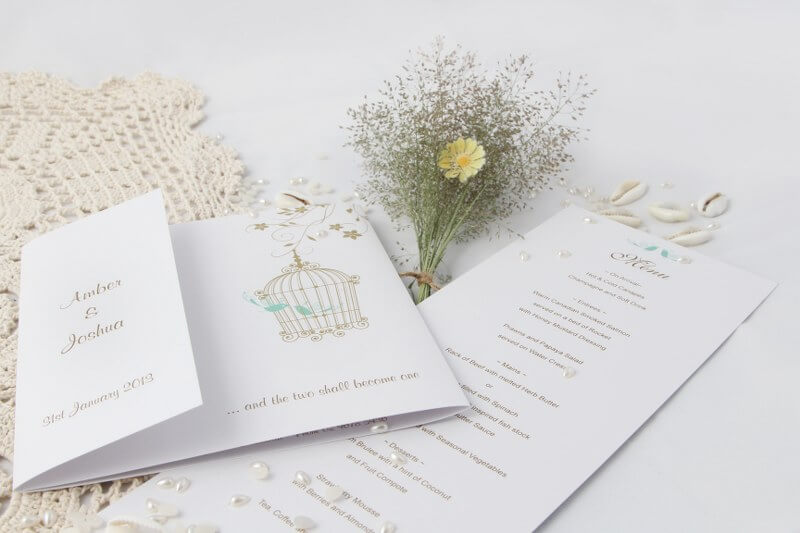
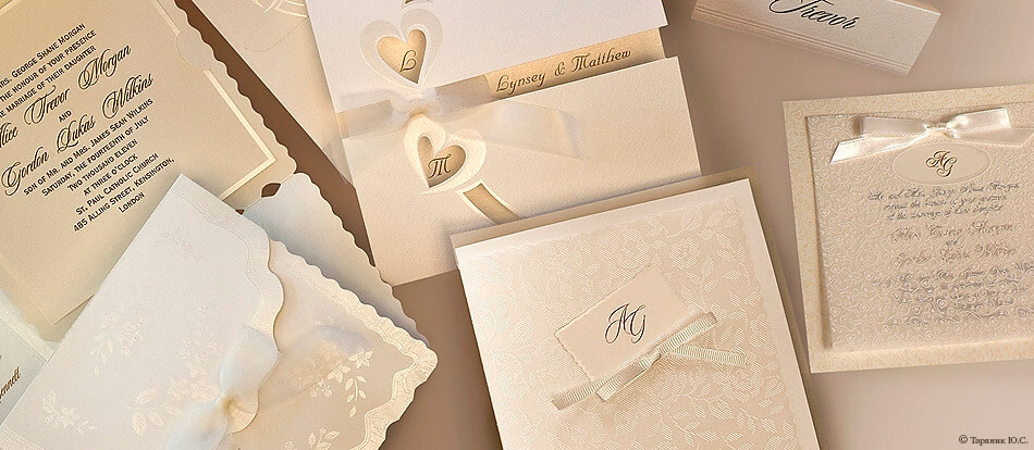
Finding the right font for wedding invitations may seem simple. A lot of people count on the quality of the paper or small decorations in the design to be the eye-grabbers. But there is no amount of white doves, intertwining heart-shaped vines and golden rings that can distract your guests from an unfortunate wedding invitation font. Just imagine if you got a fancy invite to someone’s wedding and recognised the font from the Domino’s menu.
As a general rule, don’t go for the default options from the store. Chances are their bestsellers are used by every other couple. Do you think Princess Beatrice would ever use a font for her wedding invitations if she even suspected it’s the same font used by Kate or Meghan? Exactly. So, do your homework independently. Also, keep in mind that you can tweak the font you chose for you wedding invitations. We’re not saying to design your own (actually advise against that, to be honest), but if you happen to fall in love with a wedding font that is still just a little to thin or too short, you slightly alter it until it’s perfect. Letter heights can be stretched to a certain degree and also the font’s weight (the one that determines how thin or bold letters are) can be modified.
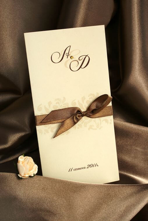
Another key advice when you’re choosing the best fonts for wedding invitations is to keep an open mind. A wedding invitation can be different from any other card you’ve ever seen, just like your wedding will be unique.
Also, it’s nice to coordinate the wedding font with the event’s theme, just don’t over do it. You might be doing a Jane Austen themed wedding, but that doesn’t mean you have to serve food cooked like in the XIXth century food. Much the same, most of your guest won’t be able to read your invites if they’re written the way they were written back then, with a quill, ink stains and letters we couldn’t make out.
Finally, remember that most wedding invitation fonts are used in italic form and the majority of them have round, soft letters, so they look as close as they can to cursive writing. As beautiful is this style is, it becomes hard to follow it of your text is too long. A lot of couples want to share their entire love story, as well as a few jokes,
So, when choosing the font for your wedding invitations, you might save yourself a lot of time if you decide first what’s more important to you: a long, funny or emotional text that tries to tell all the good news or a beautiful, but somewhat frugal invitation, with just the essential information.
Having taken all of that into consideration, we here at WhatFontIs.com put together a list with our favorite fonts for wedding invitations. Tell us which one’s your favorite or, even better, send us your own suggestions!
Windsong is a beautiful, somewhat intricate font that just begs to share the good news about a wedding. It has the advantage of looking posh but in that relaxed I-am-faboulous-without-even-trying way.
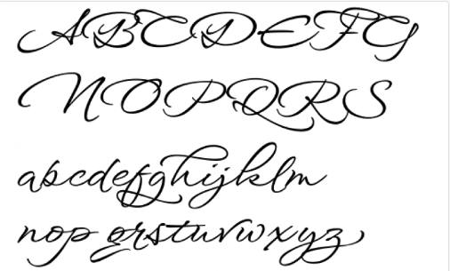
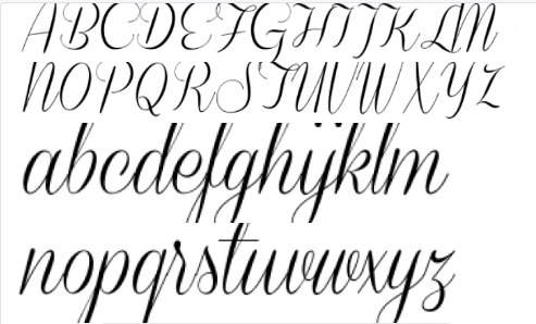
Alex Brush is also a go-to when it comes to wedding invitation fonts. Again, what we love is the cursive, fancy letters that still manage to look just the right amount of messy.
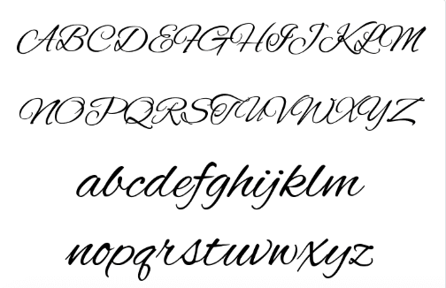
Carolyna has the many of these qualities as well. It’s dainty enough for a wedding invitation, but unstuffy enough to remind us it’s 2019.
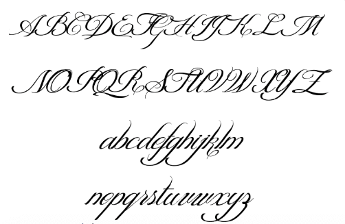
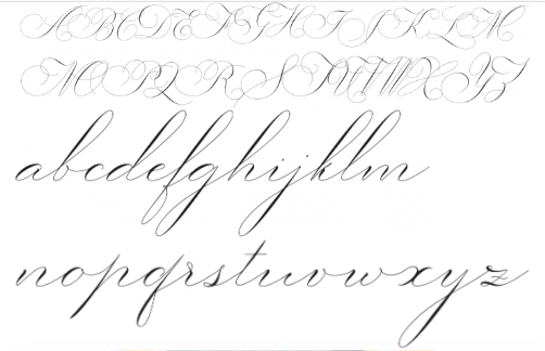
Burgues Script, on the other hand, has nothing relaxed about it. It’s a fabulous, over the top wedding font. True, maybe it’s not the first option for Princess Beatrice. But it would certainly be in Victoria Beckham’s top preferences.

Shit Happens. Ok, you might as well hear it from us. No matter how much planning and effort you’re putting into your big day, shit is bound to happen. When it does hit the fan on your wedding day and all you can think is that it’s your party and you can cry if you want to, we just pray that you’ll remember the gospel of Charlotte York. Remember her first, picture perfect wedding to her picture perfect husband and the hell it turned out to be? Now think about her second, trainwreck wedding with her bald, loudmouth second husband that turned out to be her happily ever after. So Shit Happens is on our wedding fonts list. It’s pretty and we sincerely hope it’s the only shit you’ll have to deal with about your wedding day.
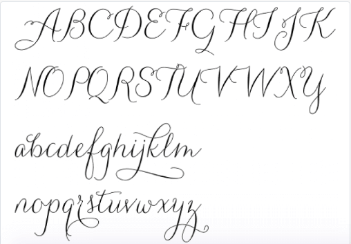
Candlescript is also a beautiful options for those who are not trying to break away from tradition. It has the perfect balance between handwritten and legibility, perfect for wedding invitations.
Coneria Script offers a similar balance between bold, beautiful capital letters and soft, barely-there strokes that will look great on your wedding invitations.
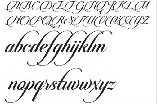
Riesling, on the other hand, is your way to go if you wedding is more pure elegance and less fairytale princess. It’s beautiful in a more airy, clean way. Again, probably not Princess Beatrice’s choice, but definitely Anna Wintour’s.
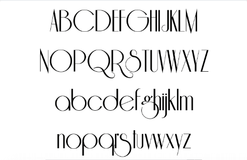
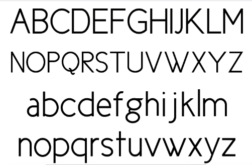
Cicle takes it one step further. If a no-fuss no-nonsense wedding is your thing, then look no further. It’s minimalist, modern, fresh and broad – wide circles, clean lines. Would pair great with a wedding invitation that asks guests to donate to their favourite charity in lieu of presents.
Gatlik Saphir finishes off our top because, well, we started out talking about Princess Beatrices’ wedding and yes, this font would look beautiful on her invitations. The gentle lines look gorgeous on wide lettering, making it perfect for both elegant, exclusive events and romantic, happy family celebrations.
Passionate about fonts or just looking for a quick solution for your lettering woes? WhatFontIs.com provides a catalogue of over 550.000 fonts that you can browse until you find the one that fits you just right.
Also, make sure you check the Blog Section – you might get that cool idea that will help you better define you visual identity.

I'm a programmer at heart. But in my 20s, I realized there was more to the world of fonts than just Courier.
Driven by endless curiosity, I built a system to explore them.
That project grew into one of the world’s leading font identifier platforms: www.WhatFontIs.com.
By 2024, WhatFontIs is helping nearly one million designers—famous or not—discover the names of the fonts they need.

