Any designer has made a flyer or poster at some point, regardless if it was for self-promotion, or for a client, this is a fun way to convey a message.
Poster designs usually start with a common canvas and poster ideas. For posters, they’re usually 8.5” by 11”, or 11” by 17”, or even 22” by 34”.
A graphic design poster can be either horizontally or vertically designed, with vertical being the more popular orientation for design posters. Let’s take a look at some tips on how to design a poster, and some great poster design ideas, and creative poster ideas if you want to learn good poster design.
It should be easily readable from a distance
A poster’s main goal is to tell someone there’s an event. The key information must be easily readable even at a distance, in order to draw people to the poster, as well as create a hierarchy in the text.
You can use three layers of text when it comes to poster design.
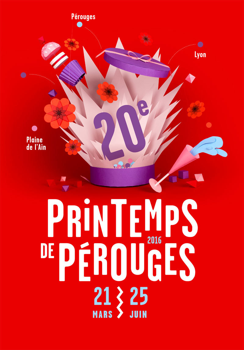
- The headline, which is the largest, main element. You can put it in addition to an art element, or you can make it the art element. For best results, use a readable typeface that demands attention.
- Details, such as the where, the what and the when, should be answered in the second layer. The information should be provided in a concise manner, and you can either drop the font size to around half of the main headline, or you can continue with the larger size, and find another way to achieve contrast.
- The fine print is pretty self-explanatory. This is everything else that the person responsible decided should be on the poster. It should be small and kept out of the way.
A poster gives you one chance to grab a person’s attention, and high contrast can do that for you. A monotone color palette isn’t a good choice but instead, go for bold colors and type. If you think that a typeface or color palette is too crazy for another project, experiment with it here.
A big color background is another option. Even though many designers begin with a white canvas, you could try a high color background and a full bleed if your printer allows it.
Make sure you consider both location and size
This is key because it will influence the poster’s size and maybe aspect ratio, as well as the visual clutter around it. Will the people who see it, see the call to action? When you know where the design lives, you can make informed choices about how it will be created.
Visual contrast isn’t important within the design, it’s also important as an external factor. For example, if you’re hanging the poster on a red wall, a contrasting color scheme will make it stand out instead of blending in.
You should also create a mini version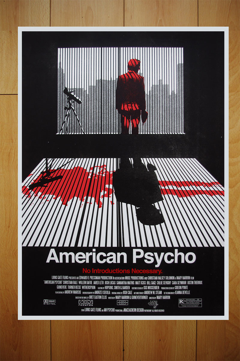
Sure, the poster is usually a print project. However, you should have mini versions that you could use in other places too. There’s a rule that says that someone needs to be exposed to something 20 times to remember it. Having a poster in multiple places can help you with this.
You could get a scaled down image for sharing on social media, and even making a letter-size one for handing out. And, if you have a website, make a poster-version landing page, as well as one that can be sent via e-mail.
Try some typography experiments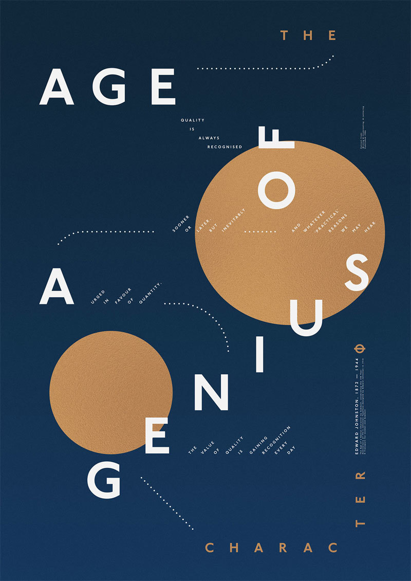
The fonts can actually do a lot for your poster. If you want elegance, opt for an italic serif. If you’re after a serious tone, a bold sans serif is your best bet. Or, if you want fun, loose, handwritten fonts are your friend. When you’re choosing a font, opt for a font pairing where one is for the headline and another one for the body.
Remove clutter, and go for “less is more”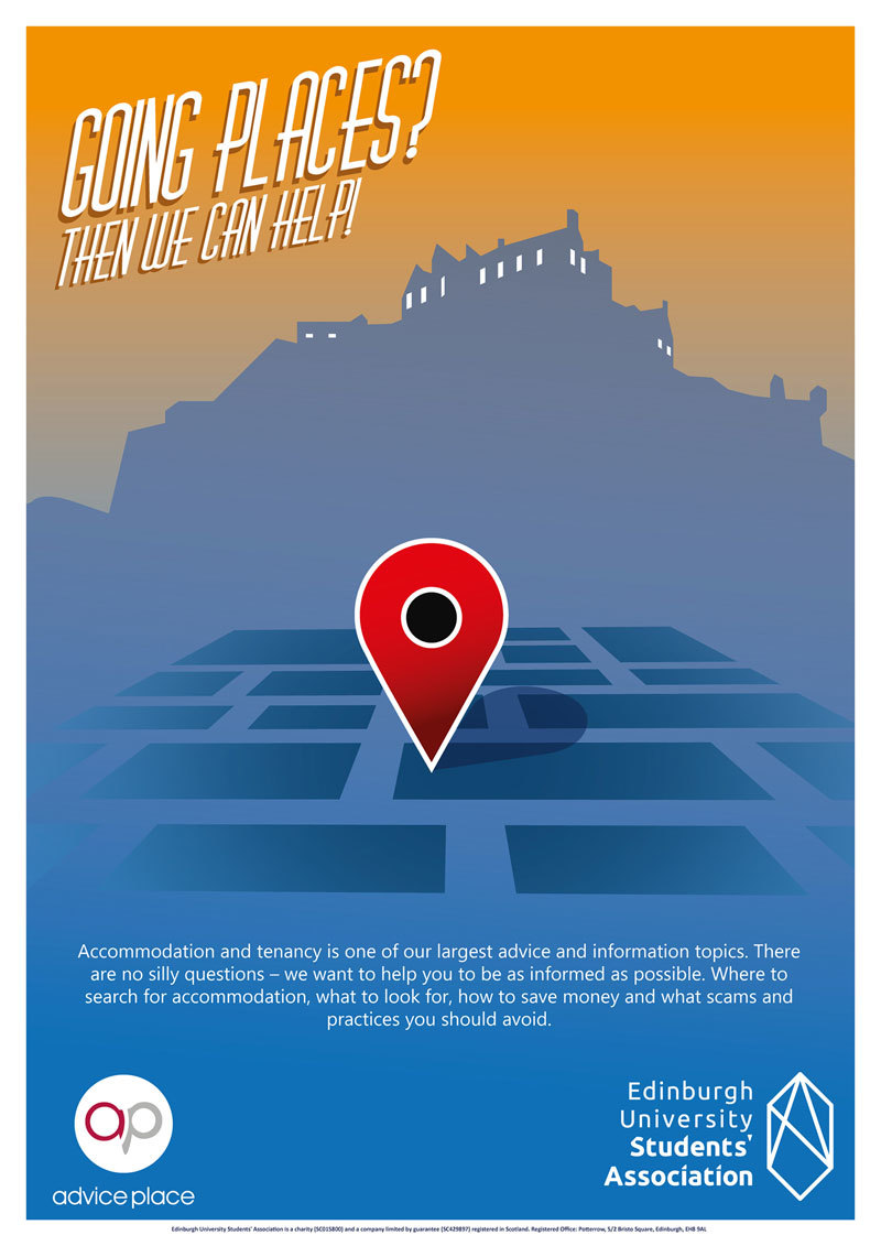
This way of thinking intrigues the viewer. There are single words, or even dramatic images, that can communicate much more than plenty of words and photos. Adding things just for the sake of adding them is often a mistake.
Keep the medium in mind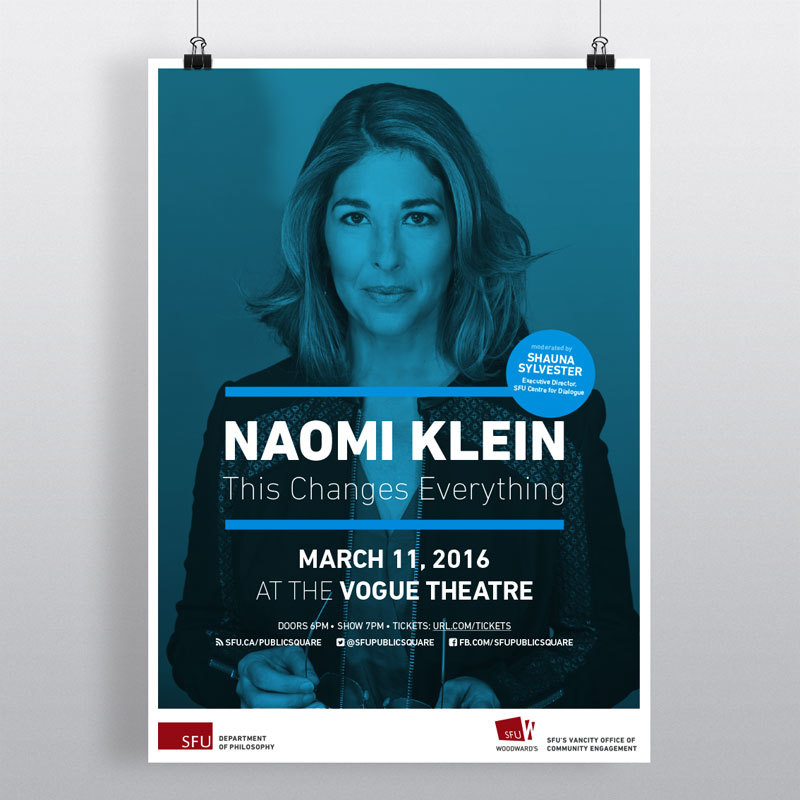
Overprinting is a good idea if you’re screen printing. This gets you an extra color without paying for it. The possibilities should be explored if you’re working with digital prints, even though plenty of screen printers look down on digital printing.
However, it’s a great way to integrate some photos and subtle shading. If you’re going with letterpress, you should explore papers that offer a good impression, as well as texture.
Move away from your computer
Try using your hands, and think and work away from your keyboard. Think about how to best execute your idea, even if that means making a 3D type, and pouring some paint on it. This can amplify an idea if it needs a dose of humanity.
Embrace the rule of fives
A good poster needs to be equally impactful at 50 feet, 5 feet, and 5 inches. This is something you need to keep in mind when designing.
A call to action should be a part of your posterSince the main goal of a poster is to expose someone to something, most of the touches will include inviting a person to an event, like a movie or a concert. Therefore, a call to action is a vital part. You should look at it just like you’d design one for a website and give it plenty of prominences.
However, unlike web design, where “sign up” is enough, this might be a bit more complex. It is often the contact point or the event information, and you can design the call to action as soon as you know what you expect the users to do. Some people might opt for a QR code but consider how popular this tool is in your market.
Mind the printing technique
Depending on the audience, and the location for the poster, you might need some cool printing technique. Plenty of things can be done on paper that just don’t work on a digital project, such as letterpress, a UV layer, or foiling. Many techniques like these are commonly reserved for high-end projects, so if you want such a touch, go for it.
You should consider talking to the printer in advance and see if they’re ready for these special techniques. And, consider budget too. Some processes are costly, make sure you can afford them.
We live in an age where we have plenty of design talk that revolves around apps and websites. The art of poster design is very commonly an afterthought, but it can be fun, and give you some room if you want to stretch your design muscles.
A poster can do wonders for almost any project. It’s a stunning way of promotion and exposes masses to any message you want to convey.

I'm a programmer at heart. But in my 20s, I realized there was more to the world of fonts than just Courier.
Driven by endless curiosity, I built a system to explore them.
That project grew into one of the world’s leading font identifier platforms: www.WhatFontIs.com.
By 2024, WhatFontIs is helping nearly one million designers—famous or not—discover the names of the fonts they need.