

Today I will share with you the nicest and the ugliest fonts in history.
In the nicest section you will find fonts that you can use with ease in many of your projects, while in the opposite section you will find fonts that you should not use, or at least, you should use with huge care.
Fonts play a major role wherever they are used, and they can easily ruin a great design.
Pay huge attention to what fonts you use.
If you don’t know how to pick the right font, just stay with the standard fonts that everybody uses. You won’t be in front of your competition, but you will be sure that your font is a good choice.
What is a nice font?A simple answer to this question is: fonts that are nice are pleased to the eye.
Even if you don’t know nothing about typography and fonts, you can easily tell if a font is nice or not. Just take a look at a font and you will immediately find out if it is nice or not.
These aspects are important:
– Even kerning
– Consistency
– Balance
– Legibility
– Design uniqueness
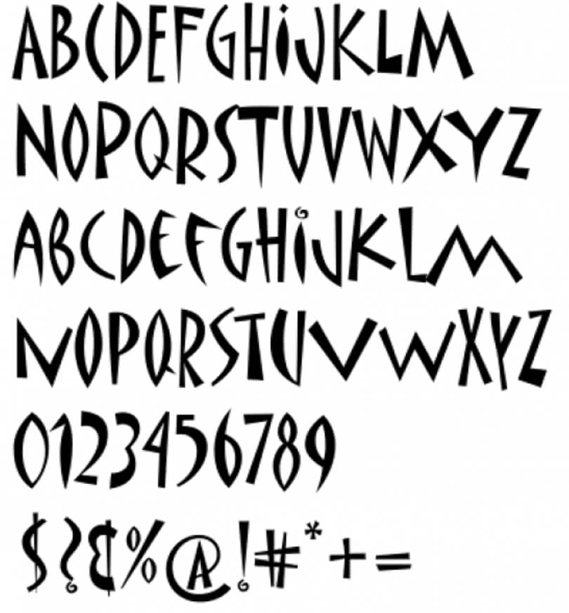
Now let’s see what makes a font ugly?What is an ugly font? Are there such fonts?
Fonts are designed to make communication easier, to help people read texts with no difficulty, and to transmit emotions or moods.
For me, an ugly font is a font that is not helping communication.
Furthermore, an ugly font is especially very hard to read and use.
In general, if a font cannot be used, it is an ugly font, at least for me.
For specialists in fonts or people with deep knowledge, ugly fonts are fonts that are not respecting design rules.
Such a font is Comic Sans.
Guys from DesignForHackers wrote about Comic Sans.
“So, you see, Comic Sans is an archetypal enemy of the Graphic Designer. Its not only an unattractive font, but it also represents the invisible, evil force that is making the “print” designer less and less relevant. A natural reaction to being threatened is violence, and the hatred for Comic Sans is arguably violent.”
The internet is full of information about Comic Sans is considered bad and ugly. If you want more info, just Google it.
The nicest 4 fonts in the history
These 4 fonts were handpicked by me considering the following aspects:– Even kerning
– Consistency
– Balance
– Legibility
– Design uniqueness
Here they are.
Helvetica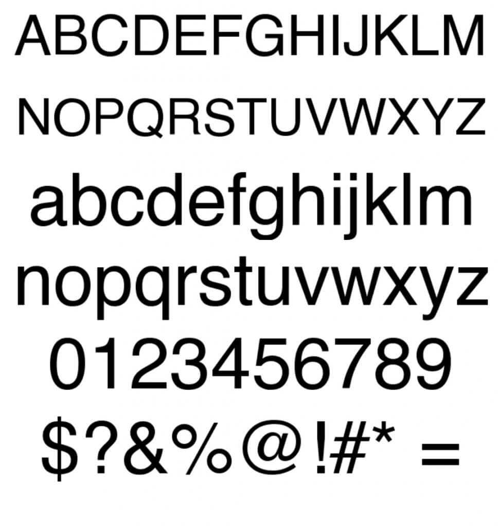
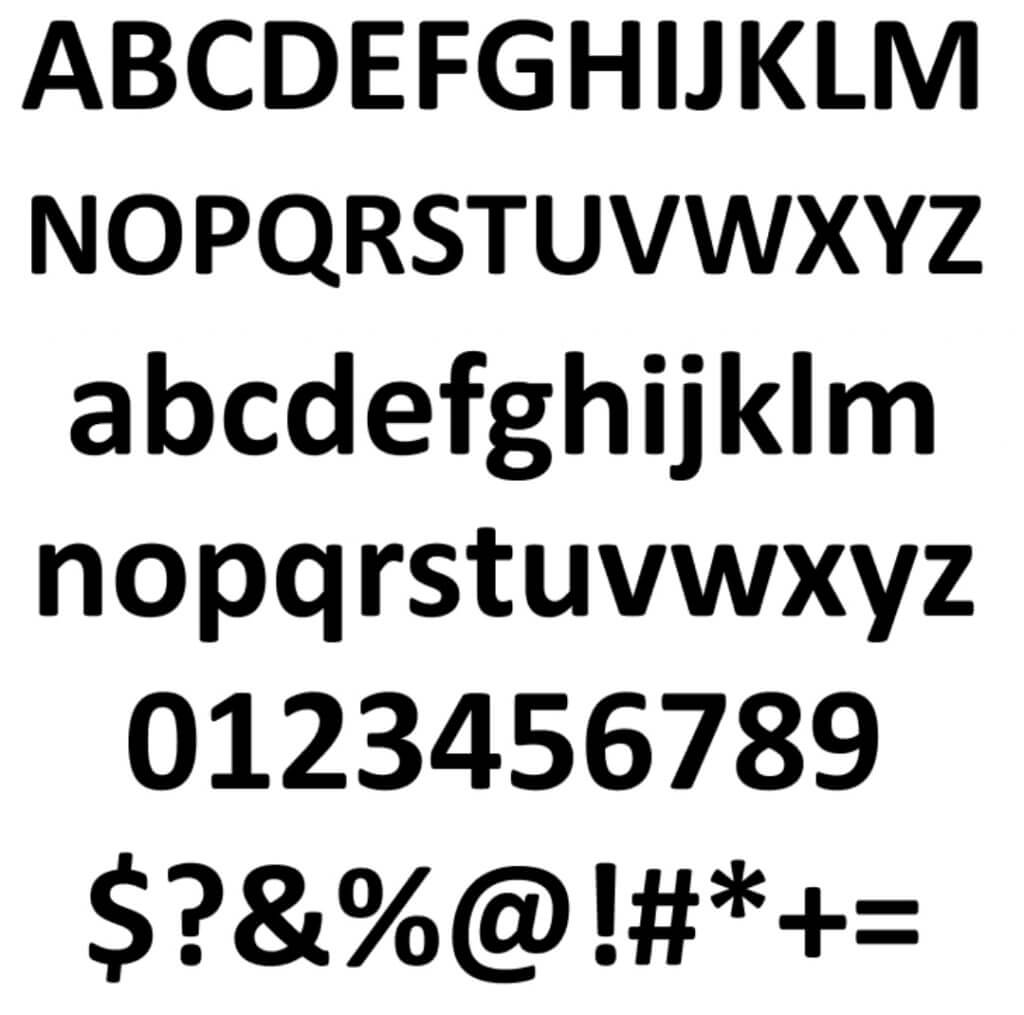
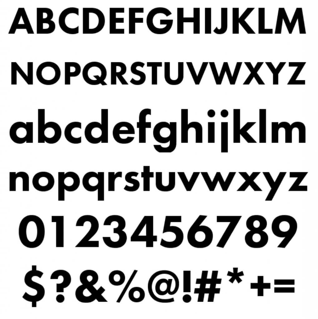
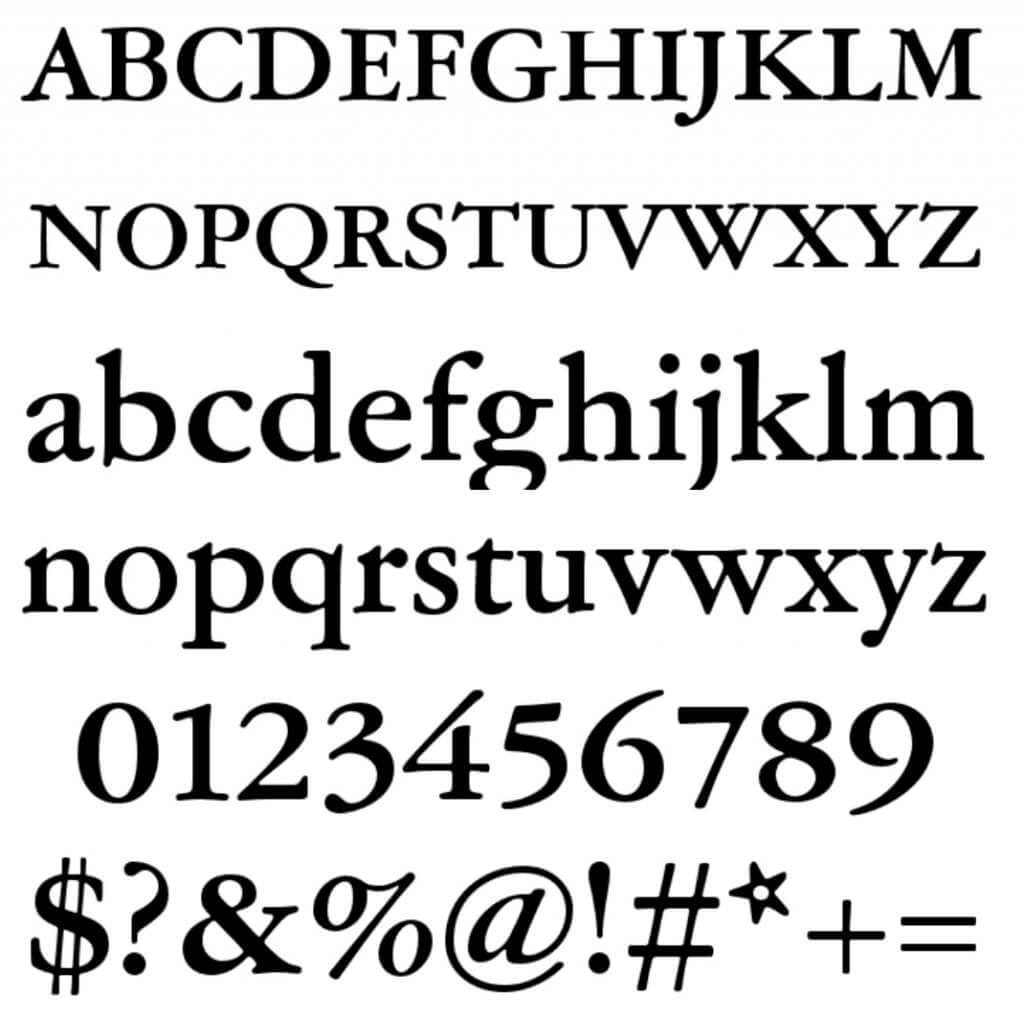
All these fonts can easily be used for all kind of projects, literally all kind:
– Websites – both for headers and paragraphs
– For advertisements
– Landing pages
– Packaging
– Books
– Brochures
– T-shirts
– And everything else
With these 4 fonts you cannot go wrong, no matter the industry you are in, as long as you use them correctly.
If you like very much these fonts, and you like to see similar fonts, use WhatFontIs Similar Fonts tool and find as many similar fonts as you want.
Write the name of the font that you like, and the tool will immediately over 60 similar fonts. Each similar font comes with a name, download link, and price.
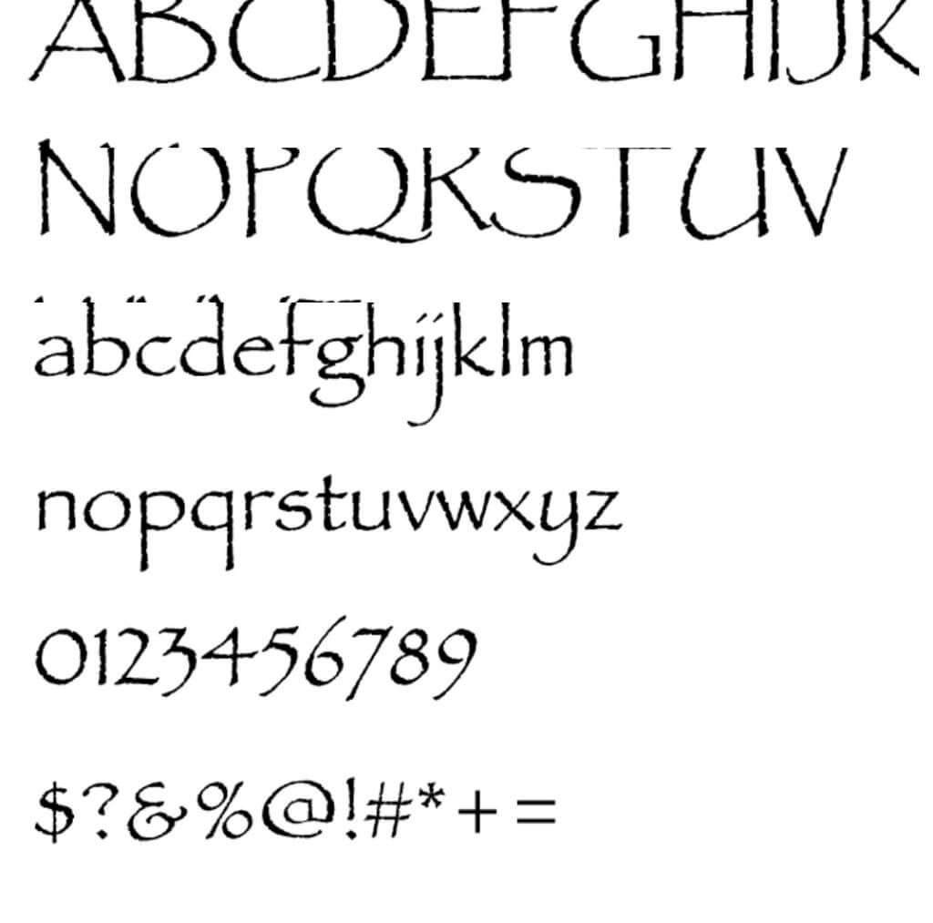
Now let’s see which are the ugliest fonts.
The ugliest 4 fonts in the historyThis top is made based on what people say.
And of course, the winner of the top is Comic Sans. 🙂
First – Comic Sans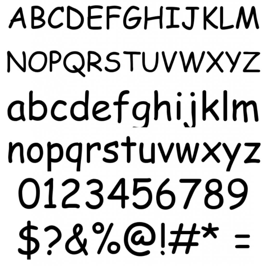
Now don’t think that you cannot use these “ugly” fonts.
In fact, some of these “ugly” fonts can work extraordinary if you use them right.
Just pay attention to not ruin your design.
ConclusionsThere are just a few really bad fonts on the planet, fonts that are impossible to use in a decent quality project.
On the other hand, even great fonts can come bad.
In other words, the improper use of fonts can transform them into very bad choices.
In conclusion, pay huge attention to the fonts you pick and where and how you use them.

I'm a programmer at heart. But in my 20s, I realized there was more to the world of fonts than just Courier.
Driven by endless curiosity, I built a system to explore them.
That project grew into one of the world’s leading font identifier platforms: www.WhatFontIs.com.
By 2024, WhatFontIs is helping nearly one million designers—famous or not—discover the names of the fonts they need.

