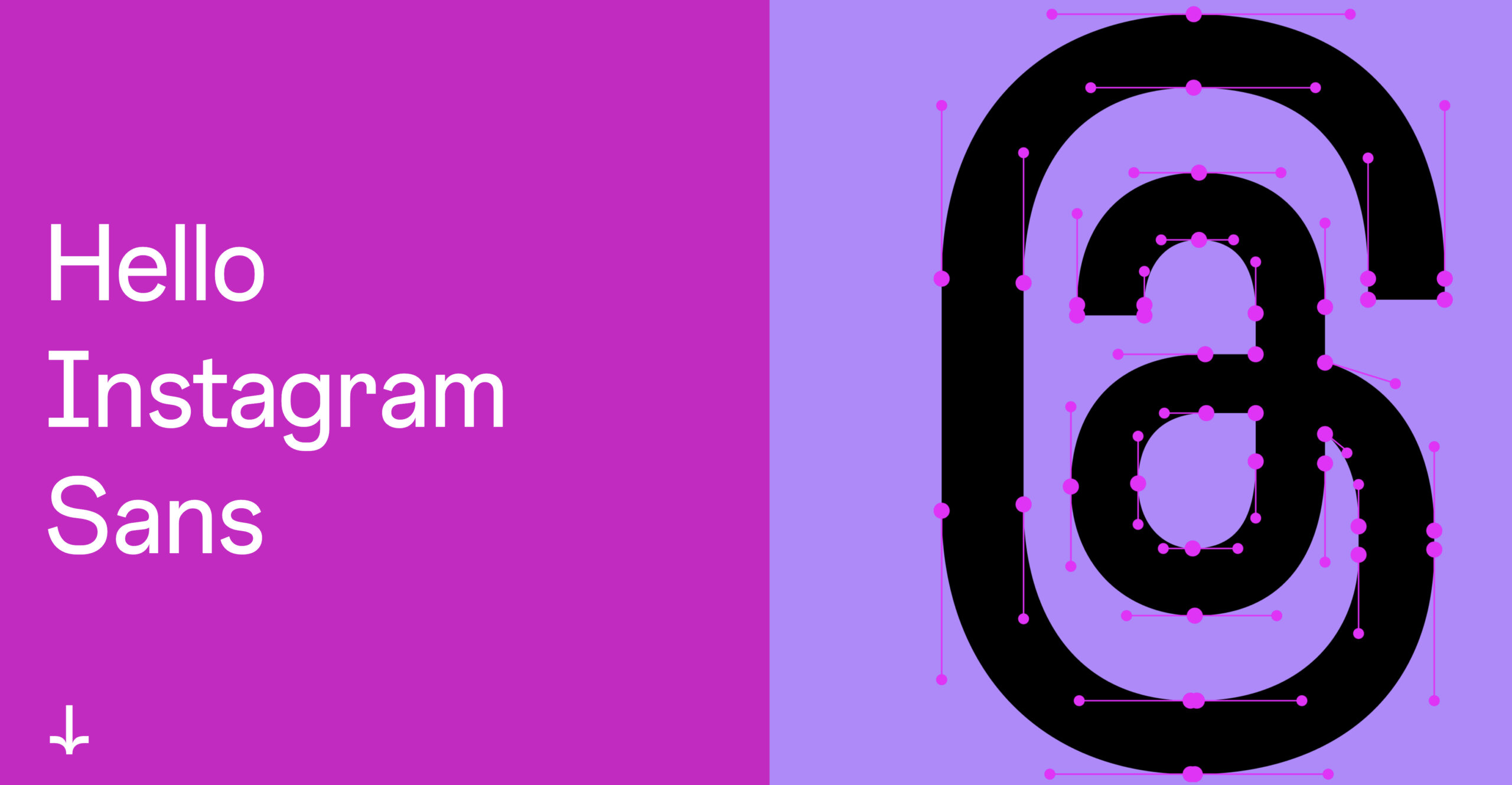
Instagram launched its own custom font; its name is Instagram Sans.
And it looks like this:
I find it cool, interesting, unique, intriguing, and carefully created.
Instagram’s logo inspired Instagram Sans as the officials said and “reflects the shape of the glyph and our commitment to simplicity and craft.”
The font is made out of squares and circles, or squircles as Instagram names them.
“Instagram Sans is our new, global typeface. The glyph and wordmark inspired this custom style that nods to our heritage.”
As you will see right away, Instagram Sans is not super easy to read but it looks great, I personally love it.
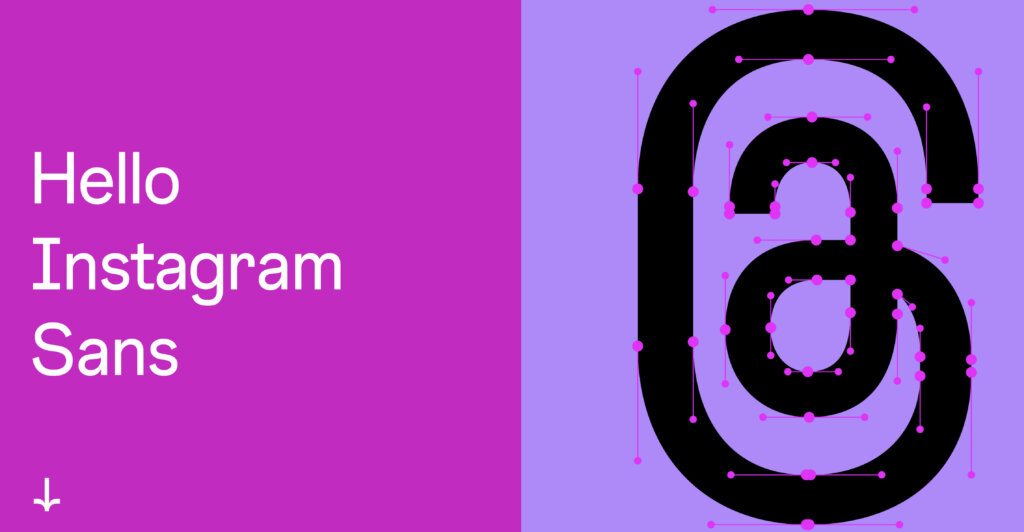
Instagram Sans designAlmost every letter is fully loaded with details and when you use this font to build a word, that word is instantly recognized as an Instagram Sans word.
And this is not simple to achieve, just think about it. Most fonts are extremely similar, and words using these fonts will not look special.
At least this happens to most fonts, even to the high-expensive and premium fonts.
This is exactly why Instagram worked hard to create this super interesting fully custom font.
Launching such a font is an act of courage from Instagram.
Do you agree?
Some letters look absolutely normal while others look a bit crowded.
At least in the combination with all the other letters, when they form a word.
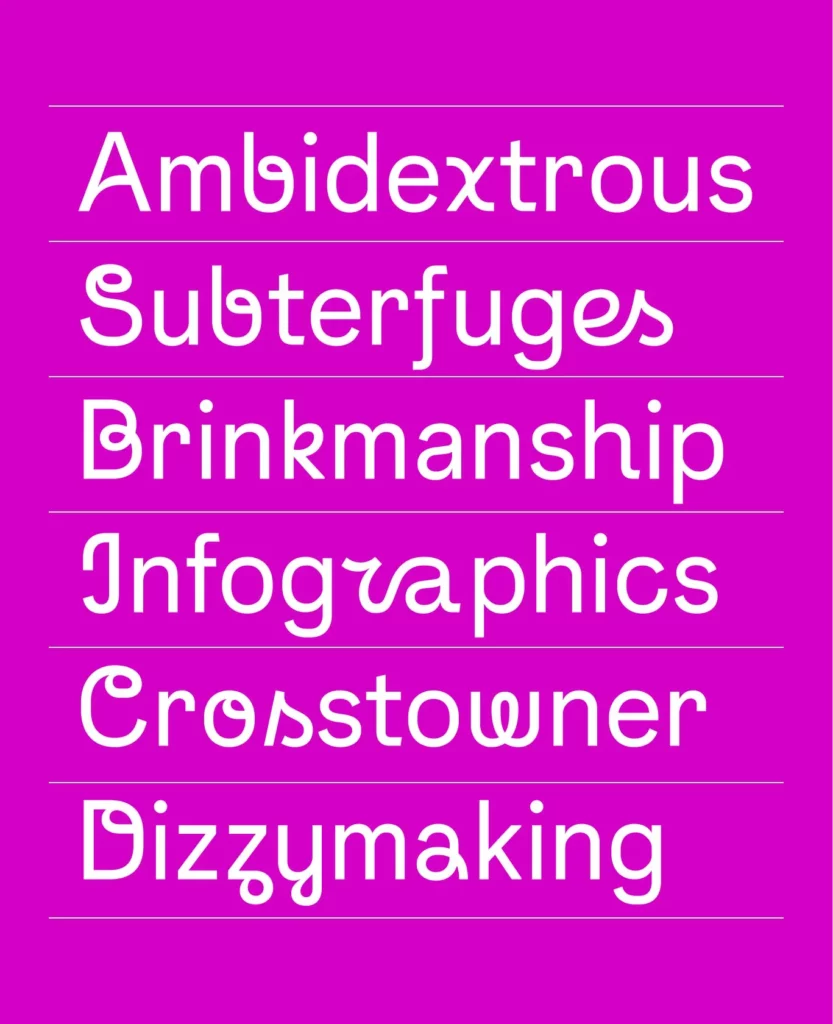
I cannot imagine a whole sentence with this font, but this is not the scope of this font.
The font is heavily loaded with details and it makes any word look fantastic.
IInstagram Launched Its Own Custom Font – inside info“Instagram Sans is a contemporary remix of grotesque and geometric styles. The type is designed with accessibility and global scripts at the core, able to express a range of styles in any language.”
“Details like sheared terminals that suggest the flick of a human hand, unexpected quirks seen in the “Q” and the interior teardrop of the “a” add a friendly personality.”
“The typeface letterforms are inspired by our iconic glyph. Circular motifs, titles, and punctuation marks further connect these two elements of our brand identity.”
“Inspired by our original wordmark from 2010, and the update in 2013, we’ve developed a more contemporary approach based on our new grotesk typeface.”
As you see, Instagram team invested lots of time and resources to create their own fully custom font.
The result is impressive, most of the people loving how Instagram Sans looks and how it enhances Instagram design.
What other changes is Instagram preparing?Instagram Sans is not the only big thing that the huge company is launching in this period.
The social media platform Instagram is also making important changes to its layout and design.
It becomes extremely clear that social media channels are reinventing themselves. People are starting to become bored and not pay attention anymore to social media ads.
And this has a huge impact on social media platforms, absolutely all of them.
The bad thing for them is that this is not the only major problem they have, but also many other types of issues – like governmental problems, tax problems, etc.
ConclusionsInstagram Sans is a nice upgrade to Instagram, making the social media channel much more unique and memorable than it was.
As we can all notice these days, the world is putting more and more accent on fonts.
They create their own custom fonts, they let you customize the text so you can read it with ease, and even more.
They even launch variable fonts like Google Roboto Flex, and much more.
Companies carefully analyze the power of fonts and they do lots of tests to improve design.

I'm a programmer at heart. But in my 20s, I realized there was more to the world of fonts than just Courier.
Driven by endless curiosity, I built a system to explore them.
That project grew into one of the world’s leading font identifier platforms: www.WhatFontIs.com.
By 2024, WhatFontIs is helping nearly one million designers—famous or not—discover the names of the fonts they need.