
Prepare yourself to get huge inspiration from 10 websites that use typography right. You will see how different websites (some have tens of billions of unique visitors each month) use typography to help users find content, get messages, and information on their websites.
Take from each what they are doing great and if possible, implement it on your website. Using the right typography doesn’t cost money (even if you for the fonts, the prices are very small), it is only a game of design rules and creativity.
Here we start.
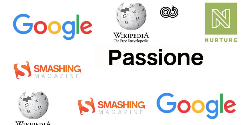
I happily present you 10 websites that use typography right Smashing Magazine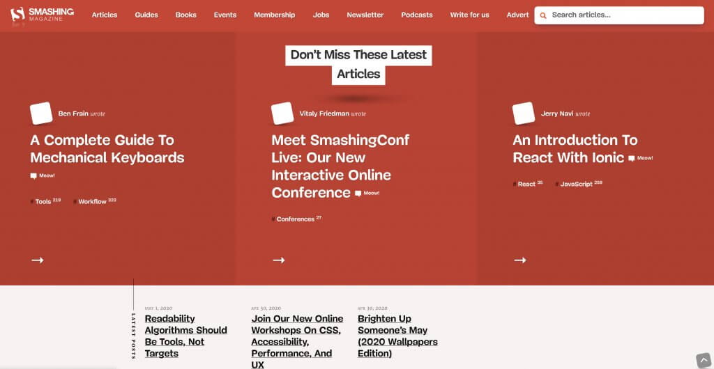
Smashing Magazine is among the best 3 web publications for web and graphic designers, and for developers. And not since now, but almost from their very first start in 2006.
The writers that collaborate with this publication are experts in their fields, and the articles that they provide are always complete, with all the information you need. If you are not an expert, you cannot publish content here.
Of course, this publication is using typography right, everything is perfect on their website.
The content is easy to read, and the overall design is very pleasant.
For the headlines, they use Mija bold and for the paragraphs they use Elena.
Andre.work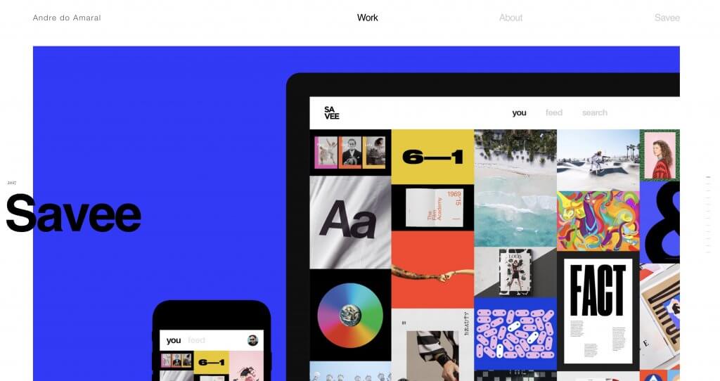
Andre do Amara has a superb website where he combined extremely well the minimalist design with super bold, large headlines.
He uses Helvetica, a common font, but just take a look at his website design, it is awesome.
Wikipedia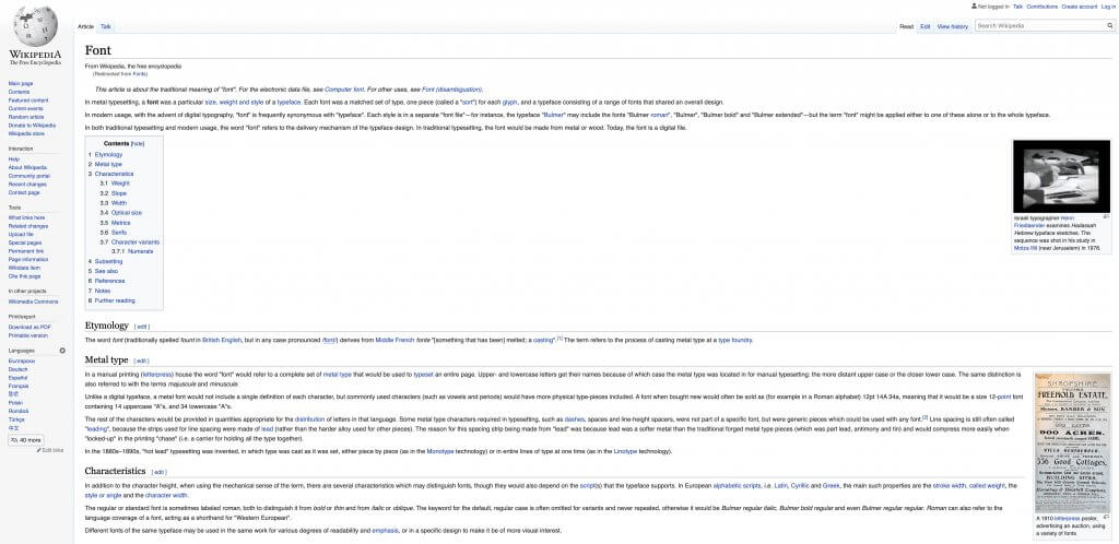
Wikipedia is a super popular website that helps people from all over the world find information about pretty much everything.
How many unique visitors per month? “Only” 5.78 billion, not so much, right? 🙂
This website relies heavily on textual content, so typography play here even a bigger role.
The used fonts are very well balanced, always have the right size difference to understand the prioritization concept in design, and the colors help us understand where are links and where are not.
Wikipedia uses a Sans Serif font.
Google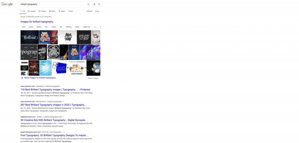
Google is another great example of a textual content website.
When you search on Google, you get a results page that is almost based only on typography.
Each result has a good distance between each other, and the font is used in different colors and sizes to help us see better the results and the info about them.
Inspiration come usually from simple places; Google is a great example. Why “run” after who knows what inspiring examples when you can simply see what a website with over 81 billion unique visitors each month is doing right?
They use Arial.
Click Funnels
Click Funnels is the kind of website that adopted the long text marketing approach. But they did it right.
Some websites using this approach are writing tons of texts that are very hard to read and follow.
The designer used pretty small headlines with colors that already present in the design, and paragraphs that are easy to read. Simple design rules that make a website look great.
They use Source Sans Pro and Helvetica.
Sell Like Crazy – book website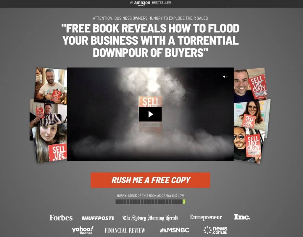
Even as I am not a huge fan of the aggressive approach in advertising, this website is using typography extremely well to make you buy the book.
They use bold headlines with right letter and line distancing, the right font for easy to read paragraphs, and the right colors.
Sabri (the writer) uses Barlow for headlines and Sanso Sans for paragraphs.
Nurture Digital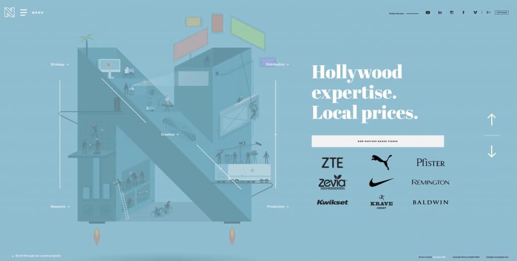
In the left part of their homepage, they built a huge N (the first letter from their brand) and created a video inside. Clever idea that transforms their homepage in a super attractive design.
But wait, on each page they used a letter and inside a video. Way cooler than I initially thought.
They even explain how the blend mask was created.
Congrats guys, you rock!
The website is using Abril Fatface for the large headlines and Aktiv Grotesk for the paragraphs.
Hauska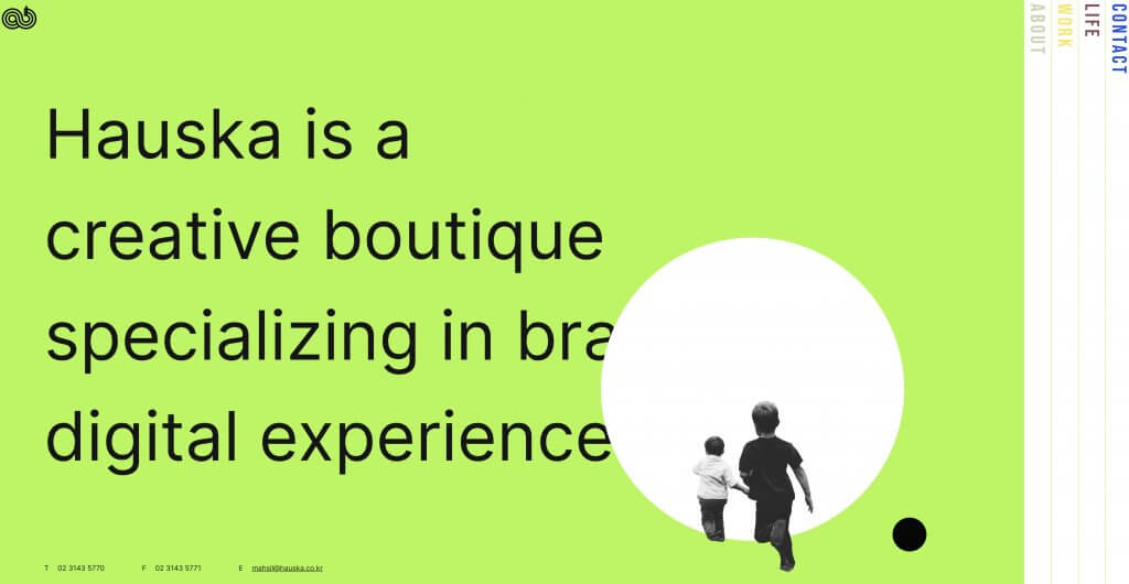
Next stop, South Korea.
Hauska use typography at its best combined with a minimalist design.
The result? An impressive homepage with clear design prioritization – the headline is clear the message of the website.
They use Inter for the large headline.
USSR Design Almanac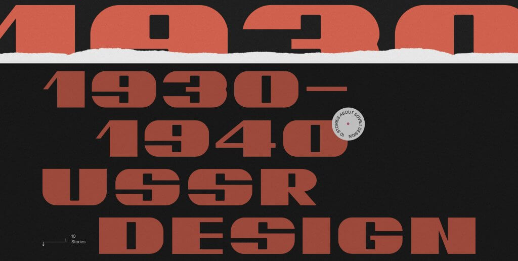
This website is extremely interesting from 2 points of view.
First, the website is the design almanac of the Soviet Union. Here we can find some of the best works made in the USSR are collected: cars, photos, architecture, graphic design and much more.
The second is the typography. They don’t respect any rule, they use all kind of fonts, sizes, colors, line and letter distancing. In just a few words, they break all the rules. But it works for this website.
They use Aeonik for the paragraphs.
Passione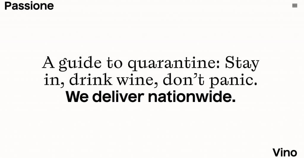
A homepage made only by using typography. How does it look? Awesome.
They wanted you to know that they deliver nationwide, this is the single message you should get from this page. Did it work? Be sure of that.
In the headline they use 2 fonts, Laica B and Nuckle.
How did I identify fonts in all these websites?It is super simple to identify fonts from websites and even from pictures, you probably know it, right?
To identify fonts from websites, you have to install the Font Identifier by WhatFontIs. It is a Chrome Extension that you can get from here. It is free, super-efficient, and simple to use.
You click the icon in the upper right part of your browser and then you simply hover with the mouse the font you want identified. It will even help you with 60 alternative fonts with a click of a button.
ConclusionsUsing typography right is not optional if you want high-converting and great-looking websites.
All these 10 websites are using it right and that is why all are having super successful, each in its field.
Get you inspiration from these websites that use typography right and use the font identifier by WhatFontIs to get the fonts for your projects.

I'm a programmer at heart. But in my 20s, I realized there was more to the world of fonts than just Courier.
Driven by endless curiosity, I built a system to explore them.
That project grew into one of the world’s leading font identifier platforms: www.WhatFontIs.com.
By 2024, WhatFontIs is helping nearly one million designers—famous or not—discover the names of the fonts they need.

