
I will show you 5 awesome fonts for high-converting flyers.
Flyers are still super relevant in 2022, being one of the best marketing printed and digital materials that you can share with massive amounts of people.
These amazing pieces of short content work because of 2 things:
– Brief content
– Design
The order is not necessary like this; an awesome flyer will be read 100%.
To have an awesome flyer, you need an awesome design.
And part of the design is the font.
The font plays a major role in your flyer design, having the power to make the flyer a piece of art, or sorry for hard words, a piece of garbage.
That is why I will show you below 5 awesome fonts that will help you create high-converting flyers.
Once you see these examples, you will understand the characteristics of the fonts you want to use on your flyers.
So here these 5 awesome fonts.
5 awesome fonts for high-converting flyersAll these 5 awesome fonts were handpicked by me, based on these aspects:
– Cool factor
– Readability
– Price
– Design impact
Siggy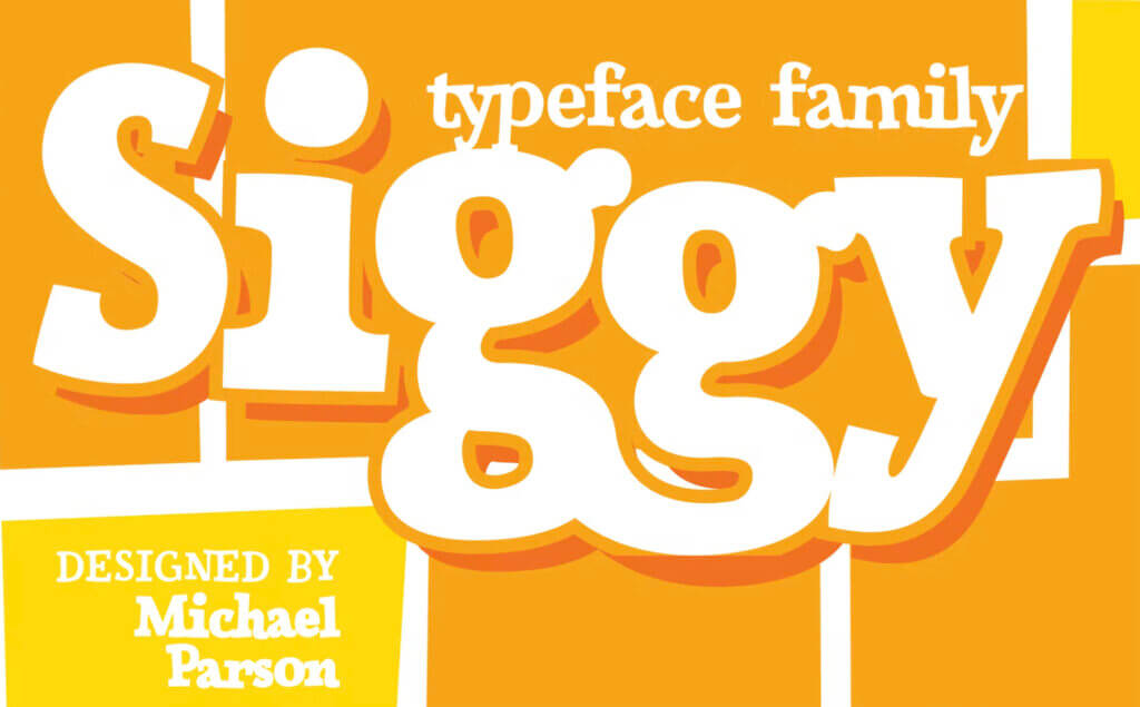
Price: $49
Lovile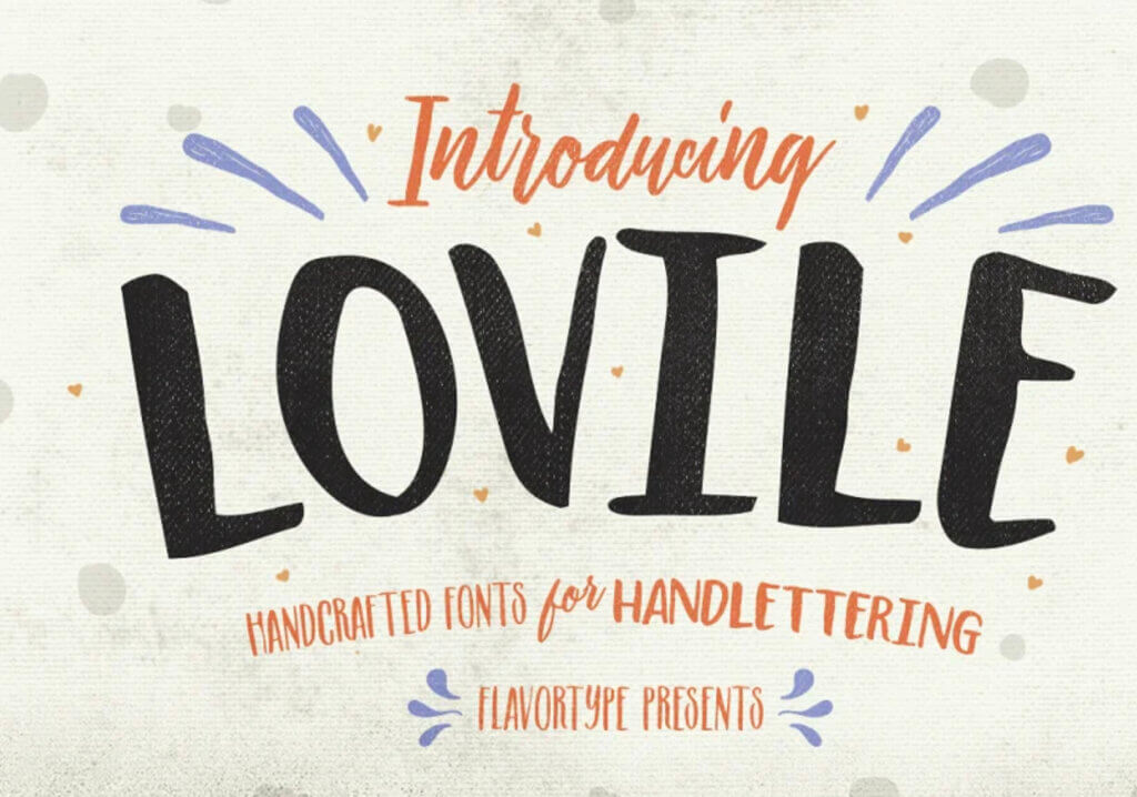
Price: $17
Brice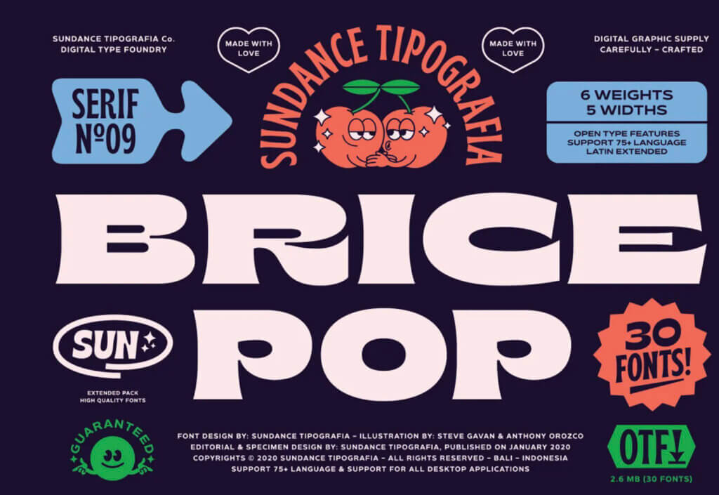
Price: $32
Karl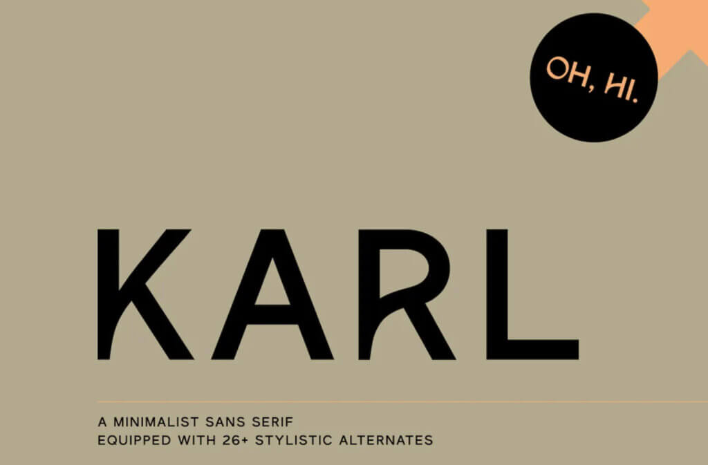
Price: $17
Flix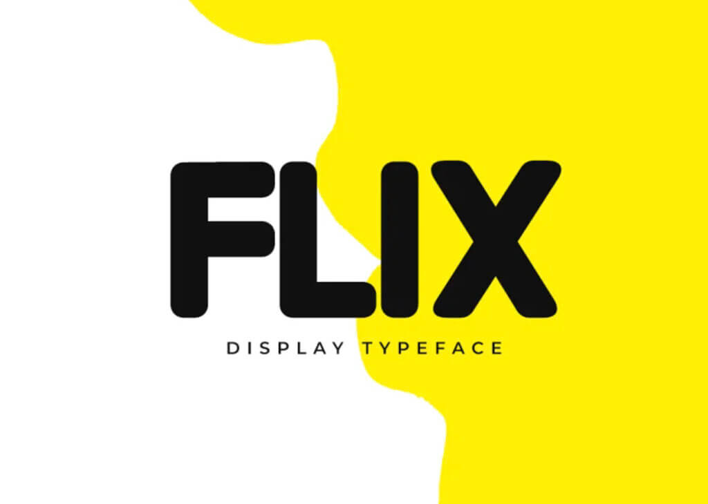
Price: $29
Tips for choosing the right font for your flyersAfter you saw these 5 handpicked awesome fonts for high-converting flyers, you already have some ideas of how fonts should look like to be a great choice.
The basic idea when choosing fonts for your flyers is to pick fonts that:
– Are easy to read.
– Don’t have weird or complicated designs.
– Look great on the sizes you will use them.
– Work in the colors you need.
– The fonts should represent the tone and voice of your flyer
– Maximum 2 fonts for your flyer design is enough – one for the heading and one for the paragraph.
– Care to not pick unpopular fonts or fonts that are hated by the communities.
– Also pay huge attention to “racist fonts“; yes, there are such fonts.
– The last piece of advice is to make sure to have the legal rights to use the fonts.
As you can notice these are not some magic rules that you should respect, all of the above are common sense and if you stick to them, you cannot make bad font choices.
And of course, make lots of tests, never pick a font without properly testing it in your flyer design.
Ask for opinions from your colleagues, friends, and family members.
In the end, probably the best thing to do is to not overcomplicate the font selection process. You want to take your time and find nice fonts, but you don’t want to find yourself blocked in the process, delaying the launch of your flyer just because you are still struggling to find the perfect font for your design.
Font selection is simple and quick if you follow the above guide.
ConclusionsThese 5 awesome fonts will help you craft your high-converting flyers in minutes, without spending more than a few tens of dollars.
While you can also use free fonts, I recommend you pick premium fonts that are not expensive and which will heavily change your flyer design with a small investment.
Nice and correctly used fonts have the power to make things sell.
All of the above 5 fonts will make your flyer look nice.
But if you feel that they don’t work for your flyer, the quick guide will help you make the right font choices for your flyers.

I'm a programmer at heart. But in my 20s, I realized there was more to the world of fonts than just Courier.
Driven by endless curiosity, I built a system to explore them.
That project grew into one of the world’s leading font identifier platforms: www.WhatFontIs.com.
By 2024, WhatFontIs is helping nearly one million designers—famous or not—discover the names of the fonts they need.

