

Everything you need to know about Twitter and the fonts it uses.
Twitter is one of the most popular social media platforms in the world, with over 330 million active users.
Typography is Twitter’s main design.
It focuses on the choice of fonts used for the platform’s logo, buttons, and text.
Below, we’ll take a closer look at the fonts used on Twitter and explore their history, design, and impact on the user experience.
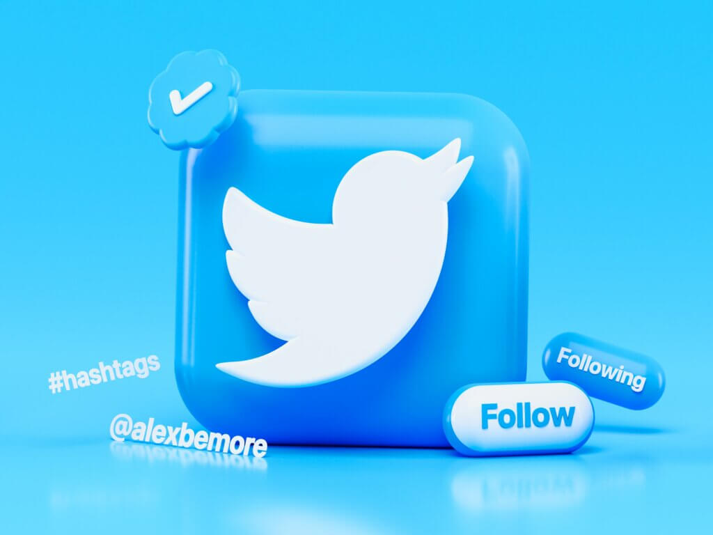
Twitter Logo FontThe Twitter logo is one of the most recognizable brand marks in the world.
Larry the Bird is the iconic bird symbol of Twitter.
Simon Oxley designed it back in 2006.
Pico Alphabet is the Twitter logo font, used to wordmark beneath the bird.
Maniackers Design created Pico Alphabet in 2005, and it is a clean and simple sans-serif font with rounded edges.
Twitter choose Pico Alphabet for its logo because it is easy to read, versatile, and modern.
The rounded edges of the font give it a friendly, approachable feel, which aligns with Twitter’s brand values of openness and inclusivity.
The font’s simple design also makes it easy to scale, ensuring that the Twitter logo looks great on everything from tiny app icons to giant billboards.
Twitter Text FontHelvetica Neue is the font Twitter chose for its main body text.
Helvetica Neue is a classic sans-serif font that was first released in 1983.
Max Miedinger designed Helvetica Neue.
Twitter selected Helvetica Neue as the text font because of its legibility, versatility, and modern look.
The font is easy to read on screens of all sizes, and its clean lines make it a great choice for both headlines and body copy. The font’s versatility also allows Twitter to use it in a variety of ways, from small tweet text to larger headlines and calls to action.
Twitter Tweet Button FontThe font used for the “Tweet” button on Twitter is called Gotham.
Gotham is a geometric sans-serif font that was designed by Tobias Frere-Jones in 2000. It has become increasingly popular in recent years and is now used by many major brands, including Barack Obama’s 2008 presidential campaign.
Gotham was chosen for the “Tweet” button on Twitter because of its bold, modern look.
The font’s strong lines and geometric shapes make it stand out, and its legibility makes it easy for users to find and click on the button. The font’s popularity also helps to reinforce Twitter’s status as a leading social media platform.
Custom Fonts on TwitterTwitter uses as primary fonts Pico Alphabet, Helvetica Neue, and Gotham but there are also other custom fonts.
These fonts are typically used for display names, bios, and other areas where users can customize their profiles.
Custom fonts on Twitter can be created using a variety of tools, including font generators and third-party services. These fonts can range from simple variations on existing fonts to completely unique designs.
Custom fonts can be a fun way for users to express their personalities.
But they can also pose a security risk.
Malicious actors can use custom fonts to create fake accounts or impersonate legitimate users.
Such a situation makes it difficult to spot fraudulent activity.
As such, Twitter has implemented measures to detect and remove fake accounts, including those using custom fonts.
Font Size and Accessibility on TwitterIn addition to font choice, font size is also an important consideration on Twitter.
The platform’s default font size is relatively small.
That
That makes it difficult for users with vision impairments or small screens to read.
To address this issue, Twitter allows users to adjust font sizes.
ConclusionsThere is a lot to learn from Twitter from many perspectives, including fonts.
So have in mind this article when you choose fonts for your projects.

I'm a programmer at heart. But in my 20s, I realized there was more to the world of fonts than just Courier.
Driven by endless curiosity, I built a system to explore them.
That project grew into one of the world’s leading font identifier platforms: www.WhatFontIs.com.
By 2024, WhatFontIs is helping nearly one million designers—famous or not—discover the names of the fonts they need.

