China starts to hunt down ‘incorrect and non-standard’ fonts.

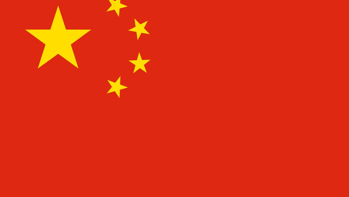
On 6 April 2022, China created a nationwide campaign to regulate the use of Chinese characters in publications, radio, TV, and the internet.
Time ago, the Chinese government recommended companies to use larger fonts so elder people can better read the information from websites.
Now they do another step in the font industry.
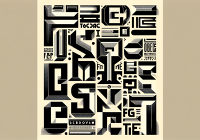
The role of this campaign is to “rectify the problems of incorrect and non-standard use of Chinese characters” and to eliminate “ugly” and “weird” fonts that contain vulgar, sloppy exaggerations and deformations in fonts.
The Chinese government says that such fonts violate the writing norms and the aesthetic standards of Chinese characters.
This campaign targets fonts used in publication, packaging, ads, movies and television, program titles, credits, and probably other things too.
What do Chinese people say about this campaign?On Weibo, a Twitter-like platform from China, people wrote:
“Some hip fonts have even changed the frame structure and radicals of Chinese characters,”
“Don’t ruin things left by our ancestors,”
Also the Chinese design community is divided, some saying that this is a good step in the visual environment, while others heavily disagree.
“There is no absolute ugliness. It’s all purposeful design, isn’t it?” Melody Mo, a graphic designer based in Shanghai, told Sixth Tone.
Cheng Xunchang, which is an important name in the font industry in China, hopes not to see a “one-size-fits-all” regulation.
“There are two major categories of font products. One is for body text, and the other is for titles,” Cheng said. “Body text fonts that are meant to be read must be supervised by experts, but title fonts should be given some leeway.”
“Designers break font rules to communicate different things,” Cheng said. He gave the example of Genki Forest, a Chinese soda company that uses the Japanese character for “gas” in its logo. “They added a cross under the character. Some said it was nonsense, but a logo is actually something between text and image, just like the combination of characters in traditional Chinese New Year hangings. It’s a kind of conceptual graphic.”
Will this font campaign affect other parts of the world?I don’t think that what happens in the font industry in China will affect the rest of the world. And I hope not.
What we all noticed in the last years is that the font industry is more and more open to customization.
And I bet that we all love this.
We can choose the fonts we like everywhere – phones, tablets, TVs, HBO Max, and many others places.
And we can also choose the font size, colors, and other things.
This is what I personally think should happen next in the font world.
I want to easily use the font I like and that I easily read, I want to use a color that I like, I want to use the font size that I need, and so on.
You want the same, right?
While we go in this direction, China will implement standardization in their font world. Maybe it will help them, maybe not.
ConclusionsIs this campaign good or not?
It is very hard to say without living in China and without knowing their language and culture.
Only time will prove it this campaign was useful or not.
If you are living in China or you understand Chinese language, please share your opinion on this matter, I am really curious what you think about this campaign.
And of course, please share the article with your friends, family, and colleagues, so we can gather as many opinions as possible.
I'm a programmer at heart. But in my 20s, I realized there was more to the world of fonts than just Courier.
Driven by endless curiosity, I built a system to explore them.
That project grew into one of the world’s leading font identifier platforms: www.WhatFontIs.com.
By 2024, WhatFontIs is helping nearly one million designers—famous or not—discover the names of the fonts they need.


