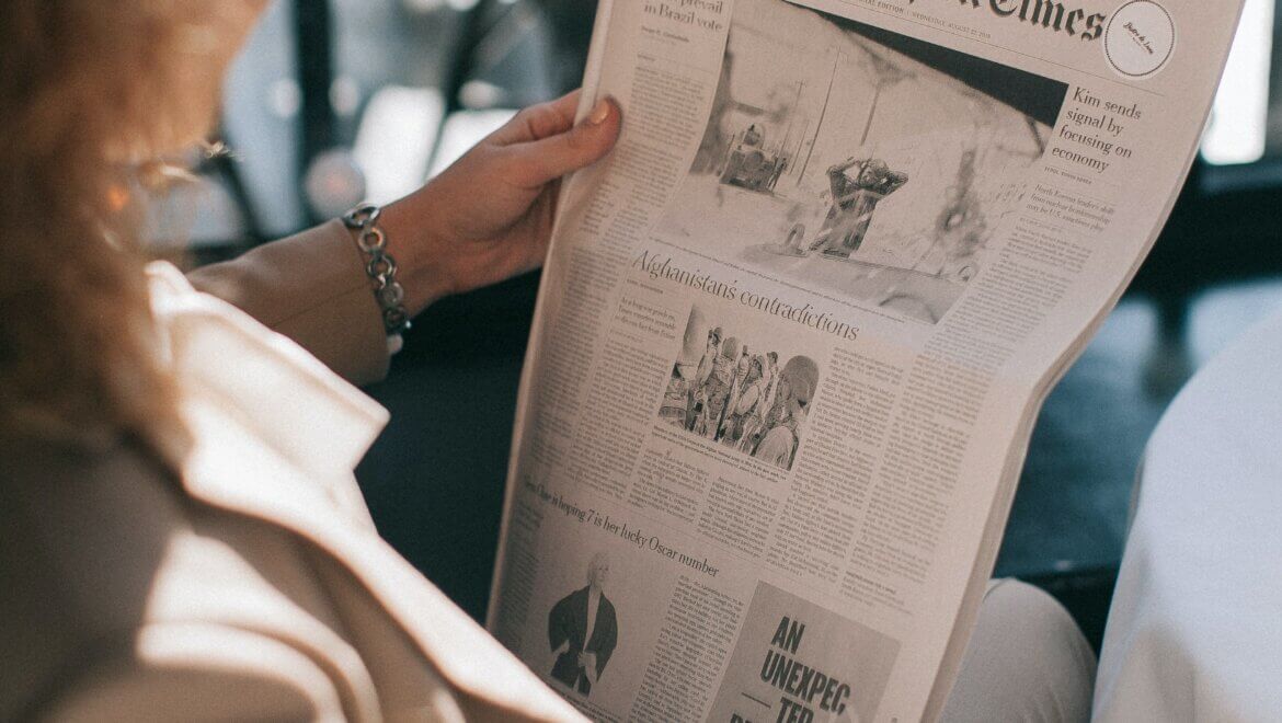
Fonts play a crucial role in the design and readability of newspapers. Here is everything you need to know on this subject.

The typeface used in a newspaper sets the tone and helps to convey the message effectively. A good font can make a story easier to read and understand, while a poor font choice can make it difficult for readers to engage with the content.
This article will discuss the most commonly used fonts in newspapers and their characteristics.
Find below 7 fonts that are commonly used in newspapers
All of the following 7 examples are super popular all over the world.
Times New Roman
Times New Roman is one of the most widely used typefaces in the newspaper industry.
Stanley Morison designed Times New Roman in early 20th century.
The font was created specifically for The Times, a British newspaper.
This font has a classic and traditional look, making it ideal for use in serious news stories, such as politics, finance, and science. Its serif style gives the text a sophisticated and elegant feel, while its thin, refined strokes make it easy to read in small print sizes.
Arial
Created in 1980s, Arial is a sans-serif font.
It is widely used in newspapers because of its clean and modern appearance.
Its straightforward design makes it a great choice for news headlines and subheadings, as it is easy to read at a glance. Arial is also a popular font for body text, as it is highly legible and has a neutral look that works well with a variety of stories.
Georgia
Matthew Carter designed Georgia serif font in 1993.
It has a sturdy, old-style look that makes it ideal for use in traditional news stories, such as history, culture, and literary reviews.
Georgia is also a popular font for body text, as it is easy to read in small print sizes. Its thick strokes and rounded serifs make it stand out, making it an excellent choice for feature stories that need to grab the reader’s attention.
Verdana
Matthew Carter designed Verdana in 1996, a sans-serif font.
It is a popular choice for newspapers because of its clear and legible design.
Its wide letterforms and large x-height make it easy to read in body text, while its clean, modern look makes it an excellent choice for headings and subheadings.
Verdana is a versatile font that can be used in a variety of stories, from news and features to opinion pieces and reviews.
Garamond
The French typographer Claude Garamond designed the font Garamond in the 16th century.
It is a classic font that has been used for centuries.
And is still popular in the newspaper industry today.
Its refined and elegant look makes it ideal for use in traditional news stories, such as politics, finance, and science. Its serif style and small print size make it a great choice for body text, as it is easy to read and understand.
Helvetica
Max Miedinger designed Helvetica as a sans-serif font in the 1950s.
It is a modern font that has a clean and straightforward design.
As it can be easily paired with various stories, Helvetica’s neutral look makes it a popular choice for headlines and subheadings.
Helvetica is also a great choice for body text.
It is legible and easy to read in small print sizes.
Courier
Designed in 1950s, Courier is a monospace font.
Courier has a a clean and straightforward design that is widely used in the newspaper industry.
Its monospace style means that every letter takes up the same amount of space.
This makes it ideal for use in technical stories, such as computer programming, engineering, and mathematics. Its simple design
Conclusions
If you want to launch your own newspaper, you can’t go wrong with any of the above examples.


