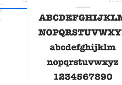
Here is a quick question: what fonts should you use for professional business cards?
Fonts play a major role in your business cards design and you want to be sure that you will send the right message to the persons that will receive your cards.

At a quick glance, you can pick any font for your business cards, right? Especially that in 2023 there are tens of thousands of cool free fonts that you can use in a matter of seconds.
But there is a huge but.
Actually, is not so easy.
Some fonts might be hard to read, others might look like as if you are a racist person, destroying your image in a just a few seconds, and many fonts might look ordinary and boring.
Before diving deep into the subject, let’s discuss about the usability of business cards in 2023.
I was amazed to find out that many people are not using them anymore, saying that these pieces of paper are old stuff and nobody wants them.
This is not true.
Here is why.
Business cards in 2023
Now we have LinkedIn, share contact details, smartphones, tablets, and smart watches.
It is super simple to share and save information, so why bother print business cards and carry them in the wallet?
Most of the people are not using them anymore, considering business cards to be non-relevant in 2023.
This is a huge opportunity for all of us, that still want to use business cards.
The competition is less fierce.
But business cards will not work in 2023 as they worked many years ago.
Now, business cards will work extremely well only if:
- Come with a creative design.
- You include a QR code.
- You make a business card that it is worth keeping.
- The business card will use premium materials.
- Include a discount code.
- Any other smart ideas.
Now you should also consider where you will use them.
Offer business cards together with your products, and make people keep them.
Business cards are an efficient marketing material that is cheap and simple to implement.
Don’t lose this opportunity.
Now let’s discuss about fonts.
What fonts should you use for professional business cards?
Getting back to the original question, here are my tips regarding fonts that you should use on your business cards.
Spend time for research
You don’t want to pick a font that is already hated by the whole world.
Maybe you don’t know that, but there are many fonts that people hate.
Examples of hated fonts: Comic Sans, Papyrus, Hobo.
Racism and fonts
Pay huge attention to racism.
There are more and more issues with racism and fonts.
Don’t pick a font that is similar with Nazi’s fonts.
Readability
This is the most important characteristic of your font.
You should pick a font that is simple to read, at least by your audience (teenagers, old people, etc.).
If your audience is made of senior people, pick a better font in terms of readability.
Font size
Font size play a major role in your overall business card design.
Play with it, too large might look weird, while a small font will be hard to read.
Free or premium font
It doesn’t matter so much; your audience will not care if you got the font for free or if it is paid.
Pick a nice font that works with the business card design, this is all that matters.
Font color
Your font should match your business card design.
I recommend you stick with darker font colors – grey, black – but powerful colors like red can work fantastic.
It all depends on your industry, company, products, and everything else.
Test your business cards
Print a few business cards (the cost is very small) and get feedback from your friends, partners, team, and family.
Check if everything is fine and if you can make improvements.
Conclusions
I recommend you use business cards in 2023, more than you did it years ago, they work extremely well.
Just take your time and do something special.
It is not hard and the results are huge.


