

Today is a cool day to discuss about 11 rare and cool facts about fonts. This is Episode 1 from a total of 5 that will be published in the following months.
Fonts are a super component of our lives. We have fonts in our books, magazines, T-shirts, flyers, web, vehicles, street signs, and everything else. It’s impossible to live a life without fonts. If you say different, please explain how are you living without fonts, below in the article you will find a guy who tried for one day but he didn’t resist.
Below there are exactly 11 rare facts that you probably don’t know about fonts. These are very interesting facts that are also coming with ideas of what to do and what not to do with fonts.
Let’s start with a super clever idea of a 14-year old student from Pittsburgh.
1. The Government Could Save $136 Million Per Year Just By Switching The Font It Uses On Documents
Right now, the government uses Times New Roman or Century Gothic for the font in all of its documentation. But a 14-year-old student in Pittsburgh, Suvir Mirchandani, discovered that if the feds switch to Garamond — which uses thinner strokes for its letters and means less ink used per letter — they could save $136 million per year.
2. Edward Johnston developed the original London underground font (sans-serif typeface) in 1913.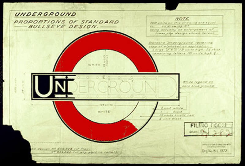
It has been the corporate font of public transport in London since the foundation of the London Passenger Transport Board in 1933, and of predecessor companies since its introduction in 1916.
It is one of the world’s longest-lasting examples of corporate branding. It remains a copyrighted property of the LPTB’s successor, Transport for London.
3. The Personality of Fonts
There are many studies regarding fonts personality and fonts psychology.
Fonts have a huge capability to convey attitude, induce and change mood, and create emotions.
People with stable personalities prefer the fonts Times New Roman, Arial, and Cambria, while for assertive people, Impact, Rockwell, and Xbold are the best fonts.
TIP: Experiment with different fonts to see which fonts match best the personality of your audience.
4. Helvetica is the most used font in print, and in the whole world.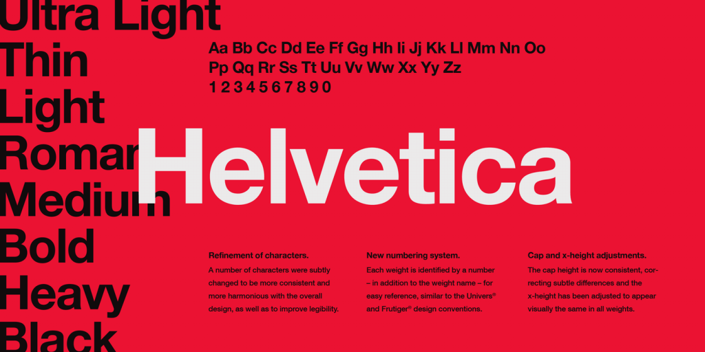
Helvetica is like water; everybody is using it.
Helvetica is the most used font in print, and you will find everywhere: on websites, on T-shirts, on flyers, posters, in movies, and much more.
5. Helvetica is in our top 15 rare facts again. A man tried for a whole day not to intereact with Helvetica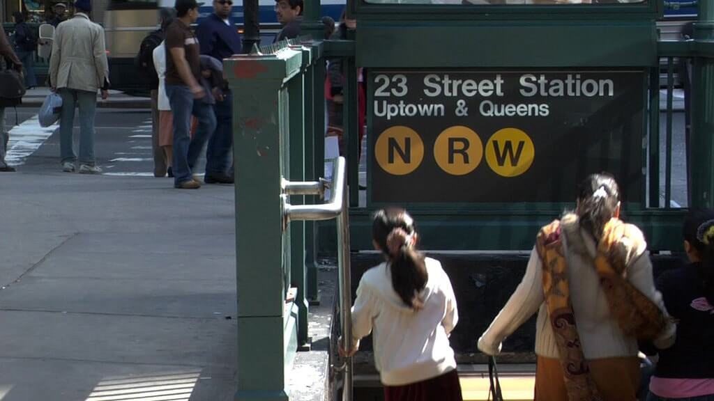
Cyrus Highsmith set himself a challenge, to avoid for a whole day the typeface Helvetica. He decided to stop buying anything branded with this font and not travelling with transports vehicles that are using Helvetica.
He avoided as much as he could computers, payment cards, the internet, but finally he cracked, it is impossible to live normally and not use Helvetica.
6. Textura was the font used to print the first Gutenberg Bible.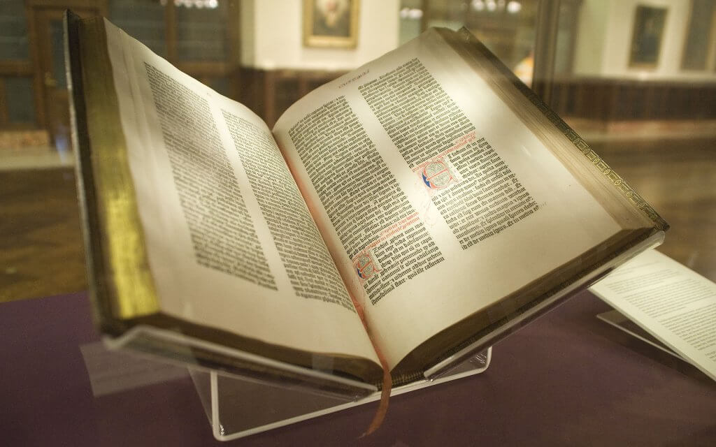
The Gutenberg Bible was among the earliest major books printed using mass-produced movable metal type in Europe. It marked the start of the “Gutenberg Revolution” and the age of printed books in the West. The book is valued and revered for its high aesthetic and artistic qualities as well as its historic significance.
7. IKEA changed the font 2 times since 2009 and their customers got angry
In 2009, IKEA switched from Future to Verdana, creating masses of unhappy people.
After all of that trouble, in 2016, they changed the font to Noto.
IKEA adopted Noto typeface because it is a much simply, slimmer and cleaner font than Verdana. It was launched in 2016 after a 5-year huge work, and it was created to be the most universal font ever.
IKEA has stores all over the world and they hugely needed it. The result, it worked fantastic.
8. Baskerville is a super trustworthy font.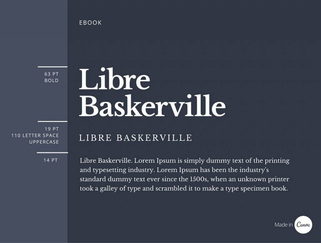
Imagine or not, people made experiments which indicated that people are more likely to trust information written in Baskerville font than in Helvetica (how is that possible, this is the most used font in the world), Comic Sans, Trebuchet, Computer Modern, and others.
Why? Because Baskerville font has a British sense of formality and solemnity that enhances its credibility.
9. Fancier fonts in restaurants menu means better food and high prices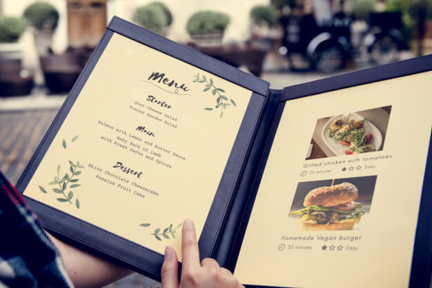
When you are seeing a fancier font in the restaurant menu, you automatically think that the food will be great and the prices will be higher than in the average restaurant. If the food description is bigger than you expect, your brain tells you that you are getting more for your money, so it is normally to pay the high price.
There is a full restaurant menu psycology that you can check here.
10. Italics was invented by an Italian
“Italics” are written in italic type, which got their name because they were invented by an Italian, Aldus Manutius. They were based on the Italic script, a form that became popular with the rise of the Humanist movement.
11. Time ago, fonts were extremely difficult to correctly identify
Can you imagine the huge work that people used to do to correctly identify fonts? They were working in large teams for several days, weeks, and even months. The process was ultra-complicated and many times errors appeared.
Even now it is a complicated process if you are not using a font finder software like What Font Is. This powerful font finder is using a catalogue of over 550k fonts (free and paid) and a super artificial intelligence robot that is doing all the hard work.
You simply upload (free to use) a picture of the font you are looking to identify, and What Font Is will quickly show you the font you need and over 60 similar fonts. You will get the name of the font, the information regarding the price and the link to download it.
Use What Font Is to find any font from any picture in 60 seconds or less.
In the endThe world of rare and fun facts about fonts will continue, it’s a promise that in this year we will write for you other articles regarding these topics.
There are hundreds of cool things that you will find out about fonts, keep an eye on our blog and prepare yourself a comfortable position to read what we happily prepare for you.

I'm a programmer at heart. But in my 20s, I realized there was more to the world of fonts than just Courier.
Driven by endless curiosity, I built a system to explore them.
That project grew into one of the world’s leading font identifier platforms: www.WhatFontIs.com.
By 2024, WhatFontIs is helping nearly one million designers—famous or not—discover the names of the fonts they need.

