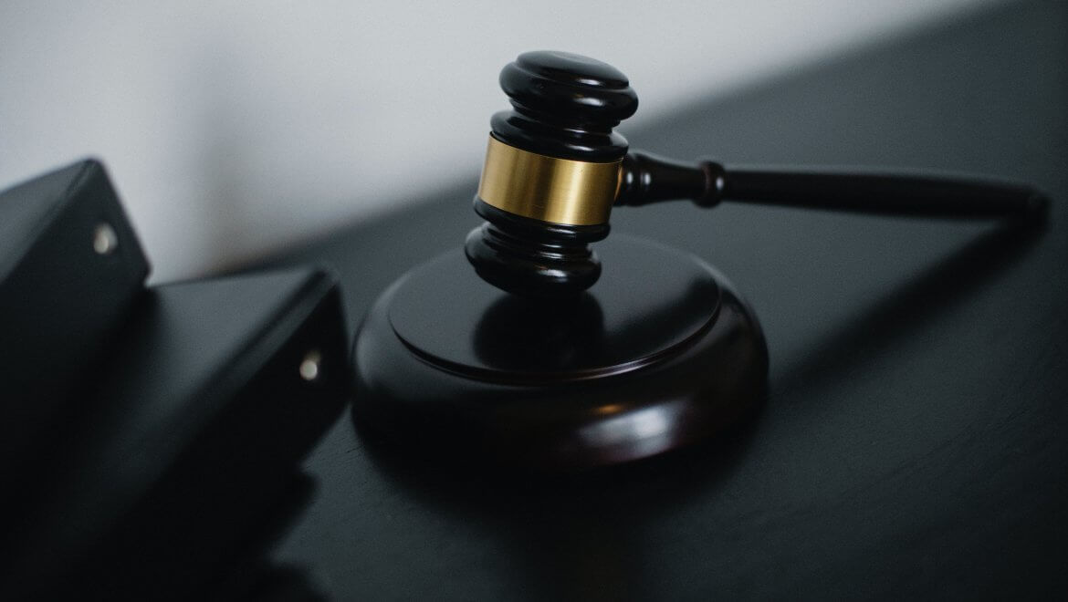
US Court of Appels in DC don’t want lawyers use Garamond font when filling briefs.
Court clerk Mark J. Langer said to lawyers a few days ago that the court will officially “discourage use of Garamond”, as this font is harder to read than other options.

Mark J. Langer wrote in a notice: “Briefs that use Garamond as the typeface can be more difficult to read and the use of this typeface is discouraged,”.
It is very interesting what is going on. This can be the start of a huge move in the font’s world.
Maybe each country, government, institution, or company, will encourage or discourage the use of particular fonts.
For sure we will see in the following years huge changes in fonts usage. Some will become popular and big names will probably get in the dark pretty fast.
One such an example is exactly Garamond, a super popular font.
But is Garamond really hard to read?Garamond is one of the most popular fonts in the last centuries, and it is used everywhere, including in Harry Potter books.
Harry Botter books were sold in over 500 million copies and it seems that its readers didn’t had problems with Garamond font.
The font was created in the 16th Century by French engraver Claude Garamond, and it is often used for printing books and body texts.
Designers consider Garamond the very best font for print. They say that this font is very readable.
This is very different from what US Court of Appels in DC says about Garamond. Why do they consider Garamond hard to read? Maybe filling is done on computers where Garamond is not so great? Probably yes, I don’t have any experience in this. If you know better, send us a message so we can update the article.
Court rules regarding fontsIf you didn’t know, yes, courts have their own rules regarding fonts. There isn’t a general policy regarding fonts, each court has its own rules.
Here are some of them:
- Typefaces should be at least 14-point in most courts, but some accept also 12-point texts.
- Courts recommend the use of very different fonts.
- Most times, courts recommend serif fonts.
- Court clerk is encouraging briefs to be filed in Century and Times New Roman.
Langer wrote: “The court has determined that certain typefaces, such as Century and Times New Roman, are more legible than others, particularly Garamond, which appears smaller than the other two typefaces,”.
But on which medium are these typefaces more legible than others, on print or on computers?
If filling is done on both print and computers, yes, Garamond for sure is not the best typeface to choose. As I already mentioned, Garamond is a great font to use in print, but not on computers. For both print and computers, Times New Roman is a much better option.
ConclusionsIt is great to see what a strong importance people started to give to fonts.
I mean that now we can easily choose the fonts we like on almost all devices we use: TVs, computers, tablets, mobile phones, but also on the internet, or on our operating systems.
In plus, there are even games created inside fonts.
The name of the video game which was created inside a font is Fontemon. It was created by Michael Mulet. I wrote a full article about this game, you can find it here.
Fonts represent a huge universe and we probably discovered only a very small part of it. Let’s see what the future of fonts will bring us in the following years.
I'm a programmer at heart. But in my 20s, I realized there was more to the world of fonts than just Courier.
Driven by endless curiosity, I built a system to explore them.
That project grew into one of the world’s leading font identifier platforms: www.WhatFontIs.com.
By 2024, WhatFontIs is helping nearly one million designers—famous or not—discover the names of the fonts they need.


