Serif fonts, known for their distinctive strokes and timeless appeal, have been a cornerstone of typography for centuries. But what exactly defines a serif, and why have these fonts remained so popular across various design applications?
This guide explores the definition, characteristics, and history of serif fonts, offering practical insights into how they can enhance readability and brand identity. By understanding the nuances of serif typography, you can make informed decisions that elevate your projects and resonate with your audience.
Table of ContentsDefinition of serif – understanding the basics
Serif font characteristics and anatomy
Types of serif fonts and their distinctive features
Examples of serif fonts and popular choices
Serif vs sans-serif fonts – key differences
History of serif fonts and their evolution
Serif font usage in modern design and applications
Choosing the right serif font for your project
Making Informed Typography Choices
Definition of serif – understanding the basicsTo understand the definition of serif, you need to recognize these typographic elements that have shaped written communication for centuries. A serif is a small stroke or line extending from the main strokes of a letter. These flourishes appear at the beginning or end of character stems. They might seem small, but they play a big role in how we read text.
The serif meaning goes beyond decoration. These strokes serve aesthetic and functional purposes, guiding the reader’s eye along lines of text and creating a sense of flow that enhances readability. When you look closely at a serif font, you’ll see how these extensions create horizontal and vertical planes within words, establishing a rhythm that makes reading more comfortable.
To answer what is a serif, think of the difference between a simple drawing and one with small details. Serifs add character and help each letter maintain its distinct identity while connecting with neighboring characters. This serif def includes both the visual appeal and the functional benefits that have made these fonts endure through centuries of typographic evolution.
Natalie Downey, Senior Designer at Duckpin, explains that “a serif is a decorative line or taper added to the beginning and/or end of a letter’s stem, which creates small horizontal and vertical planes within a word.” This definition captures how serifs transform simple letterforms into more complex, readable, and visually appealing characters that have stood the test of time in both print and digital media.
Now that we’ve covered the basics, let’s delve deeper into the anatomy and characteristics that make serif fonts so unique.
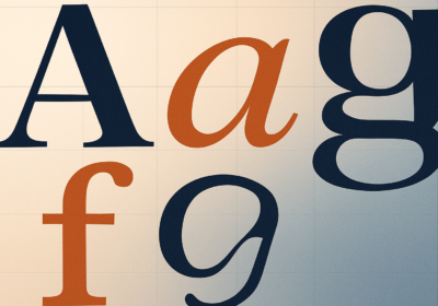
Serif font characteristics and anatomyThe serif font characteristics extend beyond the presence of serifs. These fonts have a complex anatomy that contributes to their unique appearance and readability. Understanding serif font anatomy means examining how various elements create cohesive, elegant letterforms that have remained popular for centuries.
The foundation of serif typography lies in the balance between thick and thin strokes, known as contrast. This variation creates visual interest and helps distinguish letters, especially in smaller sizes. The stress of the letterforms, the angle of the thickest parts of curved letters, varies among serif styles and contributes to their overall character.
Key anatomical features that define serif type include the baseline alignment, x-height consistency, and the relationship between ascenders and descenders. Serifs come in various forms, from delicate hairline extensions to bold, bracketed flourishes. Some serifs feature brackets, curved connections between the serif and the main stroke, while others maintain sharp, unbracketed transitions that create different visual effects.
The aperture of letters, the opening in characters like ‘e’ and ‘c’, also plays a role in serif font legibility. Designer Madeline DeCotes notes that serifs often lend more legibility at smaller scales because these anatomical features create clear letter recognition even when text is reduced in size. This makes serif fonts valuable for printed materials where space constraints require smaller text sizes while maintaining readability.
With a solid grasp of serif anatomy, we can now explore the diverse world of serif font styles and their distinctive features.
Types of serif fonts and their distinctive featuresThe world of types of serif fonts includes four main categories, each representing different periods in typographic history and offering distinct aesthetic qualities. These classifications help designers understand the subtle differences that make each style appropriate for specific applications.
Main types of serif fonts:
- Old Style,
- Transitional,
- Modern (Didone),
- Slab Serif.
Old Style serifs, the earliest category of serif font styles, emerged during the Renaissance and emulate the hand-lettered manuscripts of that era. These fonts feature diagonal stress, meaning the thickest parts of curved letters angle to the left, creating an organic, calligraphic feel. The contrast between thick and thin strokes remains moderate, and the serifs are often bracketed with gentle curves. Classic examples like Garamond and Caslon exemplify this style’s warmth and readability, making them excellent choices for extended reading in books and literary publications.
Transitional serifs bridge the gap between old style and modern classifications, representing the 18th-century evolution toward more refined typography. These fonts display more vertical stress and increased contrast between thick and thin strokes compared to old style predecessors. The serifs become more refined and less calligraphic, reflecting the period’s movement toward greater precision in printing technology. Baskerville and Times New Roman represent this category, offering versatility that works well in both traditional and contemporary contexts.
Modern serifs, also known as Didone fonts, emerged in the late 18th and early 19th centuries, characterized by extreme contrast between thick and thin strokes and completely vertical stress. These serif lettering styles feature unbracketed, hairline serifs that create a stark, geometric appearance. Fonts like Didot and Bodoni exemplify this dramatic style, which works particularly well for headlines, luxury branding, and fashion applications where a sophisticated, contemporary aesthetic is desired.
Slab serifs, the most recent addition to serif classification, developed during the Industrial Revolution to meet the demands of advertising and display typography. These fonts feature thick, block-like serifs with minimal contrast between thick and thin strokes, creating bold, attention-grabbing letterforms. Examples like Rockwell and Clarendon demonstrate how slab serifs can convey strength and reliability, making them popular choices for corporate branding and editorial headlines.
Now that we’ve explored the different types of serif fonts, let’s look at some specific examples and popular choices that you might recognize.
Examples of serif fonts and popular choicesWhen exploring examples of serif fonts, certain typefaces have become widely recognized due to their design qualities and versatility across applications. These popular serif fonts have become standards, each offering characteristics that make them suitable for different contexts.
Times New Roman is perhaps the most recognizable of all common serif fonts, originally commissioned by The Times newspaper in 1931. Its compact design and readability at small sizes made it a natural choice for newspaper printing, and later for digital applications. The font’s balanced proportions and moderate contrast make it effective for body text and headlines, explaining its ubiquity in academic papers, business documents, and web content.
Georgia is a more recent addition to essential serif fonts, specifically designed by Matthew Carter for screen readability. This font addresses the challenges of digital display by featuring larger x-heights and more open letterforms than traditional serif fonts. The robust character shapes and carefully crafted serif font alphabet ensure clarity even at low resolutions, making Georgia a preferred choice for web designers who want the elegance of serifs without sacrificing digital legibility.
Garamond, with its Renaissance origins, continues to be celebrated for its elegant proportions and readability in extended text. This old style serif demonstrates how classical typography principles remain relevant. Its organic character shapes and moderate contrast create a warm, inviting reading experience that works well for books, magazines, and high-end branding applications where sophistication and tradition are valued.
Having examined specific examples, let’s now contrast serif fonts with their sans-serif counterparts to understand their distinct roles in design.
Serif vs sans-serif fonts – key differencesThe difference between serif and sans-serif fonts goes beyond the presence or absence of decorative strokes. These font categories represent different approaches to typography, each offering advantages depending on the application. Understanding when to use serif vs sans serif fonts requires considering readability, aesthetic impact, and cultural associations.
Serif text traditionally excels in print, where the strokes help guide the reader’s eye along lines of text, creating a natural flow that reduces eye fatigue during reading. Robyn Young, founder of branding agency robyn young & co., observes that serif fonts remind us of more classical, formal and sophisticated themes, making them effective for establishing credibility in branding.
Sans-serif fonts, meaning “without serifs,” emerged later and initially faced resistance. However, their clean, minimalist appearance became associated with modernism. Designer Dylan Todd notes that sans-serif typefaces, while controversial when they first appeared, became symbols of cutting-edge design. If you’re exploring similar sans-serif fonts and alternatives, you’ll find a wide range of options available.
The choice between these fonts often depends on the medium. Designer Madeline DeCotes explains that sans-serif fonts are generally preferred for digital applications, particularly apps and websites, because legibility becomes a concern on smaller screens. However, serif fonts maintain their advantage in print and can be used for digital headlines where their character enhances visual hierarchy.
Cultural and psychological associations also play a role in font selection. Serif fonts tend to convey authority, tradition, and reliability, making them popular choices for academic institutions and legal firms. Sans-serif fonts suggest innovation, simplicity, and approachability, explaining their prevalence in technology companies.
To appreciate the full scope of serif fonts, let’s take a step back and explore their historical journey and evolution over time.
History of serif fonts and their evolutionThe history of serif fonts begins in ancient Rome, where stone carvers discovered that adding finishing strokes to letter endings improved the carving process and the final appearance of inscriptions. These early serifs likely developed from using brushes to outline letters before carving, creating flared edges that enhanced legibility and added visual appeal.
The evolution of serif font design accelerated with the invention of movable type in the 15th century. Early printers like Nicolas Jenson and Aldus Manutius drew inspiration from Roman inscriptions and medieval manuscripts, creating the first printed serif typefaces that established the foundation for centuries of typographic development. These humanist serifs captured the organic quality of hand lettering while adapting to the mechanical requirements of printing technology.
The 18th century marked a pivotal period in serif evolution, as type designers like John Baskerville began experimenting with increased contrast and more refined letterforms. This transitional period reflected cultural shifts toward rationalism, resulting in fonts that balanced traditional readability with contemporary sophistication. The improved printing techniques of this era allowed for finer details and sharper contrasts.
The Industrial Revolution brought about the most dramatic changes in serif design, with the development of modern serifs by designers like Giambattista Bodoni and Firmin Didot. These fonts featured extreme contrast and geometric precision, reflecting the era’s fascination with mechanical perfection. Simultaneously, the rise of advertising created demand for bold, attention-grabbing slab serifs that could compete with crowded visual environments.
Now that we’ve journeyed through history, let’s examine how serif fonts are utilized in modern design and various applications today.
Serif font usage in modern design and applicationsContemporary serif font usage demonstrates adaptability as these typefaces continue to find applications across design contexts. Modern designers appreciate how serif fonts can establish visual hierarchy, convey brand personality, and enhance readability while maintaining their associations with authority.
In branding, serif typography serves as a tool for communicating values such as tradition and expertise. Financial institutions and academic organizations frequently choose serif fonts to project stability. However, brands have also discovered how serif fonts can add warmth to modern identities, challenging the assumption that these fonts are inherently conservative.
Digital applications have expanded the possibilities for serif font usage beyond print. While early web design favored sans-serif fonts due to screen resolution limitations, improvements in display technology have made serif fonts viable for digital applications. Many websites now use serif fonts for headlines and even body text, particularly when targeting audiences that value sophistication.
Editorial design continues to rely on serif fonts for their performance in reading contexts. Magazines and books benefit from the way serifs guide the reader’s eye and create comfortable reading rhythms. Designer Natalie Downey emphasizes that serifs are naturally easier for the eye to read quickly, explaining their continued dominance in publications.
The versatility of modern serif fonts extends to packaging design, where they can convey premium quality. Food and beverage brands appreciate how serif fonts can suggest traditional methods, while luxury goods use them to communicate exclusivity. This demonstrates how the choice of a serif font word or phrase can influence consumer perception.
With a clear understanding of their modern applications, let’s discuss how to choose the right serif font for your specific design project.
Choosing the right serif font for your projectSelecting the right serif font for your project requires considering factors that influence aesthetic appeal and functional performance. The right serif font design choice can enhance your message’s credibility, improve readability, and strengthen brand identity. Understanding font pairing is also crucial for creating harmonious and effective typographic compositions, especially when combining serif fonts with other styles.
Begin by evaluating the purpose and context of your project. Consider whether you need a font for reading, display, or brand identity. Serif typography excels in different contexts depending on the style chosen. Old style serifs work for literary publications, while modern serifs might better serve luxury brands.
Technical considerations play a role in font selection. Evaluate how your chosen serif type performs at various sizes and across different media. Designer Madeline DeCotes notes that serifs often lend more legibility at smaller scales, but this varies among serif styles. Test your font choices in realistic conditions, considering printing quality and screen resolution to ensure performance.
Brand alignment represents another factor in serif font selection. Robyn Young emphasizes that serif fonts remind us of more classical themes, making them tools for brand positioning. Consider how your font choice will be perceived by your target audience and whether it supports your brand strategy. For projects requiring a different aesthetic, exploring options like the best script fonts can open up new creative possibilities.
Making Informed Typography ChoicesSerif fonts, with their rich history and diverse styles, offer a powerful tool for designers looking to enhance readability and convey specific brand values. By understanding the nuances of serif anatomy, historical context, and modern applications, you can select the perfect typeface to elevate your project. Whether you aim to evoke tradition, sophistication, or reliability, a well-chosen serif font can leave a lasting impression and ensure your message resonates with clarity and impact. Take the time to experiment with different styles and consider the context of your design to make informed typography choices that truly reflect your vision.
Serif Fonts: Frequently Asked Questions (FAQ)A serif font is a typeface that features small decorative lines or strokes, called serifs, at the ends of letter stems.
Serifs guide the reader’s eye along lines of text, enhancing readability and creating a classic, elegant appearance.
Serif fonts have decorative strokes (serifs) at the ends of letters, while sans-serif fonts do not. This makes serif fonts appear more traditional and formal, whereas sans-serif fonts look modern and clean.
The main categories are Old Style, Transitional, Modern (Didone), and Slab Serif, each with distinct historical and stylistic features.
Serif fonts are ideal for print materials, such as books, newspapers, and magazines, and for brands wanting to convey tradition, reliability, and sophistication.
Yes. While sans-serif fonts are often preferred for body text on screens, many modern serif fonts like Georgia are designed specifically for digital readability.
Absolutely. Serif fonts can convey authority, trustworthiness, and heritage, making them suitable for institutions, luxury brands, and editorial design.
Well-known serif fonts include Times New Roman, Garamond, Georgia, Baskerville, Didot, Bodoni, Rockwell, and Clarendon.
Consider your project’s purpose, readability needs, brand personality, and technical requirements like size and medium. Test fonts in context before making a decision.
Yes. Serif fonts can be paired effectively with sans-serif or script fonts to create visual contrast and hierarchy in your designs.

I'm a programmer at heart. But in my 20s, I realized there was more to the world of fonts than just Courier.
Driven by endless curiosity, I built a system to explore them.
That project grew into one of the world’s leading font identifier platforms: www.WhatFontIs.com.
By 2024, WhatFontIs is helping nearly one million designers—famous or not—discover the names of the fonts they need.