Google Fonts just crossed 1,800 typefaces. That number sounds clean and tidy until you sit with it for a minute. The service started in 2010 with around 18 fonts. Eighteen. Now you can browse a library a hundred times that size, for free, from a single dropdown in your CSS. It’s wild, and it changes what “choosing a font” really means in 2026.
From 18 to 1,800 in Sixteen YearsMost people who use Google Fonts never think about how the library got built. The short version: Google pays for it. The company commissions original typefaces from independent foundries, hires type designers directly for in-house work, and accepts high-quality open-source submissions from the wider community. That triple pipeline is why the catalogue keeps adding new families every month without slowing down, and why the quality bar keeps rising rather than flatlining.
What used to be a pile of slightly-OK free fonts is now a serious working library. Five years ago, picking a free typeface meant compromising on something — kerning, language support, weight range. Today, those compromises are mostly gone. The catalogue is wide enough that you can build an entire brand system without ever opening a paid foundry’s site.
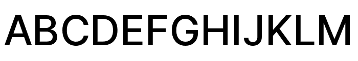
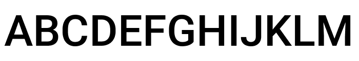
The Usage Numbers Are BananasHere’s a stat that stopped me cold: Inter, the workhorse sans-serif by Rasmus Andersson, recorded 414 billion accesses in a single twelve-month window. Not downloads. API calls. Every time a browser fetched Inter to render a webpage, Google logged a request. That’s a 57 percent year-over-year jump, which means the curve isn’t flattening — it’s accelerating.
Roboto tells an even older story. It ships as the default system font on Android, which means it accounts for roughly 20 percent of all web font usage globally. One out of every five pages you load on any given day is probably setting text in Roboto somewhere. That kind of ubiquity is genuinely unprecedented in typographic history. Helvetica, the most famous typeface of the 20th century, never came close to that level of saturation.
But there’s a quiet downside to ubiquity. When a font is everywhere, it stops carrying personality and starts carrying associations that have nothing to do with your project. Recognition isn’t the same thing as character.
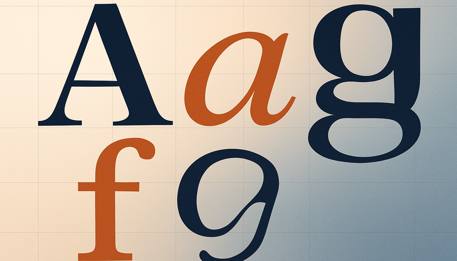
The Serif Comeback Is Real, and It’s Different This TimeOne of the most interesting shifts inside Google Fonts over the last year has been the quality of new serif additions. Serifs used to be a kind of nostalgic gesture on the web — something you reached for when you wanted to signal “this is serious” or “this is editorial.” That assumption is breaking down fast.
The serifs landing in late 2025 and early 2026 were drawn with small screens in mind from the start. Designers built optical-size considerations in so a single weight reads cleanly at 12px body copy and still looks composed at 48px display. They support variable workflows by default — one font file covers a headline, a subhead, and a caption. Accessibility was a design constraint, not a bolt-on — apertures stay open at small sizes and spacing defaults play nicely with dyslexia-conscious reading.
That’s a maturing of what “responsive typography” actually means. CSS scaling alone isn’t enough. The letterforms themselves have to perform across contexts that didn’t exist when the classic serifs were drawn.
Personality vs. Ubiquity: The Real Choice in 2026Here’s where it gets interesting for designers. The top ten fonts on Google Fonts — Roboto, Open Sans, Lato, Montserrat, Inter, Poppins, and a few others — dominate usage so completely that they’ve started to feel invisible. They’re competent. They’re safe. And they’re everywhere.
Meanwhile, the catalogue is full of typefaces with genuine character that almost nobody clicks through to find. Fraunces is a variable serif with a “wonk” axis you can literally crank up to make the letterforms more eccentric. Instrument Serif is a high-contrast editorial face that looks like it walked out of a vintage fashion magazine. Bricolage Grotesque is a quirky variable sans that flexes from neutral to extremely expressive. DM Serif Display brings drama without trying too hard.
None of these have the usage numbers of the top ten. All of them have something the top ten are losing: distinction.
How to Actually Find the Good StuffThe question is no longer whether you can afford a good typeface. It’s whether you’re willing to look past the first page of results to find the right one.
The default Google Fonts interface sorts by popularity, which means the same ten faces show up at the top for everyone. If you keep using that view, you’ll keep designing with what everyone else is using. Here are a few strategies that work better.
- Sort by Newest. Recent additions tend to be the most technically sophisticated, since the designers benefited from years of lessons learned across the rest of the catalogue.
- Filter by variable axes. Narrowing to fonts with an optical-size axis or an italic axis surfaces families that were drawn for real reading contexts, not just specimen pages.
- Use the paragraph specimen view. Body text is where typography actually lives. A font that looks gorgeous in a single word can fall apart in a column.
- Search by designer. If you admire someone’s commercial work, search their name. A lot of designers have quietly contributed open-source families that almost nobody knows about.
At 1,800 typefaces, Google Fonts has crossed a real threshold. Library breadth is no longer the limiting factor in any design decision. Need a neutral grotesque for a dashboard? It’s in there. Want a warm humanist serif for a longform layout? Multiple options. Looking for a variable display face that can swing from elegant to chaotic? Yes, several.
The practical upshot is that “we used Roboto because it was the free option” doesn’t really work as a rationale anymore. Choosing a font from this library should now reflect the same intentionality as choosing a paid one. Read the specimen. Test it in context. Pick the typeface that serves the project rather than the one that loaded fastest in the dropdown.
The library earned that expectation. The designers who built it deserve that level of attention. And honestly? Your work will be better for it.
So here’s the question: when was the last time you scrolled past the first row of Google Fonts and actually fell in love with something? If the answer is “never,” that might be worth changing this month.
Spotted a Google Font in the Wild? WhatFontIs Can Name ItHere’s something worth knowing if you ever come across a typeface you can’t identify. WhatFontIs.com detects Google Fonts directly — upload an image or paste a URL, and it will tell you exactly which Google font you’re looking at. We’re the only font identifier that offers this specifically for the Google Fonts library, which makes it dead simple to go from “I love that type” to actually using it in your own project. Take a look at the specimens above — Roboto, Inter, and Bricolage Grotesque — each one links straight to its WhatFontIs page, where you can preview the font, see matching alternatives, and grab everything you need to start using it.

I'm a programmer at heart. But in my 20s, I realized there was more to the world of fonts than just Courier.
Driven by endless curiosity, I built a system to explore them.
That project grew into one of the world’s leading font identifier platforms: www.WhatFontIs.com.
By 2024, WhatFontIs is helping nearly one million designers—famous or not—discover the names of the fonts they need.