Typography is more than just selecting the right font; it’s about fine-tuning the details that make text visually appealing and readable. Kerning, the adjustment of space between individual letters, is one such detail that can significantly impact the overall quality of your designs.
This guide provides a comprehensive overview of kerning, covering its definition, differences from other spacing techniques, practical applications, and strategies for achieving professional results. Whether you’re a seasoned designer or just starting, understanding kerning is essential for mastering the art of typography.
Table of Contents
- What is kerning – Definition and fundamentals
- Kerning vs tracking – Understanding the key differences
- Leading and kerning – How spacing elements work together
- Font-kerning techniques and best practices
- Kerning in design – Practical applications and examples
- Manual kerning strategies for professional results
- Common kerning mistakes and how to avoid them
- Frequently Asked Questions
Kerning is a crucial aspect of professional design that’s often overlooked. It involves adjusting the space between individual letter pairs to create visually balanced and harmonious text. Understanding kerning in typography goes beyond simple spacing; it’s about creating an optical effect where letters appear evenly spaced, even when the actual distances between them differ. For a broader understanding of design principles, explore typography terms and rules that every designer should know.
The principle behind kerning is rooted in how our eyes perceive letter shapes and the spaces around them. Different letter combinations need varying amounts of space to appear balanced because each letterform has unique characteristics. For example, straight-edged letters like “H” and “I” need more space between them than curved letters like “O” and “C” to achieve the same visual weight.
Why kerning matters in typography- Visual Balance: Creates optical consistency where letters appear evenly spaced regardless of their actual distances
- Enhanced Readability: Improves text flow and reduces visual distractions that can slow reading speed
- Professional Quality: Demonstrates attention to detail and commitment to typographic excellence
- Brand Impact: Particularly important for headlines, logos, and display typography where spacing irregularities are immediately noticeable
Professional designers understand that kerning enhances readability while maintaining aesthetic appeal. When done correctly, it creates a seamless reading experience where individual letters work together, allowing readers to focus on the message without distraction.
Now that we’ve defined kerning, let’s explore how it differs from another essential typography concept: tracking.
Kerning vs tracking – Understanding the key differences Key differences between kerning and trackingKerning and tracking both involve adjusting letter spacing, but they operate on different scales and serve distinct purposes. The key difference lies in their scope and application, making it essential for designers to understand when and how to use each technique.
| Aspect | Kerning | Tracking |
|---|---|---|
| Scope | Individual letter pairs | Entire words, sentences, or paragraphs |
| Purpose | Fix specific spacing problems | Adjust overall text density |
| Application | Targeted adjustments | Uniform spacing changes |
| Best for | Headlines, logos, display text | Body text, justified text blocks |
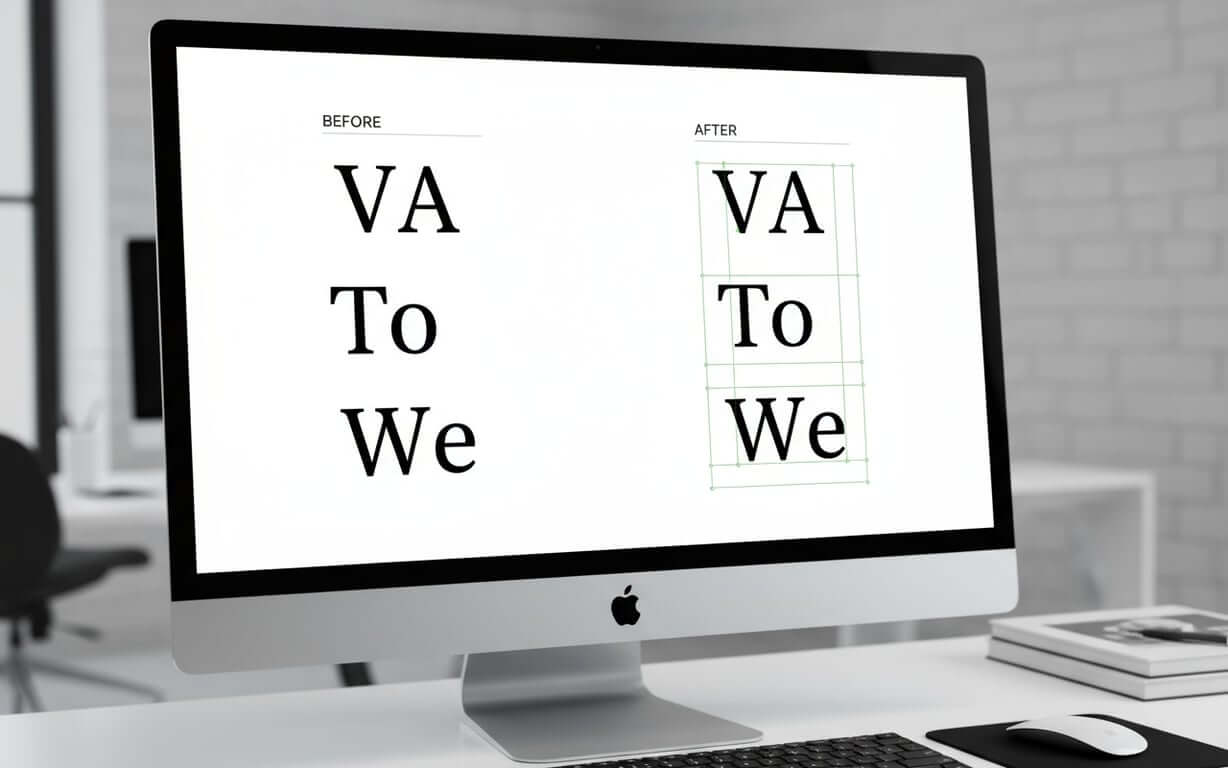
Kerning focuses on the relationship between individual letter pairs, addressing specific combinations that may appear too close or too far apart. This adjustment targets pairings like “VA,” “To,” or “We,” where the letter shapes create visual inconsistencies. Tracking, however, applies uniform spacing adjustments across entire words, sentences, or paragraphs, affecting the overall texture and density of text blocks.
Tracking proves most valuable when adjusting the overall appearance of body text, tightening or loosening entire paragraphs to improve readability or fit design constraints. It’s particularly useful when working with justified text or when trying to achieve a particular visual density across large amounts of content.
Understanding tracking and kerning as complementary techniques allows designers to create more sophisticated typography. Kerning perfects the relationships between individual letters, while tracking establishes the overall rhythm and texture of text. Designers often apply tracking first to establish the general spacing, then use kerning to fine-tune specific letter combinations.
Beyond kerning and tracking, leading also plays a crucial role in creating balanced and readable typography. Let’s examine how these spacing elements work together.
Leading and kerning – How spacing elements work together What is leading in typography?Leading and kerning form the foundation of professional typography, with each element influencing how readers perceive text. Leading, the vertical space between lines of text, works with kerning to create balanced, readable typography that guides the eye through content. To further improve your typography design, it’s crucial to understand how these spacing elements work together.
How spacing elements complement each other- Horizontal and Vertical Balance: Kerning creates harmony between individual letters while leading establishes comfortable vertical relationships
- Unified System: Adjustments to one element often necessitate changes to the other for optimal visual cohesion
- Reading Flow: Proper leading allows readers to move smoothly from line to line without visual fatigue
- Density Control: Tightly kerned text may require more generous leading to prevent lines from appearing cramped
When considering how these elements interact, designers must understand that adjustments to one often necessitate changes to the other. Tightly kerned text may require more generous leading to prevent lines from appearing cramped, while loosely spaced letters might benefit from tighter line spacing to maintain visual cohesion. The space between letters and the space between lines must be considered as a unified system.
Typographers recognize that letter spacing affects the need for vertical adjustments. When text appears too dense due to tight letter spacing, increasing the leading can restore balance and improve readability, demonstrating how these principles work together to create effective communication design.
Now that we understand how kerning interacts with other typographic elements, let’s delve into specific techniques and best practices for effective font kerning.
Font-kerning techniques and best practices
- Identify problematic letter pairs: Focus on combinations with diagonal strokes (A, V, W, Y) combined with straight-edged letters, or letters with overhanging elements like F, L, and T
- Understand letter shape relationships: Two straight letters require the most space, straight paired with rounded needs slightly less, and two rounded letters need the least space
- Work at final intended size: Spacing that appears correct at large sizes may need adjustment when reduced to ensure optimal results
- Use visual aids: Flip text upside down to focus on letter shapes and spacing relationships without being distracted by content meaning
- Save kerning for final stages: Ensure all other typographic decisions are settled before fine-tuning letter relationships
Mastering kerning requires a systematic approach that combines technical knowledge with visual sensitivity. It begins with understanding which letter combinations typically need attention, as certain pairings consistently create spacing challenges across different typefaces and design contexts.
| Letter Combination Type | Spacing Requirement | Common Examples | Adjustment Strategy |
|---|---|---|---|
| Straight + Straight | Most space needed | HI, NN, MM | Maintain generous spacing |
| Straight + Round | Moderate space needed | HO, NO, DO | Reduce space slightly |
| Round + Round | Least space needed | OO, CO, GO | Tighten spacing considerably |
| Diagonal combinations | Variable, often tight | VA, WA, To | Manual adjustment required |
Effective techniques involve understanding the relationship between letter shapes and perceived space. Best practices include working at the final intended size, as spacing that appears correct at large sizes may need adjustment when reduced. Designers also recommend using visual aids such as flipping text upside down to focus on letter shapes and spacing relationships. Saving kerningadjustments for the final stages of design ensures that all other typographic decisions are settled before fine-tuning letter relationships.
With these techniques in mind, let’s explore how kerning is applied in various design contexts.
Kerning in design – Practical applications and examples Real-world kerning applicationsUnderstanding kerning in practical design contexts helps designers recognize when and where to apply these techniques for maximum impact. It’s a critical component of brand identity, user experience, and visual communication.
- Logo Design: Brand names and taglines require precise letter spacing to convey professionalism and reinforce brand credibility
- Headlines and Display Typography: Large text sizes amplify spacing irregularities, making careful kerning essential for maintaining reader engagement
- Print and Digital Advertising: Ensures messages remain legible across various sizes and viewing distances, from billboards to web banners
- User Interface Design: Critical for navigation elements, buttons, and headings that guide user interaction
Logo design represents one of the most important applications. Brand names and taglines require precise letter spacing to convey professionalism. Poor kerning in logos can undermine brand credibility, while expertly adjusted spacing reinforces the brand’s commitment to quality. Examples often involve custom adjustments that go beyond standard font metrics to create unique, memorable wordmarks.
Headlines and display typography showcase another crucial application where kerning and manual techniques combine to create compelling visual hierarchy. Large text sizes amplify spacing irregularities, making careful kerning essential for maintaining reader engagement. Optical algorithms can provide a starting point, but manual refinement typically produces superior results.
Kerning software and toolsModern software offers sophisticated tools for both automated and manual adjustment, including real-time preview capabilities and kerning pair databases. The most effective approach typically combines automated starting points with manual refinement, allowing designers to leverage technology while maintaining creative control.
Print and digital advertising campaigns rely on effective kerning to ensure messages remain legible across various sizes and viewing distances. Whether designing billboards, magazine advertisements, or web banners, designers must consider how kerning affects readability at different scales. The choice between metric kerning (using built-in font spacing) and optical kerning(algorithmic adjustment) often depends on the specific typeface and application.
While automated tools are helpful, manual kerning often yields the best results. Let’s explore strategies for achieving professional results through manual adjustments.
Manual kerning strategies for professional results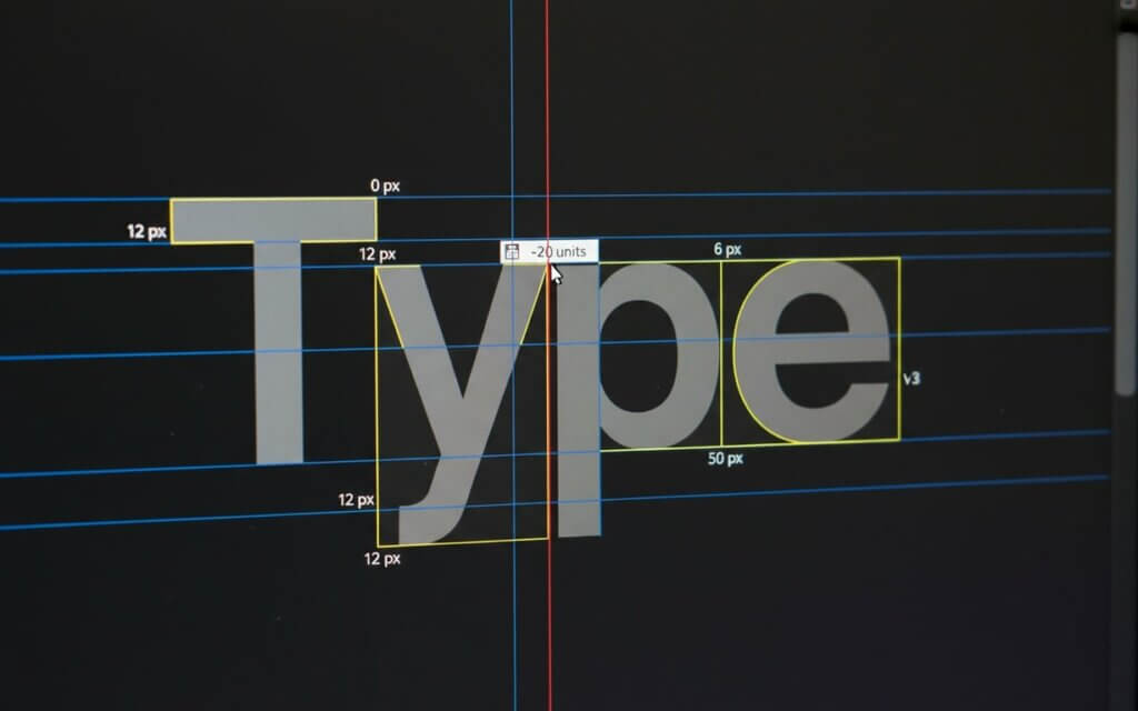
Manual kerning represents the pinnacle of typographic craftsmanship, requiring designers to develop technical skills and visual sensitivity. Automated solutions cannot replace the nuanced judgment that comes from manual adjustment.
Professional manual kerning workflow- Identify problematic combinations: Focus on letter pairs that create obvious visual disruptions rather than attempting to adjust every pair
- Trust visual judgment: What appears balanced to the eye should take precedence over equal numerical spacing
- Use visual aids: View text upside down, squint to blur details, or use high contrast backgrounds to isolate spacing relationships
- Consider point size impact: Finalize font sizes before completing kerning work, as different sizes affect spacing perception
- Work systematically: Reserve spacing adjustments for final design phases when all other elements are settled
Professional manual kerning begins with identifying the most problematic letter combinations within your specific text. Rather than attempting to adjust every letter pair, focus on combinations that create obvious visual disruptions. This targeted approach proves more efficient.
The process requires trusting your visual judgment over mathematical measurements. What appears balanced to the eye should take precedence over equal numerical spacing, as the goal is creating optical consistency. Experienced designers often describe kerning as creating an “optical effect” of even spacing.
Professional results also depend on understanding how different point sizes affect spacing perception. Adjustments that work perfectly at 48 points may require modification at 24 points, making it essential to finalize font sizes before completing kerning work. This explains why professional workflows typically reserve spacing adjustments for the final design phases.
Even with careful attention, common kerning mistakes can occur. Let’s examine these pitfalls and how to avoid them.
Common kerning mistakes and how to avoid them Most common kerning errors and prevention strategiesEven experienced designers can fall into common kerning traps. Recognizing these frequent mistakes and understanding prevention strategies helps maintain consistent quality across all design projects. For a broader perspective on common errors, consider these typography mistakes that designers should avoid.
- Inconsistent Spacing: Some letter pairs receive careful attention while others remain unaddressed, creating uneven text texture that draws unwanted attention
- Over-reliance on Automation: Using automated solutions without manual refinement produces technically correct but visually unsatisfying results
- Ignoring Typography Relationships: Making kerning adjustments in isolation from tracking, leading, and overall text hierarchy
- Point Size Neglect: Kerning text at one size but using it at another without adjustment, since spacing perception changes with scale
Inconsistent spacing represents the most prevalent error, where some letter pairs receive careful attention while others remain unaddressed. This creates uneven text texture that draws unwanted attention to spacing irregularities. Avoiding this mistake requires systematic evaluation of all significant letter combinations within a text block, ensuring that spacing adjustments create overall harmony.
Over-reliance on automated solutions without manual refinement often produces technically correct but visually unsatisfying results. While optical algorithms have improved, they cannot account for the specific context, aesthetic goals, or subtle visual relationships that human designers perceive. Professional practice involves using automated kerning as a starting point while reserving final adjustments for manual refinement.
Ignoring the relationship between kerning and other typographic elements creates another problem. Proper letter spacing must work with tracking, leading, and overall text hierarchy. Adjustments made in isolation from these other factors often require revision when the complete typographic system comes together.
Point size neglect represents a technical mistake where designers kern text at one size but use it at another without adjustment. Since spacing perception changes with scale, kerning that appears perfect at large sizes may look cramped or loose when reduced. Professional workflows address this by finalizing all size specifications before beginning detailed kerning work, or by creating size-specific kerning variations for critical applications like logos.
Frequently Asked QuestionsKerning adjusts space between specific letter pairs to address individual spacing problems, while letter spacing (tracking) applies uniform spacing changes across entire text selections. Kerning is precise, targeting problematic combinations, while letter spacing affects overall text density.
Use manual kerning for headlines, logos, and display text where spacing precision is critical. Automatic kerning works well for body text and initial adjustments, but manual refinement is essential for high-visibility applications.
Properly kerned text should appear evenly spaced without letters touching or creating obvious gaps. If letters seem to merge or create unintended shapes, the kerning is too tight. If spacing appears inconsistent or creates visual holes, adjustments are needed.
Problematic combinations typically include diagonal letters (A, V, W, Y) paired with straight letters, and letters with overhangs like F, L, T. Specific pairs like “VA,” “WA,” “To,” “We,” and “Yo” frequently require manual adjustment.
Always kern at the final intended size, as spacing perception changes with scale. Kerning that looks perfect at 72 points may appear too tight or loose at 18 points. For applications requiring multiple sizes, create size-specific adjustments.
How does kerning affect readability?
Proper kerning improves readability by creating consistent visual rhythm. Poor kerning can slow reading speed, increase eye fatigue, and distract from the intended message.
Different fonts have varying kerning requirements based on their design characteristics. Some fonts include extensive built-in kerning pairs, while others require more manual adjustment. Script and decorative fonts typically need more kerning attention.
Yes, excessive kerning can make text appear unnatural. The goal is subtle improvement that enhances rather than dominates the reading experience. When kerning becomes noticeable, it’s likely been overdone.
Practice with online kerning games, study well-designed typography examples, and experiment with different typefaces. Develop your eye by comparing before and after examples, and seek feedback from experienced designers.
Professional design software like Adobe InDesign, Illustrator, and Photoshop offer kerning tools. Specialized typography software like FontLab provides advanced capabilities for font development. For users of a popular word processor, you can also learn everything you need to know about kerning in Microsoft Word. The key is learning to use both automatic and manual kerning features effectively.
Kerning is more than a mere technicality; it’s an art that elevates typography from functional to exceptional. By understanding the principles, techniques, and common pitfalls, designers can create visually harmonious and readable text. Take the time to practice manual adjustments, experiment with different typefaces, and trust your visual judgment. Your attention to detail will not only enhance your designs but also demonstrate a commitment to quality that sets your work apart. Embrace kerning as an essential skill, and watch your typography transform.

I'm a programmer at heart. But in my 20s, I realized there was more to the world of fonts than just Courier.
Driven by endless curiosity, I built a system to explore them.
That project grew into one of the world’s leading font identifier platforms: www.WhatFontIs.com.
By 2024, WhatFontIs is helping nearly one million designers—famous or not—discover the names of the fonts they need.