Typography is a silent messenger for your brand, conveying its personality, values, and level of professionalism even before your audience reads the actual message.
The right font selection acts as a strategic decision that influences how your brand is perceived, creating emotional bonds that can sway purchasing decisions and foster brand loyalty.
Table of Contents- Understanding the fundamentals of branding typography
- Best font style for logo design – the four main categories
- Font for business applications – matching typography to industry
- Business logo fonts – essential selection criteria
- Best ad fonts and marketing typography strategies
- Famous fonts for logos – learning from successful brands
- Implementing your chosen typography across brand touchpoints
- Frequently Asked Questions
Selecting the right font for your brand is more than just an aesthetic choice; it’s a strategic decision that influences how your brand is perceived.
The typography you choose acts as a visual voice, communicating your brand’s values, personality, and professionalism. This guide provides a comprehensive overview of how to select the best fonts for your business logo, ensuring your brand makes a lasting impression.
We’ll explore the fundamentals of branding typography, delve into the main font categories, and provide essential selection criteria, offering practical examples and actionable insights to help you make informed decisions.
Understanding the fundamentals of branding typography What is branding typography?Typography is a silent messenger for your brand, conveying its personality, values, and level of professionalism even before your audience reads the actual message. The connection between branding and typeface goes beyond mere aesthetics; it forges an emotional bond that can sway purchasing decisions and foster brand loyalty.
When you’re building a branding strategy, typography is a cornerstone that supports your visual identity across every interaction. A carefully chosen branded font becomes easily recognizable, creating a consistency that builds trust and familiarity. For an even more in-depth exploration, consider this ultimate guide to using fonts for branding, reinforcing your company’s identity each time it’s seen.
Key benefits of strategic typography for branding- Brand Recognition: Consistent typography creates visual anchors that help customers instantly identify your brand across all touchpoints
- Emotional Connection: Different font styles evoke specific emotional responses, allowing brands to connect with their target audience on a psychological level
- Professional Credibility: Well-chosen fonts communicate competence and attention to detail, building trust with potential customers
- Market Differentiation: Unique typography helps brands stand out in crowded markets while maintaining industry appropriateness
The psychology of typography in branding offers insights into consumer behavior. For a more detailed analysis of how fonts influence emotions and perceptions, research indicates that different font styles evoke specific emotional responses. For example, serif fonts often suggest tradition and reliability, while sans-serif fonts can convey innovation and accessibility. Recognizing these psychological cues allows businesses to strategically select fonts that align with their brand positioning and meet the expectations of their target audience.
Now that we’ve established the fundamental role of typography in branding, let’s explore the main font categories and how they can be leveraged for effective logo design.
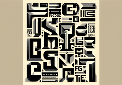
Best font style for logo design – the four main categoriesEffective logo design hinges on understanding four main font categories, each with unique advantages for different branding goals. The best font style for logo design depends on your brand’s character, the industry it’s in, and what your target audience prefers. These categories offer a framework for making informed typographic choices that support your overall brand strategy.
The four main logo font categories- Serif fonts: Feature decorative strokes that convey tradition, authority, and sophistication
- Sans-serif fonts: Clean, modern typefaces without decorative elements that suggest innovation and accessibility
- Script fonts: Flowing, handwritten-style fonts that communicate elegance, creativity, and personal touch
- Display fonts: Bold, decorative typefaces designed for headlines and attention-grabbing applications
The selection process balances how a font looks with practical aspects like how well it scales, how easy it is to read, and how versatile it is across different media. Knowing how each category performs helps designers and business owners make strategic choices that support long-term brand success.
Let’s take a closer look at each of these categories, starting with serif fonts and their applications for traditional and trustworthy brands.
Serif fonts for traditional and trustworthy brandsSerif fonts are great at conveying authority, tradition, and sophistication through their decorative strokes. These professional fonts for logos work well for established businesses, financial institutions, law firms, and luxury brands that want to project stability and trustworthiness. The small lines extending from letter forms create visual anchors that guide the eye and make text easier to read in print.
Industries that benefit from serif fonts- Banking and Finance: Convey stability, trustworthiness, and established expertise
- Legal Services: Project authority, professionalism, and traditional values
- Education: Suggest academic credibility and institutional heritage
- Publishing: Enhance readability and literary sophistication
- Luxury Retail: Communicate premium quality and timeless elegance
The timeless appeal of serif font logos ensures they remain relevant, reducing the need for frequent redesigns while staying contemporary. This makes serif typography a solid choice for companies that prioritize brand consistency and professional credibility over fleeting trends.
| Font (WhatFontIs link) | Best for | License type* |
|---|---|---|
| Playfair Display | Luxury fashion, premium hospitality, editorial brands, boutique financial services – classic, high-contrast serif with a heritage feel. | Open-source (SIL OFL) – free personal & commercial use via official Google Fonts release. |
| Lora | Banks, insurance, universities, long-form content where you want warmth + seriousness. | Open-source (SIL OFL) – free personal & commercial use. |
| Cormorant Garamond | Heritage brands, publishing, luxury retail – very bookish, sophisticated serif good for logos and headlines. | Open-source (SIL OFL) – free personal & commercial use. |
| Roboto Serif | “Serious but digital” brands – fintech, SaaS, modern consulting where you want serif trust + tech vibes. | Open-source (SIL OFL) – free personal & commercial use. |
Now, let’s shift our focus to sans-serif fonts and how they contribute to modern and clean branding strategies.
Sans-serif fonts for modern and clean brandingSans-serif fonts are common in modern branding because of their clean lines, excellent readability on screens, and contemporary feel. These good typography fonts work well across digital platforms, making them popular fonts for logos in technology, healthcare, consulting, and creative industries. The lack of decorative strokes creates a minimalist look that fits with current design trends.
Advantages of sans-serif fonts for modern brands- Digital Optimization: Excellent readability on screens and mobile devices
- Scalability: Maintain clarity at all sizes, from app icons to billboards
- Versatility: Work effectively across multiple media channels and applications
- Contemporary Appeal: Align with modern design trends and user expectations
Sans-serif fonts suggest approachability, innovation, and efficiency—qualities that are valued in today’s fast-paced business world. Companies that choose these modern branding fonts often position themselves as forward-thinking, customer-focused, and adaptable.
| Font (WhatFontIs link) | Best for | License type |
|---|---|---|
| Montserrat | Startups, SaaS, digital products, modern corporate brands; geometric, urban look for logos & headings. | Open-source (SIL OFL) – free personal & commercial use. |
| Poppins | App brands, marketing agencies, people-centric brands; rounded, friendly, works for logo + UI + social. | Open-source (SIL OFL) – free personal & commercial use. |
| Inter | Product/UI-heavy brands, dashboards, platforms – designed for interfaces, great as a logo wordmark too. | Open-source (SIL OFL) – free personal & commercial use. |
| Roboto | Mobile-first, utility and tech brands that need a neutral, flexible logo and text system. | Open-source (Apache 2.0 / OFL, depending on build) – free personal & commercial use. |
| Open Sans | Healthcare, NGOs, education; very clear, approachable, great for brands that need maximum legibility. | Open-source (Apache 2.0) – free personal & commercial use. |
Next, we’ll explore the distinctive personalities that script and display fonts can bring to a brand.
Script and display fonts for distinctive brand personalityScript and display fonts offer unique ways for brands to establish visual identities that stand out. These creative fonts for logo can effectively communicate traits like elegance, creativity, playfulness, or luxury. However, using them successfully requires careful consideration of readability and professional appropriateness.
Best applications for script and display fonts- Script Fonts: Beauty salons, fashion boutiques, artisanal food brands, wedding services, and creative agencies
- Display Fonts: Entertainment companies, sports brands, retail chains, lifestyle products, and event promotions
Display fonts, known for their bold fonts for logos and decorative nature, are great for creating memorable first impressions and strong brand recognition. These unique font for logo work best for entertainment, sports, retail, and lifestyle brands that benefit from energetic, attention-grabbing typography. The key is to balance visual impact with practical readability.
| Font (WhatFontIs link) | Best for | License type |
|---|---|---|
| Great Vibes | Wedding brands, florists, beauty salons, luxury stationery – elegant, flowing script. | Open-source (SIL OFL) – free personal & commercial use. |
| Pacifico | Youth brands, casual food, lifestyle products; playful retro brush script. | Open-source (SIL OFL) – free personal & commercial use. |
| Bebas Neue | Streetwear, sports, FMCG, events – tall, all-caps display font for short, punchy names. | Open-source (SIL OFL) – free personal & commercial use. |
| Oswald | Media, podcasts, urban brands, performance ads; condensed sans great for impactful headlines. | Open-source (SIL OFL) – free personal & commercial use. |
Understanding how different industries utilize typography can further refine your font selection process. Let’s examine how fonts are matched to specific business applications.
Font for business applications – matching typography to industryDifferent industries have established typographic conventions that shape customer expectations and brand credibility. Knowing these preferences helps businesses choose font for business that resonate with their target markets while maintaining professional standards. Selecting a best font for company logo should consider industry norms and brand differentiation goals.
| Industry | Font (WhatFontIs link) | Best for | License type |
|---|---|---|---|
| Technology / SaaS | Inter, Montserrat | Product-led brands, dashboards, platforms, startup logos, app UI typography systems. | Both open-source (SIL OFL) – free personal & commercial use. |
| Healthcare & Wellness | Open Sans, Lora | Clinics, wellness apps, health publishers – Open Sans for UI, Lora for editorial content. | Open Sans: Apache 2.0; Lora: SIL OFL – free personal & commercial use. |
| Financial Services / Legal | Playfair Display, Roboto Serif | Banks, law firms, wealth management, serious B2B services. | Both open-source (SIL OFL) – free personal & commercial use. |
| Creative industries & agencies | Poppins, Pacifico | Creative studios, marketing agencies, photographers, makers; Poppins as core, Pacifico as accent. | Both open-source (SIL OFL) – free personal & commercial use. |
| Luxury fashion / premium lifestyle | Cormorant Garamond, Great Vibes | High-end boutiques, jewelry, premium cosmetics; Cormorant for logo + typography, Great Vibes as signature mark. | Both open-source (SIL OFL) – free personal & commercial use. |
| Streetwear / youth culture / events | Bebas Neue, Oswald | Streetwear labels, music festivals, esport teams, clubs; strong, condensed all-caps for merch and posters. | Both open-source (SIL OFL) – free personal & commercial use. |
The best font for clothing brand varies based on target demographics and price. Luxury fashion brands often choose elegant serif or script fonts, while streetwear companies might opt for bold, display fonts. Knowing your specific market segment ensures more targeted font selection.
With industry-specific considerations in mind, let’s delve into the essential criteria for selecting business logo fonts.
Business logo fonts – essential selection criteria Essential font selection criteria for business logos- Evaluate legibility and scalability: Test fonts at various sizes to ensure clarity from business cards to billboards
- Assess brand personality alignment: Choose business logo fonts that reflect your company’s values and appeal to your target audience
- Consider technical requirements: Review licensing terms, file formats, and character set completeness
- Test cross-platform compatibility: Ensure fonts render properly across different devices and operating systems
- Plan for future expansion: Select great logo fonts that can accommodate international markets and brand evolution
- Balance uniqueness with appropriateness: Stand out while maintaining industry credibility and professional standards
The evaluation should consider technical requirements like licensing, file formats, and character sets, along with aesthetic and strategic factors. Font selection must account for future brand expansion, international markets, and evolving media. Designers often use checklists to ensure thorough evaluation.
Successful font selection balances visual appeal, practical functionality, brand alignment, and market differentiation. This helps businesses avoid choosing font ideas for logo based solely on personal preference or trends without considering long-term implications.
Among these criteria, legibility and scalability are paramount. Let’s explore these considerations in more detail.
Legibility and scalability considerationsProfessional fonts for logos must maintain clarity across all sizes, from business cards to billboards. Font selection should prioritize readability without sacrificing visual interest. Testing different fonts for logos at various sizes reveals potential issues before implementation.
Scalability testing involves examining font for brand name performance at small and large sizes, ensuring that letter forms remain distinct. Thin strokes may disappear at small sizes, while bold fonts can become overwhelming when enlarged. The ideal professional fonts for logos maintains its character across applications.
In addition to technical considerations, aligning your font choice with your brand personality and appealing to your target audience is crucial. Let’s examine this aspect further.
Brand personality alignment and target audience appealThe right most attractive font represents the company’s personality while appealing to its target audience. Brand identity fonts should create emotional resonance with customers, supporting the brand narrative. This ensures that typography reinforces other brand elements.
Understanding target audience preferences requires research into demographic trends and industry expectations. The font for brand name should speak to intended customers while maintaining broad appeal.
With a solid understanding of font selection criteria, let’s explore how to choose the best ad fonts for advertising and marketing campaigns.
Best ad fonts and marketing typography strategies How to select effective advertising typography- Prioritize attention-grabbing headlines: Use bold, impactful marketing fonts that capture viewer interest within seconds
- Ensure message clarity: Balance visual impact with readability to guarantee your message reaches the audience
- Create typographic hierarchy: Combine different font weights and sizes to guide reader attention through your content
- Test across media channels: Verify that best fonts for marketing perform well in both digital and print applications
- Match fonts to campaign objectives: Align typography choices with specific marketing goals and target demographics
Marketing typography involves creating systems that guide reader attention. Headlines might use bold fonts, while body text requires legible options. Campaigns often combine typefaces that work together while serving different purposes, and a guide to combining fonts for eye-catching designs can be invaluable here.
Successful advertising typography considers viewing conditions, audience demographics, and message urgency. Emergency messaging might benefit from bold fonts, while luxury advertising could use sophisticated typography. The key is to match choices to campaign goals while maintaining brand consistency.
To gain further insights, let’s examine famous logos and the fonts they use, drawing lessons from successful brands.
Famous fonts for logos – learning from successful brands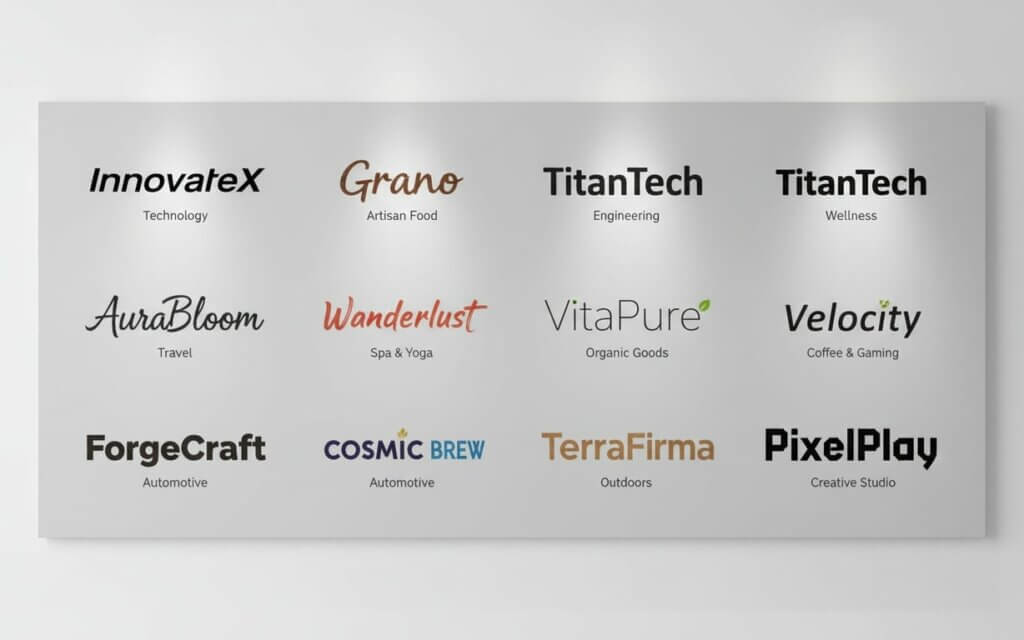
Analyzing famous fonts for logos reveals insights into branding strategies. The best brand fonts become closely associated with their companies, achieving instant recognition. These examples show how different fonts for logo selection contributes to brand equity.
Lessons from iconic brand typography- Consistency Creates Recognition: Coca-Cola’s script font has remained unchanged for over a century, demonstrating the power of consistent branding
- Simplicity Supports Innovation: Apple’s clean sans-serif approach reflects its design philosophy of minimalism and user-focused technology
- Heritage Builds Trust: Traditional brands like The New York Times use serif fonts to communicate authority and established credibility
- Boldness Commands Attention: Nike’s strong, athletic typography reinforces its “Just Do It” mentality and sports performance focus
Studying successful typography reveals common principles: consistency, alignment with brand values, and consideration of audience preferences. However, what works for one brand may not suit another, emphasizing the importance of developing unique solutions.
Once you’ve chosen the perfect branded font, consistent implementation across all brand touchpoints is essential. Let’s explore how to achieve this.
Implementing your chosen typography across brand touchpoints
- Create comprehensive brand guidelines: Document proper typography for branding, including weights, sizes, colors, and spacing specifications
- Address all media applications: Provide instructions for both digital and print implementations to maintain brand integrity
- Train team members: Ensure all staff understand proper branded font usage and have access to approved typefaces
- Conduct regular brand audits: Monitor consistency across all touchpoints and identify areas for improvement
- Plan for scalability: Establish systems that maintain consistency as your brand grows and expands
Creating brand guidelines ensures that team members understand proper brand identity fonts usage, including weights, sizes, colors, and spacing. These guidelines should address digital and print applications, providing instructions for maintaining brand identity.
Successful implementation requires monitoring to ensure consistency as brands grow. Regular audits help identify inconsistencies and opportunities for improvement, maintaining the integrity of branding investments.
Frequently Asked Questions About Fonts for BrandingSelecting the best fonts for your brand involves understanding typography fundamentals, considering industry conventions, and aligning your choices with your brand’s personality and target audience. Consistent implementation across all touchpoints ensures a cohesive brand experience that resonates with customers and sets you apart from the competition.
Most brands use a maximum of 2-3 fonts: a primary font for logos and headlines, a secondary font for body text, and an accent fontfor special cases. This ensures consistency while providing enough variety.
Classic fonts generally offer better long-term value, remaining relevant across trends. However, some industries benefit from contemporary typography that reflects innovation. Consider your brand’s long-term goals.
Test your font across devices, screen sizes, and platforms. Choose fonts with good web font support and consider how they render on different operating systems. Many fonts offer optimized web versions.
Premium fonts typically offer better quality, complete character sets, professional licensing, and support. Free fontsmay have licensing restrictions or quality issues. For serious projects, premium fonts usually provide better value.
Conduct market research through surveys or A/B testing to gauge audience response. Consider demographic preferences and industry expectations. Brand consultants can provide insights into audience psychology.
Font modification depends on licensing and technical requirements. Some fonts allow customization, while others prohibit it. Custom fontdevelopment can create unique typography, though this involves higher costs.
Font licensing is crucial for legal compliance. Commercial use requires licensing, and violations can result in penalties. Always verify licensing terms and maintain documentation.
While perfect matching isn’t required, your logo font and website typography should complement each other. Many brands use their logo font for headlines and a complementary font for body text.
International font selection requires consideration of language support and cultural associations. Ensure your fonts include character sets for target languages and research cultural meanings.
Font updates should align with brand evolution or business changes rather than following trends. Consider updates when expanding into new markets or repositioning your brand. Frequent changes can damage brand recognition.

I'm a programmer at heart. But in my 20s, I realized there was more to the world of fonts than just Courier.
Driven by endless curiosity, I built a system to explore them.
That project grew into one of the world’s leading font identifier platforms: www.WhatFontIs.com.
By 2024, WhatFontIs is helping nearly one million designers—famous or not—discover the names of the fonts they need.