Creating your own font can seem like a daunting task, but with the right tools and knowledge, it’s an achievable and rewarding endeavor. Whether you’re a graphic designer aiming to expand your creative toolkit, a brand seeking a unique typographic identity, or simply a typography enthusiast, this comprehensive guide will walk you through the essential steps of font creation. From selecting the appropriate software to mastering advanced design techniques, you’ll gain the insights needed to craft professional-quality typefaces.
This guide balances technical accuracy with practical advice, ensuring that you can immediately apply what you learn to your own font design projects.
Table of Contents- Font Creation Software – Essential Tools for Designing Custom Typefaces
- How to Design Fonts – Understanding Typography Fundamentals and Design Principles
- How to Make a Typeface – Step-by-Step Process from Concept to Completion
- Create a Custom Font – Planning Your Design Brief and Character Set
- Create Font from Handwriting – Digitizing Hand-Drawn Letterforms
- Font Creation Tools – Professional Software Comparison and Recommendations
- Advanced Font Design Techniques – Kerning, Spacing, and Technical Optimization
- Testing and Refining Your Custom Typeface – Quality Assurance and Final Adjustments
- Frequently Asked Questions
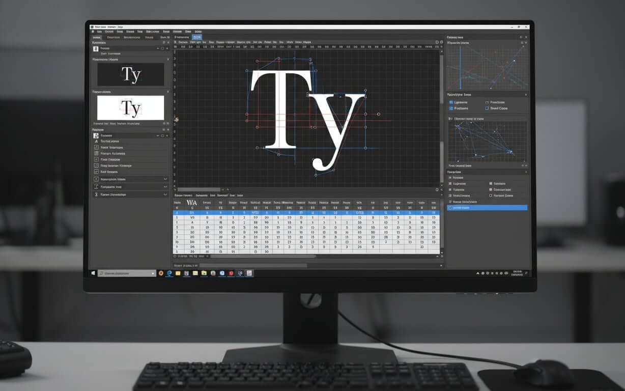
Font creation software comprises specialized digital tools designed to help designers build fonts from the ground up or modify existing typefaces. These programs provide vector-based drawing tools, character mapping capabilities, and technical features needed to produce professional-quality font files.
Choosing the right software is the first step in typeface design. Modern font creation software caters to a range of users, from beginners to seasoned typographers. If you’re just starting out, understanding how to create your own font can be made easier with beginner-friendly resources.
Key features to look for in font creation tools- Vector-based drawing tools: Essential for creating scalable letterforms with precise curves and control points
- Character mapping: Allows you to assign Unicode values and organize your character set efficiently
- Spacing and kerning controls: Critical for adjusting letter spacing and creating professional typography
- Export capabilities: Must support modern font formats like OpenType (.otf) and TrueType (.ttf)
- Preview functionality: Lets you test your font in real-time as you design
When picking font creation tools, think about your experience, budget, and what you need the software to do. Free options, such as FontForge, offer a lot of features, but they can be tricky to learn. Paid software often has easier-to-use interfaces and simpler workflows.
FontForge is a well-known open-source font editor with lots of documentation and community help. Although the interface can seem complicated at first, it lets you develop typefaces from start to finish. You can import scanned drawings or make letterforms directly in the program using vector-based drawing tools.
For those new to font design, Birdfont is a more user-friendly choice. This editor works on different operating systems and balances features with ease of use, making it good for learning the basics. It’s free to use for open-source projects, but you need to donate a small amount for commercial use.
Web-based options like Glyphr Studio don’t need to be installed and still offer professional-level features. These font generators are easy to access and allow collaboration, but they might not work offline or have all the advanced features of desktop software. For those looking for cutting-edge solutions, you can also create custom fonts with AI-powered font generators, which leverage machine learning to quickly produce unique designs.
The best font creation software depends on what you need, how comfortable you are with technology, and your long-term goals in typography. Trying out different tools on early projects can help you find the workflow that suits you best. As you explore these options, remember that the right software is the one that empowers you to bring your unique typographic visions to life.
How to Design Fonts – Understanding Typography Fundamentals and Design Principles What are the fundamental principles of typography?Typography fundamentals encompass the structural elements that make letterforms readable and visually harmonious. These principles include understanding letterform anatomy, classification systems, and design principles that guide effective typeface creation.
Good font design needs a strong understanding of typography and visual design. Before using software, designers should learn the parts of letterforms and how they combine to make readable typefaces. It’s crucial to grasp typography terms and rules that every designer should know to build a solid foundation.
Essential letterform anatomy- Baseline: The invisible line on which most characters sit, providing consistent alignment
- X-height: The height of lowercase letters without ascenders or descenders, determining readability
- Ascenders: Parts of letters that extend above the x-height, like in ‘b’, ‘d’, ‘h’
- Descenders: Parts that extend below the baseline, found in letters like ‘g’, ‘p’, ‘y’
- Cap height: The height of capital letters, usually slightly below the ascender line
These measurements create a framework that keeps all the characters in your font consistent. Knowing how these parts relate helps designers keep visual harmony while adding unique style.
Typography classification is another key part of font design. Serif typefaces, which have small decorative strokes, suggest tradition and are good for body text in books. Sans-serif fonts look modern and clear, working well in digital interfaces and branding.
Script and decorative fonts allow for more creative designs. Script fonts look like handwriting, adding personality, while decorative fonts are for display purposes where visual impact is more important than readability.
Balancing legibility and readabilityHow easy a font is to read is important for functional font design. Legibility is how easily you can tell individual characters apart, while readability is how comfortable and fast you can read text. Legibility depends on character distinctiveness and stroke contrast, while readability depends on spacing and sizing.
Design principles like balance, contrast, and visual hierarchy guide the design. Balance makes each character feel stable within the typeface. Contrast adds interest through different stroke weights, while hierarchy helps show relationships between text elements through size and style.
When you design your own font, these principles act as both creative limits and helpful tools, making sure that artistic expression helps communication. By mastering these fundamentals, you’ll be well-equipped to create typefaces that are both visually appealing and functionally effective.
How to Make a Typeface – Step-by-Step Process from Concept to Completion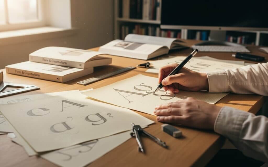
Making a typeface means turning ideas into working font files. This process needs both creativity and technical skill, with each step building on the last to get professional results. Creating a font from scratch can be a rewarding and creative process, allowing you to infuse your unique artistic vision into every character.
Step-by-step typeface creation process- Define project goals: Start by setting clear goals for the project. Think about how the font will be used, who will use it, and what it needs to do. Will it be for body text, display purposes, or something else? Knowing these things will guide your design choices.
- Research and gather inspiration: Researching and gathering inspiration gives context to your work. Look at existing typefaces that are similar to yours, studying their structure and style. This helps you find ways to be innovative and avoid copying other designs.
- Sketch initial concepts: Sketching is still important in typeface design. Using pencil and paper lets you quickly explore ideas without being limited by software. Focus on key letters like ‘H’, ‘n’, ‘o’, and ‘y’, which set the tone for the whole character set.
- Digitize letterforms: Digitizing turns hand-drawn ideas into vector letterforms using font creation software. This needs careful attention to curves, point placement, and consistency. Many designers make rough digital versions first, then refine them.
- Expand the character set: Expanding the character set means building on your key letters to make a full alphabet, numbers, and punctuation. Keep the design consistent across all glyphs while meeting the needs of each character.
- Refine spacing and kerning: Spacing and kerning make sure characters work well together in words. Spacing sets the basic rhythm of your typeface, while kerning adjusts specific letter pairs that need extra attention.
- Technical optimization: The technical phase means optimizing your font files for different formats and uses. This includes checking outlines, setting up OpenType features, and adding metadata. Hinting makes sure the font looks good at small sizes on different systems.
| Control Character | Design Purpose | Key Elements |
|---|---|---|
| H | Sets cap height and stroke weight | Vertical stems, crossbar position |
| n | Defines x-height and lowercase proportions | Arch connection, baseline relationship |
| o | Sets curve characteristics and contrast | Oval shape, stroke modulation |
| y | Determines descender length and style | Descender treatment, junction details |
Throughout this process, making my own font takes patience, attention to detail, and a willingness to make changes based on testing and feedback. Each step adds to the quality of your typeface. By following this structured approach, you can transform your initial concept into a polished, functional typeface ready for use in various applications.
Create a Custom Font – Planning Your Design Brief and Character Set How to plan and organize a custom font projectGood create a custom font projects start with careful planning and clear goals. A design brief acts as a guide, helping you stay focused and make sure the typeface meets its goals.
Essential elements of a font design brief- Define the font’s purpose: Your design brief should answer questions about the font’s purpose. Will it be for branding, multilingual text, or display? Knowing the main use affects every design choice, from style to technical details.
- Consider the reading environment: Think about where your font will be read. Digital screens need different things than print, and small sizes need more attention to legibility than large display sizes. These things affect choices like x-height, stroke contrast, and spacing.
- Plan the character set scope: Planning the character set is another key part of the project. New designers should start with basic Latin letters, numbers, and punctuation. This lets you focus on the basics without getting overwhelmed.
- Establish style parameters: Style comes from balancing function with looks. Research existing typefaces that do similar things, finding good ideas while looking for ways to be different. This helps set design parameters like serif style, stroke, and character proportions.
| Character Set Level | Included Characters | Recommended For |
|---|---|---|
| Basic | A-Z, a-z, 0-9, basic punctuation | First-time font designers |
| Extended | Basic set plus accented characters | Multilingual support needs |
| Professional | Complete Latin character set, symbols | Commercial font releases |
When you design your own font, writing down these plans helps you stay consistent. Reviewing your brief helps make sure your creative work stays on track. With a well-defined design brief and character set, you’ll have a solid foundation for creating a custom font that meets your specific needs and objectives.
Create Font from Handwriting – Digitizing Hand-Drawn Letterforms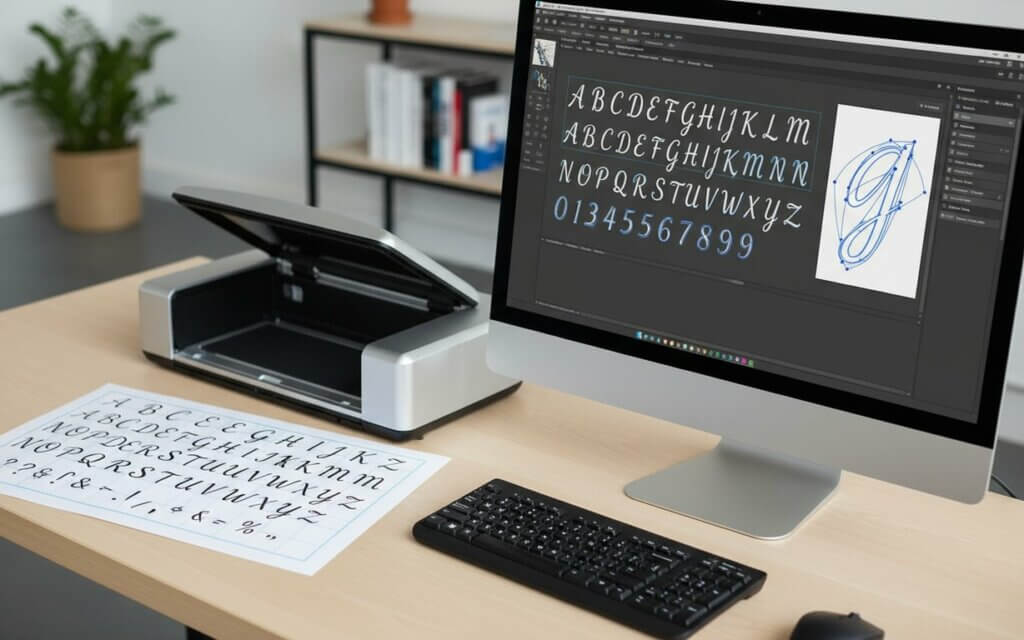
Turning handwritten letters into fonts lets you keep your personal writing style and make unique typefaces. This combines handwriting with font technology to create font from handwriting that have the feel of hand-drawn letters.
Methods for digitizing handwriting- Use a handwriting template: Using a template is the easiest way to start. Many font generators have templates where you write each character in a space, keeping the size and baseline consistent. After filling out the template, scan it and upload it to the font generator.
- Optimize scanning quality: For the best results, use the same writing tools and keep the letter size steady. Black ink on white paper usually scans best, and lining up the baseline makes sure your font looks right. Some services let you try again to fix characters that don’t scan well.
- Import into font software: More advanced methods involve importing scanned letters into font creation software for editing. This gives you more control over the look, letting you adjust spacing and refine letters in ways that automated services can’t.
- Apply vector tracing: Vector tracing turns scans into scalable letterforms for font production. Many font editors can auto-trace, but manual refinement often looks better. Focus on keeping the natural feel of handwriting while making sure the text is readable.
Think about how your handwriting font will be used. Fonts for short text can have more irregularities, while fonts for longer text need to be more consistent. The key is balancing character with readability. By carefully digitizing and refining your handwriting, you can create a font from handwriting that captures the unique essence of your personal style.
Font Creation Tools – Professional Software Comparison and Recommendations Which professional font creation tools offer the best features?Professional font design needs software that can handle the technical parts of typography. Knowing the strengths and weaknesses of different font creation tools helps designers choose the best one for their needs.
Glyphs is popular among type designers because of its easy-to-use interface and features. This macOS app simplifies font design while offering advanced options for complex projects. Its Python scripting lets you automate tasks and customize your workflow.
FontLab Studio is a traditional font creation program, giving you control over every part of typeface design. Its tools are for experienced users who need precise control over hinting, OpenType features, and multi-master fonts.
RoboFont is for technical designers who like its Python-based system and UFO file format. This allows for scripting and integration with other design tools, making it good for type foundries and designers working on large font families.
| Software | Platform | Best For | Price Range |
|---|---|---|---|
| Glyphs | macOS | Professional designers seeking intuitive workflow | Mid-range |
| FontLab Studio | Windows, macOS | Advanced users requiring comprehensive control | High-end |
| RoboFont | macOS | Technical users and foundries | High-end |
| FontForge | Cross-platform | Budget-conscious designers and students | Free |
FontForge is a good starting point for new font designers, offering professional features for free. Its interface may look old, but its documentation and community support make it a good choice for serious work.
When choosing font creation tools, think about more than just features. How easy the software is to learn, file compatibility, and long-term support all affect the cost. Many designers know multiple tools, as different projects may need different approaches. Ultimately, the best tool is the one that aligns with your skill level, project requirements, and long-term goals in typeface design.
Advanced Font Design Techniques – Kerning, Spacing, and Technical Optimization What advanced techniques are essential for professional-quality fonts?Professional fonts need advanced skills beyond basic letter design. These skills in spacing, kerning, and technical details separate amateur fonts from those ready for commercial use.
Mastering spacing fundamentalsSpacing, or sidebearing, sets the rhythm of your typeface. Each character needs carefully calculated space on the left and right, considering its visual weight. Consistent spacing makes text readable, while inconsistent spacing looks uneven.
Spacing usually starts by setting relationships between key character groups. Straight-sided letters like ‘H’ and ‘I’ give baseline spacing, while round letters like ‘O’ need tighter spacing. Diagonal letters like ‘A’ and ‘V’ need spacing that balances their shapes with the typeface rhythm.
Professional kerning techniquesKerning adjusts specific letter pairs that need different spacing than the default. Common pairs include ‘AV’, ‘To’, ‘We’, and ‘Yo’, where standard spacing looks awkward. Professional fonts may have hundreds of kerning pairs to make sure all combinations look good.
Good kerning means understanding visual spacing, not just measurements. The goal is to make the space between all characters look consistent, which may need different measurements because of different shapes.
| Kerning Category | Common Pairs | Typical Adjustment |
|---|---|---|
| Diagonal-Diagonal | AV, AW, VA, WA | Significant tightening |
| Straight-Round | To, Do, Po, Bo | Moderate tightening |
| Round-Diagonal | OV, OW, OY | Moderate tightening |
| Punctuation | T., P., V., W. | Significant tightening |
- OpenType features: Allow for ligatures, alternate characters, and contextual substitutions, making the font more versatile
- Hinting instructions: Give instructions for how to render the font at small sizes, ensuring consistent appearance across devices
- Font mastering: Includes quality control checks, outline validation and metadata completion to meet professional standards
Font mastering includes quality control checks, like outline validation and metadata completion. This makes sure your font meets standards and works well in professional settings. Mastering these advanced techniques is crucial for elevating your font designs from amateur to professional quality, ensuring they perform flawlessly across various platforms and applications.
Testing and Refining Your Custom Typeface – Quality Assurance and Final Adjustments How to test fonts and make necessary refinementsTesting separates functional fonts from professional typefaces. This means checking your font in different situations, finding areas to improve, and making changes to improve both looks and usability.
Comprehensive testing methodology- Conduct legibility testing: Legibility testing checks how easily you can tell characters apart at different sizes. Print test pages with your font at different sizes, from display text to body text. Check character distinctiveness, especially among similar letters like ‘b’ and ‘d’, ‘p’ and ‘q’, or ‘rn’ and ‘m’.
- Assess readability: Readability assessment focuses on how comfortable it is to read text in your font. Create test documents with text blocks, different line lengths, and spacing. Read these yourself and ask others for feedback to find anything that makes reading difficult.
- Perform context testing: Context testing means checking your font in real-world situations. If designing for the web, test it on different browsers and devices. For print, check output from different printers and paper. Display fonts need testing at large sizes and in different colors.
- Validate technical functionality: Technical validation makes sure your font files meet standards and work in different software. Test font installation in programs like word processors and web browsers. Make sure all characters display correctly and spacing looks consistent.
- Refine spacing and kerning: Spacing and kerning often need multiple adjustments based on testing. Print samples of your font and mark areas where spacing looks uneven. Pay attention to common letter combinations, as these have the biggest impact on reading.
- Gather external feedback: Feedback from other designers or users gives valuable perspective. New eyes can find issues that you might miss. Write down all feedback and focus on improvements that have the biggest impact.
Refining means balancing perfection with finishing the project. While every font can be improved, setting clear quality standards helps you know when your typeface is ready. Thorough testing and refinement are essential steps in ensuring that your create a custom font meets the highest standards of quality and usability.
Frequently Asked Questions about Creating Fonts- What software should beginners use to start creating fonts? Newcomers can begin with free options like FontForge or Birdfont to grasp basic concepts without spending money. These tools offer a wide array of features while allowing you to experiment with different font design approaches. Once you’re at ease with the fundamentals, upgrading to commercial software such as Glyphs or FontLab Studio can make more complex projects easier.
- How long does it typically take to create a complete font? The time it takes can vary greatly depending on how complex the font is and how experienced the designer is. A simple font with essential characters might take a beginner several weeks, whereas professional typeface families could take months or even years to develop. Factors that affect the timeline include the size of the character set, the number of weights and styles, and the level of technical optimization needed.
- Do I need drawing skills to create fonts? While drawing skills can be beneficial, they’re not essential for creating fonts. Many successful type designers hone their skills through practice and study rather than through formal art training. Understanding the structure and proportions of letterforms is more crucial than having advanced drawing abilities. These concepts can be learned through studying typography and practicing.
- What file formats should I export my fonts in? Modern font distribution typically uses OpenType (.otf) or TrueType (.ttf) formats. OpenType offers more advanced features and better cross-platform compatibility, making it the preferred choice for professional fonts. TrueType remains widely supported and may be necessary for specific applications or older systems.
- How many characters should my first font include? Start with a basic character set that includes uppercase and lowercase letters, numerals 0-9, and essential punctuation marks. This usually amounts to around 80-100 characters, allowing you to focus on mastering fundamental design principles. You can add more characters in future versions as your skills improve.
- Can I create fonts from my handwriting? Yes, it’s entirely possible to create fonts from your handwriting using various methods. Simple font generators allow you to upload scanned handwriting templates, while professional font software offers more detailed control over the digitization process. The key is to maintain consistency while preserving the unique character of your handwriting.
- What’s the difference between kerning and spacing? Spacing (or sidebearing) refers to the default horizontal space assigned to each character, whereas kerning involves adjusting the spacing between specific letter pairs. Spacing establishes the overall rhythm of your font, while kerning fine-tunes problematic character combinations that need individual attention.
- How do I test if my font is readable? Test readability by creating documents with substantial text blocks at various sizes and asking others to read them comfortably. Pay attention to factors like character distinctiveness, appropriate spacing, and overall text color. Print tests and screen tests may reveal different issues that need addressing.
- What are OpenType features, and do I need them? OpenType features enable advanced typography capabilities like ligatures, alternate characters, and contextual substitutions. While not essential for basic fonts, these features enhance professional appeal and functionality. Start with simple fonts and add OpenType features as your technical skills develop.
- How do I know when my font is finished? A font is ready when it meets your defined quality criteria and performs well in its intended usage scenarios. This includes consistent character design, appropriate spacing and kerning, technical functionality across target platforms, and positive feedback from testing. Establish clear completion criteria early in your project to avoid endless refinement cycles.
Creating your own font is a journey that blends artistic vision with technical precision. By understanding the fundamentals of typography, mastering font creation software, and diligently testing and refining your designs, you can craft unique and professional-quality typefaces. Embrace the process, experiment with different styles, and let your creativity guide you. The world of typography awaits your unique contribution.

I'm a programmer at heart. But in my 20s, I realized there was more to the world of fonts than just Courier.
Driven by endless curiosity, I built a system to explore them.
That project grew into one of the world’s leading font identifier platforms: www.WhatFontIs.com.
By 2024, WhatFontIs is helping nearly one million designers—famous or not—discover the names of the fonts they need.