
Typography is a cornerstone of design, influencing readability, aesthetics, and user experience. Whether you’re crafting a website, designing a brochure, or preparing a presentation, understanding font sizes is crucial.
This comprehensive guide provides practical recommendations, charts, and best practices for selecting the right font sizes for any project. From standard font sizes to accessibility considerations, you’ll gain the knowledge to make informed decisions and avoid common pitfalls.
For a comprehensive resource on enhancing your visual communication, learn how to improve the typography design that you create. Let’s explore the world of font sizes and how they impact your designs.
Table of Contents- What is font size and how are font sizes measured
- Standard font size recommendations for different applications
- Font size chart – Complete point size reference
- Digital typography – Web and screen font sizeing
- Print design font sizeing guidelines
- Accessibility and readability considerations
- Tools and techniques for identifying font sizes
- Common font sizeing mistakes and best practices
- Frequently Asked Questions
Font size defines the height of characters, influencing how large text appears on screens or printed pages. This measurement affects readability, visual hierarchy, and the overall look of your content.
How are font sizes measured?Typography professionals use standardized units to measure fonts:
- Points: The most common unit, where 1 point equals 1/72 of an inch, ensuring consistent sizing across design software like Adobe Creative Suite, Microsoft Office, and web browsers
- Pixels: Used for digital applications, offering exact screen measurements
- Inches: Provide real-world print dimensions for precise print work
- Millimeters: Deliver precise metric specifications for international projects
The appearance of text varies between typefaces, even at identical point sizes. Font size measures the height of the “em square”—an invisible box containing each character—rather than the visible letter height. Some fonts use more of this space, appearing larger, while others use less, appearing smaller at the same nominal size.
To ensure consistency and readability across your designs, it’s crucial to understand these measurement nuances. Next, we’ll explore standard font size recommendations for various applications.
Standard font size recommendations for different applicationsWeb Content Font SizesThe standard font size varies by application: 16-18 pixels for web body text, 10-12 points for print materials, and 24+ points for presentations. Understanding these baseline recommendations ensures optimal readability across different mediums.
- Body text: 16-18 pixels for optimal readability and accessibility compliance
- H1 headings: 32-48 pixels for primary page titles
- H2 headings: 24-32 pixels for section headers
- H3 headings: 18-24 pixels for subsections
- Body text: 10-12 points for comfortable reading
- Newspapers: 9-10 points to maximize content
- Books: 11-12 points for extended reading
- Print headings: 14-24 points depending on hierarchy
- Presentation body text: Minimum 24 points, with 30-36 points preferred
- Presentation titles: 48-72 points or larger for visibility
- Business documents: 11-12 points for professional appearance
- Email communications: 12-14 points for device compatibility
For specialized guidance on font selection and sizing in professional contexts, particularly for clarity and accuracy, refer to our guide on fonts for technical documents.
To further illustrate these recommendations, let’s examine a comprehensive font size chart that provides a complete point size reference.
Font size chart – Complete point size referenceA font size chart is a reference tool for designers, helping visualize how measurements translate across units and applications. This enables informed decisions when selecting sizes for projects.
| Points (pt) | Pixels (px) | Inches (in) | Millimeters (mm) | Common Applications |
|---|---|---|---|---|
| 6 pt | 8 px | 0.083 in | 2.1 mm | Fine print, legal disclaimers |
| 8 pt | 11 px | 0.111 in | 2.8 mm | Captions, footnotes |
| 10 pt | 13 px | 0.139 in | 3.5 mm | Small body text, newspapers |
| 12 pt | 16 px | 0.167 in | 4.2 mm | Standard body text, documents |
| 14 pt | 19 px | 0.194 in | 4.9 mm | Large body text, subheadings |
| 18 pt | 24 px | 0.250 in | 6.4 mm | Headings, web H3 elements |
| 24 pt | 32 px | 0.333 in | 8.5 mm | Large headings, web H2 elements |
| 36 pt | 48 px | 0.500 in | 12.7 mm | Display titles, web H1 elements |
| 48 pt | 64 px | 0.667 in | 16.9 mm | Large display text, poster headings |
| 72 pt | 96 px | 1.000 in | 25.4 mm | Very large display text, banners |
This chart demonstrates how different font sizes scale across measurement systems. Pixel measurements assume a standard 96 DPI (dots per inch) display, common for modern screens. High-resolution displays may render fonts differently, making point-based measurements more reliable for consistent sizing.
When using this chart, remember that visual size varies between typefaces. A 12-point Times New Roman differs from 12-point Helvetica due to each font’s design characteristics within the em square.
Now that we’ve covered the basics of font sizes and provided a handy chart, let’s dive into the specifics of digital typography and how it differs from print.
Digital typography – Web and screen font sizeingBest practices for web font sizingModern web design uses 16 pixels as the baseline for body text, the browser default that most users find comfortable. This normal font size provides readability on desktop monitors and scales appropriately on mobile devices.
- Start with 16 pixels as your baseline body text size
- Use 18-20 pixel body text for improved accessibility on content-heavy websites
- Implement responsive design with relative units like ’em’ or ‘rem’ instead of fixed pixels
- Apply typographic hierarchy with proportional scaling across devices
- Ensure interactive elements meet minimum touch target requirements
Responsive design requires flexible font sizeing. Using relative units like ’em’ or ‘rem’ instead of fixed pixels allows text to scale proportionally across screen sizes. For more on selecting fonts that perform well across all browsers and devices, consult The Ultimate Web Safe Fonts List. A rem unit equals the root element’s font size (typically 16px), making 1.125rem equivalent to 18 pixels while maintaining scalability.
Screen resolution impacts font appearance. High-DPI displays render text more crisply, allowing smaller sizes without sacrificing readability. Lower-resolution screens may need larger fonts to maintain clarity. CSS techniques like media queries let designers adjust font sizes based on device characteristics.
Digital interfaces benefit from typographic hierarchy. Primary headings often use 2.5-3rem (40-48px), secondary headings employ 1.75-2rem (28-32px), and tertiary headings utilize 1.25-1.5rem (20-24px). This scaling creates visual distinction across devices.
User experience extends beyond readability. Interactive elements like buttons need sufficient size for touch interaction, typically 44 pixels minimum for mobile interfaces. Form labels should use at least 16 pixels to prevent mobile browsers from zooming when users focus on input fields.
While digital typography offers flexibility, print design presents its own unique set of considerations. Let’s explore the guidelines for font sizeing in print materials.
Print design font sizeing guidelines How should font sizes be chosen for print materials?Print design has different constraints than digital media, requiring consideration of physical dimensions, viewing distances, and production limitations. This ensures printed materials achieve impact and readability.
Standard print font size guidelines- Books and magazines: 10-11 points for comfortable reading while maximizing content
- Newspapers: 8.5-9.5 points for content density
- Luxury publications: 12-14 points for enhanced readability
- Business cards: Minimum 8-point text for contact information, 10-12 points for names and titles
- Brochures: 10-12 point body text with 14-18 point headings
Viewing distance affects size requirements for poster writing font and large-format displays. A poster viewed from 10 feet needs minimum 72-point text for readability, while billboards viewed from 100+ feet need text measuring several inches tall. The rule suggests 1 inch of letter height per 10 feet of viewing distance.
Print production influences font size decisions. Offset printing reproduces fine details, allowing smaller text sizes, while digital printing may need larger fonts to maintain clarity. Paper quality also affects readability; newsprint needs larger fonts than coated paper due to ink absorption.
Hierarchical relationships in print follow conventions. Chapter titles often use 18-24 points, section headings employ 14-16 points, and subsection headings utilize 12-14 points. These proportions create information architecture while maintaining visual balance.
Regardless of the medium, accessibility and readability are paramount. Let’s examine how font size impacts these crucial aspects of design.
Accessibility and readability considerationsFont size requirements for accessibilityWeb Content Accessibility Guidelines (WCAG) recommend minimum 16-pixel body text for digital content, though many experts advocate for 18-20 pixels as a more inclusive baseline. These sizes accommodate users with vision impairments without assistive technology.
- Minimum web text: 16 pixels, with 18-20 pixels preferred for inclusivity
- Age-related considerations: Users over 40 prefer 12-14 points in print and 18-22 pixels on screen
- Contrast requirements: 4.5:1 ratio for normal text, 3:1 for large font size text (18+ points or 14+ points bold)
- Dyslexia support: 14+ points in print, 18+ pixels on screen with increased line spacing
- Mobile accessibility: Minimum 16-pixel text with 44+ pixel touch targets
Age-related vision changes affect many, particularly users over 40 who may experience presbyopia. Research indicates that these users prefer body text sizes of 12-14 points in print and 18-22 pixels on screen. For a deeper dive into how age, eyesight, and other factors influence readability, explore our guide on the smallest font size you can read. Designing with these preferences creates comfortable reading experiences.
Contrast ratios work with font size to ensure readability. WCAG guidelines specify minimum contrast ratios of 4.5:1 for normal text and 3:1 for large font size text (18+ points or 14+ points bold). Higher contrast allows for slightly smaller fonts while maintaining accessibility.
Dyslexia benefits from specific typographic approaches. Larger font sizes (14+ points in print, 18+ pixels on screen) combined with increased line spacing improve reading comprehension. Sans-serif fonts often prove more readable, though individual preferences vary.
Mobile accessibility requires consideration due to smaller screens. Minimum 16-pixel text ensures readability without zooming, while interactive elements need 44+ pixel touch targets. These requirements often necessitate larger fonts than desktop equivalents.
Testing with users, including those with disabilities, provides feedback for font size decisions. Automated accessibility tools can identify technical issues, but human testing reveals usability challenges that specifications alone cannot address.
Now that we’ve discussed accessibility, let’s explore tools and techniques for identifying font sizes in existing designs.
Tools and techniques for identifying font sizes What tools can help identify existing font sizes?Identifying existing font sizes is crucial for maintaining design consistency. Tools and methods can help determine what font size is this in digital and print contexts.
Digital font identification methods- Use browser developer tools by right-clicking text and selecting “Inspect Element” to reveal computed font sizes
- Access design software inspection tools in Adobe Creative Suite, Sketch, or Figma for editable files
- Utilize font identification websites like WhatFontIs.com for analyzing uploaded images
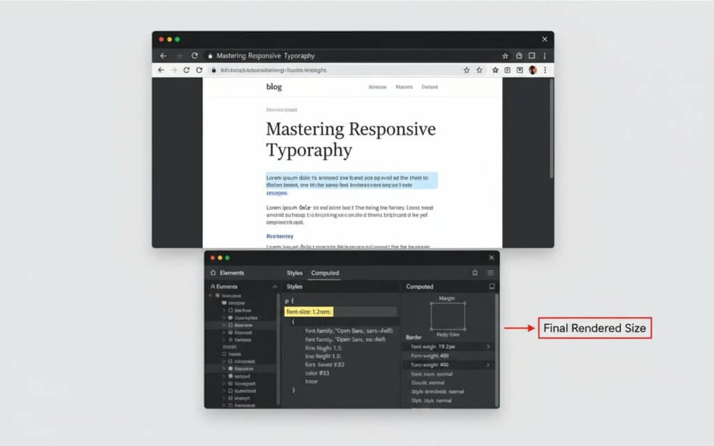
Browser developer tools provide a direct method for identifying web font sizes. Right-clicking on text and selecting “Inspect Element” reveals the computed font size in the CSS panel. Chrome, Firefox, and Safari offer similar functionality.
Design software inspection tools offer font information when working with editable files. Adobe Creative Suite applications display font properties in dedicated panels. Sketch and Figma provide similar inspection capabilities for collaborative design.
Font identification websites like WhatFontIs.com can analyze uploaded images to identify typeface and approximate size. These services work best with clear, high-resolution images.
Physical measurement techniques work for print materials when digital tools aren’t available. Measuring the height of capital letters with a ruler provides rough size estimates. Typography reference books often include actual-size font samples for comparison.
To wrap up our guide, let’s review common font sizeing mistakes and best practices to ensure your designs are both visually appealing and highly functional.
Common font sizing mistakes and best practices What are the most frequent font sizing errors?Understanding font sizeing errors helps designers avoid compromising readability. These mistakes often stem from focusing on aesthetics over functionality.
Common font sizing mistakes to avoid- Excessive size variation: Using too many different font sizes creates visual chaos and overwhelms readers
- Ignoring viewing context: Text readable on desktop may become illegible on mobile devices
- Prioritizing aesthetics over accessibility: Choosing fonts too small or with insufficient contrast excludes users
- Inconsistent application: Failing to maintain size standards throughout projects
- Poor scalability planning: Not considering how sizes work across output formats
- Establish clear hierarchy using size relationships that guide readers through content
- Test across contexts to verify readability on target devices and in expected lighting
- Consider your audience and adjust sizes based on user demographics
- Maintain consistency by applying size standards systematically throughout projects
- Plan for scalability by choosing sizing approaches that work across output formats
Successful font sizeing balances readability, aesthetics, content density, and technical constraints. User testing helps identify when best practices need adjustment. Effective typography serves content first, with visual appeal supporting the message.
Frequently Asked QuestionsAvoid using too many font sizes, choosing sizes too small for the viewing context, ignoring accessibility requirements, and failing to test across devices. Prioritize readability over aesthetics.
The standard font size for business documents and academic papers is 12 points. For web content, 16 pixels serves as the standard baseline.
Start with 16-18 pixels for body text. Consider your audience, content type, and brand personality. Test across devices and gather user feedback.
Presentation body text should be at least 24 points, with 30-36 points better for audience readability. Titles typically need 48-72 points or larger.
Use the rule of 1 inch of letter height per 10 feet of viewing distance. For a poster viewed from 20 feet, your main text should be at least 2 inches tall.
Points (pt) are traditional print units. Pixels (px) are screen units that vary with display resolution. Ems and rems are relative units that scale with parent or root element sizes.
Increase font size slightly, improve contrast ratios, and ensure adequate line spacing.
Font size measures the “em square,” rather than the visible letter height. Different typefaces use this space differently.
Browser developer tools work best for web content, while design software inspection panels help with editable files. Font identification websites can analyze uploaded images.
Create a typography style guide that specifies sizes for each content type. Use relative units for web content, and establish conversion guidelines between print points and digital pixels.

I'm a programmer at heart. But in my 20s, I realized there was more to the world of fonts than just Courier.
Driven by endless curiosity, I built a system to explore them.
That project grew into one of the world’s leading font identifier platforms: www.WhatFontIs.com.
By 2024, WhatFontIs is helping nearly one million designers—famous or not—discover the names of the fonts they need.