
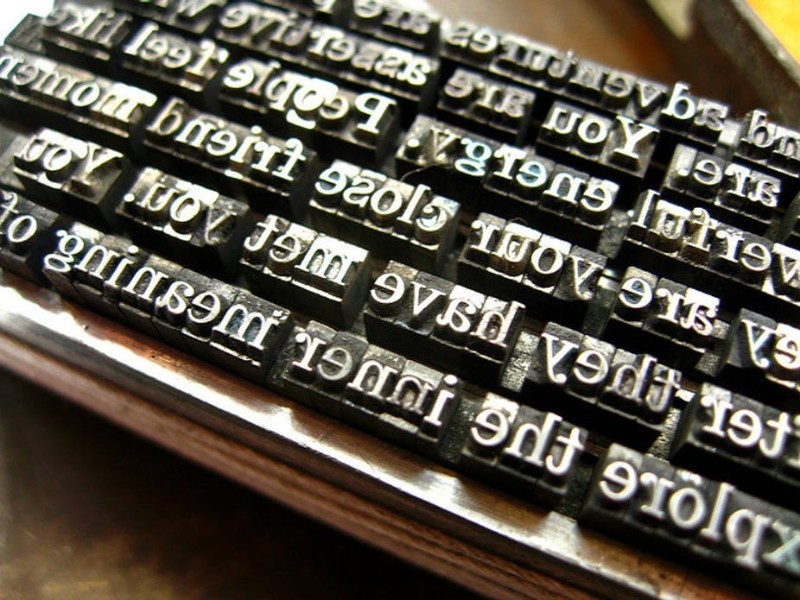
The first metal and wooden printing presses from six centuries ago continue to inspire modern typography design despite the substantial technological and time gap. Typography remains an art that requires creativity, dedication, passion, and, most of all, a comprehensive set of skills.
Graphic design typography is not all about pretty fonts as you may tend to believe and, being an art, is not always practical. Here are some useful tips designed to enhance typographic choices when it comes to typical projects such as business cards, resumes, or newsletters.
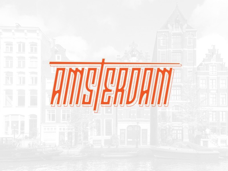
Match Mood to Message![]()
Many people tend to use the same font repeatedly, no matter the occasion, just because they love it. Others don’t see the difference between one font or another or don’t understand the importance of matching your font to the message you are trying to convey.
It may sound strange, but the fact is that fonts aren’t a suitable for all situations kind of thing. Each font has its distinct personality. Your font choice in typography design depends on what emotion that font arouses in you and how that specific emotion fits with the message of your design.
Before making a font choice, you need to analyze what message you want to communicate through your design. Once you’ve figured that out, you can search and find a font that sets the mood for conveying that message.
Match Mood to Audience
A font choice is not only about matching the mood to the message, but it is about carrying the desired message to a particular audience through the right typographical decisions. Each audience has its own expectations and will perceive your typographic design choices with those expectations in mind.
Typography designs in general and fonts, in particular, are perceived differently by different demographic groups depending on age, location, social and cultural background, etc. The point is that you need to be aware and understand that perception yourself before making any typography design choices.
When your audience is a wide range of people and not a specific, well-defined group, a good typography rule is to stick with a workhorse typeface that doesn’t stand out and just blends into the overall design. This type of neutral font doesn’t express a particular mood and doesn’t have a strong character.
Match Point Size to Design Context
There are several typography tips to consider when you want to learn how to do typography like a pro as far as font’s point size is concerned. A simple typography rule in that you need to adapt the point size of your font to your design context, i.e., the specific features of your design project.
- Match font size to your readability goals, which means point size should be not too small to make reading challenging or impossible and not too large to make typeface annoying. 15-20 pixels for web typography designs and 10-12 points for print projects.
- Adapt font size to the particularities of your font choice. When you learn typography, you find out that not all fonts are created equal, and with each having its own characteristics, you must select the optimal font size for a specific typeface.
Matching font size to the design context is taking into account how the project is displayed/presented as well as its physical size. The common-sense rule of simple typography tells you to use small-size fonts for business cards or lengthy passages and larger fonts for typography banner, for example.
No matter the typography design project you are handling, you need to remember that the role of font and point typography is to make the message easy to read and convey the message clearly. Some projects allow more creativity and freedom, while others don’t.
Typography Design: Points of FocusThere are several aspects to pay heed to when you are looking to develop the best typography design for your project. Playing with these elements will allow you to achieve a balanced, unique design:
- Typographic Measures
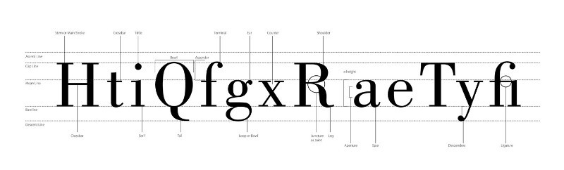
The right measure doesn’t necessarily improve your typography design by itself. Again, the role of typographic measures is to generate optimum readability within the specificity of your design. 40-80 character-long measures are said to achieve optimum readability.
- Font Leading
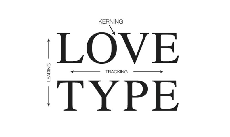
In typography, leading refers to the space between typography lines, i.e., the vertical spacing of text. Why is leading important? It is vital for proper copy readability, has a clean or untidy impact on the audience, and generates a specific density of the composition, i.e., typographic color.
Font leading is influenced by point size, typography measure, kerning, font choice, case, word spacing, etc. depending on your typeface choice, the ideal font leading should be set at 2 to 5 points larger than the actual font size because the longer the measure, the more leading is required.
- Hanging Quotes
The role of hanging quotes is to maintain optimum readability by maintaining an intact and balanced left alignment. Hanging quotes means leaving quotation marks hanging in the margin of the text, which prevents them from disrupting the flow of a body of text.
- Typography Widow and Orphan Typography
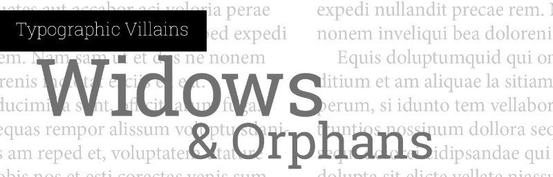
Both widows and orphans generate irregular or uneven vertical margin of a block of type, i.e., rags, which upset the reader’s reading rhythm. Adjusting type size, font type, measure, leading, kerning, word spacing, and manual line break design can help you control widows and orphans.
- A widow in typography is a single word or a short line at the end of a paragraph
- An orphan is a short line or word at the beginning of a column or page
- Rags
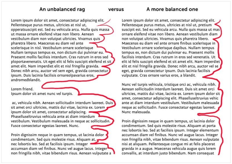
When going for left or right alignment, the uneven vertical margin, i.e., rag, needs to be balanced to avoid clumsy shapes and holes in the block of type. A soft unevenness, or clean rags, will not unsettle the eye or distract the reader. In CSS, you can only do this by manual adjustment.
- Background Color
Typography design is many times about balance, and your background color needs to create sufficient contrast to make your text prominent enough. Avoid clashing colors, dramatically bright neon colors, frustratingly busy backgrounds. Transparency effects and warping can be used but purposefully, not for the sake of appearances.
- Word Emphasis
As a designer, you know that emphasis is important, but you should also know that too striking an emphasis can be disrupting. You can emphasize a word by using italic, bold, small caps, caps, changing font size or color, underlining, or using a different font.
Use just one form of emphasis and stay away from awkward combinations, such as italic, bold, or italic-bold-underline. Italic is said to be the most efficient way of word emphasis in typography design that causes the least disturbance to the reader’s rhythm.
The Best Designing Deals and Trends
Typography design is an evolving art and, just like with all forms of art, there are trends that determine a certain style for a certain moment in time. A good designer is a good observer and pays attention to the latest trends.
You are not an island in the world of graphic design. Pay attention to the best design deals and embrace the trends that are leading typography design.
Ending thoughts on typography designTypography design has many elements, and you need to pay attention to all of them and the way they come together in order to attain balance.
It is a matter of using your creativity and unique personal touch to play with those components. It’s not rocket science, but it’s not easy-peasy either.
Arrange letters in your own unique fashion by paying attention to letter spacing, font leading, content mood, word spacing, typeface, font size, line measure, hanging quotes, and more.
Attend to all those typography design aspects targeting harmony and balance in all facets of your typography design.
If you enjoyed reading this article about the typography design, you should read these as well:
- Good Magazine Ads to Take as Example
- Color theory: what you need to know as a designer
- Make your own font: A guide on how to create a font
Technical lead at WhatFontIs since 2010 with a (healthy?) obsession for fonts.

