Choosing the right headline font is crucial for capturing your audience’s attention and conveying your message effectively. A poorly chosen font can make your content look unprofessional or even deter readers from engaging with it altogether.
This guide provides a comprehensive overview of how to select the best headline fonts, covering everything from understanding typography fundamentals to practical tips for fontpairing and brand alignment.
Whether you’re designing a website, creating marketing materials, or crafting social media posts, this guide will equip you with the knowledge and tools you need to make informed typographic decisions.
Essential Elements of Effective Headline Font SelectionUnderstanding headline typography fundamentalsSuccessful headline typography combines visual impact with readability, brand alignment, and audience appropriateness. The right font choice captures attention immediately while conveying your message’s essence and supporting your brand identity across all platforms and mediums.
Effective headline typography is the entry point to your content, influencing whether readers engage or scroll past. Selecting the right typeface extends beyond aesthetics, incorporating psychological impact, readability, and brand communication. The key is to choose a font for headline that not only looks good but also enhances the overall message.
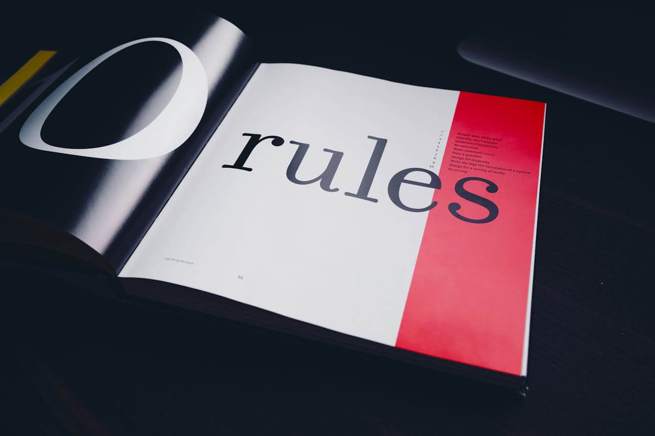
Headline typography hinges on immediate visual impact. Unlike body text, which emphasizes sustained readability, headline fonts must capture attention quickly while conveying the message’s essence. This requires careful consideration of letterform characteristics, spacing, and visual weight.
Different typefaces evoke distinct emotional responses. Serif fonts often suggest authority and tradition, making them suitable for news and professional content. Sans-serif options project modernity and clarity, while display fonts can evoke moods from playful to dramatic. Understanding these associations helps align font choices with your message and audience, ensuring you pick good typography fonts.
What Makes Headlines Different from Body TextHeadlines serve a fundamentally different purpose than body text, requiring fonts optimized for immediate visual impact rather than sustained reading comfort. Headlines must capture attention within seconds, communicate hierarchy, and work effectively at larger sizes while maintaining character and personality.
Now that we’ve covered the fundamentals, let’s delve into the different categories of fonts and their unique characteristics.
Font for title categories and characteristicsFont for title fall into distinct categories, each with unique characteristics for different communication purposes. Understanding these categories is crucial for making informed typographic decisions and choosing the best font for title.
Serif fonts feature small decorative strokes, creating a traditional appearance. They excel in print and formal contexts. Times New Roman and Georgia offer excellent readability while conveying professionalism. Modern serif variations like Playfair Display provide contemporary elegance suitable for luxury brands. These are classic title font ideas.
Sans-serif fonts eliminate decorative strokes, resulting in clean letterforms that perform well in digital environments. Popular choices include Helvetica, Arial, and Montserrat, each offering different personality traits while maintaining legibility across screen sizes. You can also browse a comprehensive collection of sans-serif fonts to find the perfect typeface for your design.
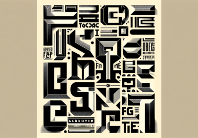
Display fonts are designed for large-scale use in headlines. They prioritize visual impact over extended readability, featuring bold weights and unique styling. Impact works for bold statements, Bebas Neue for modern minimalism, and custom display faces create unique brand identities.
Script fonts mimic handwritten text, adding warmth to headlines. Requiring careful application due to readability, script fonts like Pacifico or Dancing Script can communicate creativity or personal connection when used appropriately.
Key Characteristics of Each Font Category- Serif Fonts: Traditional appearance with decorative strokes, excellent for print and formal contexts, convey authority and professionalism
- Sans-Serif Fonts: Clean letterforms without decorative elements, perform well digitally, project modernity and clarity
- Display Fonts: Designed for large-scale headlines, prioritize visual impact, feature bold weights and unique styling
- Script Fonts: Mimic handwritten text, add warmth and personality, require careful application for readability
With a grasp on font categories, let’s explore how the medium and your audience influence your font selection process.
Choosing fonts based on your medium and audienceThe medium through which your content reaches audiences influences font selection, as different platforms present unique challenges. Understanding these requirements ensures headlines maintain impact across all touchpoints.
Print media, particularly newspapers, traditionally favor serif fonts for their readability and authoritative appearance. The New York Times uses custom serif typefaces that maintain clarity even when printed on newsprint. Print requires fonts that remain legible at smaller sizes while providing sufficient contrast. This is why selecting the right fonts for newspaper is essential.
Digital platforms offer flexibility but introduce considerations such as screen resolution and loading speeds. Web-safe fonts ensure consistent rendering across browsers, while web fonts expand creative possibilities at the cost of loading time. Mobile optimization is crucial as smaller screens demand readable fonts without zooming.
Social media platforms present formatting constraints and audience expectations. Instagram favors bold fonts that stand out in feeds, while LinkedIn audiences respond to professional typeface choices. Understanding platform-specific practices helps optimize engagement.
Audience demographics also influence font selection. Younger audiences often respond to modern typefaces, while older demographics may prefer familiar fonts. Cultural considerations are important for global brands, as certain styles carry different connotations across cultures.
How to Match Fonts to Different Platforms- Analyze the platform’s technical requirements and constraints
- Research audience demographics and preferences for that medium
- Test font readability across different screen sizes and resolutions
- Consider loading speeds and technical compatibility
- Evaluate how the font performs within the platform’s visual environment
- Gather feedback from your target audience on that specific platform

Selecting fonts that represent your brand requires understanding your brand personality, target audience, and communication objectives. The typefaces you choose become visual extensions of your brand voice. Therefore, knowing how to choose a font is essential for brand consistency.
Begin by analyzing your brand’s core characteristics. Established brands often benefit from serif fonts that convey stability. Technology companies might choose sans-serif options that project forward-thinking attitudes. Creative agencies can explore display fonts that showcase their design expertise.
Consider your audience’s expectations when making font selections. Professional services targeting corporate clients should prioritize readability over creative expression. Consumer brands have more flexibility to experiment with typefaces that create emotional connections.
Consistency across all brand touchpoints strengthens recognition. Establish a primary headline font that works across applications, from website headers to social media graphics. Consider creating a font hierarchy that includes complementary options while maintaining visual cohesion.
Test your font choices across different applications and gather feedback from your target audience. What appears perfect on your computer screen might perform differently on mobile devices. Regular evaluation ensures your typography supports your brand objectives as your business evolves.
Steps to Align Fonts with Brand Identity- Define your brand’s core personality traits and values
- Analyze your target audience’s preferences and expectations
- Research competitor typography choices and identify differentiation opportunities
- Select a primary headline font that embodies your brand characteristics
- Test the font across all brand touchpoints and applications
- Gather feedback from your target audience and stakeholders
- Establish a consistent font hierarchy for all brand communications
Once you’ve chosen a font, the next step is to pair it effectively with other fonts. Let’s explore the art of font pairings and combinations for headlines.
Font pairings and combinations for headlinesEffective font pairing creates visual harmony while establishing hierarchy between headlines and supporting text. Combining typefaces enhances readability and elevates the design quality of your content. This is why understanding Canva fonts that go together is essential for creating visually appealing designs.
The principle of successful font pairing involves creating contrast. Pairing a bold sans-serif headline font with a lighter serif body text creates visual interest while maintaining readability. For example, combining Montserrat Bold for headlines with Georgia for body text provides modern appeal with classical readability.
Within Canva, several combinations deliver results. League Spartan pairs with Open Sans, creating a clean aesthetic suitable for technology content. Playfair Display combined with Source Sans Pro offers elegance perfect for lifestyle brands. Bebas Neue works with Lato, providing impact with approachable body text.
Consider using different weights within the same font family to create hierarchy without introducing competing typeface personalities. Montserrat offers multiple weights, allowing you to create layouts using variations of a single typeface family.
Avoid pairing fonts that compete for attention or share similar characteristics without sufficient contrast. Two display fonts rarely work well together. Similarly, pairing fonts from the same category requires consideration of their characteristics to ensure they complement each other.
Proven Font Pairing Combinations- Modern Tech: League Spartan headlines with Open Sans body text
- Elegant Lifestyle: Playfair Display headlines with Source Sans Pro body text
- Bold Impact: Bebas Neue headlines with Lato body text
- Classic Professional: Montserrat Bold headlines with Georgia body text
- Single Family: Multiple weights of Montserrat for cohesive hierarchy
To ensure you’ve made the right choice, use this checklist to guide your font selection process.
Good font for title selection checklistA systematic approach to font selection ensures your headlines achieve maximum impact. This checklist guides you through the essential considerations for choosing effective title fonts. Therefore, using a good font for title selection checklist is essential.
Readability Assessment: Test your chosen font at various sizes and distances. Headlines must remain legible when viewed quickly, whether on mobile screens or printed materials. Consider how the font performs in different lighting conditions.
Brand Alignment Verification: Ensure your font choice reinforces your brand personality. Conservative brands should avoid decorative fonts, while creative businesses can embrace expressive options. The font should feel like an extension of your brand voice.
Technical Compatibility Check: Verify that your chosen font renders correctly across browsers and devices. Web fonts should load quickly without impacting page performance. Consider fallback options for situations where your primary font fails to load.
Scalability Testing: Evaluate how your font performs at different sizes, from banner headlines to subheadings. The font should maintain its character across all applications where you plan to use it.
Context Appropriateness: Consider where your headlines will appear. Social media graphics require different font characteristics than website headers. Ensure your font choice suits all intended applications.
Emotional Impact Evaluation: Assess whether your font choice evokes the desired emotional response from your target audience. The typography should support your message.
Complete Font Selection Evaluation Process- Test readability at multiple sizes and viewing distances
- Verify alignment with brand personality and values
- Check technical compatibility across all target platforms
- Evaluate scalability from large banners to small subheadings
- Assess appropriateness for all intended contexts and applications
- Measure emotional impact and audience response
- Confirm licensing requirements for commercial use
- Test loading speeds and performance impact
Headline fonts prioritize visual impact over sustained readability, featuring bolder weights and higher contrast ratios. Body text fonts emphasize comfort during extended reading, with more neutral characteristics.
Limit yourself to two or three fonts maximum: one for headlines, one for body text, and optionally one for accents. Too many fonts create visual chaos.
Both can work. Sans-serif fonts often perform better on screens due to their clean lines, but serif fonts designed for digital use can provide readability while adding personality.
Monitor engagement metrics and gather feedback from your target audience. Effective headline fonts should improve click-through rates and user engagement.
Yes, but use them sparingly and ensure they remain readable. Decorative fonts work best for short headlines. Always test readability across devices.
System fonts are pre-installed and load instantly but offer limited options. Web fonts provide greater flexibility but require downloading, potentially affecting page load speeds.
Font licensing is crucial for commercial applications. Many fonts require paid licenses for business use. Always verify licensing terms before using fonts in commercial projects.
Consistency strengthens brand recognition, but you may need variations for different applications. Establish a primary font family with multiple weights, or create a small font palette.
Different cultures have varying associations with typeface styles. Research your target markets and consider cultural context when selecting fonts for global audiences.
Font identification tools like WhatFontIs.com use AI technology to identify fonts from uploaded images. Browser extensions can also help identify fonts on websites.
Selecting the perfect headline font is an iterative process that blends art and science. By understanding typography fundamentals, considering your medium and audience, and aligning your choices with your brand, you can craft headlines that not only capture attention but also communicate your message effectively. Start experimenting with different font pairings, test your choices across various platforms, and always prioritize readability. Your next step? Audit your existing headlines and identify opportunities for typographic enhancement. Small changes can yield significant improvements in engagement and brand perception.

I'm a programmer at heart. But in my 20s, I realized there was more to the world of fonts than just Courier.
Driven by endless curiosity, I built a system to explore them.
That project grew into one of the world’s leading font identifier platforms: www.WhatFontIs.com.
By 2024, WhatFontIs is helping nearly one million designers—famous or not—discover the names of the fonts they need.