Ever wonder how some designs just *click*? Often, it’s the subtle art of font pairing that elevates a project from good to great.
Think of it as the secret sauce of visual communication. Just as a chef carefully selects ingredients to create a harmonious dish, designers thoughtfully choose typefaces that complement each other, enhancing readability and reinforcing the overall message. Let’s explore how to master this skill.
Table of ContentsFont pairing is a crucial skill in modern design, forming the basis for visually appealing and effective communication. At its heart, it’s about carefully selecting two or more typefaces that work together to improve readability, create a visual hierarchy, and clearly convey the intended message.
Typography pairing involves more than just picking fonts that look good on their own. It means understanding how different typeface combinations interact, considering things like contrast, proportion, and the emotions they evoke. When done well, effective font pairing can turn ordinary text into engaging visual communication. It guides readers through the content naturally, reinforcing your brand and design goals, a critical aspect when selecting the right font for your brand.
Successful font matching serves several purposes in design. It adds visual interest through contrast, creates a clear information structure, improves readability across different sections, and enhances the overall look of the design. Whether you’re designing a website, creating marketing materials, or developing brand guidelines, mastering typography pairing will improve your design work and ensure your message connects with your audience.
Now that you understand the fundamentals, let’s dive into the essential font categories that will help you create successful combinations.
Essential font categories for successful combinationsUnderstanding the main font categories is essential for successful font pairing. Each category has unique characteristics that affect how fonts work together, so it’s important to recognize these differences when creating complementary fonts combinations.
Serif fonts, with their small decorative strokes, traditionally convey elegance, authority, and readability in print. They work well for body text in formal documents, books, and traditional publications. When considering Serif vs. Sans-Serif fonts, serif fonts often serve as excellent anchors for more modern sans serif headlines, creating a balanced contrast.
Sans serif fonts, known for their clean lines and lack of decorative strokes, project modernity, clarity, and efficiency. They excel in digital environments where screen readability is key. Their versatility makes them ideal for headlines and body text in web design, mobile apps, and contemporary print materials. The simplicity of sans serif fonts allows them to pair well with more decorative typefaces without competing for attention.
Script fonts mimic handwriting and add personality, elegance, and a human touch to designs. However, script font pairing requires careful consideration. These fonts are best used sparingly for emphasis, signatures, or decorative elements. Pairing script fonts with clean, readable sans serif or serif typefaces ensures that they enhance rather than hinder communication.
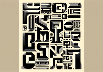
Display and decorative fonts are designed to grab attention and make bold statements. These unique fonts work best for headlines, logos, and short text where visual impact is more important than extended readability. When using display fonts in your font pairing, balance them with neutral, easy-to-read fonts for supporting text to maintain overall design harmony and functionality.
Now that you have a handle on font categories, let’s explore the core principles that will guide you toward harmonious font combinations.
Font matching principles and best practicesMastering font matching means understanding the design principles that govern how typefaces interact. Font harmony happens when chosen typefaces complement each other while maintaining distinct roles in the design. This balance between similarity and contrast is the foundation of effective font pairing.
Contrast is key to successful font matching. When learning how to pair fonts, think about contrasting elements like serif versus sans serif, thick versus thin weights, formal versus casual styles, and large versus small sizes. This creates visual interest and helps establish a clear information structure, guiding readers through the content. However, contrast should be purposeful and support the overall communication goals of your design.

Establishing a visual hierarchy through fonts that go well together involves assigning specific roles to each typeface. Primary fonts typically handle headlines and major headings, requiring a strong personality and excellent readability at larger sizes. Secondary fonts often manage subheadings and supporting text, needing to be versatile across different sizes while harmonizing with the primary choice. Body text fonts prioritize readability and comfort, ensuring readers can consume longer content without fatigue.
Proportion and scale significantly impact how fonts that go well together function in a design. Consider x-height relationships, character width, and overall font proportions when making pairing decisions. Fonts with similar x-heights often work well together, even from different categories, because they maintain consistent visual weight and readability across different sizes.
Mood and personality alignment ensures that your font matching supports the overall message and brand identity. Formal contexts benefit from traditional serif and clean sans serif combinations, while creative projects might use more experimental pairings. Consider the emotional impact of your typeface choices and ensure they align with your content’s tone and purpose.
Limiting your font selection to two or three typefaces prevents visual chaos and maintains design cohesion. This forces you to explore the full potential of each typeface through different weights, sizes, and styles rather than relying on many fonts to create variety. Successful font harmony often comes from thoughtful exploration of fewer typefaces.
With these principles in mind, let’s explore how font combination strategies differ based on the design context.
Font combination strategies for different contextsDifferent design contexts require different approaches to font combinations. The medium, audience, and purpose influence which pairings will be most effective. Understanding these contextual considerations allows designers to make informed decisions that optimize both aesthetic appeal and functional performance.
Font pairings for print benefit from the high resolution and controlled viewing conditions of printed materials. Serif fonts excel for body text in print because their small serifs help guide the eye along lines of text. Effective font pairings for print often combine elegant serif typefaces for extended reading with bold sans serif fonts for headlines and callouts. The contrast creates visual interest while maintaining readability.
Print design also allows for more subtle font distinctions that might not translate well to digital screens. Delicate script fonts, condensed typefaces, and fonts with fine details can work effectively in print where resolution isn’t a limiting factor. When developing font pairings for print, consider how your choices will reproduce across different printing methods and paper types, ensuring consistency and quality.

Font combinations for web must prioritize screen readability and cross-platform compatibility. Sans serif fonts typically perform better for body text in digital environments, where pixel limitations can make serif details appear unclear. Successful font combinations for web often reverse traditional print hierarchies, using clean sans serif fonts for body text and serif fonts for headlines where larger sizes minimize readability concerns.
Web typography also requires consideration of loading times and font availability across different devices and browsers. Modern font pairings for digital applications often use web font services like Google Fonts or Adobe Fonts, which provide reliable cross-platform performance and fast loading times. When selecting font combinations for web, test your choices across different devices, browsers, and screen sizes to ensure consistent performance and appearance.
Modern font pairings embrace contemporary design trends while maintaining timeless readability principles. These combinations often feature geometric sans serif fonts paired with humanist typefaces, creating a balance between technical precision and organic warmth. Contemporary design contexts allow for more experimental approaches, such as pairing bold display fonts with minimal sans serif body text or combining variable fonts that adapt to different contexts and screen sizes.
Now that you know how context influences font choices, let’s look at some proven combinations that consistently deliver professional results.
Fonts that go together – proven combinationsCertain font combinations have consistently delivered professional results across various design contexts. These proven pairings are reliable starting points for designers seeking fonts that go together while maintaining excellent readability and visual appeal.
The classic pairing of Helvetica and Times New Roman is one of the most enduring examples. It combines the clean, modern appeal of Helvetica’s sans serif design with the traditional elegance and readability of Times New Roman’s serif structure. This combination works well for corporate communications, academic publications, and professional documents where credibility and clarity are key.
Garamond paired with Futura creates another timeless combination that balances historical elegance with geometric modernity. Garamond’s classical proportions and refined serif details provide excellent readability for body text, while Futura’s geometric sans serif design offers a strong headline presence. This pairing works particularly well for editorial design, luxury branding, and cultural institutions seeking to convey both tradition and a forward-thinking vision.

Fonts that look good together often share subtle design characteristics despite belonging to different categories. The combination of Georgia and Verdana exemplifies this, as both were specifically designed for screen readability while maintaining distinct personalities. Georgia’s serif design provides warmth and approachability for body text, while Verdana’s sans serif clarity ensures excellent headline readability across digital platforms.
For more contemporary applications, the pairing of Montserrat and Merriweather has gained popularity among web designers. Montserrat’s geometric sans serif design offers clean, contemporary headlines, while Merriweather’s serif design provides comfortable reading for longer text passages. This combination works well for blogs, online publications, and modern websites requiring both style and substance.
Script and sans serif combinations, such as Pacifico paired with Open Sans, demonstrate how decorative fonts can enhance design communication. Pacifico’s casual script style adds personality and warmth to headlines and accents, while Open Sans provides neutral, readable support for body text and navigation. This type of pairing works well for lifestyle brands, creative agencies, and informal communication contexts.
The best combination font choices often come from understanding the specific needs of your project rather than following strict rules. Successful combinations balance contrast with harmony, ensuring that each font serves a distinct purpose while contributing to the overall design. Whether you choose classic pairings or explore more contemporary options, the key is to test your selections and ensure they support your communication objectives.
Now, let’s explore how to leverage popular font libraries like Adobe Fonts and Google Fonts to create stunning pairings.
Adobe font pairings and Google font combinationsModern font libraries like Adobe Fonts and Google Fonts have revolutionized access to high-quality typography, offering designers extensive collections for commercial and personal projects. Understanding how to use these platforms for effective adobe font pairings and google font combinations can significantly enhance your design capabilities while ensuring reliable cross-platform performance.
Adobe Fonts provides access to thousands of premium typefaces from renowned foundries, offering sophisticated options for professional design work. When exploring adobe font pairings, consider combinations like Source Sans Pro with Source Serif Pro, which were specifically designed as complementary families. These fonts share similar proportions and design philosophy while offering distinct serif and sans serif personalities, making them ideal for complex design systems.
Google Fonts democratizes access to quality typography by offering hundreds of free font pairings optimized for web performance. Popular google font combinations include Roboto paired with Roboto Slab, providing a cohesive system with both sans serif and serif options. Similarly, the combination of Lato and Lora offers excellent readability and personality, with Lato’s humanist sans serif design complementing Lora’s calligraphic serif characteristics.
Many platforms now offer google font pairing generator tools that suggest compatible combinations based on design principles and user preferences. These generators analyze font characteristics such as x-height, character width, and overall personality to recommend harmonious pairings. While these tools provide excellent starting points, successful font pairing ultimately requires testing combinations within your specific design context.
When working with free font pairings from Google Fonts, consider combinations that offer multiple weights and styles for maximum flexibility. The pairing of Nunito Sans with Nunito provides a comprehensive type system with both sans serif and rounded sans serif options, while maintaining consistent design DNA throughout. This ensures visual cohesion while providing sufficient variety for complex design requirements.
Both Adobe and Google font platforms offer filtering and search capabilities that can streamline the font pairing process. Look for fonts with similar design periods, complementary moods, or shared design characteristics when building your combinations. Remember that successful font pairing depends not just on individual font quality but on how well the chosen typefaces work together to support your overall design objectives.
To further streamline your font selection process, let’s explore some helpful tools and resources.
Font pairing tools and resourcesThe digital age has brought forth numerous font pairing tools and resources designed to streamline the typography selection process for designers. These tools use design principles, artificial intelligence, and curated expertise to suggest harmonious font combinations that enhance aesthetic appeal and functional performance.
Professional font pairing tool options include Monotype’s Font Pairing Generator, which allows users to select an anchor font and receive intelligent suggestions for complementary typefaces. These tools analyze font characteristics such as x-height, character width, contrast levels, and design period to recommend pairings that maintain visual harmony while providing appropriate contrast.
Visual font pairing chart resources provide curated collections of proven combinations organized by style, mood, or application context. These charts often include sample layouts demonstrating how the paired fonts work together in real design scenarios, helping designers visualize the practical application of different combinations.
Interactive font mixer tools enable real-time experimentation with different typeface combinations, allowing designers to input their own text and see immediate results across various sizes and weights. These tools often include features for adjusting spacing, sizing, and color to fine-tune the relationship between paired fonts.
Typography inspiration platforms showcase successful pairing typefaces examples from professional design work, providing context for how different combinations perform in real-world applications. These resources often include detailed analysis of why specific pairings work effectively, helping designers understand the underlying principles.
When using font pairing tools, remember that automated suggestions are starting points, not final solutions. The most effective approach combines tool-generated recommendations with manual testing and refinement based on your specific project requirements, target audience, and brand guidelines. Consider factors such as readability across different devices, loading performance for web applications, and reproduction quality for print materials.
Before you go off and start pairing fonts, let’s cover some common mistakes to avoid.
Common font pairing mistakes to avoidEven experienced designers can make mistakes when selecting font combinations, leading to designs that lack visual impact or compromise readability. Understanding these frequent font pairing mistakes helps designers make more informed decisions and create more effective typography systems.
One of the most common mistakes involves pairing fonts that are too similar, creating insufficient contrast for a visual hierarchy. When fonts share similar characteristics without providing clear distinction, the result often appears indecisive. Successful font matching requires purposeful contrast that serves the design’s communication goals.
Conversely, selecting fonts that clash dramatically can create visual discord that distracts from the intended message. While contrast is essential, the chosen typefaces should share some underlying compatibility in terms of proportion, mood, or design period. Font combinations work best when they balance difference with harmony.
Overusing decorative or display fonts is another common pitfall that can overwhelm readers and compromise message clarity. These fonts work best when used sparingly for headlines, logos, or accent elements, paired with neutral, readable fonts for supporting text. Excessive use of decorative fonts can make designs appear unprofessional and difficult to navigate.
Ignoring readability in favor of aesthetic appeal often leads to designs that look impressive but fail to communicate effectively. This often happens when designers select condensed fonts for body text, use insufficient contrast between text and background, or choose fonts with poor performance at smaller sizes. Remember that typography’s primary function is communication, and aesthetic choices should enhance this goal.
Finally, failing to test font pairing choices across different contexts and applications can result in combinations that work well in one situation but fail in others. Always evaluate your font selections across various sizes, devices, and viewing conditions to ensure consistent performance and maintain the integrity of your design communication.
Elevate Your Designs Through Thoughtful Font ChoicesUltimately, mastering font pairing is about understanding the nuances of typography and how different typefaces interact. By applying the principles discussed—contrast, hierarchy, context, and careful selection—you can create visually compelling designs that effectively communicate your message. Don’t be afraid to experiment with different combinations, but always prioritize readability and ensure your choices align with your brand’s identity. As a next step, try analyzing the font pairings used on your favorite websites or in print materials to identify what makes them work so well. With practice and a keen eye, you’ll be well on your way to crafting typography that truly shines.
Frequently Asked Questions about Font PairingFont pairing is the process of selecting two or more typefaces that work harmoniously together in a design, enhancing readability and visual interest.
Good font pairing improves readability, establishes visual hierarchy, and ensures the overall message is clear and engaging.
It’s best to limit your design to two or three typefaces to maintain visual cohesion and avoid chaos.
Serif, sans serif, script, and display/decorative fonts are commonly used for pairings, each bringing unique characteristics to the design.
Contrast can be achieved by combining different categories (such as serif with sans serif), varying weights, or contrasting sizes and styles.
Test your font pairings in the actual design layout, check for readability, and ensure the fonts reflect your brand’s mood and purpose.
Yes, there are font pairing tools, generators, and charts available on platforms like Adobe Fonts and Google Fonts to suggest harmonious combinations.
No, decorative and script fonts should be used sparingly, for headlines or accents, while readable fonts are preferred for body text.
Print fonts can use finer details and serif fonts for body text, while digital designs favor sans serif fonts for on-screen clarity and readability.
Avoid pairing fonts that are too similar or clash dramatically, overusing decorative fonts, and neglecting to test legibility in your final design context.

I'm a programmer at heart. But in my 20s, I realized there was more to the world of fonts than just Courier.
Driven by endless curiosity, I built a system to explore them.
That project grew into one of the world’s leading font identifier platforms: www.WhatFontIs.com.
By 2024, WhatFontIs is helping nearly one million designers—famous or not—discover the names of the fonts they need.