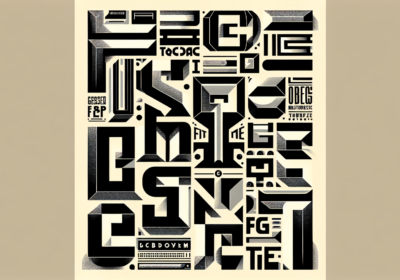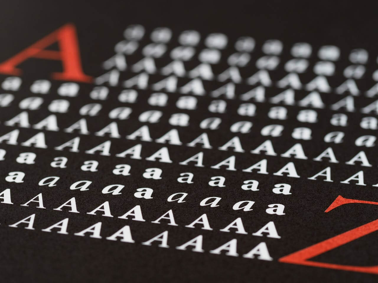
When it comes to graphic design, typography serves as a storyteller. It is responsible for defining brand identities, shaping perceptions, and communicating feelings. However, in the vast universe of fonts, there are a few that have grown so common and so frequently used that they have lost their authentic allure and their ability to be successful. Below are examples of fonts that are used excessively. They are visual clichés that, while they may have been novel or just convenient in the past, now indicate a lack of originality and attention to detail.
This article explores the most overused fonts, dissecting why they’ve fallen from grace and offering fair alternatives to revitalize your designs and truly stand out in a crowded visual landscape.
Comic SansAs a prime example of bad typography, this font is among the most despised in the history of graphic design. Comic Sans, first created in 1994 for a lighthearted, approachable interface (Microsoft Bob), swiftly found its way into gravestones, medical documents, as well as corporate communications and serious signs. Its basic, hand-drawn look looks out of place in serious or professional settings, which makes people question its reliability and makes anyone with even a passing appreciation for design cringe. Although there are many who defend its usage in very casual contexts (such as a birthday invitation for a child), the widespread perception of it as unprofessional makes it best avoided. It was a simple choice for many due to its friendly, playful personality and its default availability on Windows PCs, which led to its abuse.
Consider well-designed, legible script or display fonts like Quicksand, Cabin Sketch, or Architects Daughter for a more refined hand-drawn feel, or options like Bubblegum Sans or Fredoka One for genuinely fun and readable, if you’re going for a playful, friendly vibe. Open Sans, Roboto, or Lato provide warmth and readability without the Comic Sans stigma, making them ideal for informal yet professional settings. While Comic Sans’s unique letterforms make it easy to read, there are better options for accessibility, especially for people with dyslexia, such as OpenDyslexic or Lexend.
PapyrusThe widespread usage of Papyrus in anything from organic food packaging and yoga studio logos to movie posters (Avatar) has taken away its authentic nature, which it conveys with an “ethnic” or “natural” vibe. Despite their originality, the design’s ragged edges and distinctive strokes today scream “amateur designer trying too hard to be exotic”. For some reason, it now looks like “ancient” or “spiritual”, words that might make you feel inauthentic and uninspired. Businesses seeking to portray a sense of spirituality, earthiness, or historical significance often turned to its distinctive, “earthy” aesthetic, which led to its misuse despite its lack of genuine relevance.
Explore typefaces that have a more refined texture or delicately wavy lines for a more organic, natural vibe. Sometimes, a custom hand-lettered choice, Crimson Text (maybe with a little distressing if preferred), or Lora is the way to go. Do some digging for real historical typefaces or tasteful modern revivals if you want to go for an old-fashioned vibe. This can be much more effectively accomplished with fonts like Garamond, Trajan (which should be used with great care on movie posters), or a custom-designed serif with character. Alternatively, you could think about commissioning a unique typeface that draws inspiration from specific historical scripts. If you’re going for a modern, handmade vibe, try Gilroy, Montserrat, or a hand-crafted humanist sans-serif.
Times New RomanTimes New Roman, the beige of fonts, is the unchallenged monarch of term papers and word processor defaults. Its legibility and reliability in long-form text are undeniable, but it’s monotony in creative undertakings is a direct result of its overuse in formal papers. Every time you use it in a branding, headline, or design that tries to stand out, it says, “I didn’t try very hard.” Overuse occurred because to its exceptional legibility and the fact that it was the default font in innumerable applications. As a result, it was used for anything that required substantial text.
Garamond, Palatino Linotype, Georgia, Merriweather, and Libre Baskerville are all professional sans-serif fonts that provide comparable legibility but with a touch more style and less heft. If you’re looking for a modern take on a traditional serif, choose Playfair Display, Lora, or Butler for your headlines and displays. Serif for body material on the web, such PT Serif or Noto Serif, is a great choice for legibility.
Arial & HelveticaDespite Helvetica‘s (and Arial, its widespread PC clone) famous fame as a minimalist font known for its clean, adaptable, and neutral appearance, the lack of inspiration in its designers can be its downfall. The “boring” option is usually the “safe” one. When used carelessly, it devolves into being a generic placeholder instead of a purposeful part of the design. Although Helvetica may still be stunning in well-designed projects, its universal nature makes it hard for any given design to stand out when set against it. Overuse was greatly exacerbated by its extraordinary legibility, widespread availability, and perceived “modern” and “clean” style, which made it a go-to for everything from government signage to corporate branding.
With a more modern twist and less “been there, done that” fatigue, sans-serif fonts like Roboto, Open Sans, Lato, Montserrat, and Manrope provide equal readability and versatility. Feel free to use Futura, Avenir Next, or Gotham if you’re going for a more polished geometric sans-serif. Warm and welcoming humanist sans-serifs include Karla, Nunito, and Source Sans Pro.
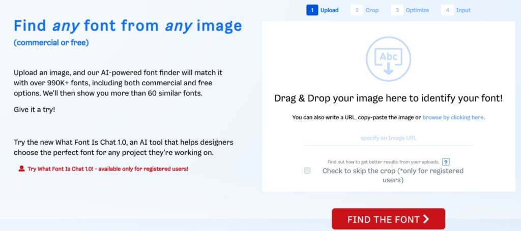
The field of typography is vast, providing designers with an infinite number of options for visual storytelling and idea expression. Using tired, overused fonts gives the impression that the designer didn’t put any thought or effort into the project. And remember, our website, WhatFontIs.com, is always here to help you choose the perfect font, even if you’re stuck on a really dull one and can’t think of anything better to use for your project. Particularly, whether you’re looking for free or premium fonts, you may use one of the site’s features to discover alternatives that are similar to your current choices and could enhance your project. In this manner, you can guarantee that your project will not be viewed as boring.

I'm a programmer at heart. But in my 20s, I realized there was more to the world of fonts than just Courier.
Driven by endless curiosity, I built a system to explore them.
That project grew into one of the world’s leading font identifier platforms: www.WhatFontIs.com.
By 2024, WhatFontIs is helping nearly one million designers—famous or not—discover the names of the fonts they need.