Think about the enormous amount of text you interact with on a daily basis. Words are omnipresent, silently shaping your thoughts and actions, from attention-grabbing headlines, screaming for your attention online, to the small print on a medicine bottle. In rush to get to the point, we frequently ignore the style of the font itself in favor of the message. However, have you ever stopped to think about how the font size could be subtly influencing your thoughts, opinions, or perhaps determining your final decision?
The size of the typeface is an important, yet frequently disregarded, factor in the art of persuasion, as it turns out. Although it’s hardly an ideal solution, font size discreetly influences profound psychological currents. It has the potential to improve text comprehension, draw attention to what appears most crucial , reduce reading difficulty, and evoke feelings. Let’s dig deeper into these subconscious psychological factors, examine how this information may be utilized in various fields such as advertising and education, and talk about the situations in which we need to exercise caution when utilizing these visual signals. Investigating the unexpectedly delicate connection between typography and cognitive processes will reveal the extent to which larger text may really have a more profound effect on our thoughts.
Font size in psychologyFont size does more than make text legible. It affects our brain’s processing of information, which can subtly but significantly affect our beliefs. The concept of visual fluency is central to how this operates. This is simply a more fancy way of expressing how intuitive something is to the human mind. When we see words written in a larger, more legible font, like Georgia or Arial at 14 points, it doesn’t take as much mental effort for us to decipher what they mean. Reading becomes a more pleasant and effortless experience using this. We could be influenced to make a snap decision due to how easy it is to read, a phenomenon known as the “truth effect”. Simply said, our brains are more likely to accept anything as true or valid if it is easy to read. For instance, you might be more receptive to a product’s benefits presented in a legible 16-point Roboto font than in a crowded 8-point Times New Roman. The more readable claim will always have greater credibility, regardless of how true the other one is.
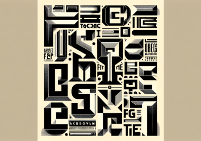
Font size also has a significant role in projecting importance and authority. Words and phrases with larger font sizes draw more attention to them, drawing our attention to the areas that are most important. This goes beyond just aesthetics. It takes use of our natural desire to focus on what is immediately noticeable. Consider newspaper headlines. They captivate readers with their attention-grabbing 72-point Playfair Display or bold Oswald typefaces and convey the day’s most important news in a second. Titles, headings, and official documents (such as academic research or legal documents) sometimes utilize higher font size to indicate importance and authority. Subtly, a company’s goal statement expresses more authenticity and weight when presented in a big, respectable font, like 24-point Garamond. The massive scale gives the impression that the message and its originator are very powerful.
Finally, the amount of mental work required, or cognitive load, and the focus that is directed are both influenced by the size of the font. It takes a lot more mental effort to read small, tight fonts, such as 7-point Calibri or dense Franklin Gothic Book, particularly if they have difficult details or tight spacing. With all that additional processing going on, there’s less cerebral capacity for taking in the message’s ideas and content. The words themselves are too difficult for us to interpret at the moment. However, this mental load is reduced and more mental energy is available to fully understand the meaning and persuasive arguments presented in larger, well-spaced text. This saves us from worrying about the meaning of the communication and allows us to concentrate on its content.
Furthermore, larger text has a capacity to captivate our attention and maintain it for extended durations, reducing the chances that we will scan or abandon reading altogether. Font size has a psychological impact on our perception of truth, authority, and mental effort, in addition to making text readable, which is the immediate benefit.
The connection between font size and emotionsThe impact of a message can be amplified beyond what can be rationally processed by appealing to our emotions and senses through the use of font size. Bolded and larger words have a distinctive way of making people feel excited, rushed, or intense. Consider how many ads you’ve seen that boldly state “SALE!” or “LIMITED TIME OFFER!” using striking, large fonts like Bebas Neue or strong Impacto. The point isn’t just to grab your attention; it’s to make you feel either delighted or terrified that you’ll miss out. Like a sudden, intense volume or a bright flash, the visual dominance of these big impulses can have a physiological “arousal” effect, making us feel more awake and tuned into the emotional core of the message.
In addition, the unexpected impact of font size on psychological distance cannot be overlooked. The idea here is how close or far something is to us, be it a person, an event, or an idea. One way to break down that mental barrier is to use a bigger font size. This will make the message seem more personal, current, and urgent. A bold 48-point Open Sans Extra Bold font makes a strong call to action like “ACT NOW!” feel considerably more assertive and urgent than a small 10-point script. It’s like someone is yelling the message at you, expecting you to answer right now. On the flip side, tiny fonts, as is common in legal disclaimers and terms and conditions, could make the writing seem distant or unimportant. It fades from view, making the data appear less important and maybe even enabling us to ignore it in our minds.
And lastly, embodied cognition, a more complicated concept, posits, in a nutshell, that our bodily engagement with text might gently impact our comprehension. When we read, our eyes do more than simply move across the page. There is a little physical component to the visual effort involved. Less eye strain from larger, clearer fonts could give the impression that the information is more concrete or tangible. By presenting it at a big size, the message seems to take on a more solid form, making it feel more real and effective than if we had to strain our eyes to make it out. The impact of font size on our perceptions and decisions is complex, involving multiple emotional and sensory levels.
Despite its often-overlooked status as a design element, font size turns out to be a surprisingly powerful tool in the art of subtle persuasion. The significance of very tiny visual clues cannot be overestimated. The complex relationship between design and psychology can be better understood by looking at how larger text can improve perceptual fluency, communicate importance, reduce intellectual burden, and induce emotional reactions. With this knowledge in hand, we may approach visual communication with greater care and strategy.
With the bold presence of Montserrat Black, you can create an attention-grabbing advertisement. With the legible body text of Lato, you can build trust on a user-friendly website. And with the clarity of Merriweather, you can convey important points in an educational presentation. Every choice of typography has the power to persuade.
It’s possible that WhatFontIs.com could be of great assistance at this stage. Not only is it possible to upload a screenshot and discover the name of a typeface that you saw somewhere else that inspired you, but our website also has the capability of doing other things. We are able to assist you in determining whether or not the font you intend to use requires a license, if you are unsure about this matter. You may test out this function for free right here.

I'm a programmer at heart. But in my 20s, I realized there was more to the world of fonts than just Courier.
Driven by endless curiosity, I built a system to explore them.
That project grew into one of the world’s leading font identifier platforms: www.WhatFontIs.com.
By 2024, WhatFontIs is helping nearly one million designers—famous or not—discover the names of the fonts they need.