Simply said, typography is the visual language we use to express ourselves in writing. Every font has its own distinct tone and slight accent. It’s a vast and ever-changing landscape. For a lot of people, sticking to one or two fonts gives them a sense of calm constancy, which is the visual foundation for professionalism and clarity. However, there is fascinating potential inside the context that includes numerous fonts: the ability to give designs unique personalities, create a clear visual hierarchy, and capture consumers with a more subtle and complex look. But walking the fine line of multi-font design is no joke. A planned visual symphony can quickly become a chaotic mess with only one reckless coupling or slip-up. Surprisingly, there is really little space between visually stunning complexity and complete anarchy.
Think about, carefully planned design is what it takes to master the art of successfully combining more than two fonts. It requires precision, familiarity with basic typographic concepts, and an adventurous spirit. With a little luck, this article will bring some light on the process and help you make sense of all the complicated typeface combinations out there. In the following piece, we will explore the concepts of harmonious font pairings, including how to create a distinct visual hierarchy, make good use of contrast, and keep the aesthetic constant. When you’ve mastered these approaches, you’ll be able to use multi-font design to its fullest potential, creating compositions that are visually appealing while still maintaining the professionalism and clarity needed for effective communication. If you want your designs to have an impact while yet being elegant, we’ll show you how to confidently mix several fonts.
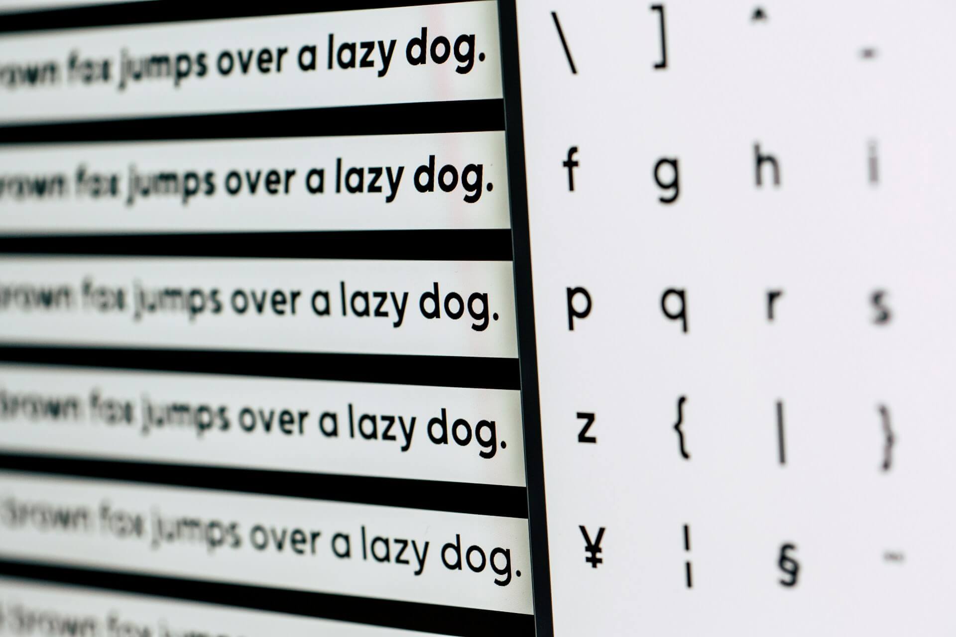
The fundamentals of pairing fontsA complete familiarity with basic typographic features is necessary before entering into the world of font pairings. Font families and typefaces are not the same thing. Typefaces that have common characteristics are grouped together in font families. For example, among the most famous font families are Times New Roman, Arial, and Helvetica. Particular variants, like bold, italic, or light, of typefaces or fonts arise within these families. A consistent design structure allows for nuanced expression through these variations.
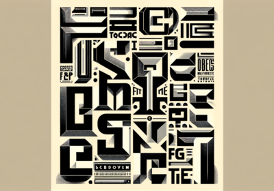
The next type of font we’ll see is a serif font, which has tiny decorative strokes (serifs) at the very end of each character. The use of classic and formal typefaces like Georgia or Garamond conveys an air of tradition and refinement to a design. On the other hand, sans-serif typefaces, such as Open Sans or Futura Thin, don’t have any of these flourishes and look much more contemporary. Display typefaces, made specifically for use in titles and headings, are the next step beyond regular text fonts. Fonts like Lobster and Impact are designed to make a strong visual impression by drawing the reader’s eye with their complex and powerful designs. Brush Script MT Italic and Pacifico are two examples of script fonts that imitate handwriting and give an air of casual elegance to any design. Monospaced typefaces, like Courier New, have characters that all fit into the same horizontal space, which makes them perfect for showing technical documents and code where alignment is key.
The principles of harmonious font mixingFollowing essential guidelines is important for achieving visual harmony when combining several fonts. First things first, make sure there is a clear hierarchy. This draws attention to key points while guiding the reader’s eye over the text. A display font, like Bebas Neue, would be used for headlines, a sans-serif, like Roboto, or a serif, like Lora, for body text, and a third, maybe a lighter weight, like Open Sans or an italic Times New Roman, for captions or callouts. Elements are further distinguished and their hierarchy is reinforced by variation in font size, weight, and style.
Second, in order to catch the eye, contrast is essential. Choose typefaces that do not blend together. Using contrasting fonts, such as Playfair Display and Montserrat, or contrasting bold display fonts like Impact and Arial, can make a strong design statement. Stay away from fonts that are too similar; it can create visual confusion. Look for differences in style, size, weight, and font families.
Thirdly, be consistent. Make sure there’s a visual connection between the fonts you choose. Pick typefaces that go with the style and mood of your design as a whole. If you want to keep things simple and not overwhelm the reader, use no more than two or three typefaces that vary in weight and style. Prioritize readability, particularly for body text, as a fourth point. Pick typefaces whose letterforms are easy to read, even at tiny sizes. Never use a script or decorative font, such as Lobster or Brush Script MT Italic, for lengthy passages of text. Maintaining proper leading and spacing is also essential for legibility.
Context should be considered lastly. The fonts you choose will be influenced by the rest of your design. Fonts like Garamond, which are more commonly seen in official documents, may be inappropriate for a tech startup’s website, which is more likely to use more contemporary sans-serif fonts like Poppins. Before deciding on a font, think about who you’re writing for and what you want to say.
Practical techniques for mixing multiple fontsThere are a number of practical methods that can be used to blend fonts efficiently. Combining serif and sans-serif fonts to create a striking contrast is an old-school technique. One example of this would be to use a serif font for the headlines and a sans-serif font for the body content. For the sake of aesthetic harmony, it is necessary that the selected typefaces have matching x-heights, or the height of lowercase letters.
Also, display typefaces are a great way to make your designs stand out, especially when it comes to headlines. If you want to make a big statement without overwhelming your viewers, utilize a simple and readable body font combined with a bold display typeface. For a more unified and polished appearance, try making different fonts from the same family. Consider using italics for focus, a standard weight for body text, and bold for headlines. Combining fonts in this way is risk-free and efficient. Keep in mind that script fonts impart a distinct vibe to every design that uses them. Wear them lightly, limiting their use to brief expressions or a single word, and balance their impact with a simple sans-serif typeface. Readability issues might arise from using script typefaces excessively.
Typography also makes use of color and spacing, which are potent tools. The use of distinct font colors helps to establish visual hierarchy. To ensure legibility, make sure there is enough white space, spacing, and leading. Emptiness improves readability, therefore don’t be afraid to leave some white space. It is essential to do extensive testing and refinement. Try out various font combinations and see what works best. Verify that designs are readable across a range of devices and screen sizes. Be open to changing fonts and asking for input. There may be problems with the design that aren’t obvious when you print it out.
Last but not least, think about the tone that fonts create. Fonts are unique individuals. In contrast to the formality of a squared-off sans-serif, the friendliness of a rounded typeface is immediately apparent. Elegance is shown by a thin serif typeface, and strength by a bold one. The project’s tone should reflect the typefaces’ personalities.
Learning how to blend several fonts is a task that calls both imagination and caution. Overusing fonts without proper hierarchy creates visual disorder, which in turn distracts from the design’s intended message and makes the most common mistake. On the flip side, if you use typefaces that are too similar, there won’t be enough contrast to form a visual hierarchy, and the composition will be confusing and tough to understand.
Putting aesthetics before readability is just as bad. A pretty design that doesn’t make the material easy to understand will fail to engage its target audience. Another common error is using fancy typefaces for long sections of body text. Although eye-catching, these fonts make reading difficult and reduce readability.
Finally, inconsistent leading and spacing makes the design look untidy and amateurish. Through careful attention to detail and avoidance of these typical mistakes, designers may utilize many typefaces to their advantage, producing visually appealing and impactful compositions that effectively convey meaning and connect with their target audience.
Have you figured out how to effectively combine two or more fonts without creating visual chaos? It means you are ready to play. As you take in all of the information we’ve provided, remember that WhatFontIs.com is a great resource for identifying fonts. If you come across one you like, but don’t know its exact name or where to download it (licensed or not), you can use it in your visuals. Simply capture a screenshot that includes a section of text whose font you are unable to recognize. Then, return to our website, where we provide assistance in identifying in seconds over one million typefaces globally, including alternatives to expensive fonts!

I'm a programmer at heart. But in my 20s, I realized there was more to the world of fonts than just Courier.
Driven by endless curiosity, I built a system to explore them.
That project grew into one of the world’s leading font identifier platforms: www.WhatFontIs.com.
By 2024, WhatFontIs is helping nearly one million designers—famous or not—discover the names of the fonts they need.