A powerful brand identity is essential for survival in today’s competitive industry. In the center of that identity is your logo, the visual representation of your brand. As the first point of contact between your company and a potential customer, it expresses your brand’s values, personality, and message in a subtle but significant way. The font you choose for your logo is just as important as the other visual aspects, such images and color schemes, but it gets less attention.
Imagine a well-written statement as your logo. The visual context, including the subject and object, is provided by the pictures and colors. The font, though? Verb, tone, and inflection are all represented by the typeface. It changes the way the visual elements are perceived by giving them life and significance. Just by using the right font, you may take a basic logo design to the next level, making a bold and memorable brand statement. Subtle variations in letterforms allow it to express creativity, playfulness, trustworthiness, or sophistication.
On the flip side, no amount of inventiveness in logo design can save a badly selected font. It may lead to discord, which in turn can cause your brand’s message to be misunderstood and fall flat with its intended consumers. Picture a luxury apparel label using a funny font or a children’s toy manufacturer employing a strong, business serif style. Disconnecting like that would be shocking and make a bad impression right away.
Explore the complex topic of fonts and their vital function in logo design with this guide. We’ll have a look at the wide variety of font families, each with its own personality and effect on the viewer’s mind. We’ll break down the most important factors to think about when choosing a font for your company logo, so it fits in with the rest of your brand’s identity and makes a lasting impression. This article will teach you all you need to know to pick a font that represents your business effectively, from the subtle clues offered by serifs and sans serifs to how to pair fonts.
How fonts can help your brandSelecting an appropriate font for your brand is comparable to finding the ideal tone of voice for your company. How you say something is just as important as what you say. Fonts, like voices, are unique and may make people feel things they wouldn’t otherwise. Choosing the correct typographic voice for your brand relies on your familiarity with these fonts. There are a number of main types of fonts, and each has its own unique traits.
Serif typefaces are commonly associated with an air of refinement, authority, and tradition because of the little artistic strokes that end each letter. Serif fonts are commonly used in newspapers and academic writings. Classical and traditionally suited for more formal events, old style serifs (like Garamond) are a subset of the serif family. Baskerville and other transitional serifs provide an equilibrium between two extremes, bringing together the best of both worlds. Modern serifs, like Didot, create an air of refined elegance with their sharp, narrow serifs and striking contrast. Last but not least, slab serifs, such as Rockwell, have thick, block-like serifs that make them look strong and aggressive.
Next, we have sans serif fonts, which are different from serif fonts in that they do not have any decorative strokes. Sans serif fonts are commonly used in digital applications because they are easy to read on displays and have a modern, clean, and minimalistic appearance. Franklin Gothic is an example of early sans serif designs that are typically quite aggressive and have a somewhat industrial vibe. Fonts like Helvetica are known for their understated elegance and adaptability. Similar to Futura, geometric sans fonts are constructed from geometric shapes, which gives them a modern and organized vibe. Open Sans has a more welcoming and approachable style that is based on the proportions of classic serif fonts.
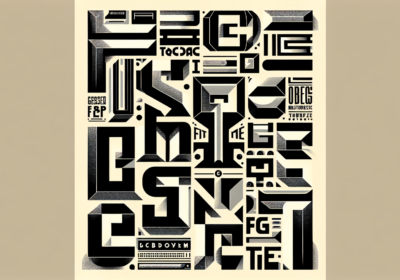
As their name implies, script fonts look like handwriting. They might be as serious as Edwardian Script ITC or as lighthearted as Pacifico. Script typefaces are great for adding a creative or personal touch, but they should be used carefully because they become illegible at smaller sizes. Headlines and logos frequently make use of display fonts like Lobster Two or Impact, which are created for purely cosmetic purposes. Despite their individuality and high level of stylization, these typefaces are typically not appropriate for body content. Last but not least, Courier New and other monospaced fonts have the same horizontal space between each letter. Although they are more commonly associated with technical writing or code, they have the ability to suggest a distinct vintage style.
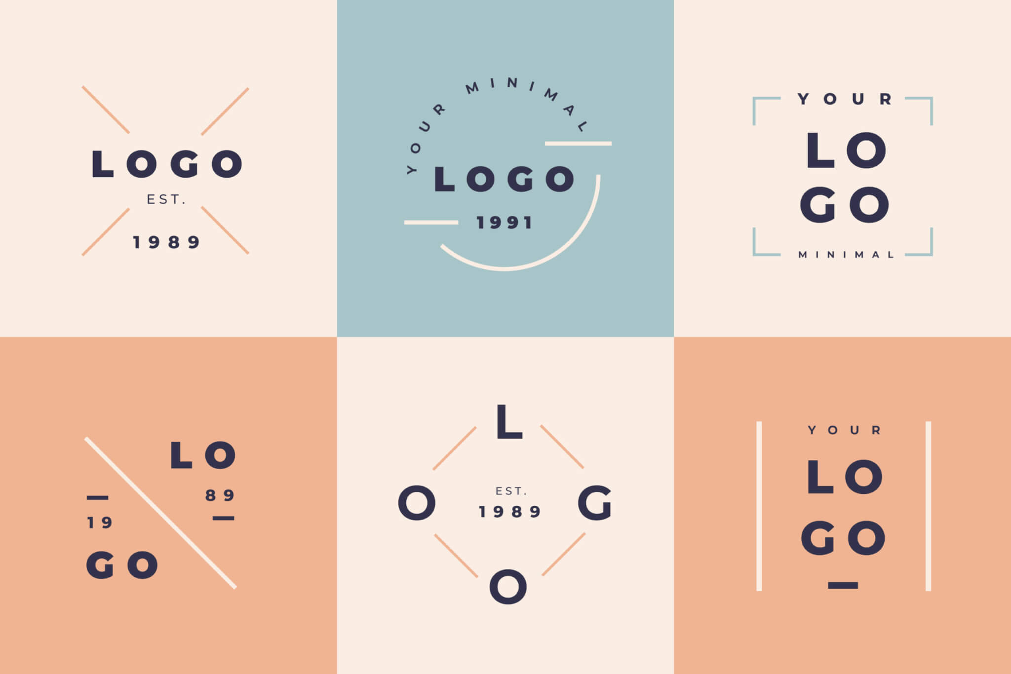
Font families and how to combine themAn important part of creating a memorable brand is picking the correct font for your logo. Finding a visual voice that communicates your brand’s values effectively is more important than simply picking something aesthetically pleasing. When making such a significant choice, many considerations must be considered. The character of your brand should be your top priority. How would you like others to feel? Do you want something playful and creative, like a tech startup using Open Sans, or serious and professional, like a legal office using Times New Roman? This personality should shine through in the fonts you choose. Keep in mind who you’re writing for. Various types of people are drawn to particular fonts. A more conventional audience may incline toward a classic serif, while a younger demographic may be more receptive to a fresh, contemporary sans-serif.
Another important factor is the field in which you work. Different fields call for different typeface families. Georgia, a robust and trustworthy serif, might be used by a bank, while Futura, a geometric sans-serif, might be chosen by a creative firm for its individuality and expressiveness. Priority is given to visibility and readability. Even at tiny sizes, your logo type should be legible and easy to understand. Some script fonts, however lovely, might be hard to read at tiny sizes due to their complexity and excessive ornamentation. Adaptability is crucial as well. All of your logo’s collateral, from website and business cards to packaging and signs, should use the same typeface. Pick a font that works well with a variety of sizes while keeping its visibility and impact intact.
To be unique, one must strike a balance. You want your logo to be easily legible, but you also want it to be noticeable. Think about employing a modified version of a common font or, if your budget permits, making a unique font for your business. Doing so can make your logo stand out. Choosing the right fonts to fit with your logo’s slogan or any supporting text is crucial. Pick a font that works well with your logo’s font and brings the two together visually. Combining serif and sans-serif fonts is a popular and effective approach. Think about the Playfair Display in conjunction with Montserrat. We must prioritize scalability. Whether it’s a small icon on a website or a huge banner on a billboard, your logo should be professional and recognizable. Pick a font that looks good and stays legible no matter how big or small you make it. The licensing aspect should not be overlooked. Before you use any typeface, be sure you know what the license requirements are. You can use some fonts for commercial purposes without paying a dime, but utilizing others requires a license, and you can get in trouble with the law if you don’t.
WhatFontIs.com might be extremely helpful at this point. Uploading a screenshot and finding out the name of a font you saw somewhere else that inspired you isn’t the only thing our site can do. If you’re not sure if the font you want to use for your company logo requires a license or not, we can help you find out. Run a free test of this feature here.
Testing becomes very important when you have reduced your options of fonts. Make some logo mockups using various typefaces and see what your audience thinks. Try out several color schemes and backgrounds to get a feel for the font’s personality. Think about the many settings in which it functions. You may find the ideal font for your brand by going through this testing and refining procedure repeatedly. Last but not least, if you want your company logo to stand out and be remembered, picking the correct font is an important step. Choose a font that conveys your brand’s identity, boosts recognition, and leaves a lasting impression by familiarizing yourself with the various font families, their psychological effects, and the important factors mentioned below. Your logo represents your brand visually, and your font choice conveys its message verbally. Choose wisely.

I'm a programmer at heart. But in my 20s, I realized there was more to the world of fonts than just Courier.
Driven by endless curiosity, I built a system to explore them.
That project grew into one of the world’s leading font identifier platforms: www.WhatFontIs.com.
By 2024, WhatFontIs is helping nearly one million designers—famous or not—discover the names of the fonts they need.