Vintage design is still hugely popular today. Whether it’s the appearance of a vintage-inspired website or the texture of old-fashioned packaging, incorporating elements from the past may provide projects a feeling of authenticity, quality, and nostalgia. Classic styles will always be in vogue, as this reference to the past is evident in all forms of creative expression. Selecting appropriate fonts is essential for achieving that retro style. Typefaces have the unique ability to transport us to a forgotten era. They immediately bring up images from past times, giving our work a deep historical atmosphere. Think about the elegant script on a Victorian ad or the strong, geometric letters on an Art Deco poster. Fonts tell the story of a design without actually saying a word.
However, it can be difficult to get your options down to just one font because there are so many. Finding the perfect font to convey the precise sense of nostalgia you’re going for may be a real challenge, what with all the beautiful serifs and striking display faces to explore. If you’re working with a vintage style, this article will help you choose the right fonts. In addition, we will provide you with useful information that will enable you to make designs that are both distinctive and expressive of the classic style.
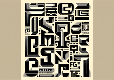
Understanding what a vintage style isChoosing the desired level of “vintage” must come before your choice of fonts. Vintage goes deeply into many different time periods, each of which possesses its own unique character. Think of the Art Deco era for its elegant simplicity. The 1950s for their carefree spirit. The Wild West for its raw allure, or the 1960s for its trippy, avant-garde styles. It will be much easier to choose the proper fonts if you know exactly the era you are aiming to express. Consider a geometric sans-serif, like Broadway, or a stylized serif, like Bifur, if you’re going for that Art Deco vibe from the 1920s. The geometric shapes and minimalist style of the time are reflected in these typefaces.
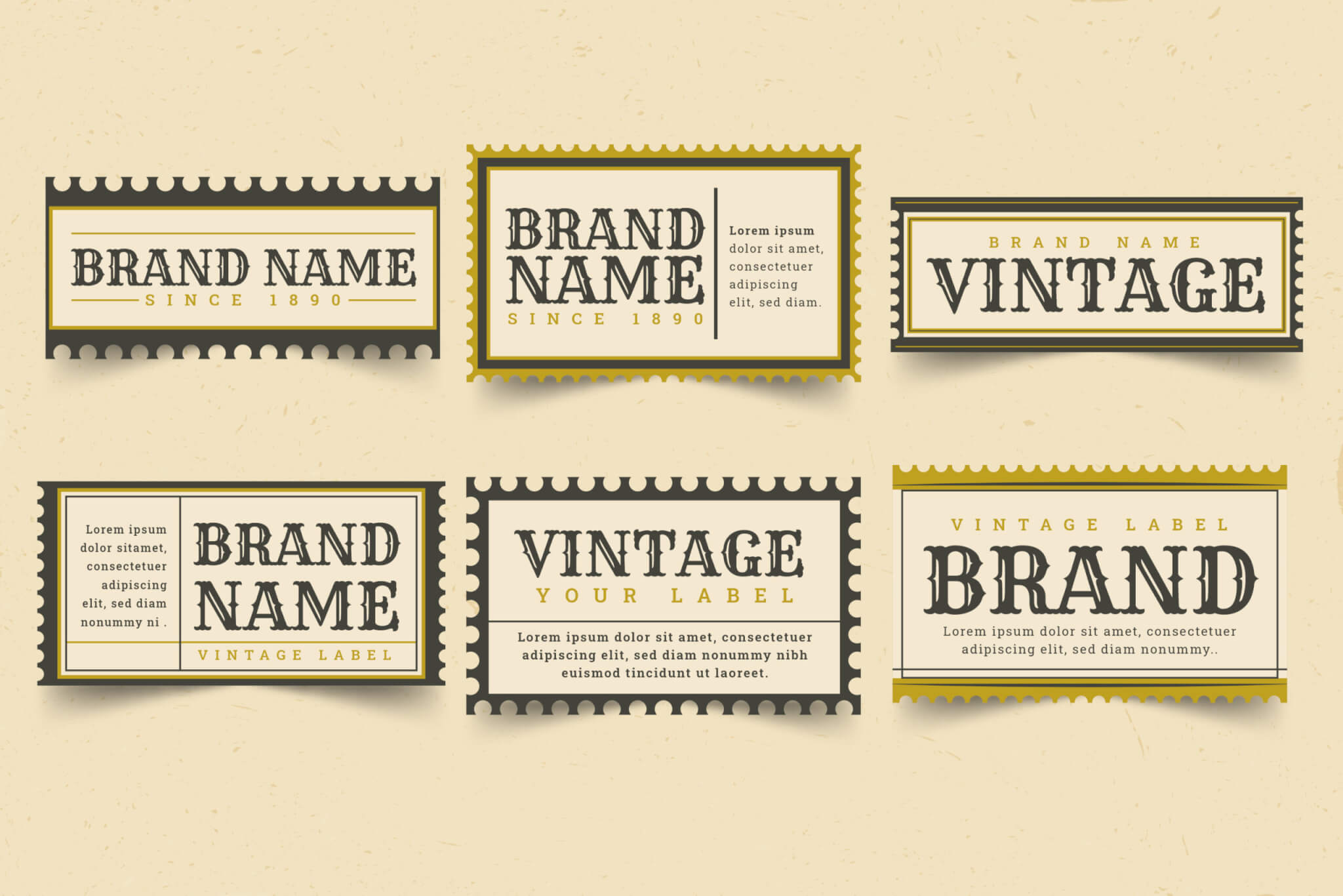
Some of these older styles deserve a more in-depth examination. The Victorian era (1837–1901) was characterized by an affinity for striking details and vibrant colors. Imagine elegant serifs like Trajan Pro or sophisticated fonts like Alex Brush. These typefaces provide an air of timeless elegance with their ornate flourishes and elaborate designs. Then there’s Art Nouveau (1890–1910), characterized by organic, flowing lines that drew inspiration from nature. The delicate and fluid serifs and calligraphic inspirations of fonts like Lydian MT and ITC Willow capture this style.
As we entered the twentieth century, the Art Deco era (1920s–1930s) introduced us to modern, geometric forms. Cooper Black and other stylized geometric serifs were popular at this time, as were bold sans-serifs like Futura and Kabel. The focus on modernism and opulence in these typefaces highlights the time. From the 1950s through the 1960s, people lived in the Mid-Century Modern style, which was defined by practical minimalism infused with playful touches. The most common types of fonts used were clean sans-serifs (such as Helvetica or Univers) and serifs and scripts with a hint of retro style. Bebas Neue and Lobster Two are two fonts that come to mind while considering this style.
Last but not least, the Retro era (1970s–1980s) is characterized by carefree attitude, vivid colors, and geometric fonts. Popular fonts included chunky, pixelated styles and disco-inspired scripts like Pacifico and Stay Groovy. Having fun with design and making a statement were the defining characteristics of this era. So, to help you choose the best fonts for your vintage-inspired projects, it’s necessary to have an idea of the many vintage styles and the fonts typically linked with them.
How to effectively use and combine vintage fontsYou need to remember a few important aspects when selecting your fonts after you’ve decided on the exact antique period you’re going for. Before anything else, remember that readability is essential, particularly for longer pieces of text, even though old fonts tend to prioritize style. Verify that at all sizes, the typeface you select is legible. Consider the x-height (the height of the lowercase letters), the space between the characters, and the contrast between thick and thin strokes. While a fancy font like Playfair Display would be perfect for a heading, a simpler one like Lora would work much better for body copy.
The creation of an obvious visual hierarchy is another critical component. In order to guide the reader’s eye across the design, good typography makes use of multiple fonts to highlight the most crucial elements. To make headlines stand out, you can pick a colorful, bold typeface like Bebas Neue. For the body text, you can go with a more readable font like Open Sans. The use of contrast both draws the eye and makes the text simpler to read.
Additionally, your design’s context is essential. The font you choose should complement the design and the message you want to express. A vintage wedding invitation set in a delicate script font, such as Alex Brush, would be the ultimate of romance and elegance. However, a more daring and powerful script, such as Montserrat, would be more fitting for the logo of a rough and tumble outdoor enterprise. Consider the design’s purpose and the people you’re doing it for.
Being able to pair fonts successfully is another significant ability. If you use an excessive number of fonts, your design will appear chaotic and unorganized. No more than two or three fonts that blend with one another is ideal. A classic method is to use a display typeface (for headlines) and a more legible text font (for body information). The use of multiple weights (bold, italic, light) within the same font family or the combination of serif and sans-serif fonts are other ways to generate contrast. To illustrate the point, consider combining serif and sans-serif fonts, such as Merriweather and Roboto.
Lastly, before you use any fonts, make sure they are available and that you have the proper license. It is essential to review the licensing terms of any free fonts you find online to ensure that they are suitable for your project. For commercial applications, you may need to purchase a license, even though certain typefaces are free for personal use. To keep yourself out of trouble with the law, you should be familiar with these limitations.
If you happen to come across a vintage font that you absolutely love but you’re not sure of its name, WhatFontIs.com can be a lifesaver! This incredibly useful tool can identify almost any typeface in just a few seconds. All you have to do is take a screenshot of the text using the vintage font you want to use, upload it to the site, and our advanced search algorithms will do the rest. In no time, you’ll have the vintage font name and can easily incorporate it into your own projects.
Always put clarity first in your design, however if you’re going for a little Wild West vibe, think about using Crackling or Giddyup as your typeface. Learn the ins and outs of these vintage font families and how they’re usually used, and you’ll be well on your way to selecting the ideal typefaces to realize your retro-inspired visuals.

I'm a programmer at heart. But in my 20s, I realized there was more to the world of fonts than just Courier.
Driven by endless curiosity, I built a system to explore them.
That project grew into one of the world’s leading font identifier platforms: www.WhatFontIs.com.
By 2024, WhatFontIs is helping nearly one million designers—famous or not—discover the names of the fonts they need.