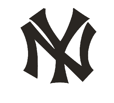
The Houston Astros might have beaten the New York Yankees in last night’s baseball game, but when it comes to fonts and logos, we have to accept that few in the world are as recognizable as the emblematic NY.
The Texas based team won 8-3 in front of the New York Yankees in the fourth ALCS game last night and spirits ran high. Soon after the game, allegations of cheating started to flow, but the Houston Astros were quick and adamant in dismissing them.
Before the fifth ALCS game on Friday night, let’s take a closer look at the two logos and official fonts used by each team.
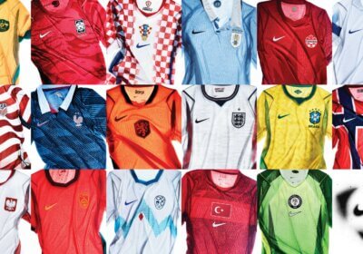
Obviously, there are high stakes when it comes to official fonts used by baseball teams. Like all professional sports teams, authentic merchandise is an essential revenue source and fans just love it.
Let’s start with the Houston Astros official font, used on all their equipment and official merchandise (t-shirts, hats, bats, mugs and so on). But first, we have to start with a bit of sports history, which is always essential in understanding and properly evaluating a team’s visual identity.
The Texas team’s origin can be traced as back as 1881, when the first professional baseball team in Houston was established. They started playing in the National League in 1962. Its first name in the League was Colt. 45s, chosen after a contest in which fans got to submit their name proposals for the Houston baseball team. They only started using the name Astros in the late 1960’s. The first official logo we were able to trace was a simple, dark blue font, heavily styled to have an astronomical look. It was a custom font, but if you are looking for something similar, we highly recommend Dulcian Norm Demi or Rockwell Bold.

The Houston Astros used this logo for nearly two decades, from 1975 until 1993. They changed it with a more bold, flashy-er version in 1994, when they added a gold color, as well as a star outline to better represent their astronomical name.
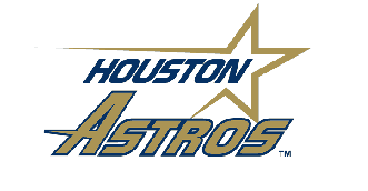
These new logo and font were short lived, being replaced in 1999. Then, the team decided on a cursive font, resembling old school baseball attire. They kept this one for over a decade, after which, in 2013, they found their present logo and official font.
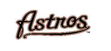
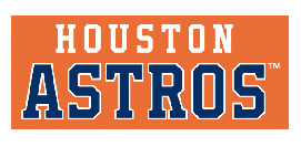
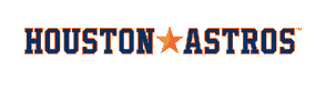
Today, they settled on a more angled font, with thick lines and a strong presence. The font they used is a bespoke typeface, but we found that Leophard Bold and YWFT League Bold are pretty close to the official Houston Astros font.
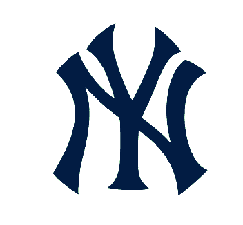
The New York Yankees, on the other hand, had a very different experience when it comes to their logo and official font. The NY used on their baseball caps is one of the most recognized logos in the world, having crossed the border from sports memorabilia to streetwear. In the 1990, it was no longer a fan item and, instead, became a fashion statement. Rap music had a huge part of that and the baseball cap with the New York Yankees logo was soon available in every corner of the world.
The team was established in the first years of the XX century, in 1902 with the name New York Highlanders. This is why they started using the letters N and Y as their logo, but in a very different form. It was an intricate font, with many details on each end point of the letters. We found a few close matches using WhatFontIs font finder tool, which allows you to identify a font with just a picture of it. There is no font exactly like that one, but we do recommend Meet Hall, Vecna and Teebone Front as good alternatives.
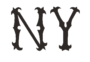
They went through quite a few fonts and logos after that, changing three official fonts and logos in just three years.
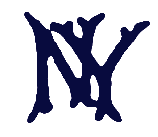
The team became known as the New York Yankees in 1913 and, in that same year, they began using the classic NY font and logo, the one that became famous worldwide. It was actually designed by the Jewellery mammoth Tiffany & Co. as a Medal of Valor for a New York City Police officer, shot in the line of duty.
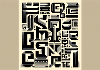
Passionate about fonts or just looking for a quick solution for your lettering woes? WhatFontIs.com provides a catalogue of over 550.000 fonts that you can browse until you find the one that fits you just right.
Also, make sure you check the Blog Section – you might get that cool idea that will help you better define you visual identity.

I'm a programmer at heart. But in my 20s, I realized there was more to the world of fonts than just Courier.
Driven by endless curiosity, I built a system to explore them.
That project grew into one of the world’s leading font identifier platforms: www.WhatFontIs.com.
By 2024, WhatFontIs is helping nearly one million designers—famous or not—discover the names of the fonts they need.