
Typography can set the tone of your overall design and impact the readers’ perception of your project and understanding of your business message. As an art, typography requires a set of well-honed design skills in general and in-depth knowledge of typography in particular.
Graphic design typography, however, comes with a clear set of typography rules. No matter how good you think you are or how inexperienced you are, it’s never a waste of time to remember the typography rules because they transform your creativity into an effective design.
If you want to know how to do typography correctly, you need to learn about the particularities of typography and the various types of typography. You also need to understand that sticking to the basic rules of good typography doesn’t involve sacrificing your creative freedom.
Master Knowledge to Master the Typography Rules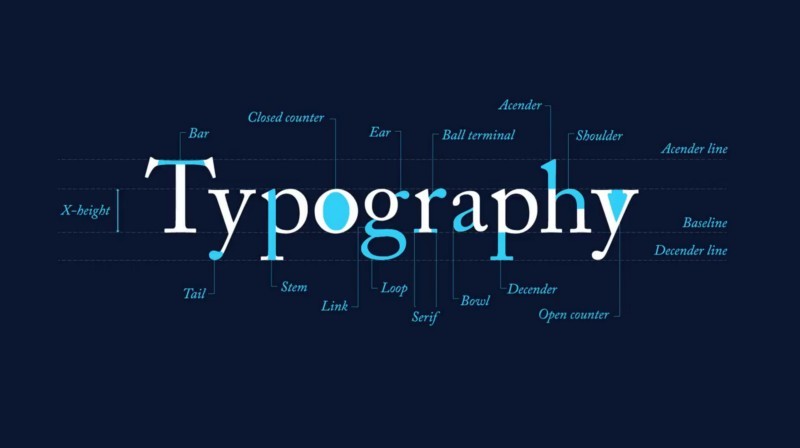
Typography is both an art and a science and, while creativity is a gift, mastering the practical details of good typography involves a complex learning process of the ins and outs of the structure of typography and a profound understanding of typography art definition.
Typography study is about learning and understanding the specific vocabulary, precise measurements, and main specifications of typeface composition. Typography study allows for the rules of good typography to set in and become an extension of you as an artist.
The advantage of knowing the rules of graphic design typography and mastering the nuts and bolts of typography is that you become empowered with the knowledge to break these typography rules deliberately with the express purpose of developing a concept of significance.
The Significance of Typeface Choice
There is this tendency to reduce the complexity of the typography art to a simple matter of randomly choosing fonts based on aesthetical considerations, which suggests that font choice has no consequences on typography design layout, call-to-action, or overall design.
Seasoned designers are fully aware of the significance of typeface choice and how it is by no means a matter of personal preference. Each font has its character, a personality that transcends the screen, reaches out to your audience and triggers a specific reaction/emotion.
If you want to know how to make typography art effective, not just appealing, you need to get an insight of how fonts relate to your audience. Armed with that understanding, you must make a different font choice to get across a specific message to a particular audience.
What does that tell you? People are advised to dress for the occasion. Think of your font choice as the outfit of your typography design project and think of your audience as the occasion. In the end, what is typography in graphic design? The outfit of your whole design. Makes sense?
There are many typography tips out there in the virtual world and one that makes a powerful statement refers to matching your font choice to your target market. Are you designing a typography advert for a rock and roll party or are you designing the website of an organic farm?
Deepen Your Knowledge of Kerning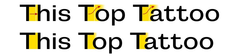
Veteran graphic designers know how important it is that you grow to be a virtuoso of kerning because clumsy kerning can ruin your overall typography design. Kerning embodies the fine adjustment of the tiny space linking any two letters to craft a visually slick copy.
Each letter has its personality and combines with differently with a different letter. Kerning is not a mathematical process that targets mathematically equal spaces between letters but a visual exercise that seeks to accomplish aesthetically even spaces between different letters.
Different typography fonts will require different kerning approach, as will different letter combinations. Remembers that graphic design programs can only help you so much and the magic touch needs to come from the artist in you that will develop an eye for kerning blunders.
Kerning errors have a subtle visual impact when it comes to lengthier copy and programs such as Illustrator may handle the kerning process well enough. However, logos or headlines require manual kerning because the visual impact of kerning errors weighs down your whole design.
Refrain from Using Too Many Fonts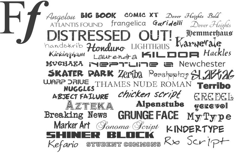
Newcomers to the design trade have a propensity for exhibiting their design skills by abusing typography fonts as far as variety goes. It is a frequent slipup that should be fixed because too many different fonts will cause your design to appear too dense, relatively tedious, and chaotic.
Three is the magic number when it comes to typefaces: one font for the headline, one font for subheadings, and one font for the body. Tip: pick fonts from visually distinct font families. Using fonts that are too similar may be regarded as a sloppy mistake and not as a calculated pick.
Understand Correct Typography Alignment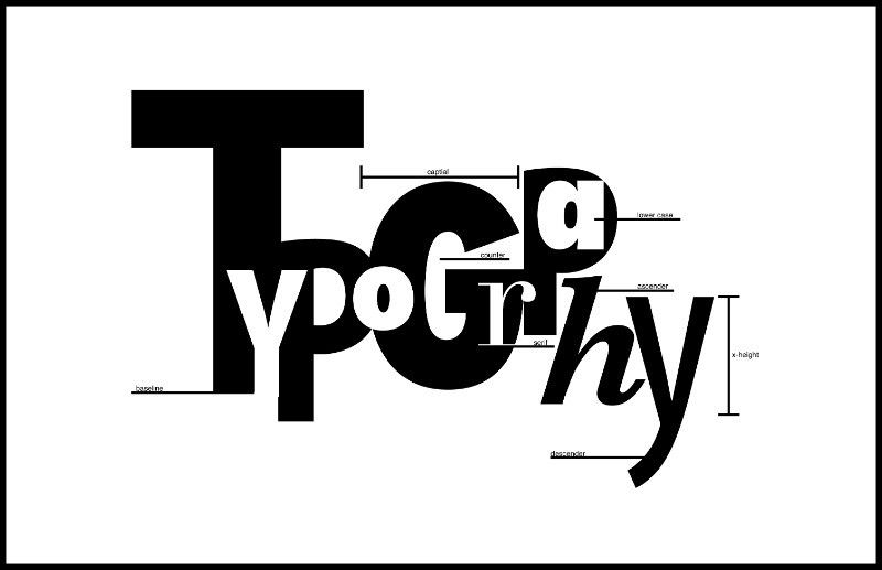
There are four possibilities for proper typography alignment, irrespective of the typography fonts or the graphics program you are using: Center Aligned, Left Aligned, Justified Aligned, and Right Aligned. Center and justified alignments are on a little on the difficult side as far as readability.
The most popular and effective choice is left alignment, often referred to as Flushed Left. It is the most comfortable choice on the eyes and therefore the preferred pick of the designers. The justified alignment is every designer’s nightmare while Flushed Right requires quite a lot of work as well.
Both Flushed Right and Flushed Left alignments generate the same problem that needs to be fixed: ragged left or right margins. Sometimes, playing with tracking, line measurements, and other typography design elements can help you control typography alignment effectively.
As a non-designer or as a beginner, you may be tempted to go for center alignment that subconsciously suggests balance and people love balance. The truth is that center alignment should be used exceptionally because it is an untidy alignment that impairs legibility the most.
Master the Art of Visual Hierarchy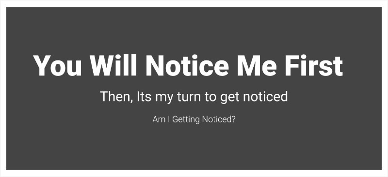
Typography allows you to make use of visual hierarchy, i.e., to emphasize a specific line of type over another. You offer information to the reader in the order of its importance, which is the exact order in which you want the different information of your design to be communicated.
Visual hierarchy in typography is about steering the viewers’ eye movement through your design in a way that allows them to identify certain wedges of information at the appointed time. Make visual hierarchy your priority and your design will not appear confusing and messy.
Size Does Matter in the Typography Arena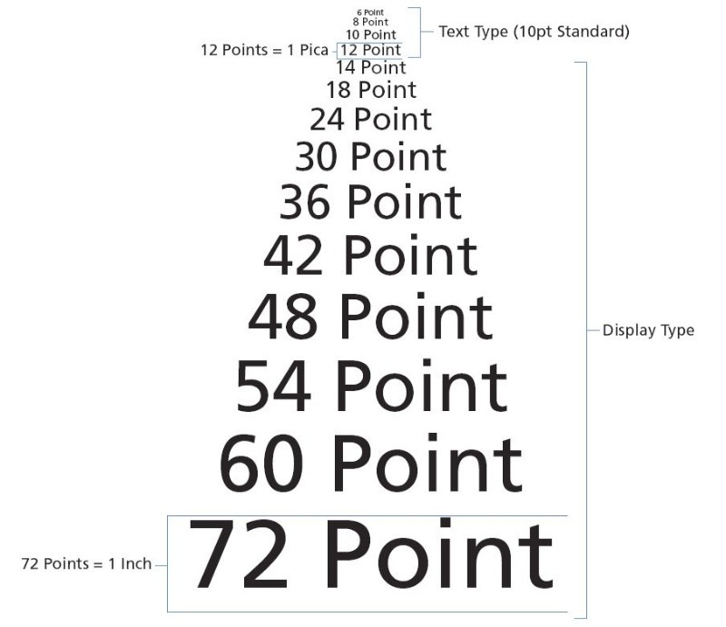
As a designer, you know you can count on 1-2 seconds to grab the reader’s attention in this field. Use larger fonts for the typography fonts of your headlines and logos because those are the lines that can make the difference between winning and losing a potential client.
Mix Fonts Skillfully and Cleverly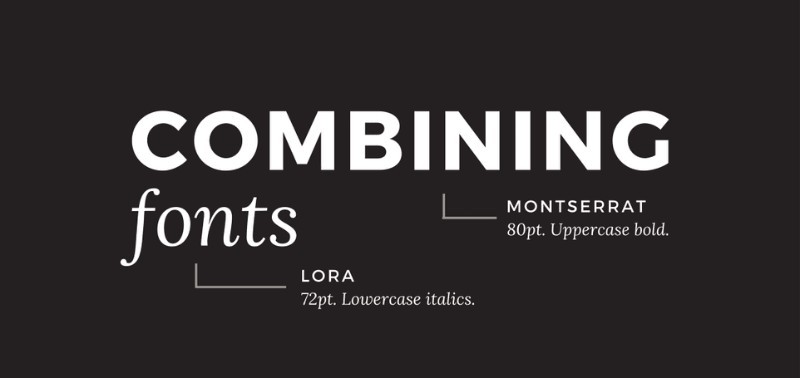
While a smart mixture of typography fonts has the power to enrich and boost your design, a clumsy attempt at mixing typefaces can quickly ruin your overall design. It’s just like preparing a salad of ingredients that complement each other perfectly as far as color, texture, and size.
Bring Readability into Play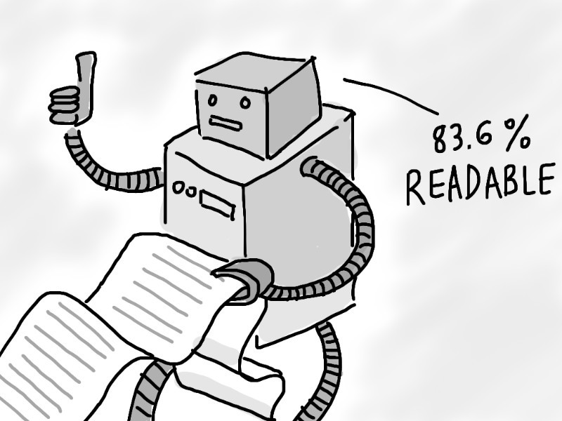
Designers may be so drawn to the creative aspects of their font choice that they fail to cater to its readability. Don’t let aesthetic preferences allow you to choose looks over legibility. Fonts should enhance readability because words have no value if they look nice but are not legible.
Avoid Grammar Errors at All Costs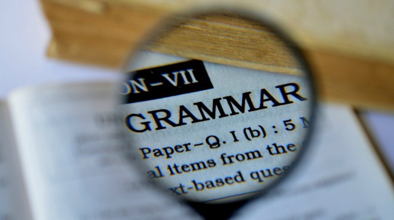
Perhaps it should have been the first rule of design, more important than choosing the right typographic fonts, but the truth is that typography needs all these aspects taken care of to be perfect. Ignoring the importance of correct grammar in your typography is bad. Really bad.
Before making any other typography choices, such as picking your typography fonts, make sure you have catered successfully to all the grammar needs of your text. Then and only then can you can start working your magic on the final, error-free version of your text content.
Adapt your typographical choices to the content of your text and not the other way around. Typography is about conveying a message to an audience, a message that needs to be read first. It is all down to using the elements of typography to make your text visible to your reader.
Stay Away from Distorting Fonts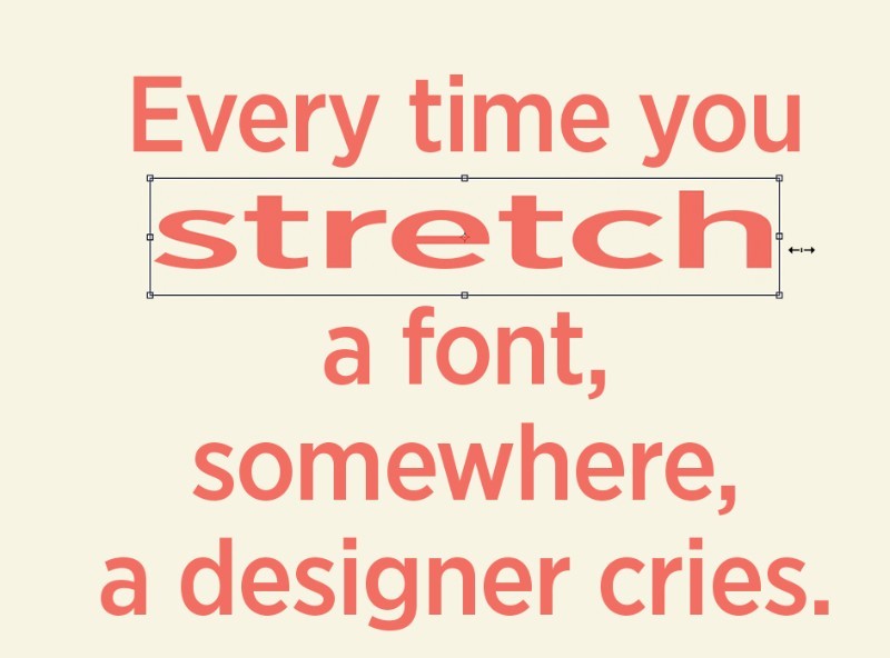
There are so many details to take of when it comes to typography fonts that, sometimes, designers choose an easy fix for some of the problems that they are facing. Once you’ve managed to identify the one perfect font to match your content and design, don’t ruin it!
Text may not always fill perfectly a text box and stretching/condensing content may seem like a practical fix. In fact, doing so breaks up the balance of the typeface of your choice. Its features have been built with care and attention to achieve a specific look and performance.
These unique characteristics give your font a certain personality, and this personality triggers the emotional response you are looking for in your specific audience. The unique features of your font choice represent the very reason you picked it out of a pool of typography fonts.
Ending thoughts on typography rulesTypography doesn’t look so simple anymore, does it? It takes skill, involves a lot of learning, and has quite a few typography rules that you need to learn how to navigate. It’s not as simple as it looks at first glance but sticking to these guidelines will make a huge difference in the quality of your design.
If you enjoyed reading this article about typography rules, you should read these as well:
- How to install a font you downloaded from the internet
- Make your own font: A guide on how to create a font
- Font pairing: Combinations of fonts that go together
Technical lead at WhatFontIs since 2010 with a (healthy?) obsession for fonts.

